I was looking at my Captain Cold FUNKO POP recently and felt inspired. It’s been ten years since this was gifted to me and I was thinking about how it would be a fun idea if it was outside in the snow. Especially since the character is already dressed for winter with his jacket and whatnot. I found a picture of a snowy city area and went from there. Compositing the word “Cold Days” with a snowflake was a highlight for me.
I believe you have heard a saying that everything you see in New York makes sense, so I made the picture above to verify this statement. Would everyone think it’s reasonable?
This final image places Venom and Carnage into a New York City street scene. My goal was to make the characters more realistic into an urban environment using Photoshop masks, layers, and blending techniques.
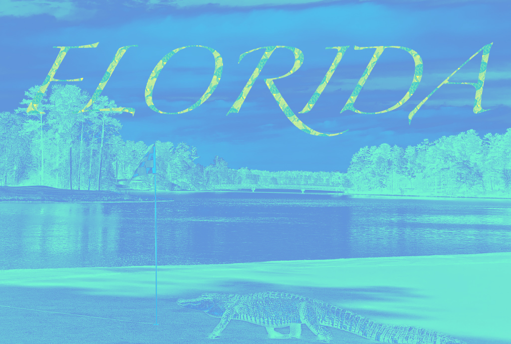
I used a golf course as the starting point for my image composition project. I then added an alligator onto the course, a sight that I found very common on many different courses in Florida. I edited the shadows for the alligator image to match the image of the golf course and added a blue gradient map to create a different color palette. For my text, I modified the font size and overlayed the pattern that I created. For my pattern I used a combination of ocean images, a turtle, a starfish, and a bay scallop shell to stick with the Floridian theme. One of the biggest challenges for my projected was adding the adjustments to the proper layers in the original composition and figuring how to group layers to apply the adjustments to the entire group instead of a single layer.
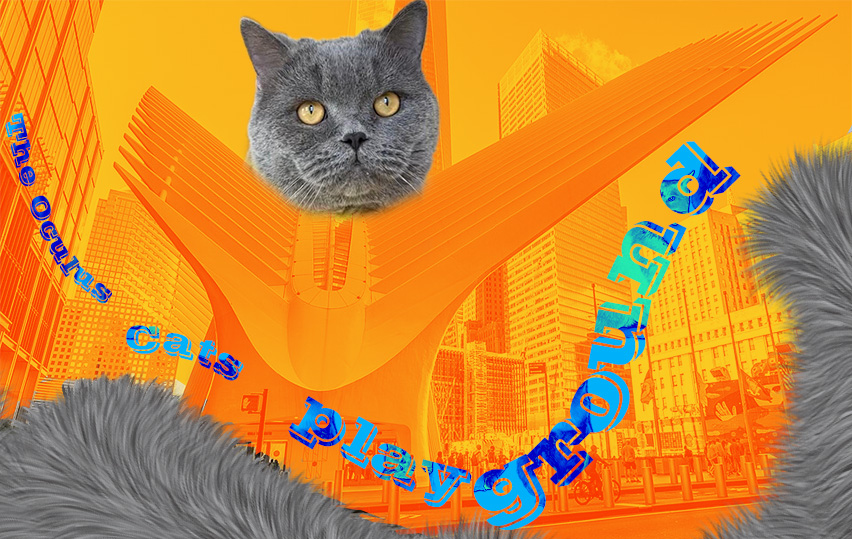
By combining my cat with The Oculus mall to make it appear as if the mall was his playground. To add more visual interest, I designed a pattern based on cats pictures and applied it to the fonts, enhancing them with vibrant, saturated colors. My inspiration came from bringing a playful colors to the scene. The most challenging part was blending the mixture of colors, which I solved by adjusting lighting and color balance to unify the composition.
This is a photo of me in Japan. I made this image kind of like a vision board for when I hopefully get to go there one day. The reason I wrote the line “life with no money is better in Japan” and look a little beat up in the image is because I’ve happily run around Japan, spending all my money on clothes, toys, food, and whatever else (as you can see by my smile). I added a noise gradient and saved the image in low quality because I thought it made it look more like something taken on an old digital camera. I used cherry blossoms when I made my pattern because sakura (or cherry blossom) is the national flower of Japan!
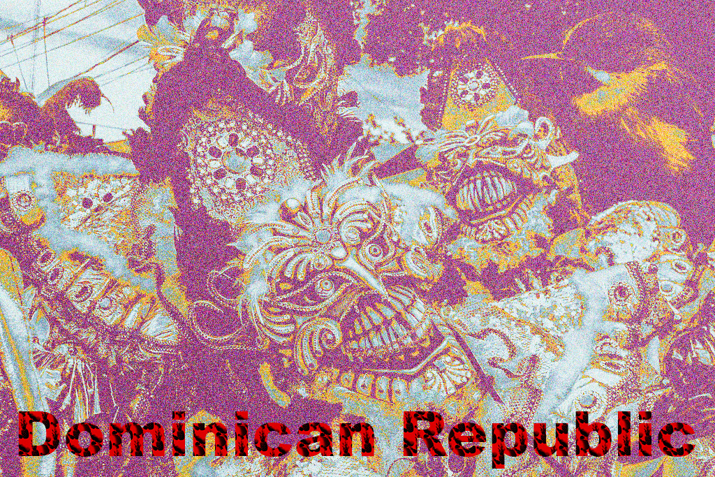
For this project, I chose an image inspired by the vibrant and colorful culture of the Dominican Republic, incorporating elements of its iconic carnival traditions. I combined three images, each focusing on the intricate masks and costumes worn during the festival. My primary sources of inspiration were the bold colors and unique designs seen in traditional Dominican carnival celebrations. Additionally, I added fruit patterns to the text—mango, lemon, and pineapple—and applied a gradient map of red and blue, resulting in a striking purple hue. The most challenging part of the project was blending the images together to create a cohesive, yet abstract composition, but I overcame this by experimenting with blending modes and color adjustments to achieve the desired effect. The final composition reflects the vibrant, chaotic energy of Carnaval, while also introducing a surreal twist.
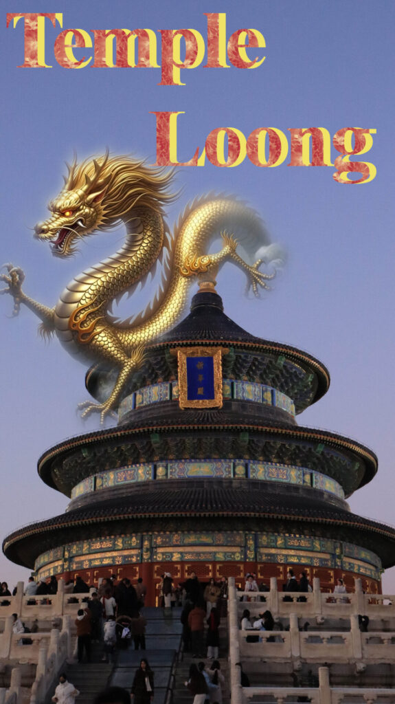
This background photo was taken during my winter vacation in Beijing. The building you see is the Temple of Heaven, one of the spots I visited.
At the beginning, I was totally stuck for ideas until I looked at this photo. The first thing that popped into my head was a Loong(dragon). Dragons are deeply connected to mythology and have had a lasting impact on the emperors of every dynasty throughout history. The emperor’s clothes, his throne, even his title. Nobody’s ever seen Loong, but I’ve always believed they must exist somewhere.
I thought this project would be tough, but it was easier than I expected, and I actually learned a lot more than I thought I would. I really enjoyed the creative process—it was so engaging that I completely lost track of time!
For the text design, I used red and yellow. Red stands for the Temple of Heaven, and yellow for the Loong(dragon). The red pattern has lotus and peach blossom designs.








.png)

.jpg)


