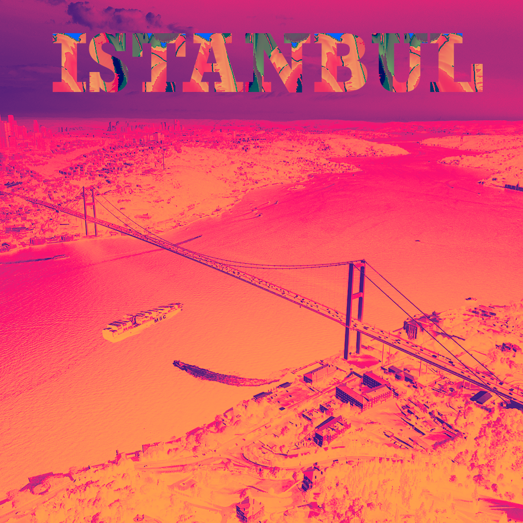
A ship passing under the Bosphorus Bridge, the pearl of Istanbul, has been added. I also included the city’s name along with a pattern featuring the tulip motif, a historic symbol of Istanbul. In the 1730s, tulips were planted all over Istanbul, and this period came to be known as the Tulip Era.
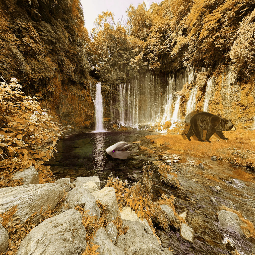
This Is my final draft of my composite image which I combined two images together which is a bear a dolphin and lastly a waterfall for the background. I added an adjustment layer/color balance to make the forest a warmer tone and added shadow to both of the animals and I drew a purple eye for the dolphin to make It more alienated.
Photo by Janaka Pushpakumara Rathnayaka from Pexels: https://www.pexels.com/photo/serene-waterfall-in-lush-forest-landscape-33725404/
This pattern came to me as I was making a smoothie and thought some fruits would make a great pattern. I combined three images 4 images total. My source of inspiration was my smoothie. Making the pattern and setting up all the images was tuff. Placing everything accordingly and messing with that gradient chart on the strawberry was fun.
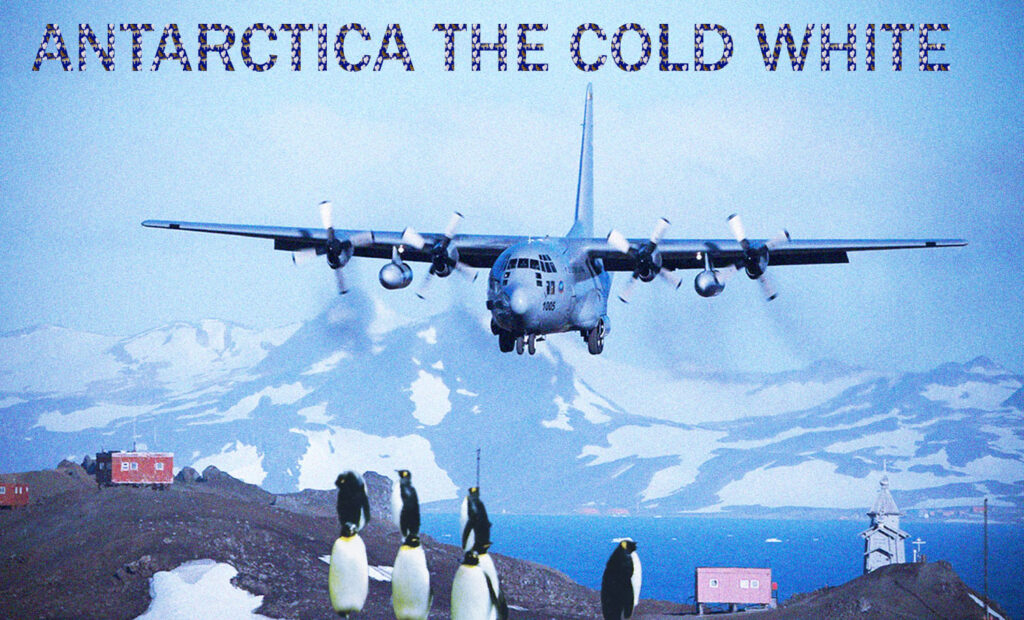
For my image project, I decided to use my previous composite image by also adding an owl, a fox, and a wolf into the text pattern. I wanted to capture the blue and white environment of Antarctica by also including the penguins that inhabit that environment. For this project, I combined 5 images, which included images for the text and the background. My main source of inspiration was the ancient history of Antarctica. The most challenging part of this project was applying and using the color gradient.
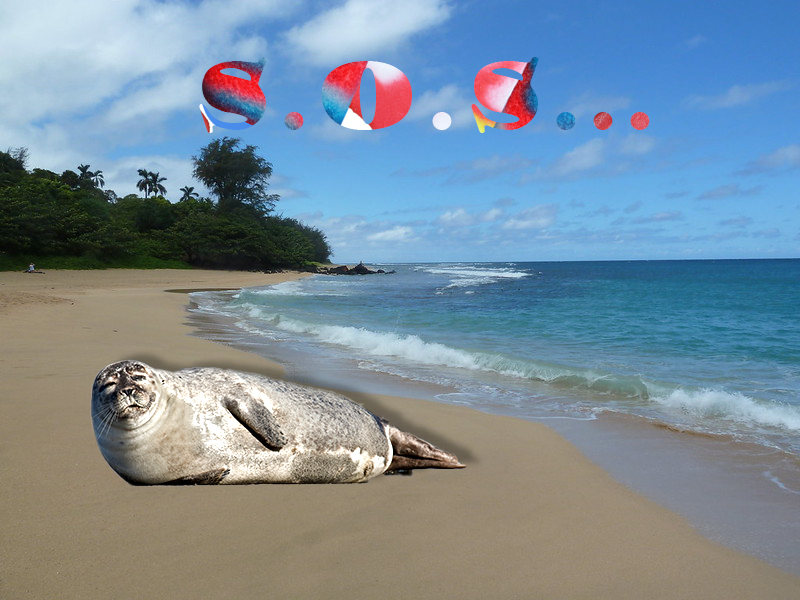
I decided to add a confused seal to an image of a beach shore. It’s not common for seals to be on the sand, so I thought it would be a nice and funny touch to add a confused seal to a beach environment. Very different from the rocks and water that they’re used to. To go along with the beach theme, I decided to do an ice popsicle pattern. The common snack people usually go for when at the beach is popsicles to obviously cool them down. People aren’t usually the best with cleaning up after themselves after they’re done at the beach, so animals tend to get into things they shouldn’t, like ice popsicles. For this image, I combine five images including two from the original composite image. I added the popular SpongeBob popsicle from the ice cream truck, a watermelon popsicle and a cool 4th of July colored ice popsicle.
“Patriotic ice pop” Pink Sherbet Photography from USA, CC BY 2.0 https://creativecommons.org/licenses/by/2.0, via Wikimedia Commons Published December 15, 2014 ttps://upload.wikimedia.org/wikipedia/commons/5/58/Patriotic_Ice_Pop_%284685807904%29.jpg
I used my previous cat project as the background for this image. For the text, I created a pattern using three different cat pictures and altered the colors with a gradient map. I chose to make the text yellow and orange to complement the blue of the background.
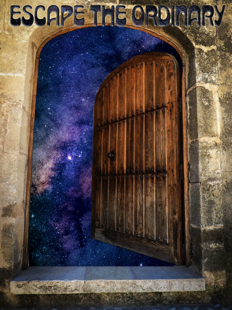
My main inspiration for this project comes from games like Baldur’s Gate, Tyranny, and the general vibe of space and fantasy games. I tried to make it feel like the beginning scene of an old school space or fantasy game. I combined 5 images total, including the door, space background, and the patterns I used for the text. The hardest part of this project was getting everything to blend well, especially making the text stand out with the pattern while still matching the rest of the image.
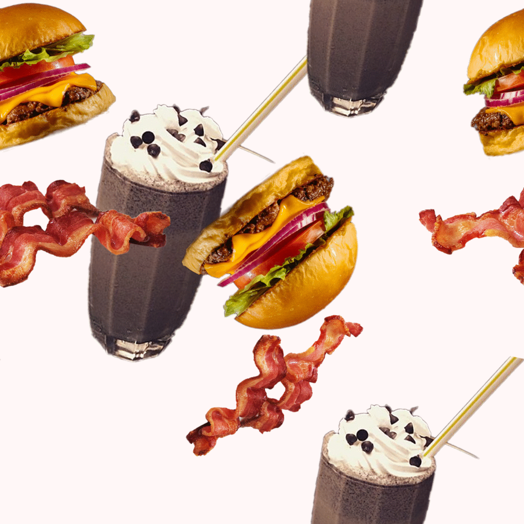
My aim this week was to create a pattern similar to a recent food order I had at a diner. The entire process came from creative curiosity-finding images, rotating them to create a falling effect, and sizing them to avoid clipping. This week, I think I’ve learned a skill I would like to use in outside of class sometime in the other creative endeavors.
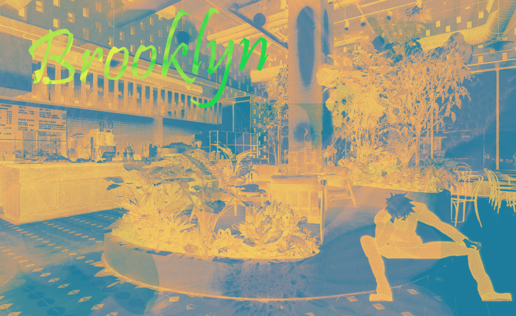
Wanted to continue improving and messing with the colors of a cafe I really like so I adjusted the gradients and put a pattern on the Brooklyn text to go for a more advertisement look.
“Devocion coffee shop in Brooklyn” by LOT Office for Architecture
I found an image of a yawning monkey that looked like it was yelling. I wasn’t sure what to do with it, but then I found an image of the moon and decided to layer the two images create a howling moon monkey. I then made a pattern of two satellites and a photo of the earth taken from the moon.






.jpg)


