
Overview
It is suggested, if you have not, to start off with the Beginner Emoji Tutorial and the Intermediate Icon Tutorial. Much of what we’ll be using has been covered in the previous tutorials, like using the pen tool, or explaining what anchors and handles are. The only new items I will show off is raster effects you can do in Illustrator.
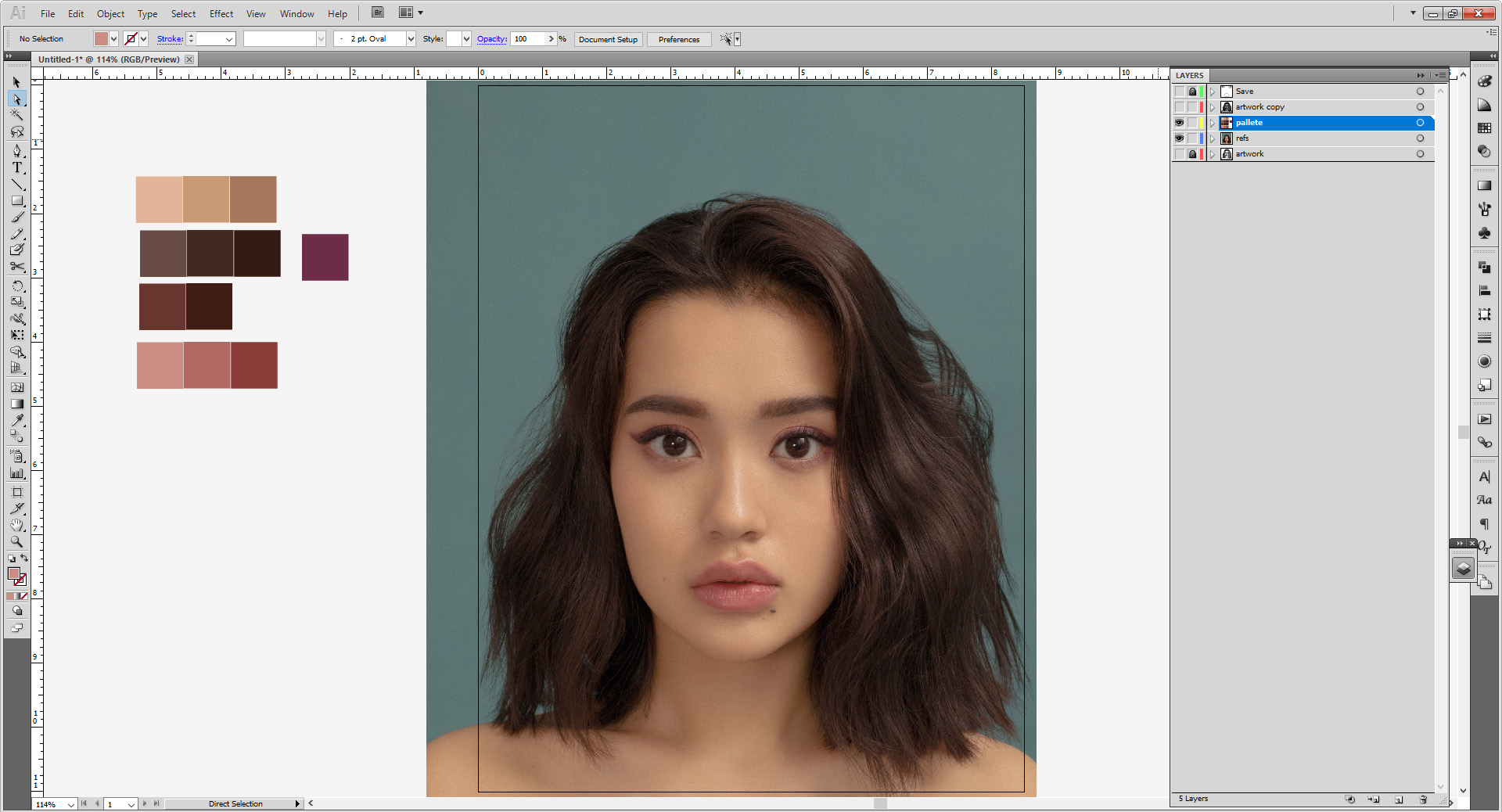
In this tutorial, we’re going to make an illustrated portrait based off a photo. We’ll be using a stock image for this tutorial (see below), but feel free to use a photo of yourself. If you are doing so, please make sure it in color and very clear, showing details of your face. Once you understand what it is you will be doing, you may experiment in black and white or with other photos.
The biggest takeaway here I will say is: Take Your Time. Very detailed portraits like these still take me several hours to finish– and I’ve been illustrating in Illustrator for 10 years now. Don’t be afraid to pause and save and take a break and come back. The site will be here.
Working in Adobe Illustrator:
While we provide links to some open source/free software for use at home, the Makerspace itself has license to use Adobe Illustrator. You may try to follow with the best ability with another program as well, but there might be an additional learning curve. Be patient, and refer to program’s online guide to see what it can/cannot do.
My version of Illustrator is CS5, which is much older than the CC version on our machines in the space. The only difference being my user interface is light colored and may not have as many capabilities as your versions have. All the commands are the same, so don’t feel daunted!

Important Tools in Illustrator:
- Select Tool (V) is self-explanatory. It selects items, and if grouped, will select the whole group
- Direct Select Tool (A) selects only the item you click on.
- Pen Tool (P) Pen Tool (P) is nice to know for making certain shapes. Holding down the icon opens other options. For more information on those, check out the Stencil Workshop
- Shape Tool draws shapes. Quick Command M for rectangles and L for circles. Holding down the Shape tool in your toolbar will open up more options.
- Pencil Tool (N) works best if you are using a drawing tablet, you can easily draw over your reference and fix the lines after.
- Scissor Tool (C) cuts along a path or point. Good for making custom shapes or removing small parts of shapes. If you don’t see it, the Eraser Tool or Knife Tool may have been used prior. Hold down the icon to reveal it.
- Eyedropper Tool (I) samples colors/styles from another shape/stroke/image. You may need this to choose your colors later.
- Artboard Tool (Shift + O) allows you to resize the size of your artboard. This is good if you intend to scale the image for other formats/print size.
- Hand Tool (H) allows you to move around the artboard without disturbing your artwork when zoomed in at higher levels.
- Magnifying Glass Tool (Z) helps you zoom in/out of the image, useful with working on particular details.
- Stroke and Fill (X) allows you to make your shapes filled in solid or just remain outlines, or both. You will need to physically clock on each to set the color. Using D resets your colors to the default white fill and black stroke.
Important Panels in Illustrator:
If you cannot find these in your workspace go to Window on the top of your main menu. Select the panels as needed.
- Color an alternative to using the the color selection in the Stroke/Fill panel. It has various slider options for you to make colors
- Color Guide has preset color swatches and generates a pre-made palette of tints and shades.
- Swatches where all the set colors/styles/patterns are. Any custom colors/patterns you save will go here.
- Transparency allows you to edit the opacity and blending mode. If you’re familiar with Photoshop, this would be the Layer Panel.
- Gradient allows you to generate a gradient, and edit it further.
- Stroke allows you to change the appearance of your stroke, its thickness, or to make it a dotted line
- Pathfinder merges multiple shapes together in different ways.
- Align helps you center or stagger shapes relative to your artboard.
- Transform allows you change the size of you shapes.
- Appearance allows you to edit any effect you have on a shape (blur, drop shadow, etc).
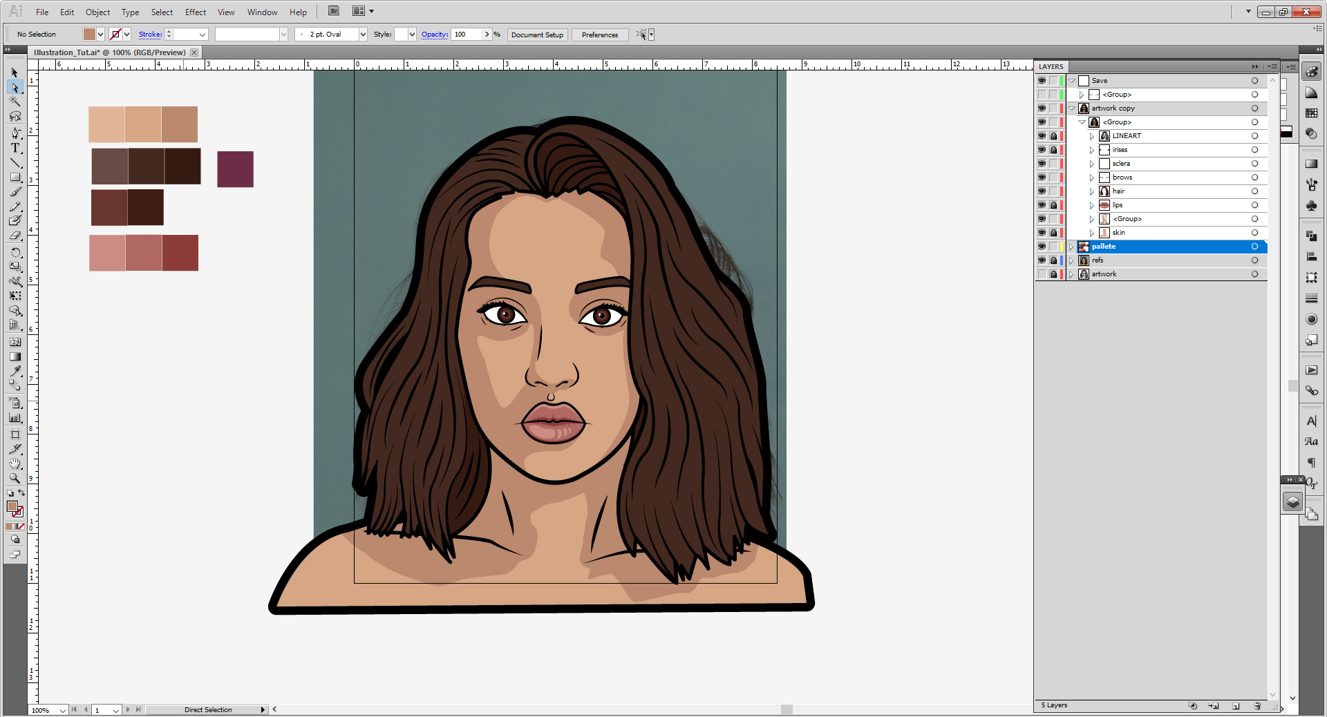
- Layers show you every path, shape, our type object you’ve made. You can organize pieces using many different layers, or groups within said layers.
Important Windows in Illustrator:
- File is where you check your color mode, or output settings.
- Object allows you to further edit, group, or expand your shapes (important for laser cutting prep)
- Effect is where you can access all sorts of raster-based stylistic effects, like blur, drop shadow, or glow. If you’re familiar with Photoshop, you might be familiar to some of these.
- View allows you make, show, or hide guides and grids.
- Window is where you can access all your panels if they aren’t on your artboard or you accidentally close them.
Shortcuts to Know:
- Ctrl/Cmd + A selects everything
- Shift + Ctrl/Cmd + V pastes an object in place relative to where it was on the previous space; great if you’re moving it to a new file/artboard.
- Ctrl/Cmd + G groups selected items into groups
- Shift + Ctrl/Cmd + G ungroups the group selected
- Cntrl/Cmd + J closes open shapes.
- Ctrl/Cmd + R opens up the rulers on the artboard, allowing you to easily make guides
- Cntrl/Cmd + “ reveals and hides the grid
- Holding Down Cntrl/Cmd and hitting + or – will zoom the artboard in or out.
Illustrating in Illustrator
I will be using a stock image from Unsplash, which I cropped to suit our needs. You can get the full-sized images to download Here.
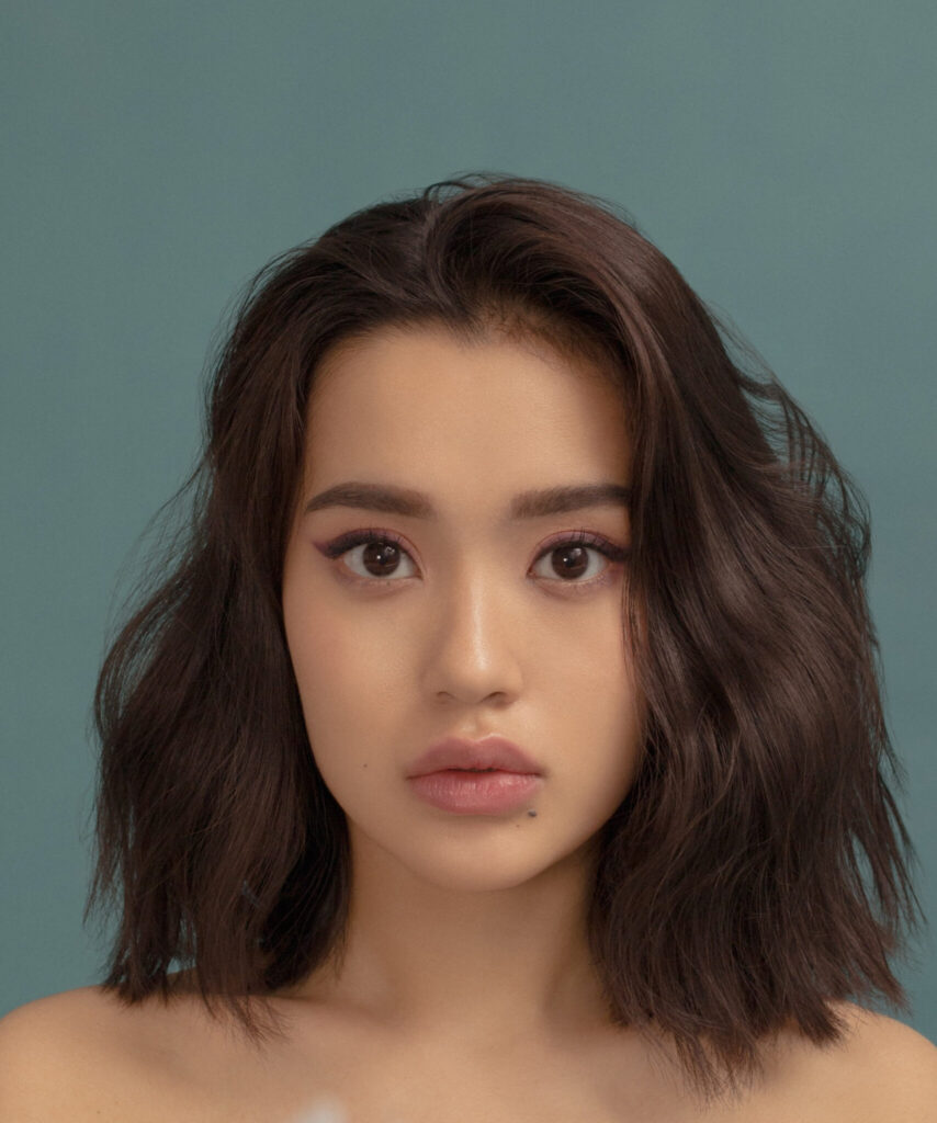
It’s good stock portrait for your first go. Not too detailed but also neutral enough to play around with some effects I’d like to cover in this tutorial. You can also use an image of yourself as well, or find another portrait off Unsplash, as there are plenty. If you are going that route start with something in color, then if you want to work off black and white later, you can.
If you have the programs, ability, or tablet, you can always go over quickly with a sketch of your subject in a raster drawing program first. Otherwise, you can just past the original file and go over it. I personally like doing a quick sketch to bring in to help get some of the details.

(You can also get the full-sized image Here.)
Go to File > New. Set your artboard to 8.5 by 11 inches (landscape or portrait layout depending on your choice of image, but for ours we want portrait). If you wish to scale up or down later, you can, thanks to the vector format. For a faster shortcut, you can go into the preset dropdown menu and select “Letter”.

For now, RGB is fine, but if you planned on printing it, you can switch the profile to CMYK and save it later by going to File > Document Color Mode > CMYK Color. You can activate your rulers/grid as needed at this time as well. (Cntrl/Cmd + R and Cntrl/Cmd + “ respectively.)
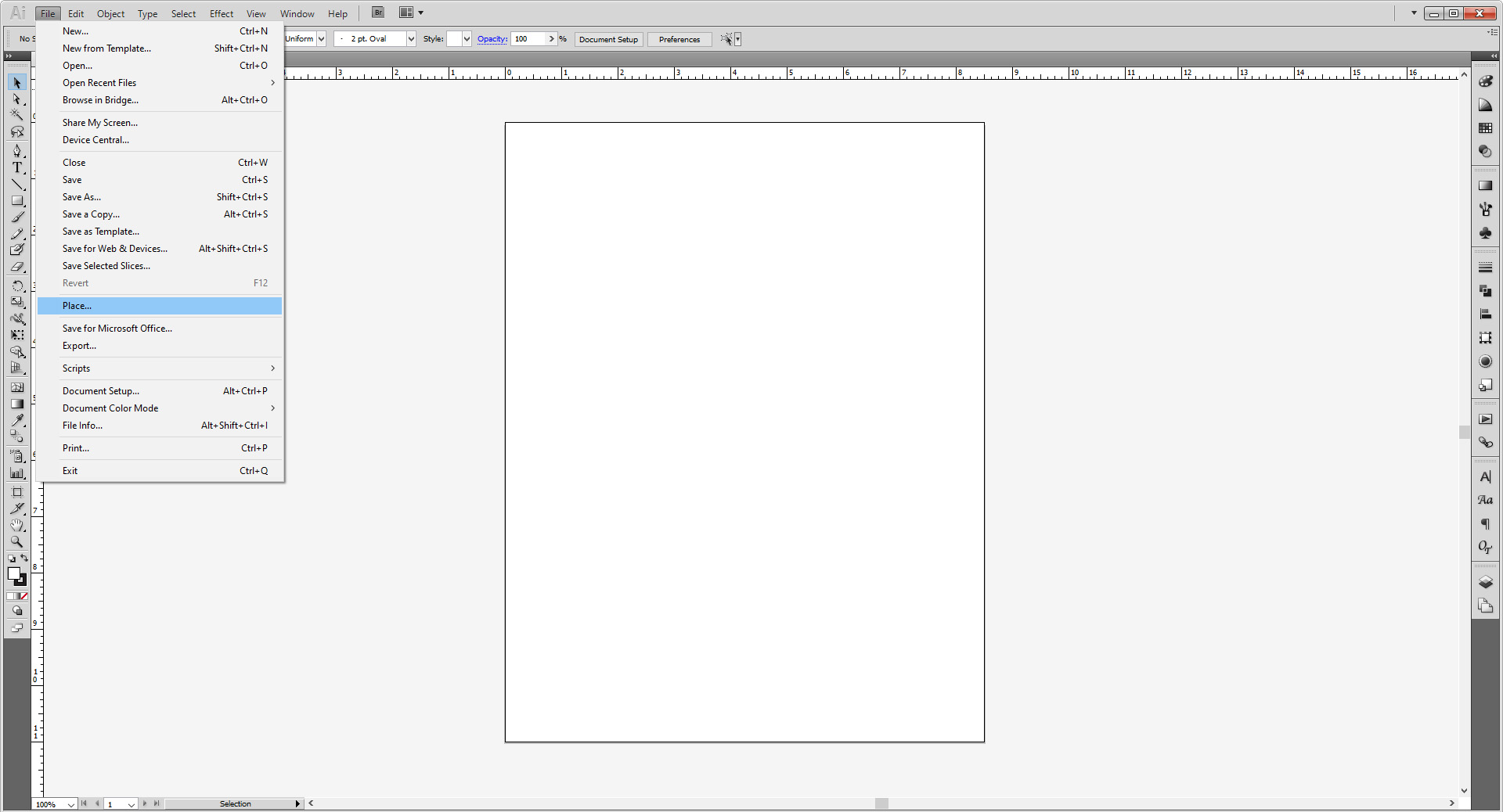
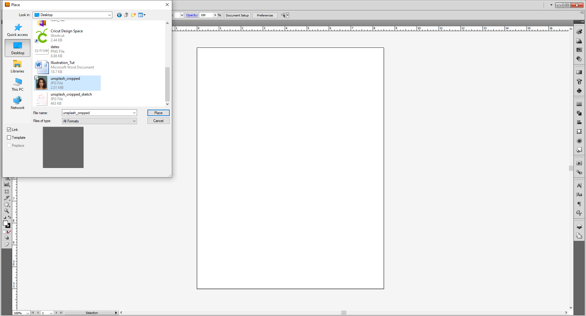
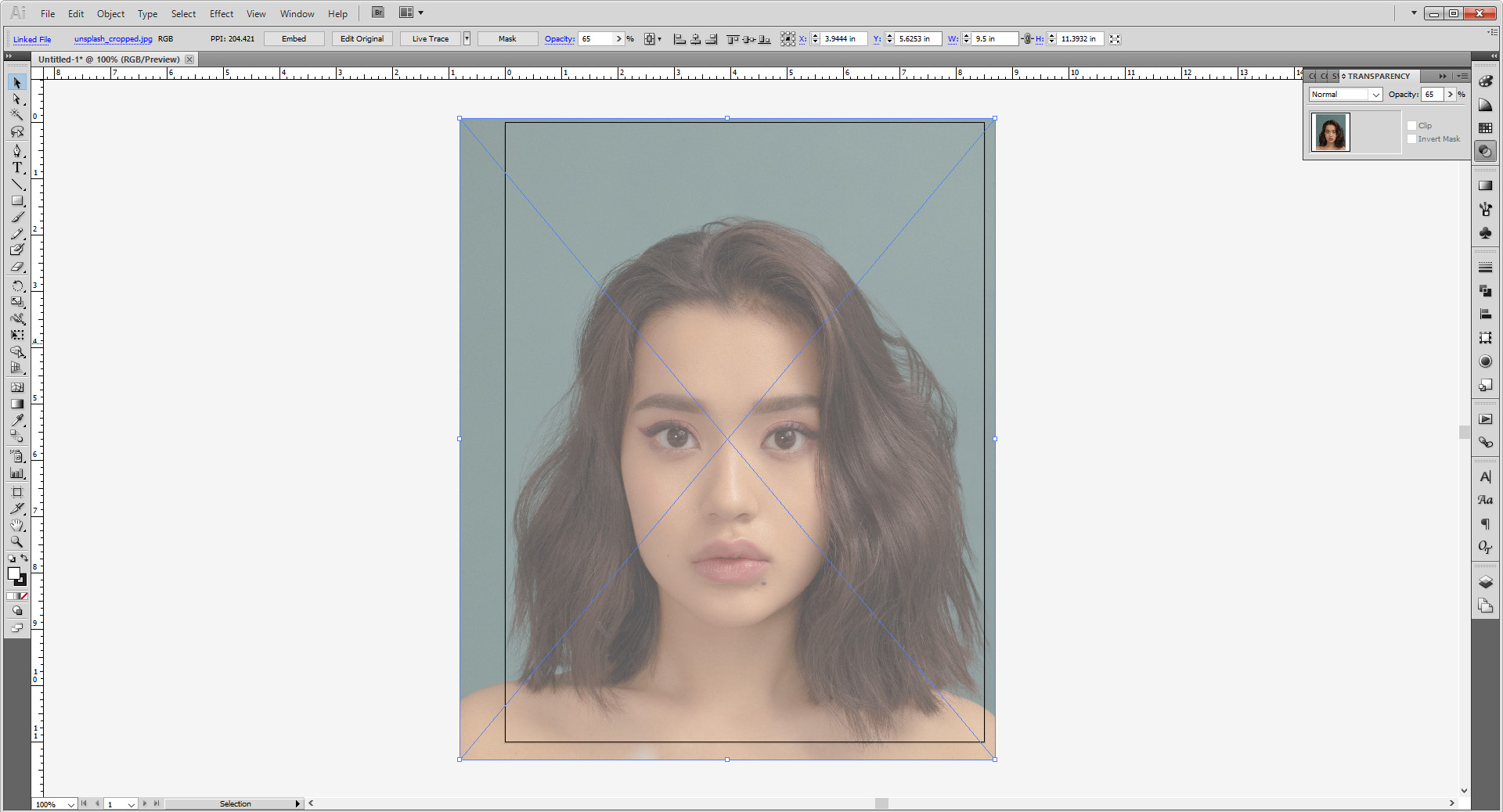
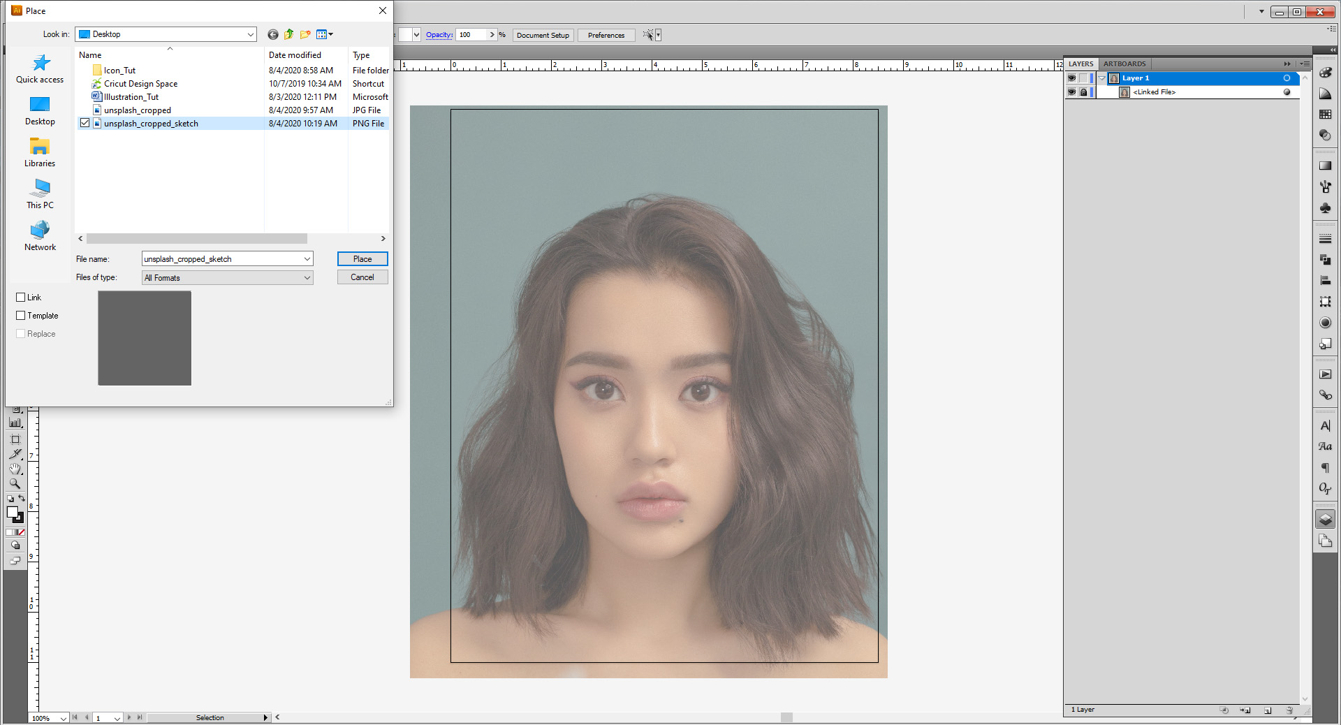
Next, go to File > Place. Place the first image (unsplashed_cropped) into the artboard and scale up or down to fit it however you wish, either using Transform panel. (You may have the option on the bar above the artboard as well depending on your UI layout/version of Illustrator.)
I set my image with a 9.5 inch width and centered it the best I could.

Go to the Transparency panel and bump the image’s opacity down. Between the 75-60% range is fine. Lock the image when you’re done.
THIS NEXT PART IS OPTIONAL, AND ONLY IF YOU’RE FOLLOWING ALONG WITH MY EXAMPLES OR MADE A SKETCH OF YOUR OWN.
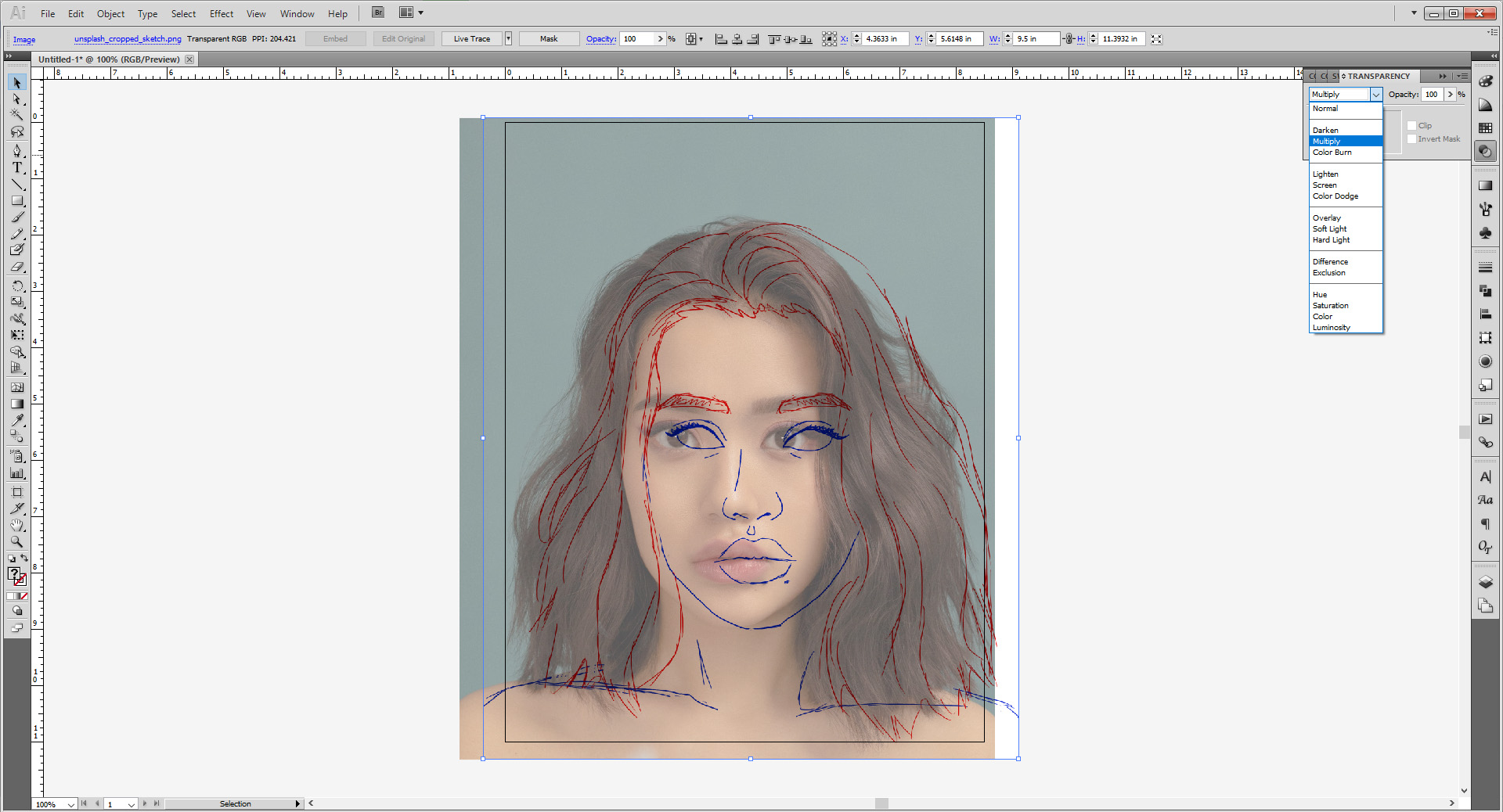
Repeat this process, go to File > Place and now place the sketch (unsplash_cropped_sketch) over the image.

Since we know I made these both the same width originally, match it with the image by making the width 9.5 inches. Go to the Transparency panel and switch the layer style to Multiply. Use the arrow keys to move the sketch over the photo and align them. Lock this layer when you’re done as well.
IF YOU ARE JUST USING AN IMAGE WITHOUT A SKETCH, CONTINUE HERE.
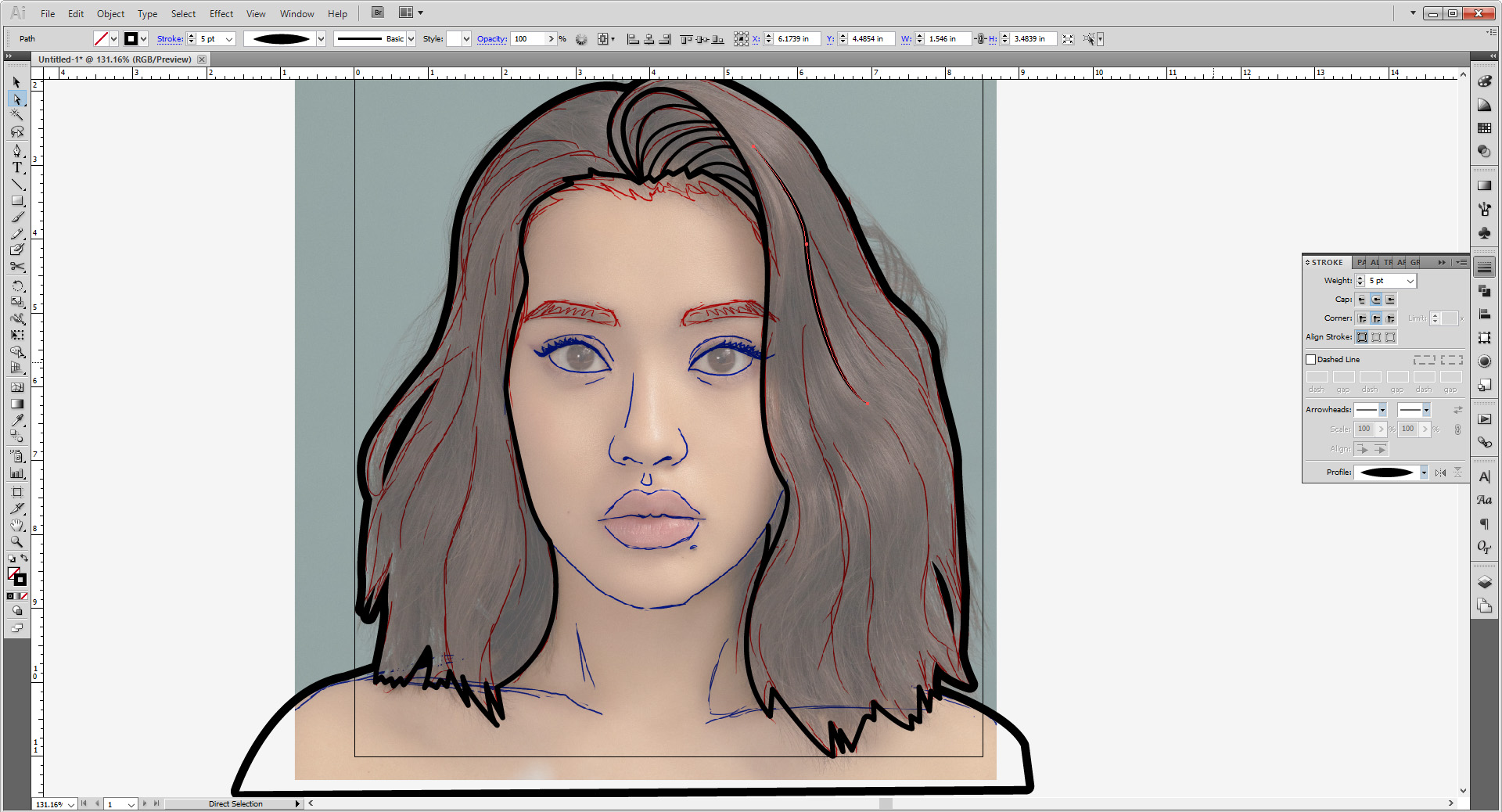
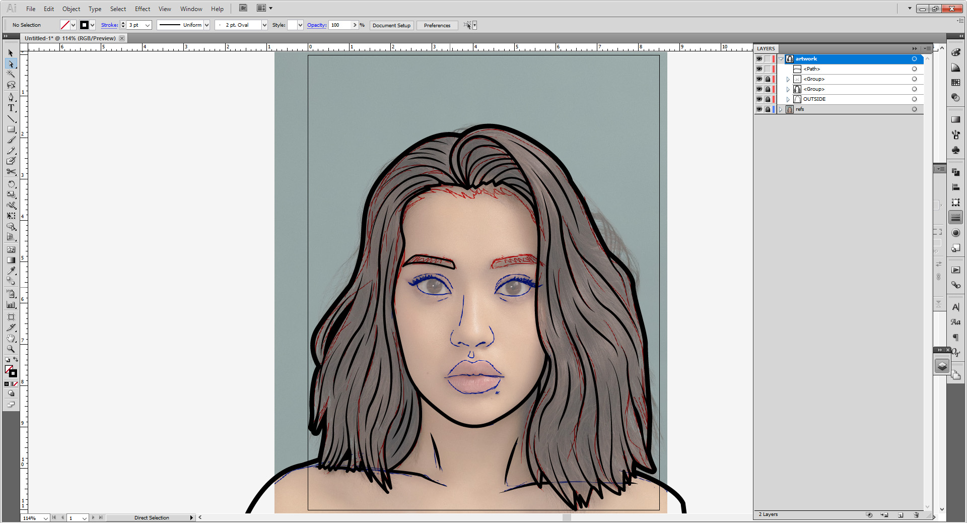
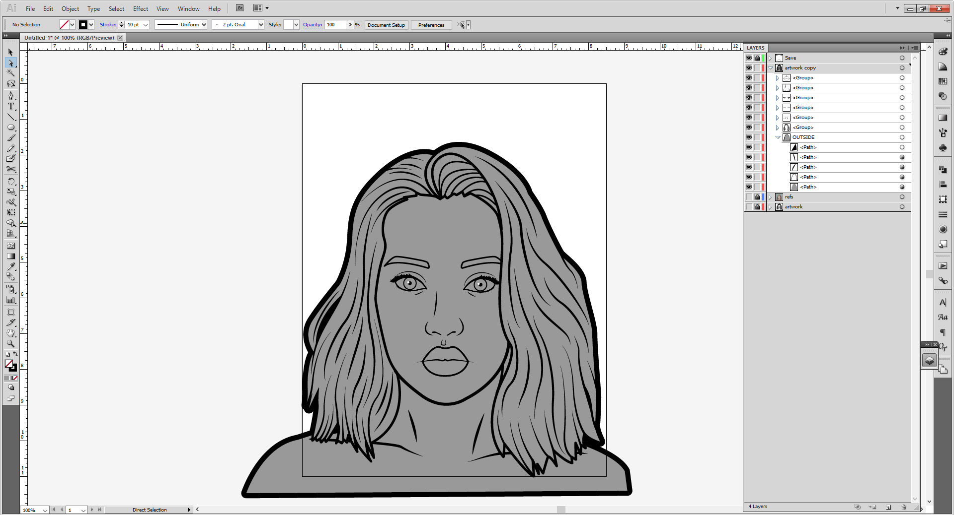
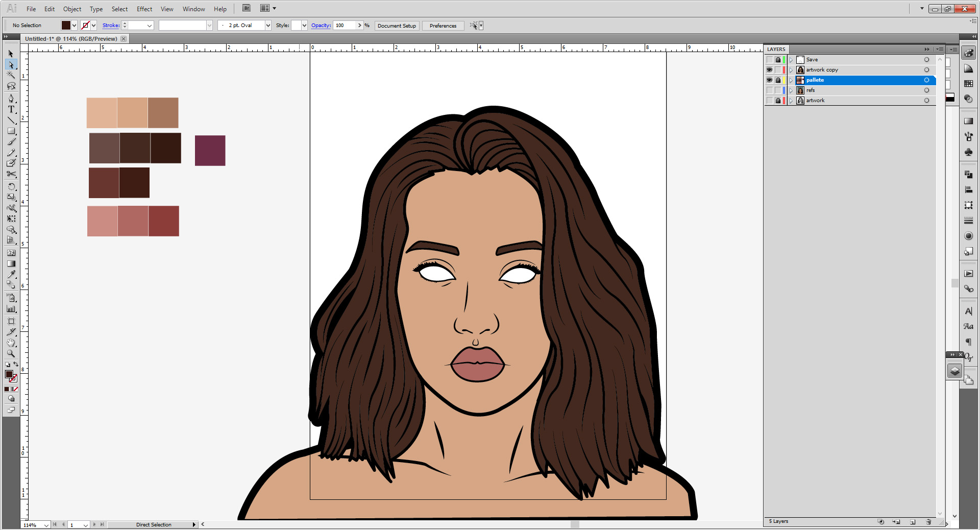
Create a second Layer for your artwork. Using the pen tool, you will start off by blocking out your whole outer shape. It’s okay if you go off the artboard—when you save the image, it will not be seen. I have set the stroke weight to 8 pts, with rounded ends and corners, and currently aligned to the outside.
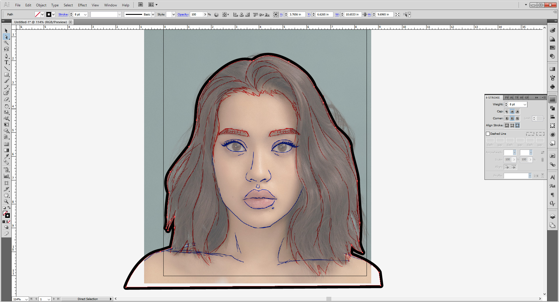
You want to touch everything that’s considered “outside, even if it’s not actually on the outside, like the two gaps in the model’s hair. Those are all the same, save the stroke is aligned to the inside.
If you want the outside line to be thicker, you can bump it up to 10 points; I find anything above 12 points looks too thick.

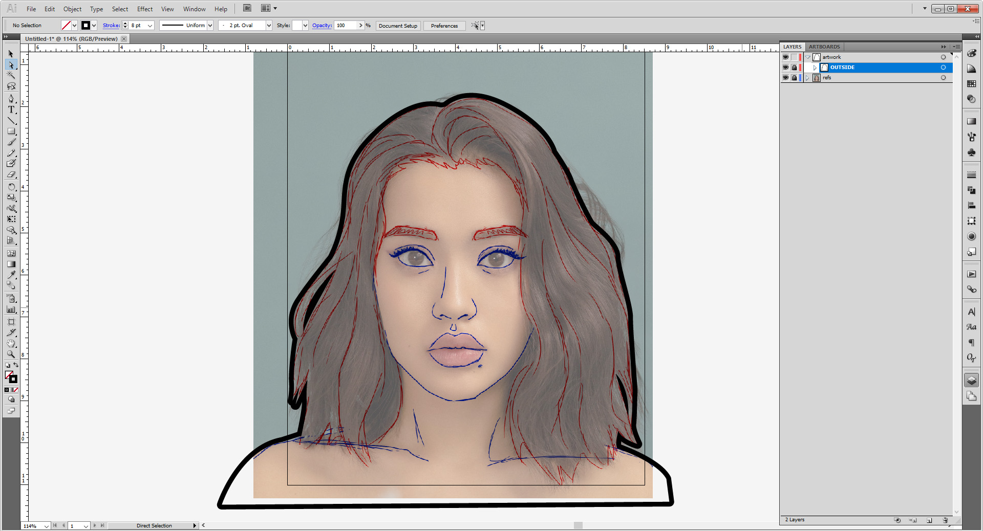
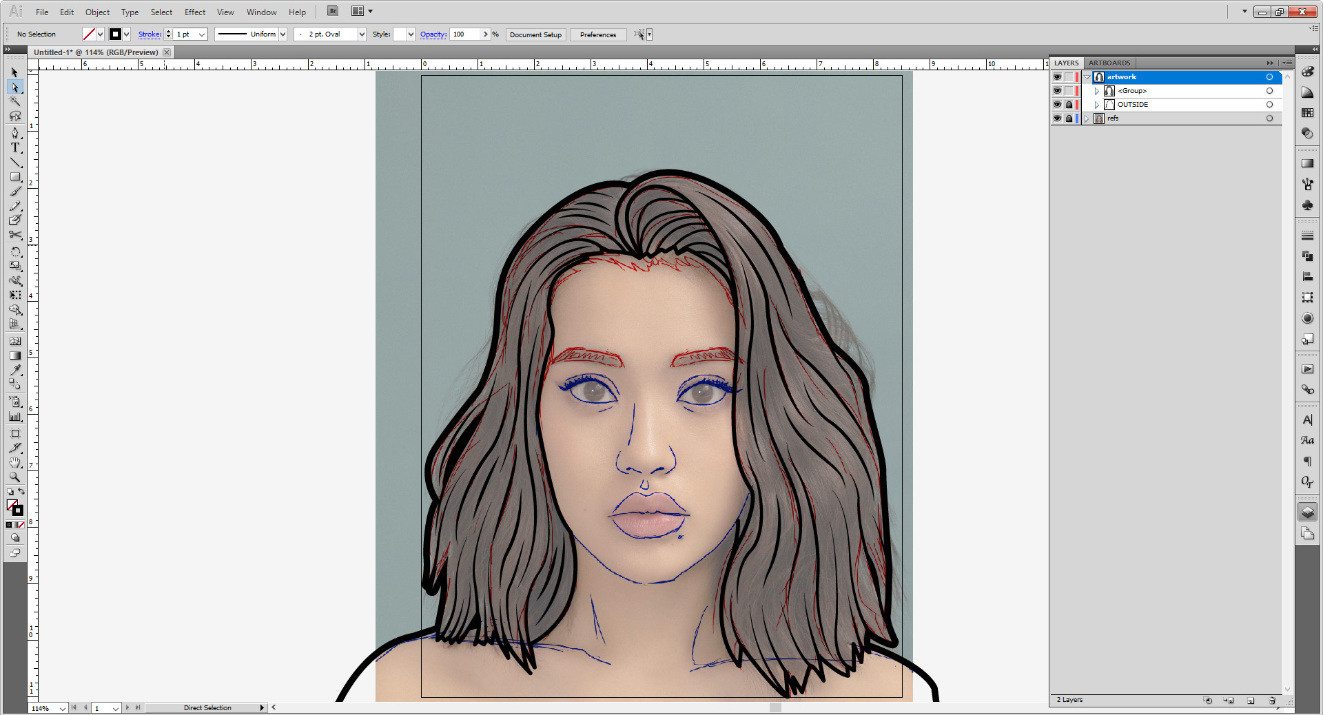
When you are finished, select all your shapes and group them with Cntrl/Cmd + G. Lock the group.
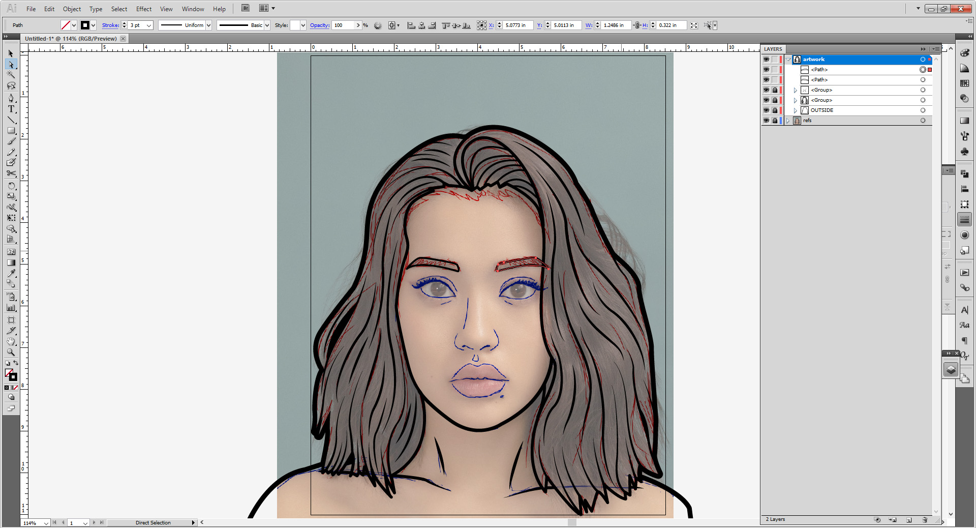
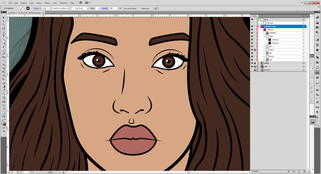
Now we’ll work on the details, starting with the hair. You want to use a stroke weight that’s less than 8 points, I usually use 5. You can change this after you start working on your lines as well for ease, or before so you can see your lines better. Details I’ll usually use 3-4 points, but don’t hesitate to experiment with stroke weights to get the look you want!

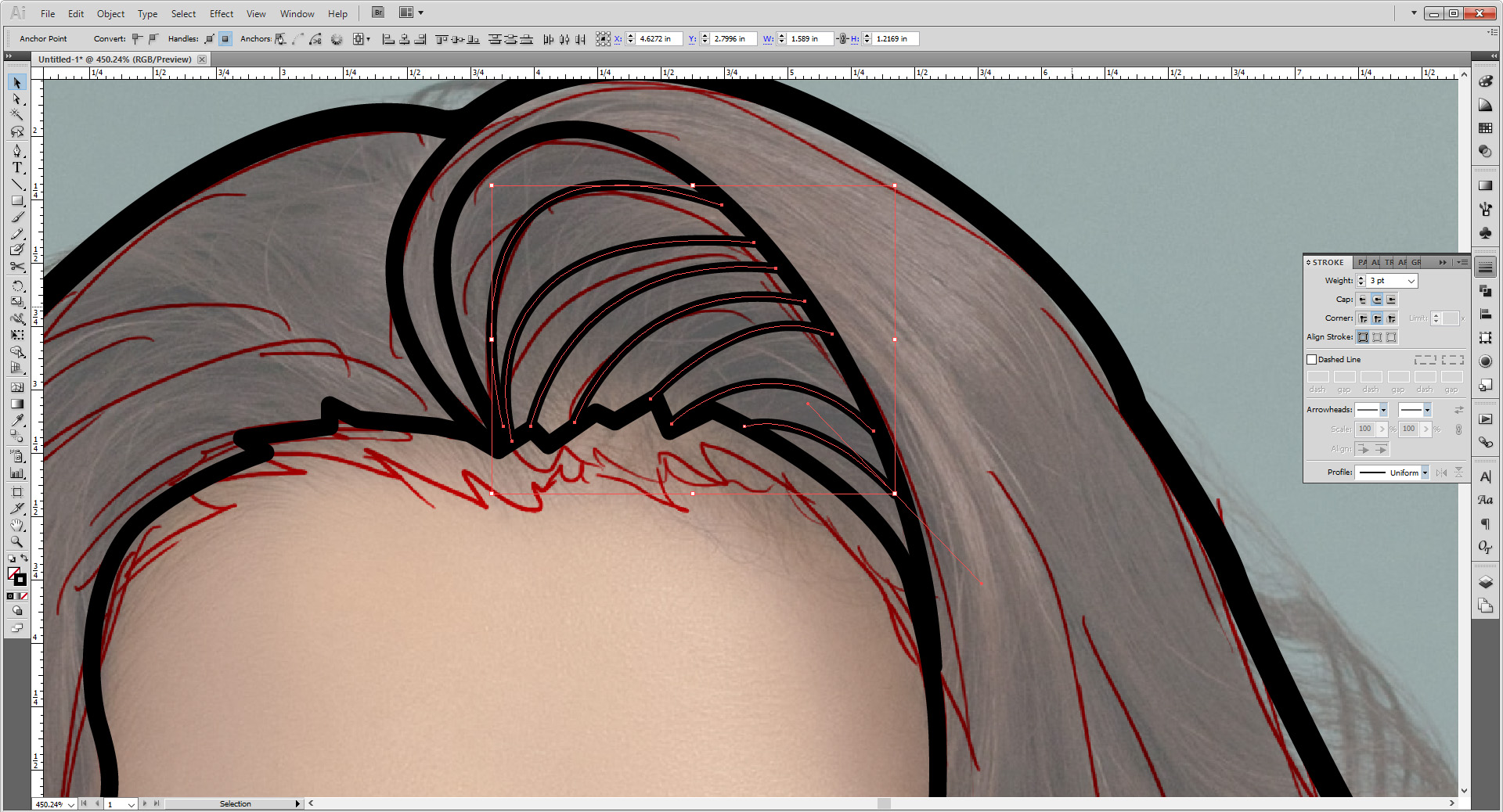
You can also use Stroke Profiles to make your strokes more dynamic. As you saw in the previous tutorial, they are great for defining hair. My go-tos are Width Profile 1, which tapers off at both ends, and Width Profile 4, which only tapers at one end.
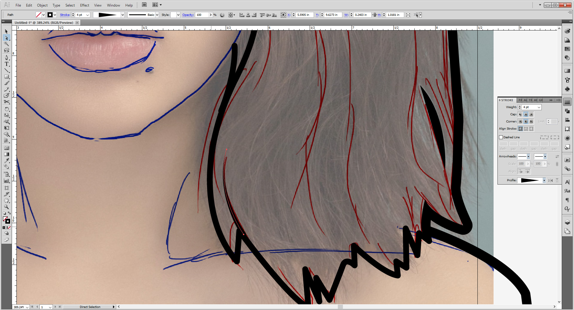
Don’t be afraid to break out the scissor too to cut your strokes if the taper is too long. Take your time and don’t stress! When you are done, group everything and lock this group as well.
For the chin and body details, I like something thicker than the hair but thinner than the outside. 6-7 points works well. Once again, follow the sketch/photo and take your time. For the collar bones, it might help to make the stroke and use the scissor too to cut out the parts hidden under the hair.

Once you’re done group and lock this too.

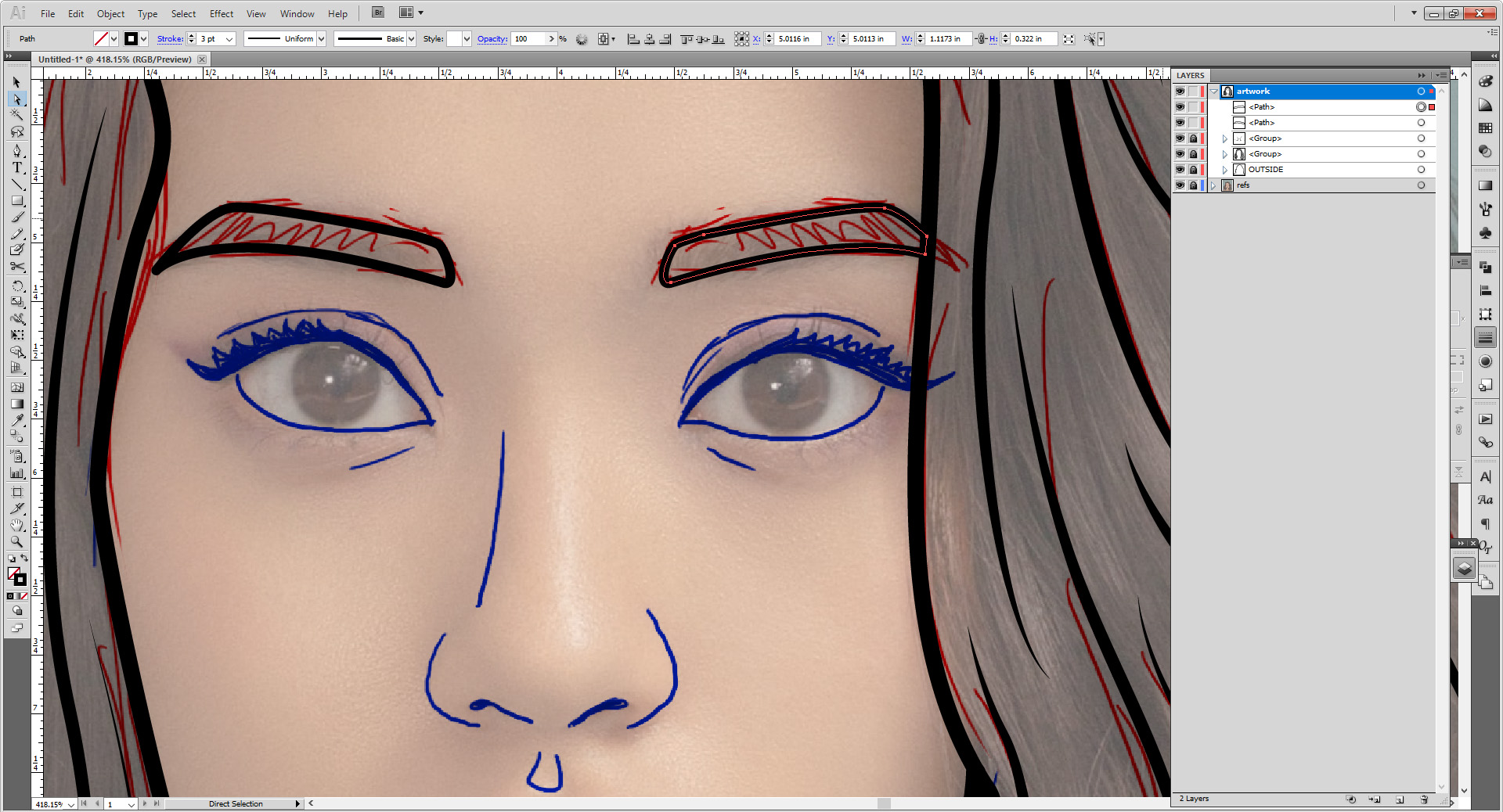
For the face, I use thinner weights, 3 points or lower. It will vary depending on what we’re working on. For the eyebrows, use the 3 points. Our model’s face thankfully is posed directly forward and somewhat symmetrical, so you can copy and reflect the eyebrow.
Copy by selecting the shape, hold down Alt/Option and click the right arrow key once. Next go to Object > Transform >Reflect and make sure to Reflect Vertical. Move the eyebrow with the arrow key.


Cut the tip of the brow shape that’s poking through the hair with the scissor tool and remove it with either Backspace or Delete. Close the shape with Cntrl/Cmd + J.
For the eye, set the stroke weight at 2 points.

Using the pen tool, draw out the shape of the eyelashes and turn the stroke into a fill.
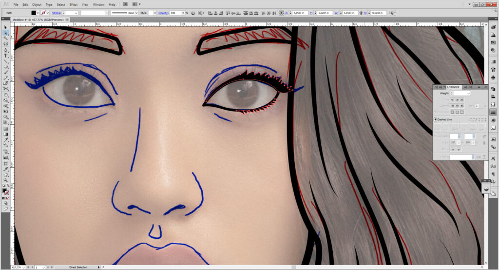
For the eye creases, use a 1.5 point stroke with width profile 1.
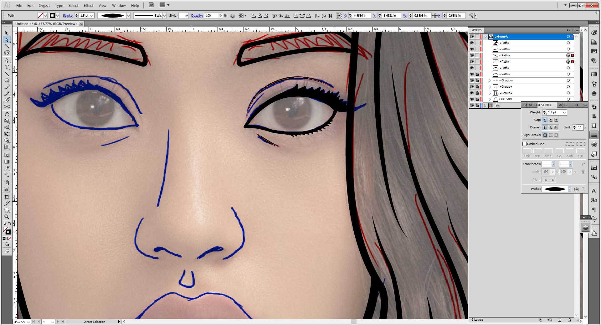
Use an ellipse tool for the iris, pupil, and eye shine. Group the ellipses in their own group, and then group the rest into a separate group. This will help you when we color later.
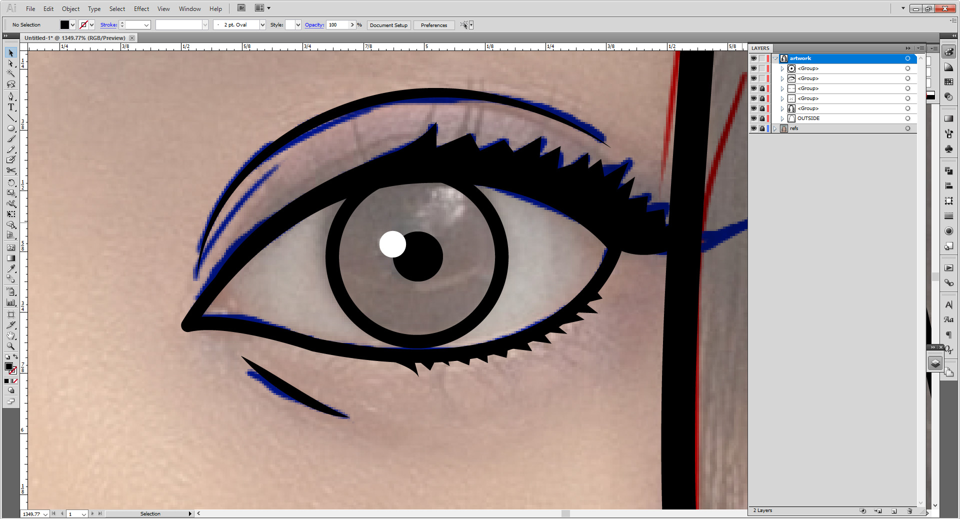
Like the eyebrows duplicate and reflect these two groups and move them over the other eye. This might not work in other photos, though, as I explained before our model is luckily mostly symmetrical. You may need to move it slightly above the other or turn it slightly on an angle to match the other eye. Don’t forget to fix the eye shine as well!

For the nose, use a stroke weight of 2.5 points. Draw the nostrils using the pen tool and flip it to a fill.


For the part right under the nose, make a stroke with a 1.5 point weight.

For the lips, you’ll use two different weights. 2.5 points for the line in the middle, 3 points for the upper and lower lip line.

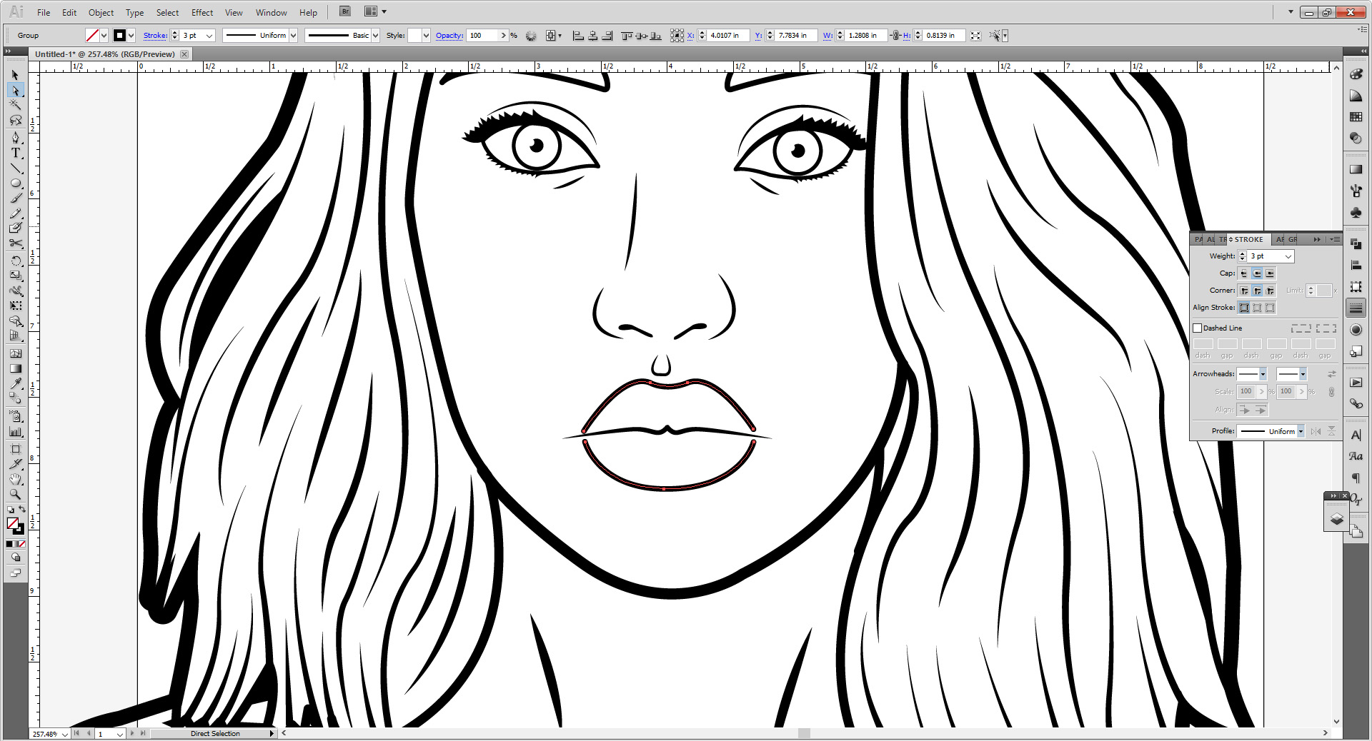
You can keep the two lines separate, or merge them into a shape, either or works. I like it as one shape, however, so close the shape by using Cntrl/Cmd + J twice.

You are now halfway to you first illustrated image!
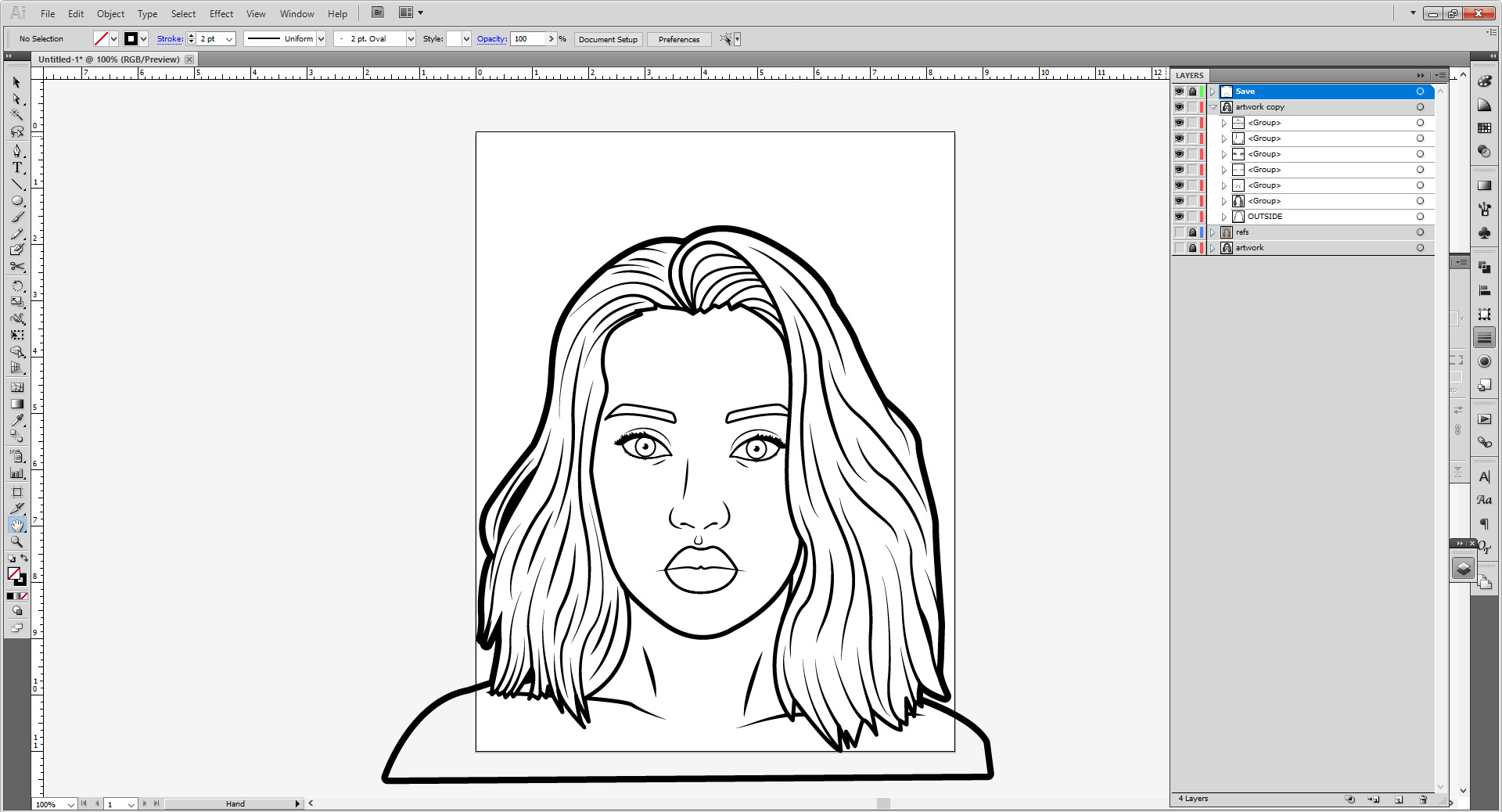
Next make a new layer. Make copies of your eyes and lips, and move the group with your irises into that new layer.

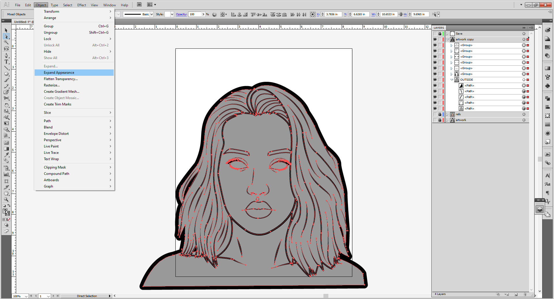
Lock this layer, and then copy the entire artwork layer. Lock and hide the original layer. Unlock everything in the copied layer.
Duplicate the outline shape and turn it into a grey fill. Place it under the stroke.
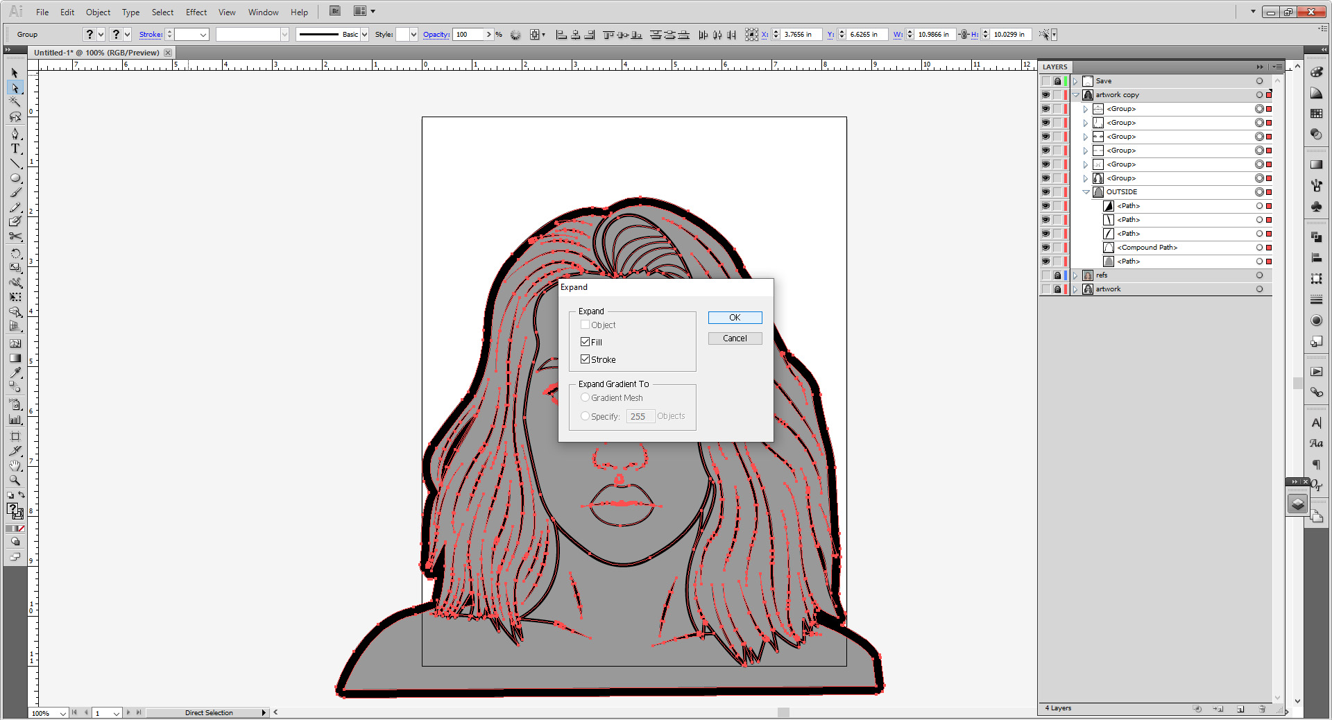
Select everything in the copied layer. If anything is still locked, unlock it. Go to Object > Expand Appearance. Continue this until Object > Expand is available, then use that. You want all your strokes to me made into shapes.

With everything still selected, go to the Pathfinder panel. Then select Merge.
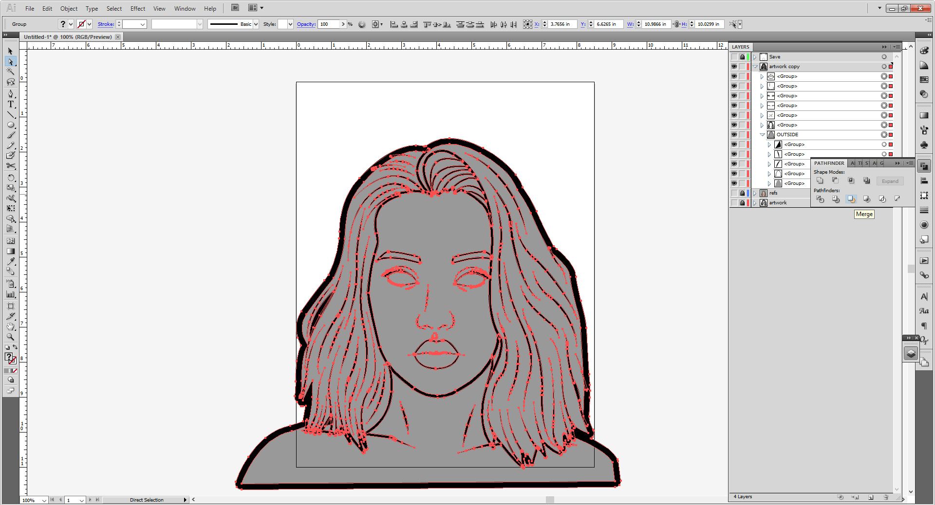

Take your time separating the black from the grey. I like to separate the grey parts further into groups (hair, skin, etc).

All of this can be deleted, these are paths generated by the merge that serve no purpose.

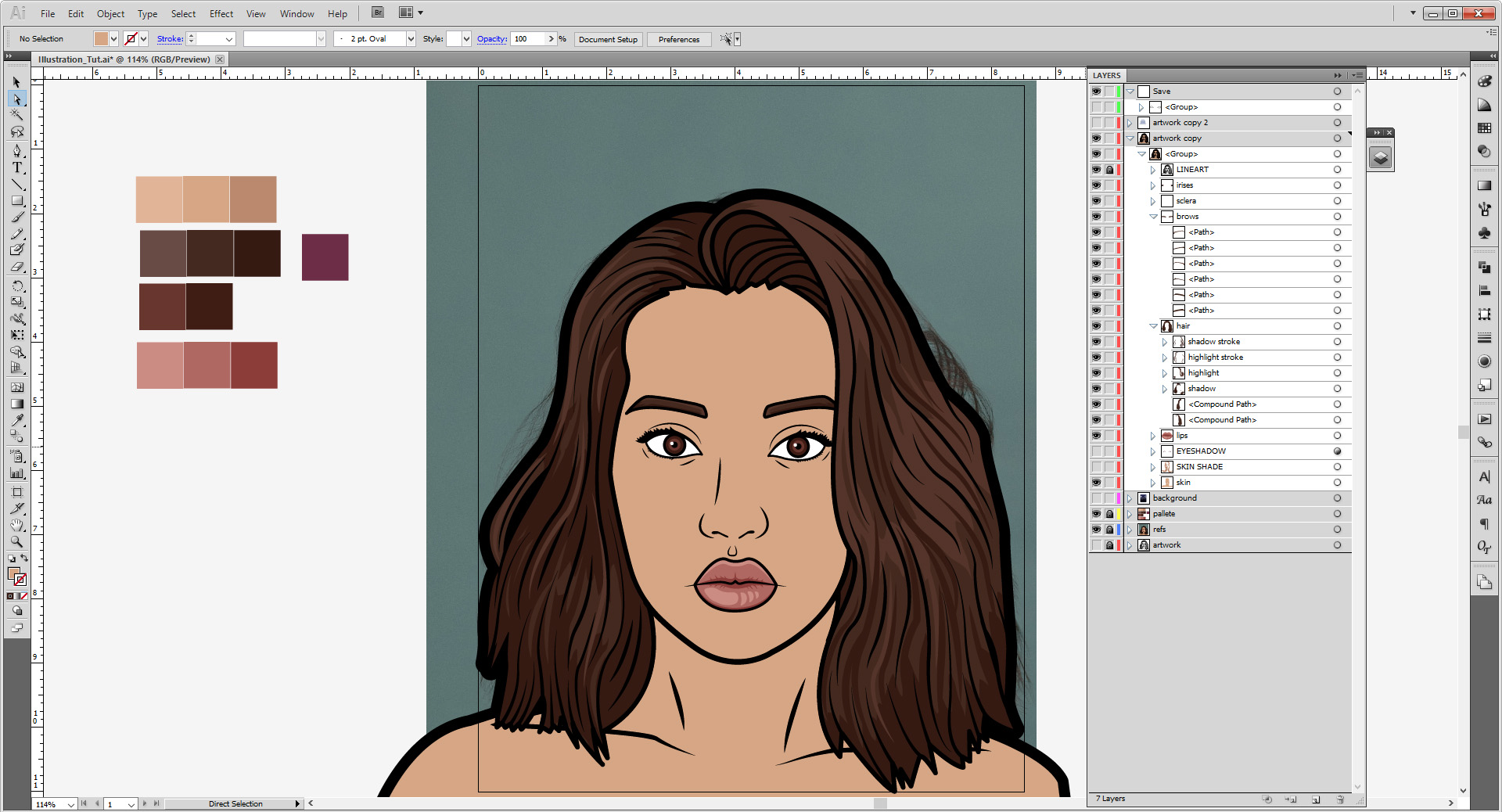
Once it’s all cleaned, lock and hide that layer for now. Make a new layer for your palette, and bump the opacity of the original photo to 100%. You’ll be sampling from this photo with the Eyedropper Tool (I). For some of your colors you’ll need three; a base, a highlight and shadow color. Other times, you may just need one or two for other things.
Palette Chosen:
- Skin (Base): #D6A685
- Skin(Shadow): #BA896E
- Hair (Highlight): # 54342A
- Hair (Base): #44291F
- Hair (Shadow): #351A12
- Lips (Highlight): #CB8C83
- Lips (Base): #AF6862
- Lips (Shadow): #8C3D3A
- Sclera: #FFFFFF
- Eyes (Highlight): #68362E
- Eyes (Base): #3F1C14
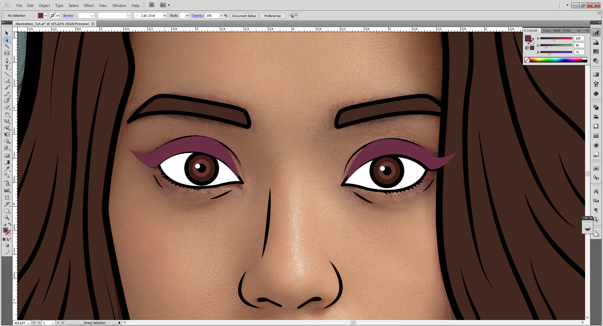
- Eye Shadow: #6D2D47
I may adjust the colors as I go along. So don’t worry if you see the colors on the screenshots change from time to time.
Fill in your flat color with your base color (the middle square in my palette).
Go to the layer we left our irises, and duplicate the outer stroke ellipse until there are three of them. Bump up the stroke weight to 3 points on the top most, the highlight on the second highest, and the base color on the bottom. Scale down the highlight ellipse so the base is visible. You may want to scale up/down a bit to match your image a little more.

(I went back and added a small 1 point stroke on the under side of each eye because I felt it didn’t look entirely right.)
Using the pen tool begin to add the highlights and shadows. I started with the lips. Rule of thumb with the lips is the darkest color goes closes to the mouth and bottom of the bottom lip. The lower lip can also have a bit of a highlight as well. You can tone it down or make the highlight a little closer to lip color for a matte lip effect.

Next add shadows/highlights to the hair, you can take some of the already made shapes and just change them to the darker color. Some you may need to draw over too! It’s just simple as locking the base color and working over it.

For highlights you can draw over large color blocks, or make strokes with the Width Profile 1 for more of an individual strand look. The cool thing is you can reference the original picture…or if you plan on the light source being different, you can adjust for that. (I’m keeping mine fairly neutral so it’s almost like the source photo.) I am using stoke widths between 4-8 points to add a bit of variation.
Hair is complex. Like I said before…take your time. You may take forever to undo and redo to get it right. If I’m honest, I probably spend the most time in a drawing rendering the hair, with clothes a close second.
You can also add a little shade/highlight to the eyebrows, but that’s really up to you. Sometimes I do, sometimes I don’t.
(Please note, all of the following are without the highlights—I honestly forgot this step and did this last. So don’t worry if the images don’t look the same.)
Hide the skin layer so you can have a better idea of the shadows, and add them in. Personally, I don’t add highlights to skin, but if you’d like to, take this time to do that with a color lighter than the base skin tone.
Time to add the eye shadow! This will be done with the blur effect I explained about earlier. Select your eyeshadow color and go over the eyes. Don’t worry about it being on a layer above the eyes—we will reorganize later.
Select the two shapes and group them. Then go to Effect > Blur > Gaussian Blur. Make the blur 20 pixels. Hit Ok. Move it to the layer above the skin and under the eyes.
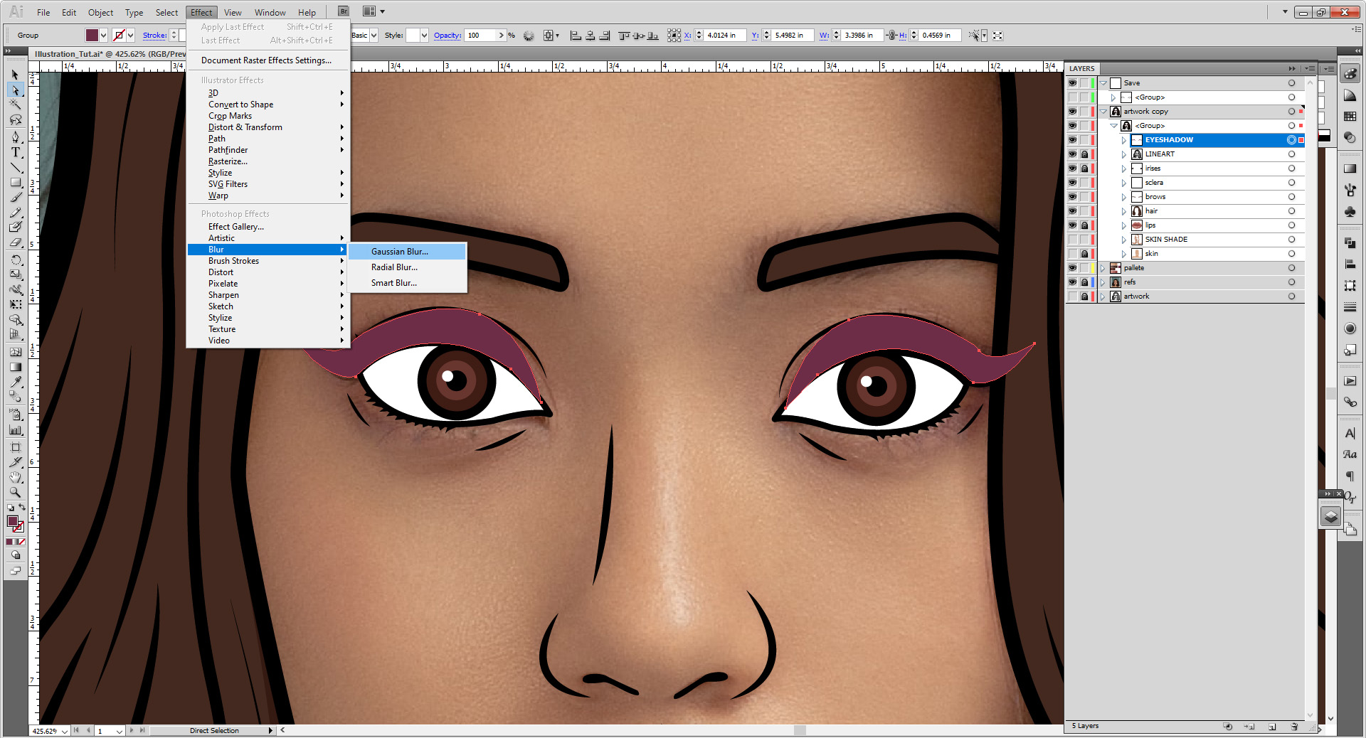


If you want the eye shadow to be less blurry, you can change it in the Appearances panel. Click on the Gaussian Blur option in blue, and it will bring you back to the Gaussian blur panel. Bring it down to 10-15 pixels should so.

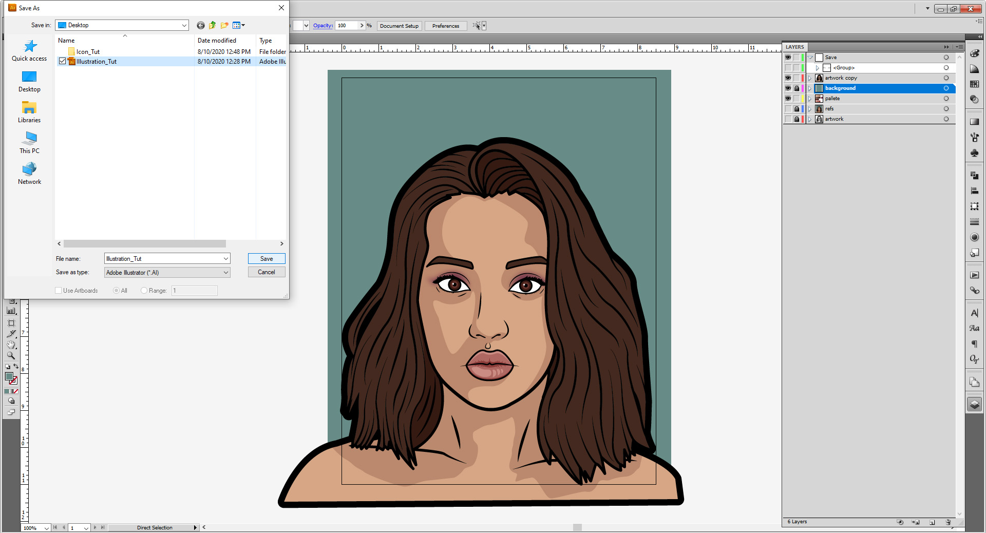
Make a new layer for the background, and move it under your art. Stick a colored rectangle just slightly bigger than 8.5 by 11 inches.

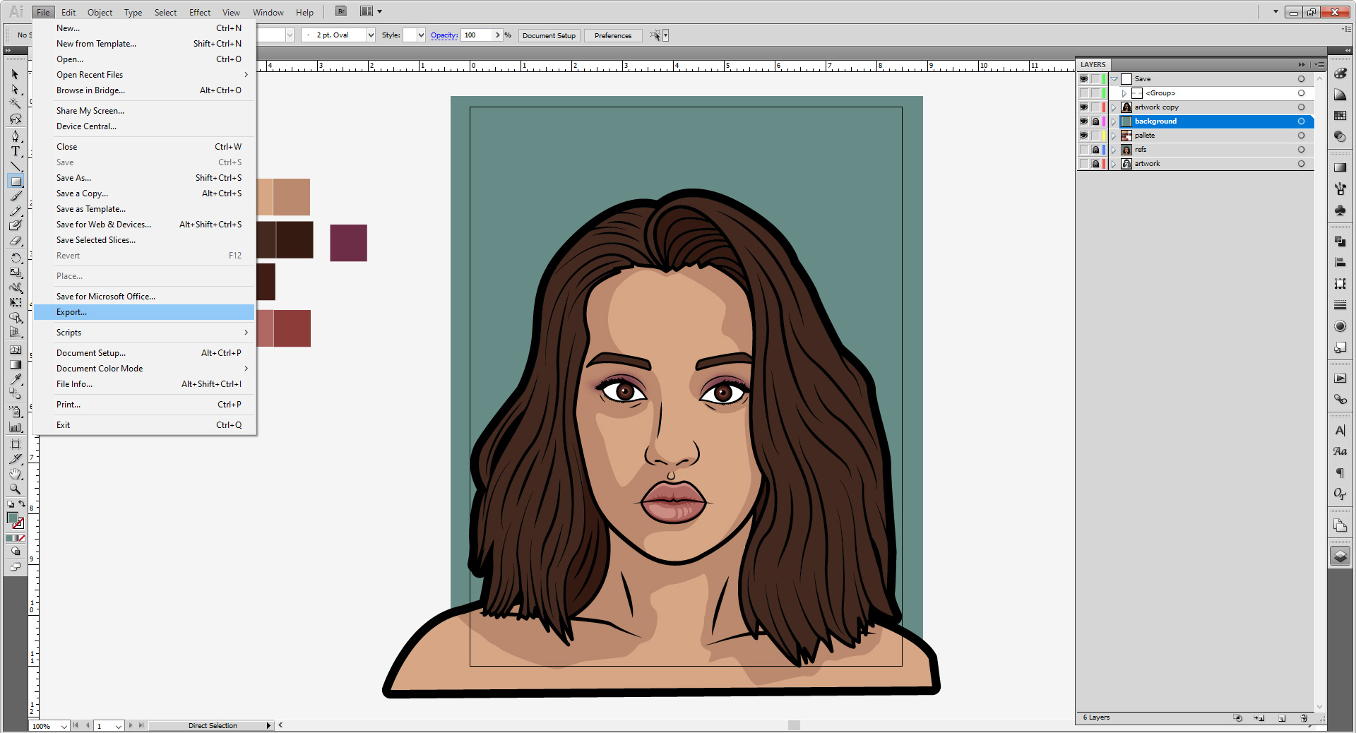
Now it’s time to save and export! Go to File > Save As and save as an Adobe Illustrator (.AI) File.

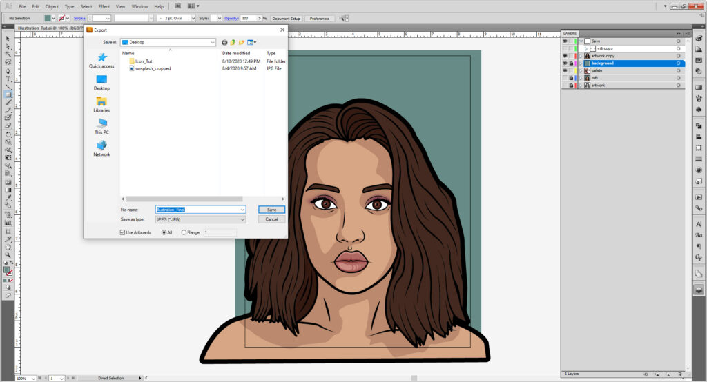
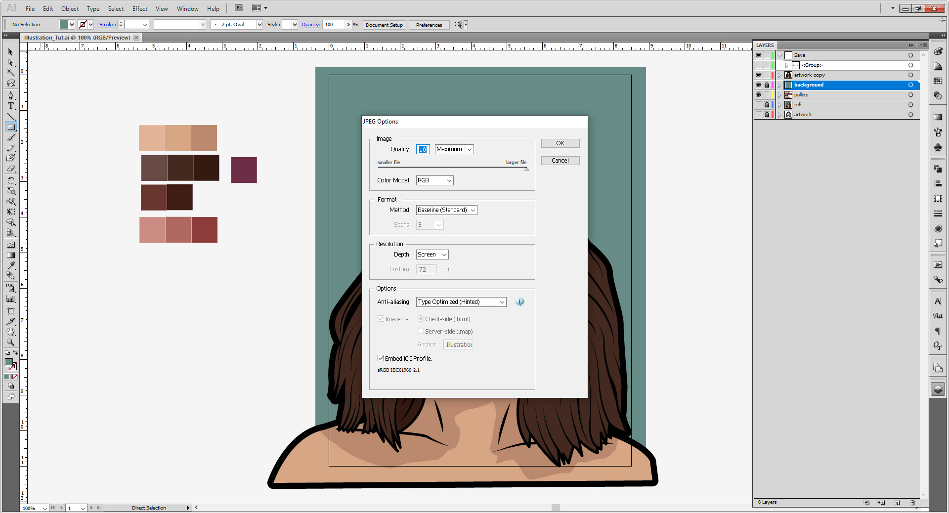
Now that we have the source file saved for future use, now go to File > Export. Exporting is as a JPEG or PNG file works best. Make sure the Use Artboards box is checked. This means everything off the artboard won’t show off in the image. Hit Save and then hit okay. You can resave from the AI file as a higher quality image later if need be, but we want to set the resolution to 72 dpi, which is good for web use.

If you’re happy with what you have right now, great! But if you want play with some other effects, follow below!
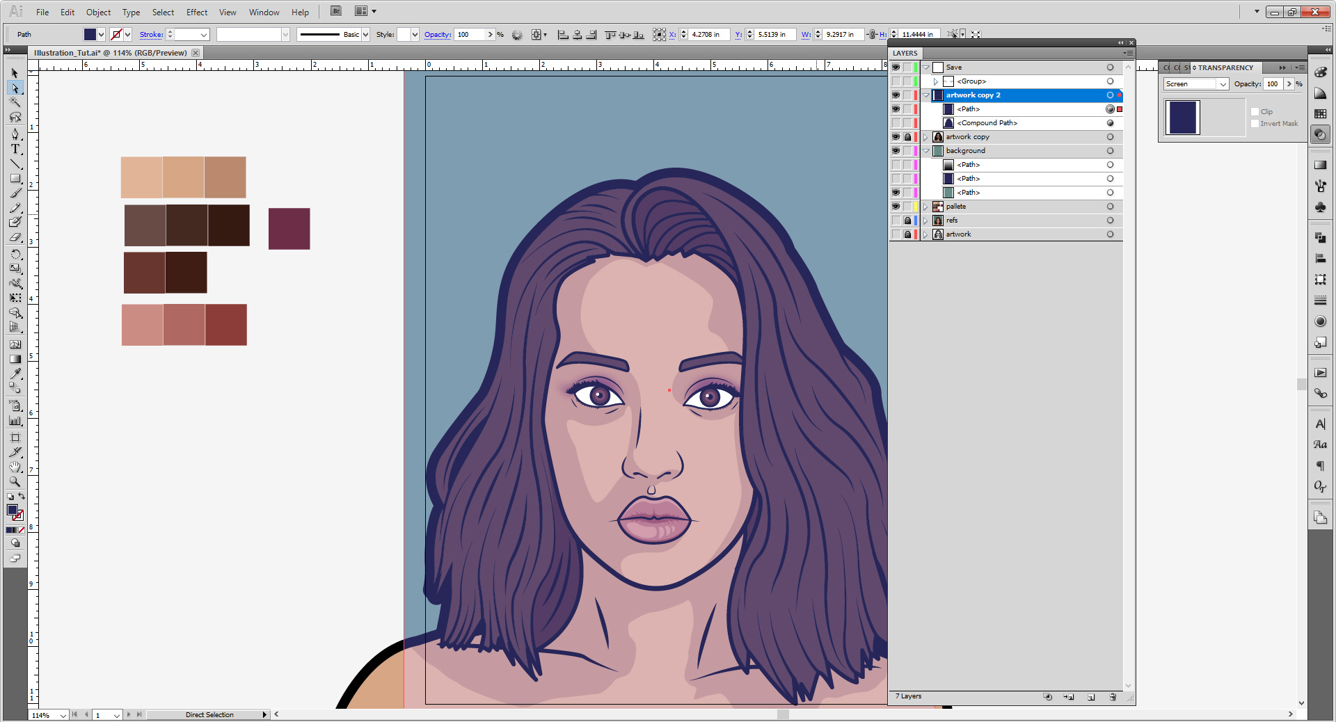
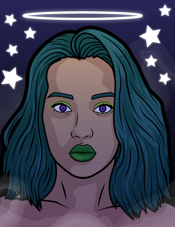
If you wanted to added a vintage look to it, you can added a darker color that isn’t black (I used a blue), and set it to Screen in the Transparency panel. You may also want to raise or lower the opacity percentage for different effects.
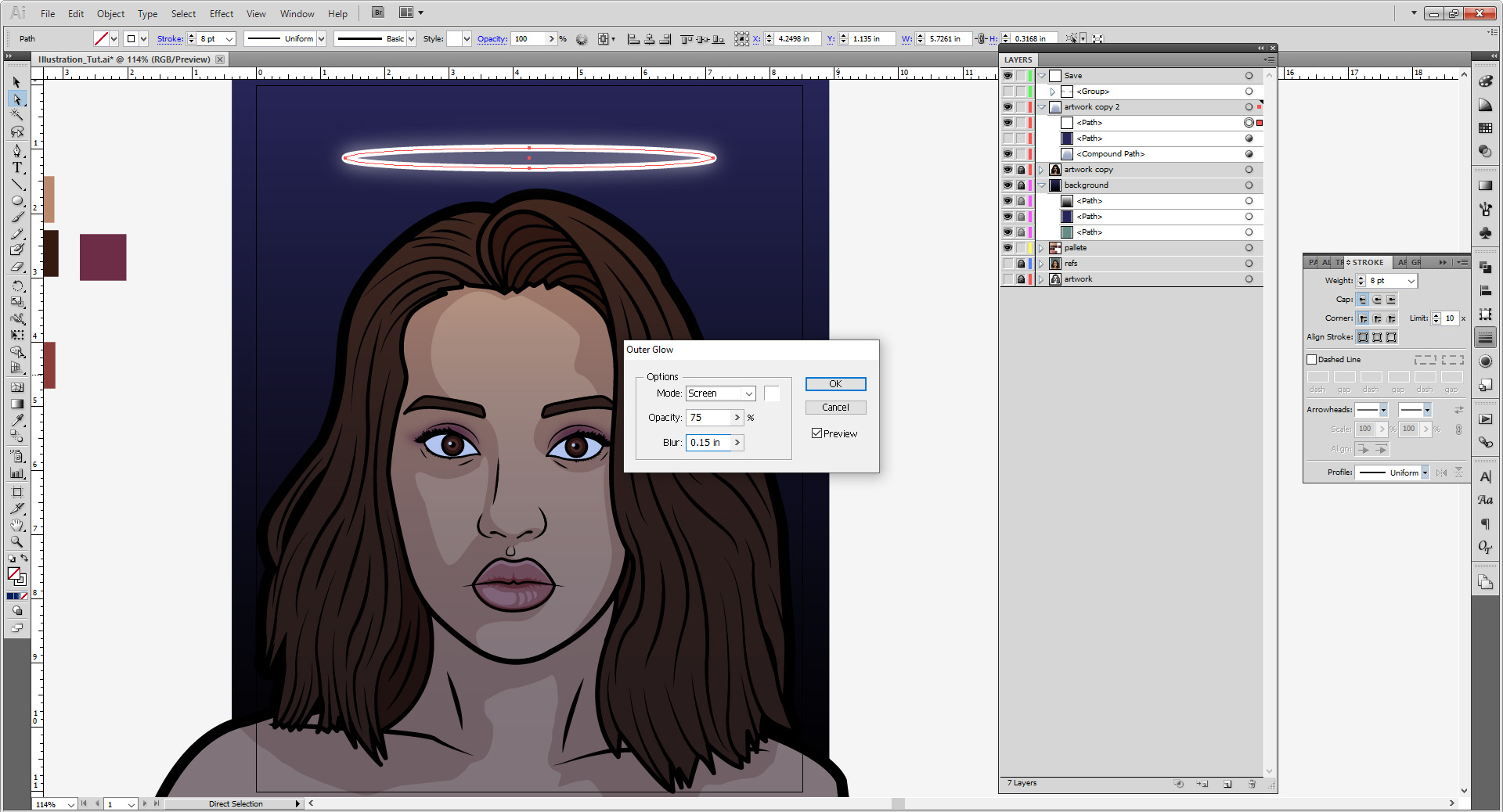
For a neon light effect, make a stroke or shape, although strokes tend to lend itself to the effect. I used an ellipse with 8 point weight stroke to make a sort of halo. Selecting that, go to Effect > Stylize > Outer Glow. Set the blend to Screen, the color white, the percentage 75%, and the blend distance to 0.15 inches.

If you want to do colored neon, expand your halo, and duplicate it. Unlike in Photoshop it is hard to layer multiple effects on one shape in Illustrator. And for the light effect on the model, it is a blue to transparent gradient set to Hard Light with a 40% opacity.

You can also find Illustrator brushes and vector add-ons on the internet if you want go further on in illustrating that can add to your desired look (like this smoke brush pack from deviantART is one of my go-to brushes for my works). Elements from Vecteezy or Freepik can be incorporated– just makes sure the usage rights. Check out our Stock Resource Page for more info and links!
Say you want to change the colors of things. Select the items and got to Edit > Edit Colors > Recolor Artwork.


And there you have it! There’s plenty of other things you can do with layer styles, transparencies, gradients, et cetera. Have fun an explore !
Show us what you made! Send it to bmcc.makerspace@gmail.com or reach us at bmcc.makerspace on Instagram (or use the the #bmccmakerspace tag) to be highlighted on our page!
And if you want to prep the file for one of our machines, here’s how to do it for the Laser Cutter and Vinyl Cutter! The Stamp Workshop may also be of help.
Other Links:
Some Artists that have inspired this art style on my end. Many of them have done it with paint, others have been fully digital.
- Malika Favre
- Shepard Fairey (You might know him for his Obama “HOPE” posters.)
- Patrick Nagel (His artwork was the stylistic inspiration for “Moonbeam City”)
- Roy Lichtenstein
- Animation World Network: The Minimalist Art of “Archer”
- Also if you’re REALLY into animation, the actual “Art of Archer” Book is a good reference to have. Archer honestly is probably the biggest influence here, and the original tutorial I learned from is now lost unfortunately.
- Gareth David Studio: Beginner’s Guide to Illustrator
- Dansky: Illustrator Basics in 3 Minutes
- Flow Graphics: Learn Illustrator in 5 Minutes
- Tech & Design: Illustrator Tutorial: Part 1 | Part 2
- Inkscape provides their own tutorials. And even have interactive ones in the software!
- TJ FREE: Inkscape Tutorial
- Logos By Nick’s YouTube Channel has some Fantastic tutorials on working in Inkscape!
Please note if you are using Inkscape, Laser Cutter files must be saved as an EPS, Vinyl Cutter files as both an EPS and DXF.