Overview:
Monograms and Logos are everywhere. Seemingly simple, but it’s something that improves with repetition and practice.
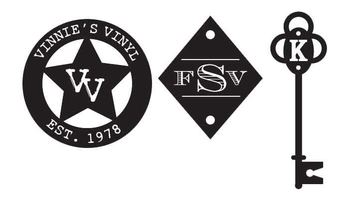
Some of this information may overlap with the Stamp Workshop, please feel free to look at that as well. The difference is it focuses on export with the laser cuter. This tutorial is going to focus heavily on the design aspect and the tools in Illustrator that you can eventually move on comfortably to exporting for any digital fabrication machine.
Since we will be working in type, I will also like to go over using fonts in depth as well.
Working in Adobe Illustrator:
While we provide links to some open source/free software for use at home, the Makerspace itself has license to use Adobe Illustrator. You may try to follow with the best ability with another program as well, but there might be an additional learning curve. Be patient, and refer to program’s online guide to see what it can/cannot do.
My version of Illustrator is CS5, which is much older than the CC version on our machines in the space. The only difference being my user interface is light colored and may not have as many capabilities as your versions have. All the commands are the same, so don’t feel daunted!
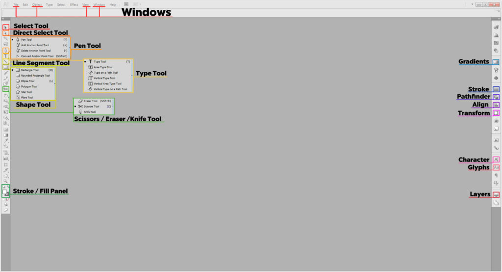
Tools in Illustrator Covered:
- Select Tool (V) is self-explanatory. It selects items, and if grouped, will select the whole group
- Direct Select Tool (A) selects only the item you click on.
- Type Tool (T) is for adding text. Holding down the icon reveals more varied tools for type like Type on a Path tool, which I will cover more in depth later.
- Line Segment Tool (\) generates straight lines.
- Shape Tool draws shapes. Quick Command M for rectangles and L for circles. Holding down the Shape tool in your toolbar will open up more options for other shapes.
- Scissor Tool (C) cuts along a path or point. Good for making custom shapes or removing small parts of shapes. If you don’t see it, the Eraser Tool or Knife Tool may have been used prior. Hold down the icon to reveal it.
- Stroke and Fill (X) allows you to make your shapes filled in solid or just remain outlines, or both. You will need to physically clock on each to set the color. Using D resets your colors to the default white fill and black stroke.
Panels in Illustrator Covered:
If you cannot find these in your workspace go to Window on the top of your main menu. Select the panels as needed.
- Stroke allows you to change the appearance of your stroke, its thickness, or to make it a dotted line
- Pathfinder merges multiple shapes together in different ways.
- Align helps you center or stagger shapes relative to your artboard.
- Transform allows you change the size of you shapes.
- Character Where you modify your type. Font type, size, leading, kerning, and scale. (More on those later).
- Glyphs allows you to access alternate glyphs should a font have them. You tend to have alternates when working in script-based fonts
- Layers shows you every path, shape, and type object you’ve made. You can organize pieces using many different layers, or groups within said layers.
Windows in Illustrator Covered:
- File is where you check your color mode, or output settings.
- Object allows you to further edit, group, or expand your shapes (important for laser cutting prep)
- View allows you make, show, or hide guides and grids.
- Window is where you can access all your panels if they aren’t on your artboard or you accidentally close them.
Shortcuts to Know:
- Ctrl/Cmd + A selects everything
- Shift + Ctrl/Cmd + V pastes an object in place relative to where it was on the previous space; great if you’re moving it to a new file/artboard.
- Ctrl/Cmd + G groups selected items into groups
- Shift + Ctrl/Cmd + G ungroups the group selected
- Ctrl/Cmd + R opens up the rulers on the artboard, allowing you to easily make guides
- Cntrl/Cmd + J closes open shapes.
- Cntrl/Cmd + “ reveals and hides the grid
Designing a Monogram/Logo:
Like any good design, it’s always good practice to start with sketch. Especially if you have a design in mind. Even if your sketch looks nothing like the finished piece, or even if you have limited drawing skills at all it’s worth getting it out on paper. You can come up with your design and just read about the tools, or feel free to follow along blank from scratch.
Another important thing to note as to why we focus on Illustrator. A vector image, like the one we make is scaleable, meaning it can be made as large or small as needed quickly and easily. The monogram or logo doesn’t have to be bg in the original design. But if you wanted to use on a letter head or any other prn-based item, it can be scaled up to as large as it needs without it being blurry or pixelated. Likewise if you scaled it down very small it would remain the same without any issues. (Illustrator is your friend and it’s worth knowing if you’re a designer!)
Fonts to tend to be more forgiving as a vector than as a raster as well, so programs like InDesign and Illustrator are great for page layout!
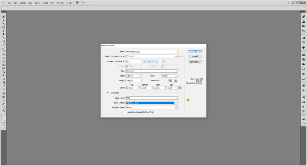
Open up your file and set it at 500 by 500 Pixels. Since we’re not actually printing this out we can keep the color mode to RGB (good for web-based images and the laser/vinyl cutter), but if you were planning on using it for print later you can change it to CMYK by going to File > Document Color Mode.
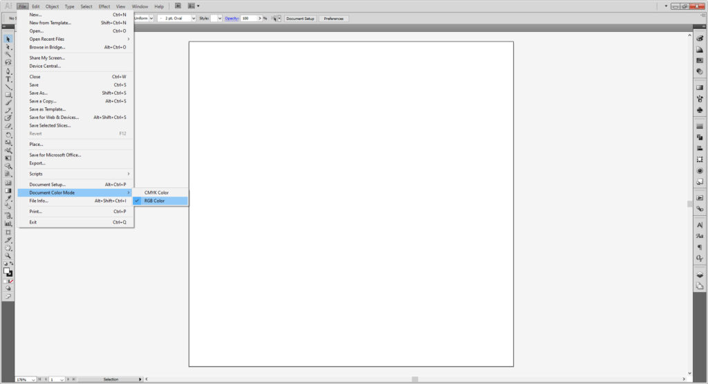
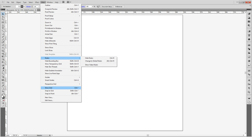
Another thing that’s just good practice is to activate the ruler. The rulers will allow you make guides as needed, simply pull from the rulers to generate a guide. You can use Cntrl/Cmd + R or go to View > Rulers. If you prefer a grid, then use Cntrl/Cmd + “ or View > Show Grid.
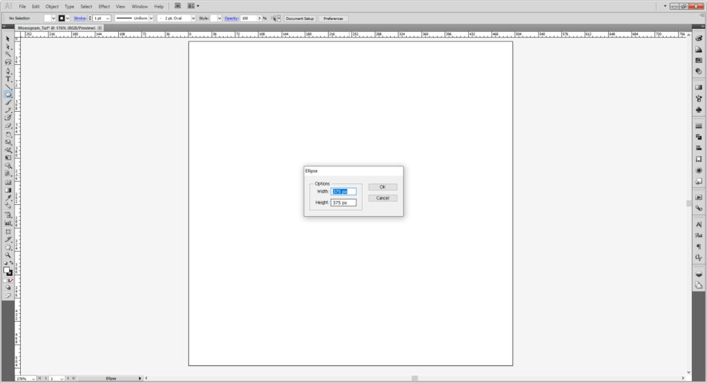
Once you have it set up however you wish, select the Ellipse tool (L) and click the artboard. When the dialogue menu comes up make it 375 by 375 pixels. Or pick a shape you like and keep it the 375 by 375 dimension. (You can change the size by either using the box atop the workspace or the Transform panel. (If it isn’t already there, go to Window > Transform.)
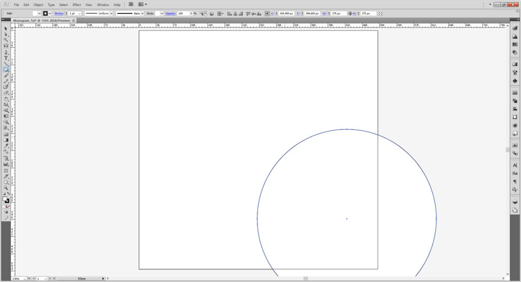
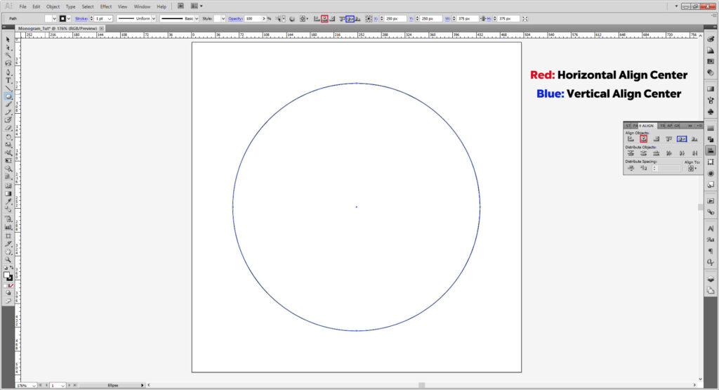
Either at the top of the user interface or using the Align panel we’re going to center our image. First make sure to check your setting are set to Align to Artboard.
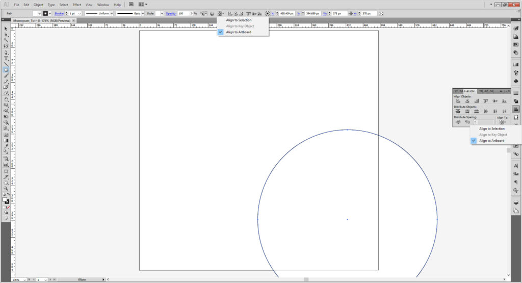
Once you do that, select your shape and select Horizontal Align Center, and Vertical Align Center to center it perfectly
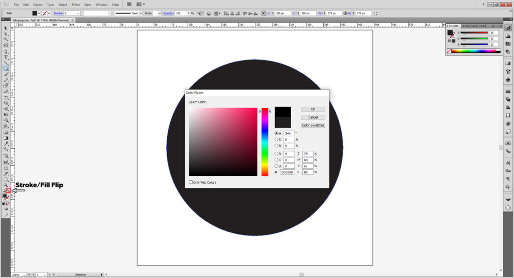
I want to make more of a modern-inspired design, but feel free to keep in however you wish. I’m removing the stroke, but changing the fill to black (#000000). Your fill is the colored square without the hole; your stroke is the square with. To flip the colors click the tiny arrow on the upper right of the Stroke/Fill selection. To change each one directly, double click on either the stroke (with the hole) or fill (solid) square.
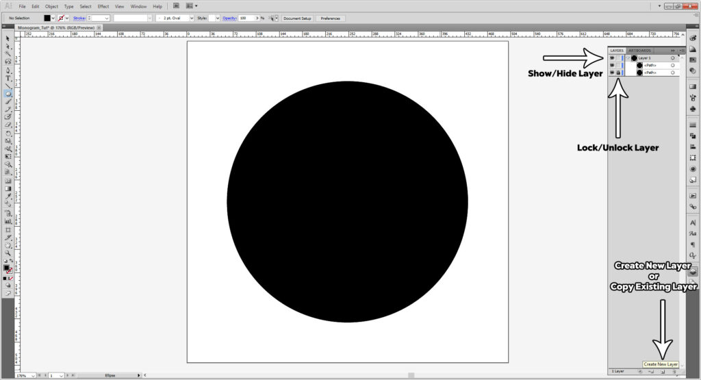
Copy the ellipse by selecting the layer and dragging to the “New Layer” icon in the Layers panel. It’s important to to note that Illustrator layers top-down. The things you want up front go to the top and the ones you want near the bottom go to the bottom. To keep the bottom circle from moving, I will lock my shape in my Layers panel. This will allow it to not be selected or moved until I unlock it.
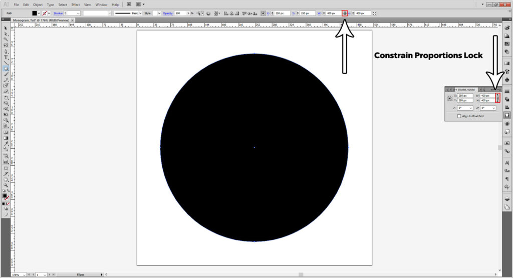
Select the top circle and transform it to be 400 by 400 pixels. If for some reason your transform is giving you issues, check to see if your proportions are being constrained or not (the little link symbol).
Now flip it so the black becomes a stroke and open up your stroke panel (Window > Stroke). I want to make a ring of dot. Change the stroke weight to 8 pts, and check the Round End and Rounded Corners options. Next, check the checkbox that says Dashed Line, just as the name suggests, it will make your stroke a dotted line. Set the dash to 0.25 pts and the gap to 15 pts. Lock the layer.
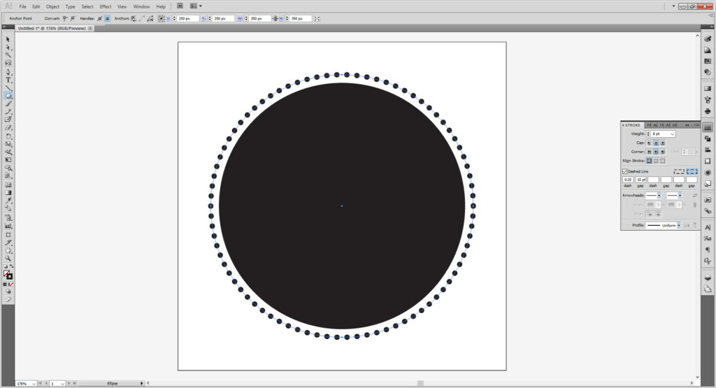
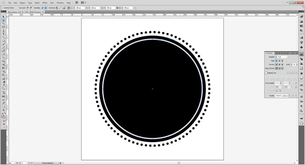
Copy the solid black circle, transform that to 350 by 350 pixels and set to have no fill and a white (#ffffff) stroke. In the Stroke panel, set the stroke weight to 4 pts.
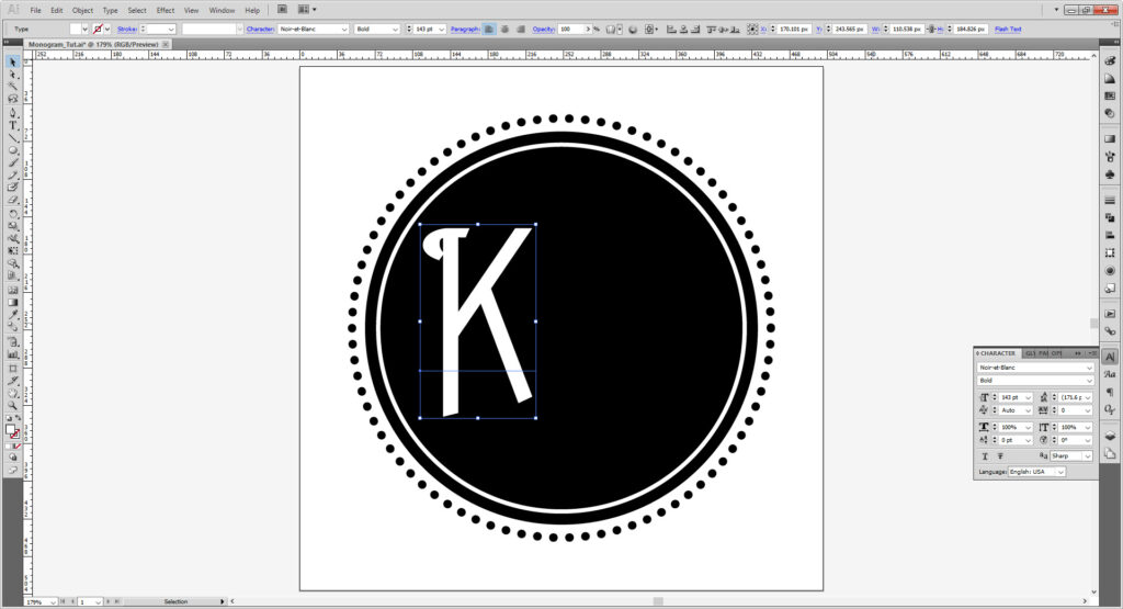
Using the Type tool (T), make your first letter of your monogram. I am using a font called Noir-et-Blanc, which is free for both personal and commercial use.
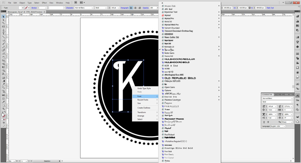
Change your font and font size as you please. Either you can use the top of the workspace or the Characters panel (Window > Type > Characters). If you want to browse fonts with a preview of the text, right click and select Fonts.
There’s some neat things like scaling, leading (the spaces between actual text lines), kerning (space between singular letters), tracking (spacing through the whole word/sentence). This is more for formal page layout, but it’s nice to know.
Should you not have a font available, we have links of sites to get them (as well as vector design goodies to use) in our Stocks & Fonts page. I cover on it more in the stock page, but be mindful of the usage rights for your fonts. For educational or noncommercial purposes (like working on a tutorial, or making a monogram for self-printed wedding invites) it is usually fine to use most, if not all fonts. If you plan on using this to be your logo or printed on anything you plan to sell, you may have to purchase the font, or in the case of donationware, donate to the creator. Some might be free but make sure it says Free for Commercial use.
If you don’t know how to install a font, please look at FontSpring’s guide on installing fonts. If you’re using one of the machines on the makerspace, please let the Makerspace Manager know you are installing a font before doing so.
Select your letter; hold down Alt/Option and drag. You’ve now copied your letter and change it as you wish.
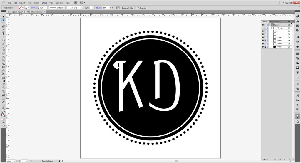
Hit the Line Segment Tool (\) and make it a 250 pt line at 90 degrees. If it’s not already set to white, set the stroke to white and stroke weight 6 pts. Align to the center.
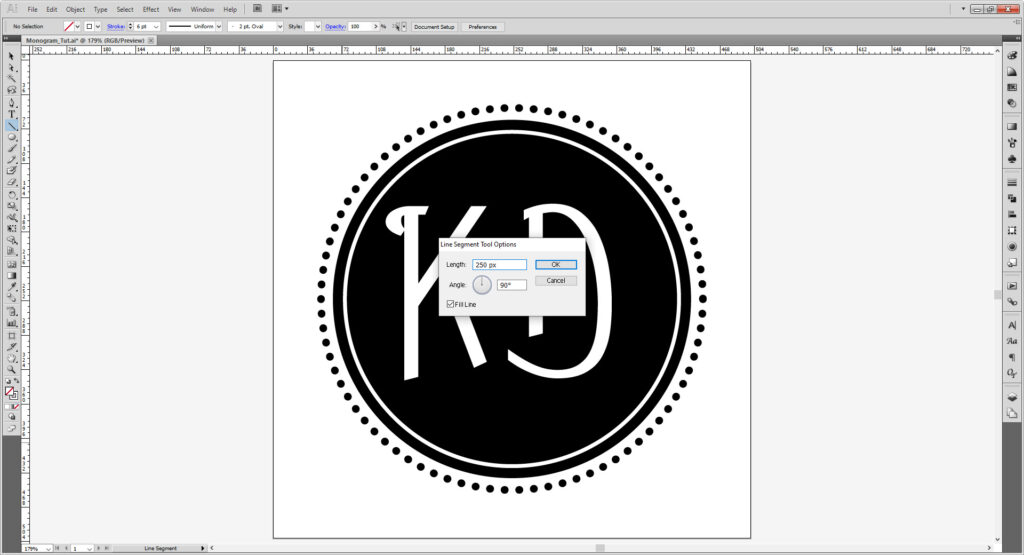
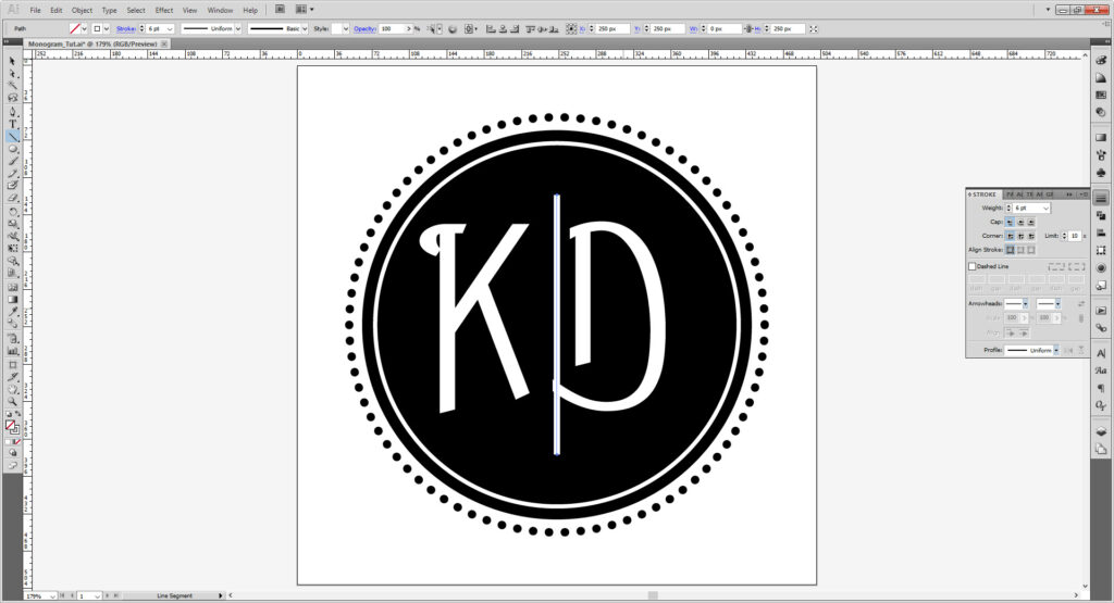
Adjust the letters until they don’t touch the line, group them using Cntrl/Cmd + G or Object > Group. This will allow you can align them evenly with the align tool.
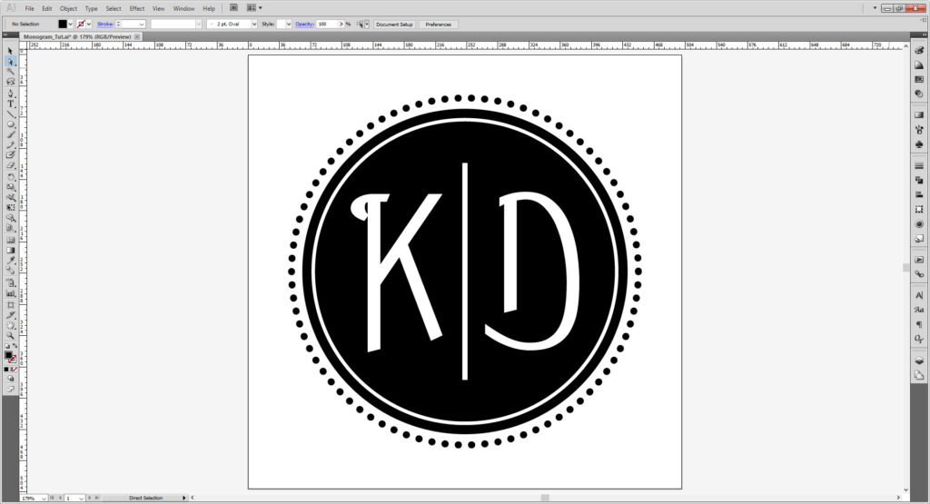
Unlock your layers and group them. Then copy the group and lock and hide it. That way you can go back and change things later.
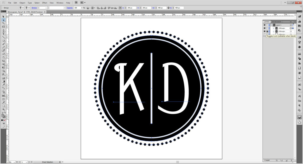
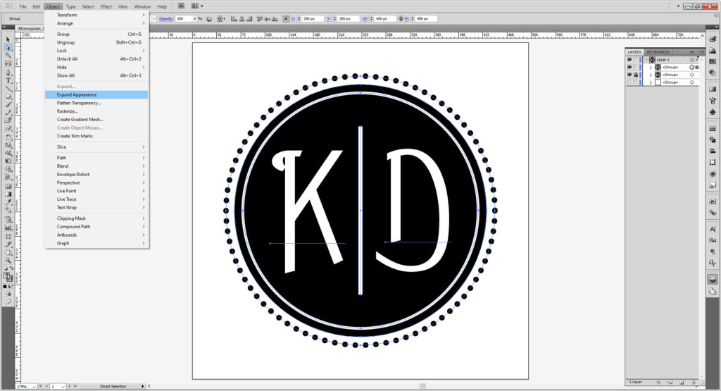
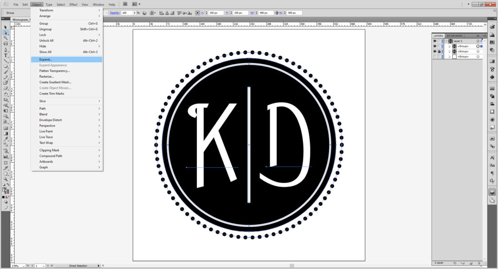
Go to Object > Expand Appearance. You may need to repeat and use Object > Expand until everything is expanded. Now you can resize the image without needing to fix the stroke weights and font sizes.
Further Tools:
Glyphs Panel:
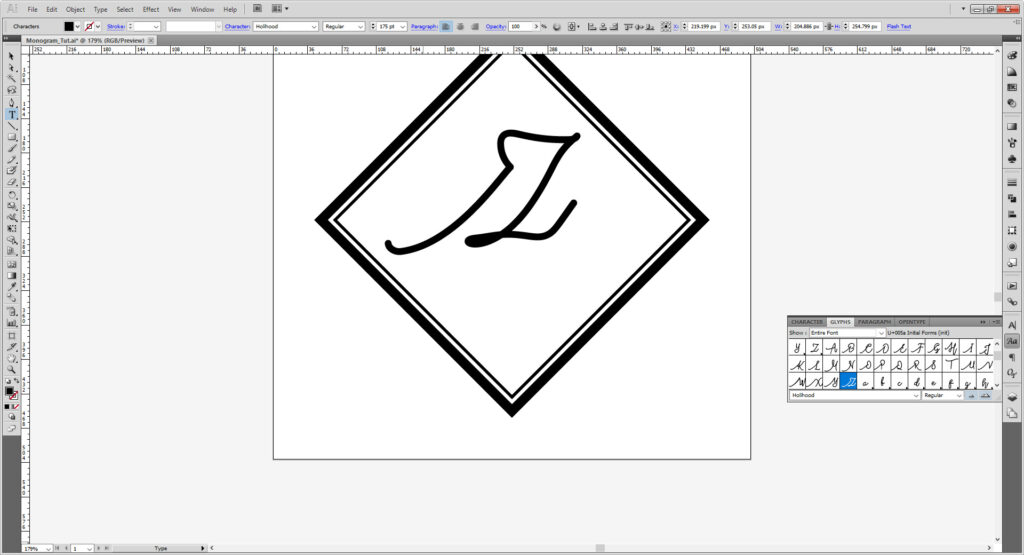
I mentioned previously about how some fonts may have special or alternate characters. To access them, you need to the Glyphs panel (Window > Type > Glyphs). The Font I’m using is a paid font from Creative Market called Holihood Script (I am not instructing you to purchase, simply giving you a link in case you like it and want to purchase it).
I made a quick little frame using two squares rotated to become diamonds, and used different stroke weights. (Just like above but with squares.)
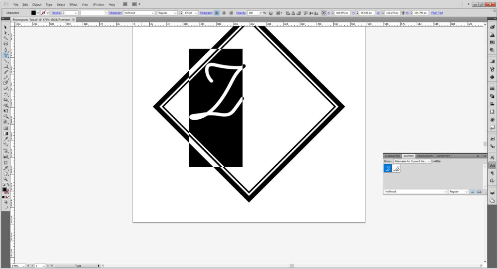
Select your Type tool and type out a letter, then go to the Glyphs panel. There, you can see you can see all available glyphs. To change the glyph, select and highlight your glyph and click the glyph you want in the panel. It may take a few tries.
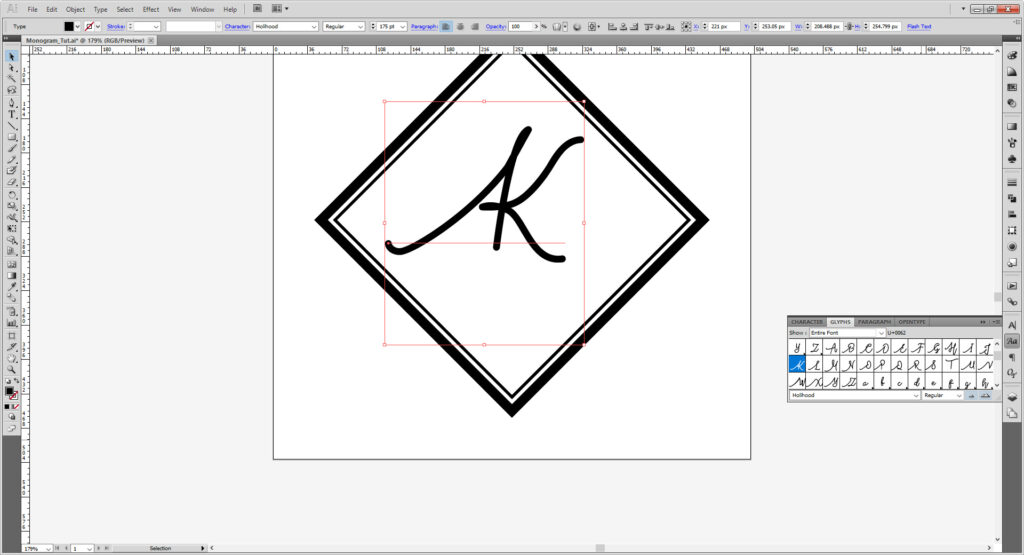
If you’re looking for a specific character, you can choose Select All Alternates for Current Selection.
Type on a Path Tool:
The other tool I was to show that is very useful is the Type on a Path tool. You can access this by holding down the Type tool, where a sub menu should come up. As the name suggests, this generates a text path on any path, which can be used on lines and shapes.
Here I have made a 375 by 375 ellipse with a black stroke, and a second 325 by 325 pixel ellipse but removed the stroke and fill. That green circle you see is the ellipse, but it may be a different color for you depending on what layer you have.
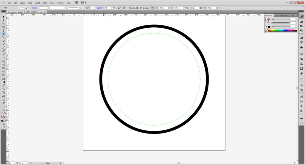
(Illustrator generates a new color for each layer and if you have issues with the color, double clock the layer and change the color from the dialogue menu.)
Click on the Type on a Path tool and click anywhere on your ellipse. I suggest near the left edge right about the halfway point. You will see a blinking type cursor on the ellipse when it becomes a type path. Type out what you want.
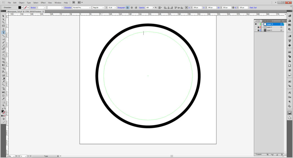
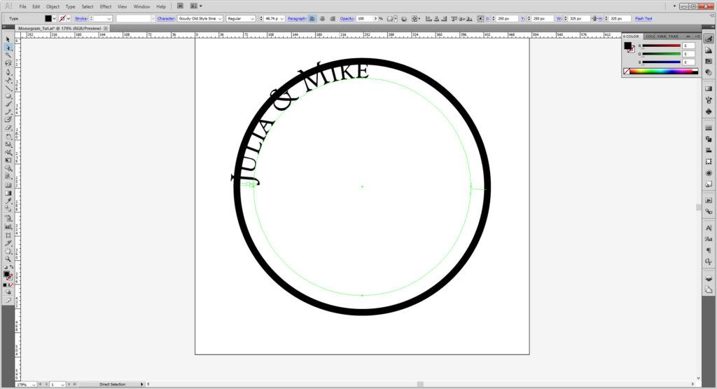
On the left there are 2 small “sticks” and another one on the right. The left two indicate the start and end of your type, which you can manipulate to suit your need.
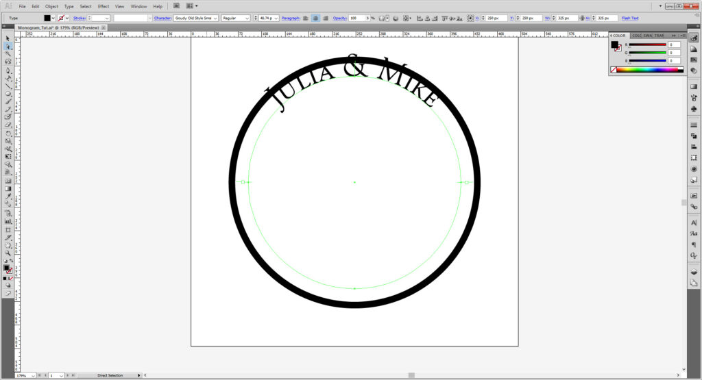
The tool defaults to the outside. The single like on the right with make your shape aligned to the inside of the ellipse.
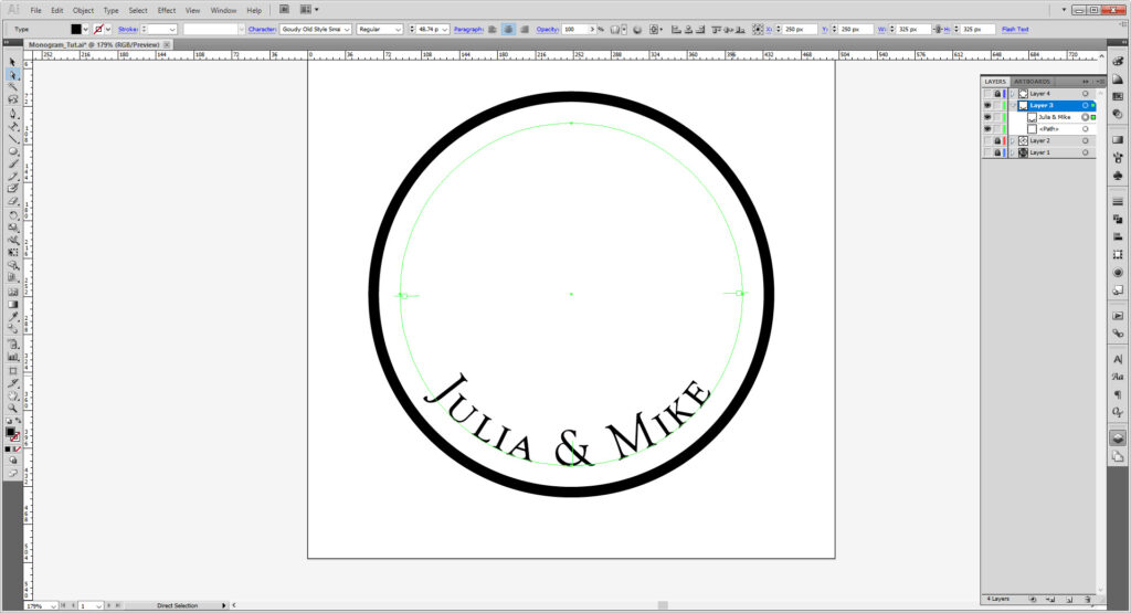
Text alignment still works, and can be used to some effect. Transform and align at will to get the design you want! You can also use the scissor tool to cut away parts (Covered a bit more in the Emoji Tutorial).
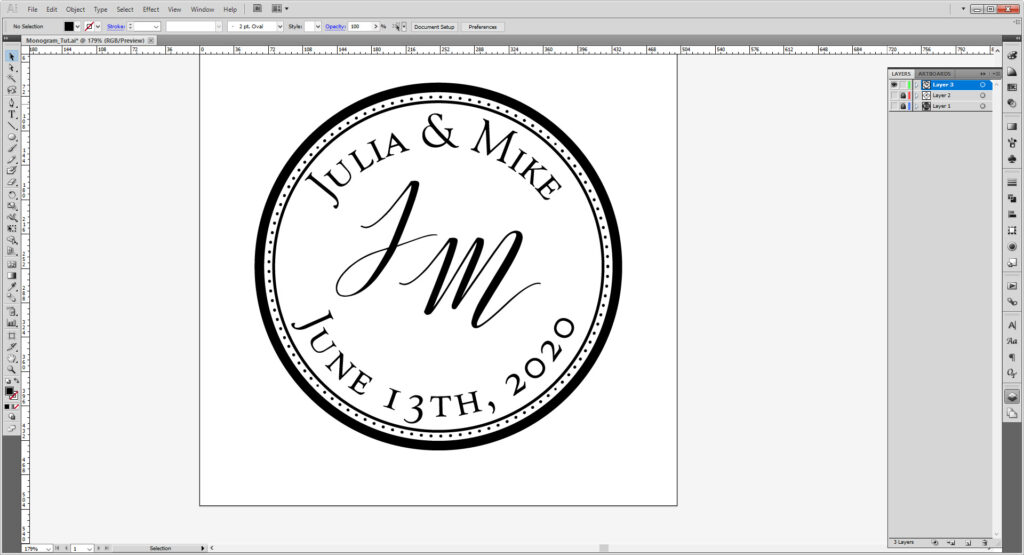
Play around with shapes and strokes, the possibilities are endless!
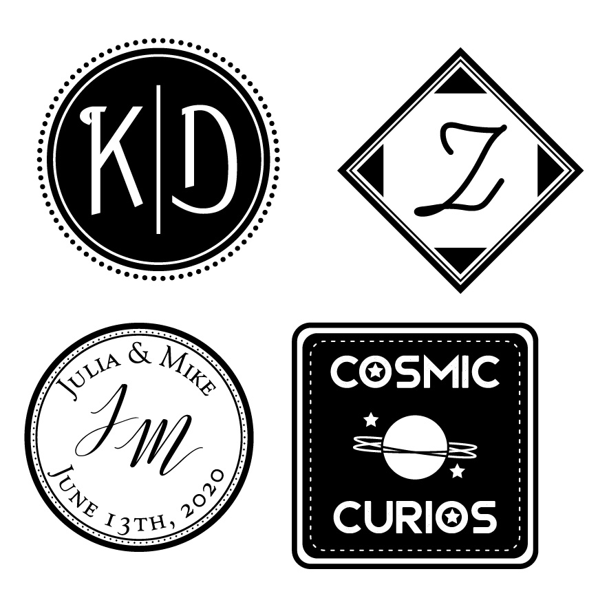
Here’s all the designs I made in throughout the tutorial and a bonus “stamp” logo! The same rules to monograms apply to logo work! If you’re designing for print, feel free to experiment with color! If you’re designing for the Laser/Vinyl cutter, keep it black and white.
If you want to make it into a stamp, check out our Stamp Workshop for more information! And if you want to prep the file for one of our machines, here’s how to do it for the Laser Cutter and Vinyl Cutter!
Show us what you made! Send it to bmcc.makerspace@gmail.com or reach us at bmcc.makerspace on Instagram (or use the the #bmccmakerspace tag) to be highlighted on our page!
Other Links:
- Digital Synopsis: 50 Creative Monograms
- Designer Daily: 25 Inspiring Logos
- Inspirationfeed: 40 Lovely Monograms
- Pinterest: Monogram Logos
- The Knot: How to Monogram (For Weddings)
- Pinterest: Wedding Monograms
- Freepik: Monogram Logos (While we encourage you to make your own, there are some pre-made templates for inspiration!)
- Gareth David Studio: Beginner’s Guide to Illustrator
- Dansky: Illustrator Basics in 3 Minutes
- Flow Graphics: Learn Illustrator in 5 Minutes
- Tech & Design: Illustrator Tutorial: Part 1 | Part 2
- Adobe Illustrator Shortcuts Guide
- Inkscape provides their own tutorials. And even have interactive ones in the software!
- TJ FREE: Inkscape Tutorial
- Logos By Nick’s YouTube Channel has some Fantastic tutorials on working in Inkscape!
Please note if you are using Inkscape, Laser Cutter files must be saved as an EPS, Vinyl Cutter files as both an EPS and DXF.
