It is suggested that if you have not done so, to start off with the Beginner: Emoji Tutorial.
In this tutorial, we’re going to go through some of the same tools in illustrator but going a little more advanced with the finished product. This will be a simplified cartoon (or “chibi” in popular parlance) of whomever you wish! I’m making myself, but you can so a character of yours, a friend, whomever you wish!
You can use this icon for social media, or if scaled enough even like an emoji should you wish! And if you do not like it your first go, hide the layer and try, try again!
Working in Adobe Illustrator:
While we provide links to some open source/free software for use at home, the Makerspace itself has license to use Adobe Illustrator. You may try to follow with the best ability with another program as well, but there might be an additional learning curve. Be patient, and refer to program’s online guide to see what it can/cannot do.
My version of Illustrator is CS5, which is much older than the CC version on our machines in the space. The only difference being my user interface is light colored and may not have as many capabilities as your versions have. All the commands are the same, so don’t feel daunted!
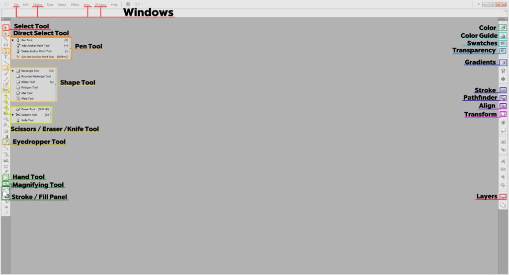
Important Tools in Illustrator:
- Select Tool (V) selects items, and if grouped, will select the whole group
- Direct Select Tool (A) selects only the item you click on.
- Pen Tool (P) Pen Tool (P) is nice to know for making certain shapes. Holding down the icon opens other options. For more information on those, check out the Stencil Workshop [LINK]
- Shape Tool draws shapes. Quick Command M for rectangles and L for circles. Holding down the Shape tool in your toolbar will open up more options.
- Pencil Tool (N) works best if you are using a drawing tablet, you can easily draw over your reference and fix the lines after.
- Scissor Tool (C) cuts along a path or point. Good for making custom shapes or removing small parts of shapes. If you don’t see it, the Eraser Tool or Knife Tool may have been used prior. Hold down the icon to reveal it.
- Eyedropper Tool (I) samples colors/styles from another shape/stroke/image. You may need this to choose your colors later.
- Hand Tool (H) allows you to move around the artboard without disturbing your artwork when zoomed in at higher levels.
- Magnifying Glass Tool (Z) helps you zoom in/out of the image, useful with working on particular details.
- Stroke and Fill (X) allows you to make your shapes filled in solid or just remain outlines, or both. You will need to physically clock on each to set the color. Using D resets your colors to the default white fill and black stroke.
Important Panels in Illustrator:
If you cannot find these in your workspace go to Window on the top of your main menu. Select the panels as needed.
- Color an alternative to using the the color selection in the Stroke/Fill panel. It has various slider options for you to make colors
- Color Guide has preset color swatches and generates a pre-made palette of tints and shades.
- Swatches where all the set colors/styles/patterns are. Any custom colors/patterns you save will go here.
- Transparency allows you to edit the opacity and blending mode. If you’re familiar with Photoshop, this would be the Layer Panel.
- Gradient allows you to generate a gradient, and edit it further.
- Stroke allows you to change the appearance of your stroke, its thickness, or to make it a dotted line
- Pathfinder merges multiple shapes together in different ways.
- Align helps you center or stagger shapes relative to your artboard.
- Transform will allow you to scale items up or down as needed.
- Layers shows you every path, shape, our type object you’ve made. You can organize pieces using many different layers, or groups within said layers.
Important Windows in Illustrator:
- File is where you check your color mode, or output settings.
- Object allows you to further edit, group, or expand your shapes (important for laser cutting prep)
- View allows you make, show, or hide guides and grids.
- Window is where you can access all your panels if they aren’t on your artboard or you accidentally close them.
Shortcuts to Know:
- Ctrl/Cmd + A selects everything
- Shift + Ctrl/Cmd + V pastes an object in place relative to where it was on the previous space; great if you’re moving it to a new file/artboard.
- Ctrl/Cmd + G groups selected items into groups
- Shift + Ctrl/Cmd + G ungroups the group selected
- Cntrl/Cmd + J closes open shapes.
- Ctrl/Cmd + R opens up the rulers on the artboard, allowing you to easily make guides
- Cntrl/Cmd + “ reveals and hides the grid
- Holding Down Cntrl/Cmd and hitting + or – will zoom the artboard in or out.
Making Your Icon:
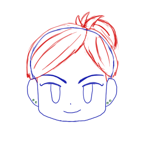
It’s good practice to sketch it out. I have done my digitally using a tablet, but you can draw it by hand and scan it/take a photo from your phone to upload. In fact, I have provided a blank you can use to draw over in a digital drawing program or print out! I’ve left the face blank to allow you design in your own way.
You can get the full sized ones HERE!
I’m making mine look like me, which I separated the hair and head by color. If you’re rather use that as a base, here it is!
Another important thing to note is why we’re using illustrator. Vector format is what the laser and vinyl cutters need to work, but in the print sense, it’s a popular illustration tool due to its scaleability. Meaning, it can be made as large or small as needed quickly and easily. For our icon we need a small scale (500×500 pixels), but if you wanted to for whatever reason want to print it on a banner it can be scaled up to as large as it needs without it being blurry or pixelated. Likewise if you scaled it down very small it would remain the same without any issues. (If you plan on doing any design work, particularly with regards to print—Illustrator is your friend and it’s worth knowing!)
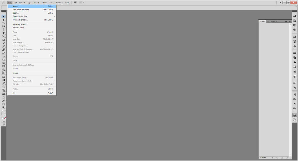
First things first, for File > New. Set it to 500 by 500 pixels.
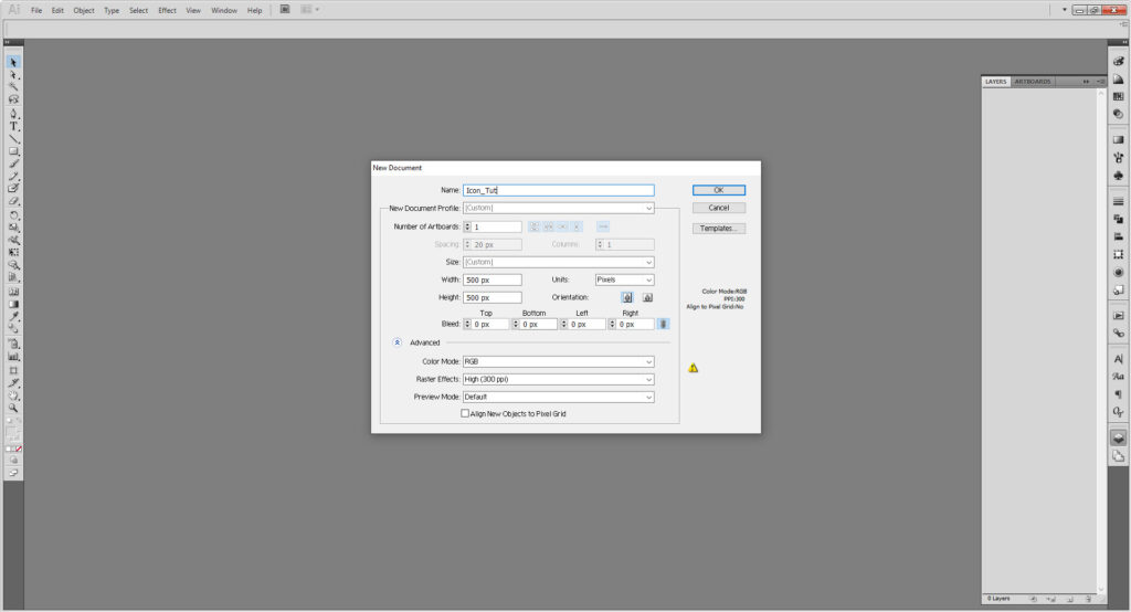
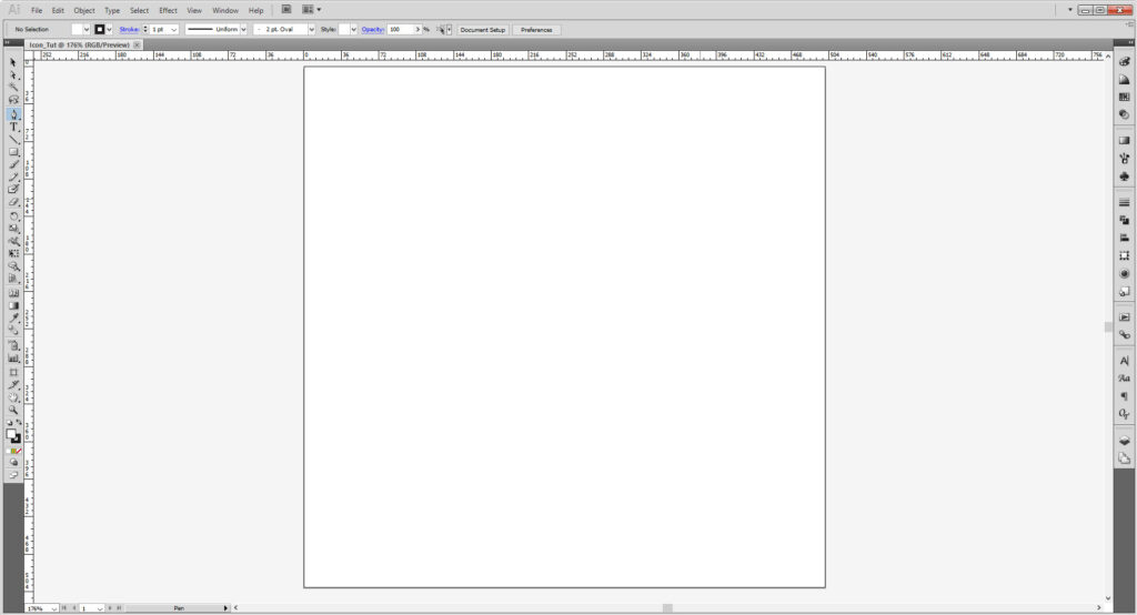
Since it’s not for print, we can use RGB Color. If we were making this for print, CMYK would be preferred (and you can change it at any time by going to File > Document Color Mode ).
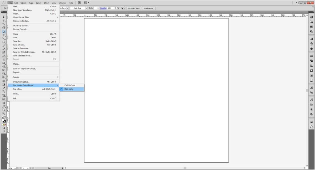
You may notice I have rulers out (Cntrl/Cmd + R will reveal them. In case you want guides. If you prefer working on a grid that works too, then you want Cntrl/Cmd + “). Or go to the View window to show or hide any rulers or grids.
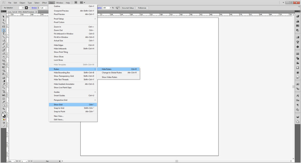
If you had sketched it first, then you’ll want to place it into the document. Skip to the next part if you’re making it from scratch, although it might be difficult for you to start fresh.
Go to File > Place and find your image. Once you have, select Place for it to appear on the artboard.
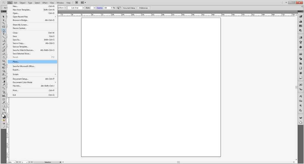
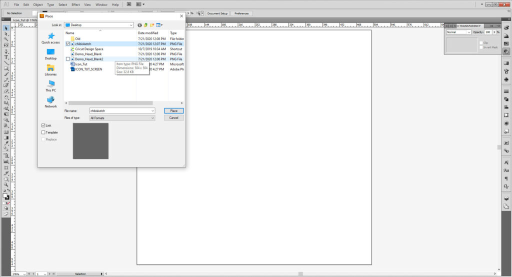
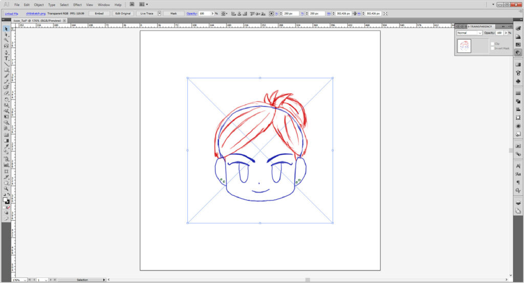
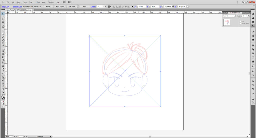
I like bumping the transparency of my sketch down once I’ve placed it. So select your image and go to the Transparency panel (Window > Transparency) and bump the opacity to 20%. (Anything under 50% works!)
Lock the layer. That way, it won’t be moved, and make two new layers. One for your artwork, and the other for guides.
In case you didn’t know Illustrator layers work top down. So if you want something up to the front, you want it up on the higher part of the layer, if you want something at the bottom, then you want it below.
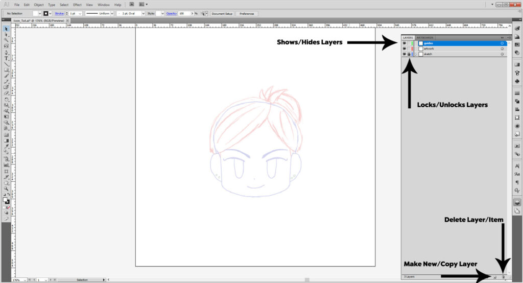
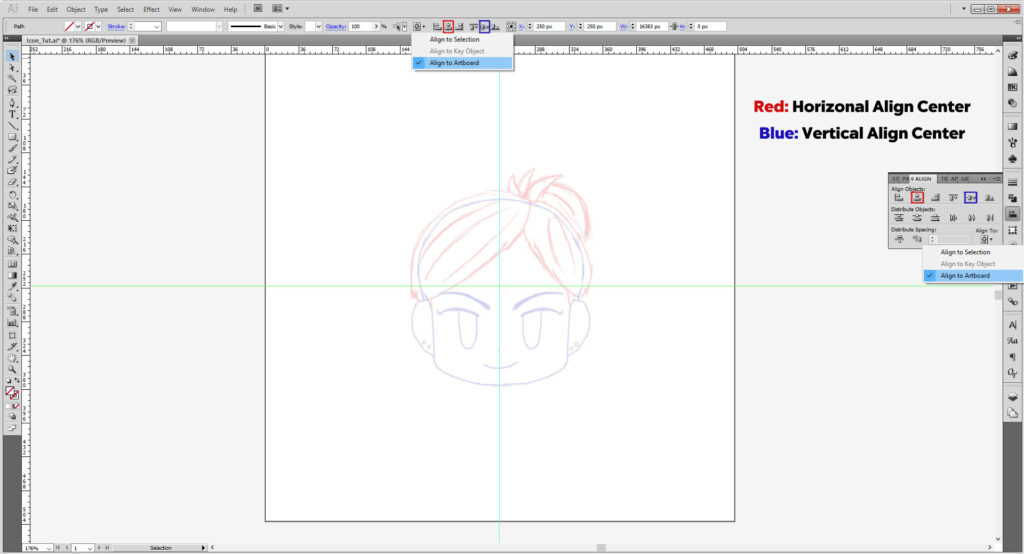
Using the rulers, you will be pulling out one horizontal and one vertical guide that will cross the square and show the center. The speed up the process we’ll use the Align tool to center them. (You can hand type the X and Y location too, but that’s usually if you have a specific measurement.)
Make sure the Align to Artboard is selected. The select one guide and click Horizontal Align Center and Vertical Align Center. Repeat that for the other guide to make it perfectly centered. Lock that layer as well, so now you should have 2 locked layers and one unlocked layer for your artwork.
Now let’s start with the head.
We’ll be doing that by making points with the Pen Tool (P) and adjusting the curves as needed. Make sure you only the stroke has color. If not, you can select the fill option and click None. Feel free to use the Magnifying Tool (Z)and Hand Tool (H) to zoom in to see your artwork better.
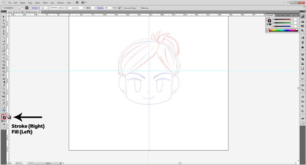
To start, click on the artboard just near the vertical guide but not quite.
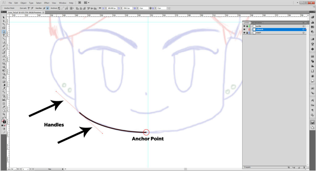
The white dots are Anchor Points; those sticks poking out are Handles. Those will be what we use to make your shape. You can also use other tools. Hold down the Pen Tool icon to reveal more. Add Anchor Point Tool (+) adds anchor points to a shape; Delete Anchor Point Tool (–) deletes them. Convert Anchor Tool (Shift + C) turns a curved point into a straight point.
Holding down the Alt/Option key, click on the anchor point that has the handles. You see the cursor changed to the convert anchor tool. This is a shortcut I recommend you getting familiar with.
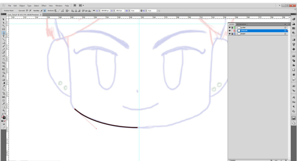
Add the next point just at the base of the ear, adjust the handles as needed. Hold down Alt/Option again and click the point next to the base of the ear. Adjust the curve with the handle to your specification.

Continue along the ear and up the head, stopping just short of the vertical guide again. You may need to adjust handles or use the Alt/Option key to convert anchors along the way. If you wind up making more anchors than needed or too little to make the right shape and want to fix it after, use the Add/ Delete Anchor Tools mentioned above.
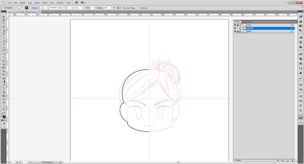
Select the path, hold down Alt/Option and move with the right arrow key. You should now have a copy of your path.
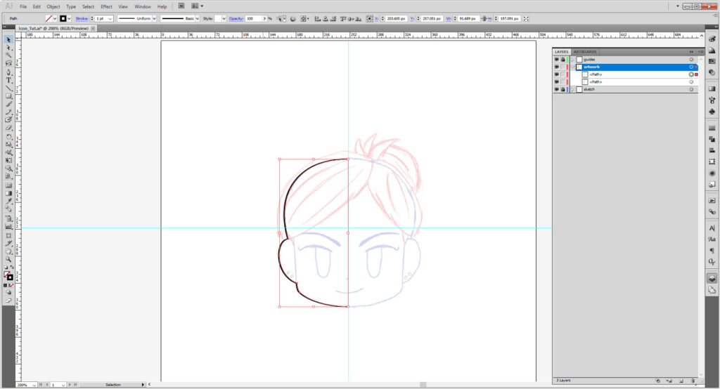
With the new copy selected, go to Object > Transform > Reflect and select Flip Vertical. Hit OK.
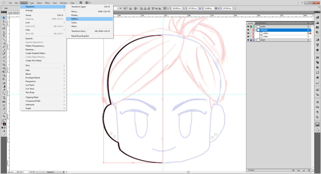
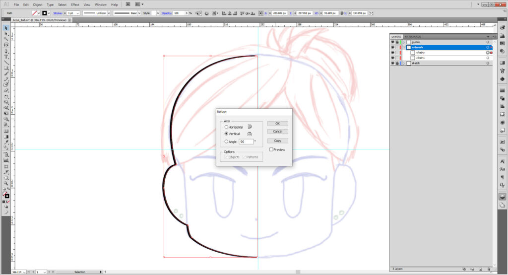
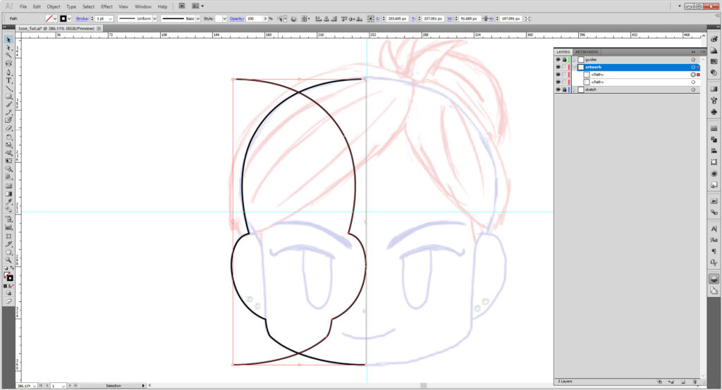
Select the newly flipped path and using the arrow key, move it into place. (I had to move the other one a bit as well to match it evenly.)
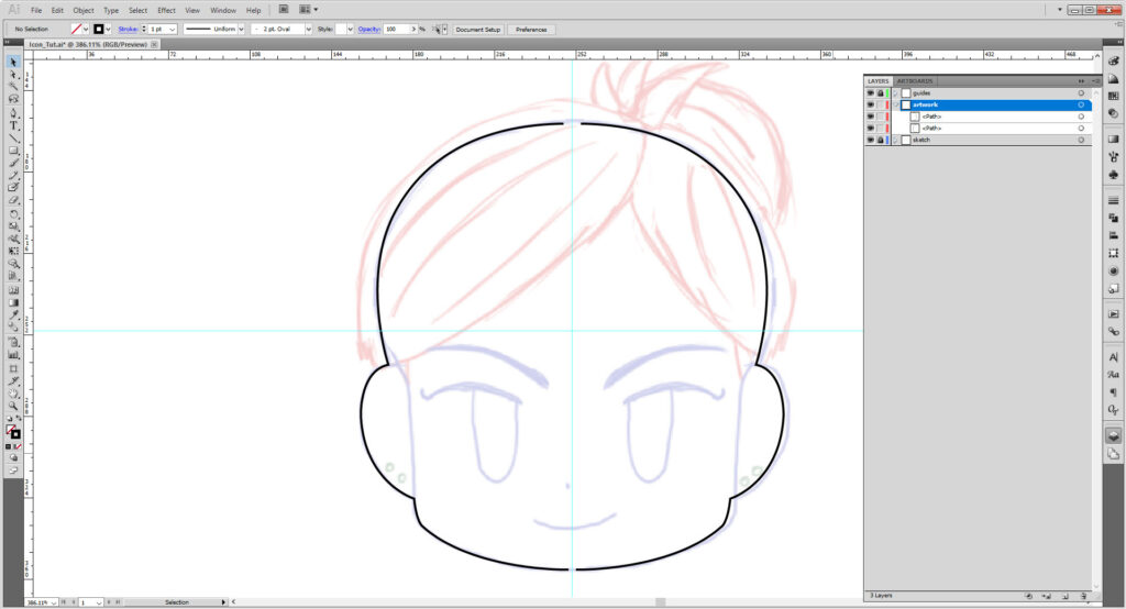
Select both paths and use Ctrl/Cmd + J two times to close the path into a shape.
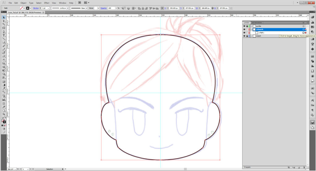
For the smile, I’ll use the pen tool again. Setting one anchor point on one end, hold down Shift and make your next anchor. Do not let go until you see handles, otherwise you will just have a straight line. Adjust the handles to suit the curve you want. Go to the Stroke Panel (Window > Stroke) and select Round Cap and Rounded Corner.
(If you want more of a semicircle mouth, you might want to use the ellipse and scissors tool, which is covered in depth in the Emoji Tutorial).
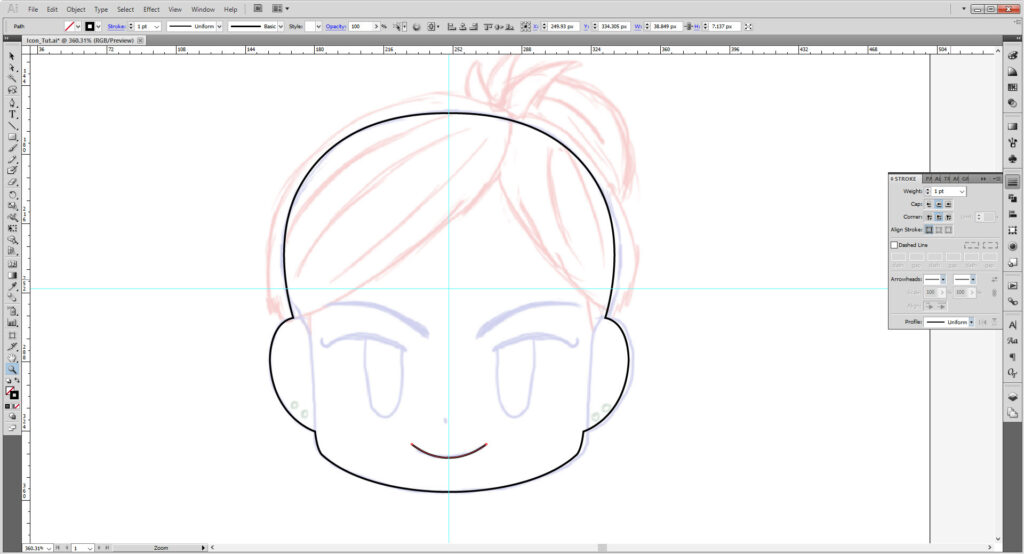
Make a little path with the pen tool for the nose and adjust the stroke the same as above.
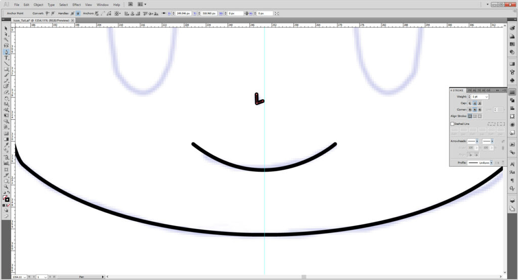
Use the pen tool to draw the rest of the face. Certain items however, might benefit with using the Shape Tool. Hold down the shape tool and select the Rounded Rectangle Tool.
Click the artboard and fill out the dialogue box with the following.
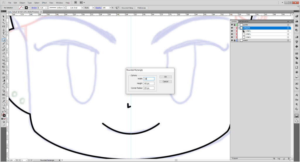
Line it up with the Artwork.
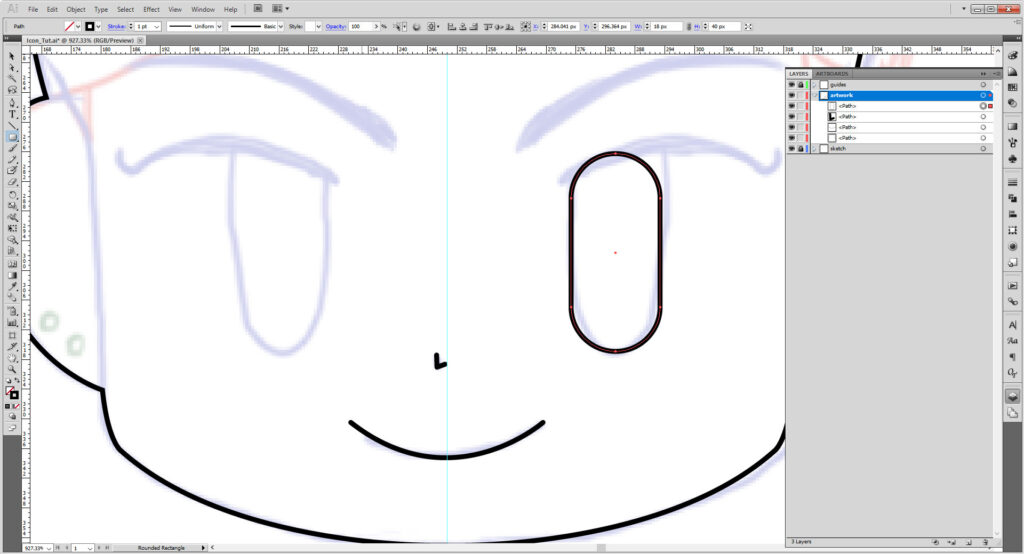
Now, using the Scissors Tool (C), we’ll be cutting the shape apart as needed. If you can’t find it, hold down the Eraser Tool or Knife Tool panel to open it up and reveal the scissors.
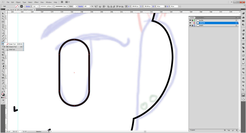
Zoom up close and make sure your scissor aligns with the anchor point, or close enough to it. The crosshair is very difficult to see, but it will change the line the opposite color if on the line. (Those two tiny specks of cyan on the screen). Click to cut. Repeat for the other anchor point.
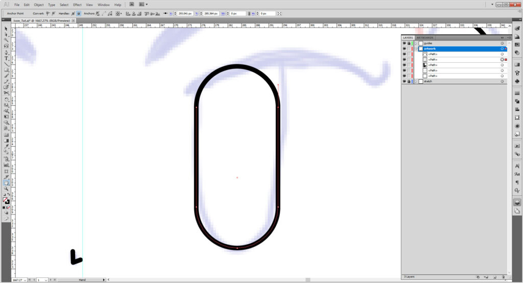
Delete the top part of the shape by using Delete or Backspace.
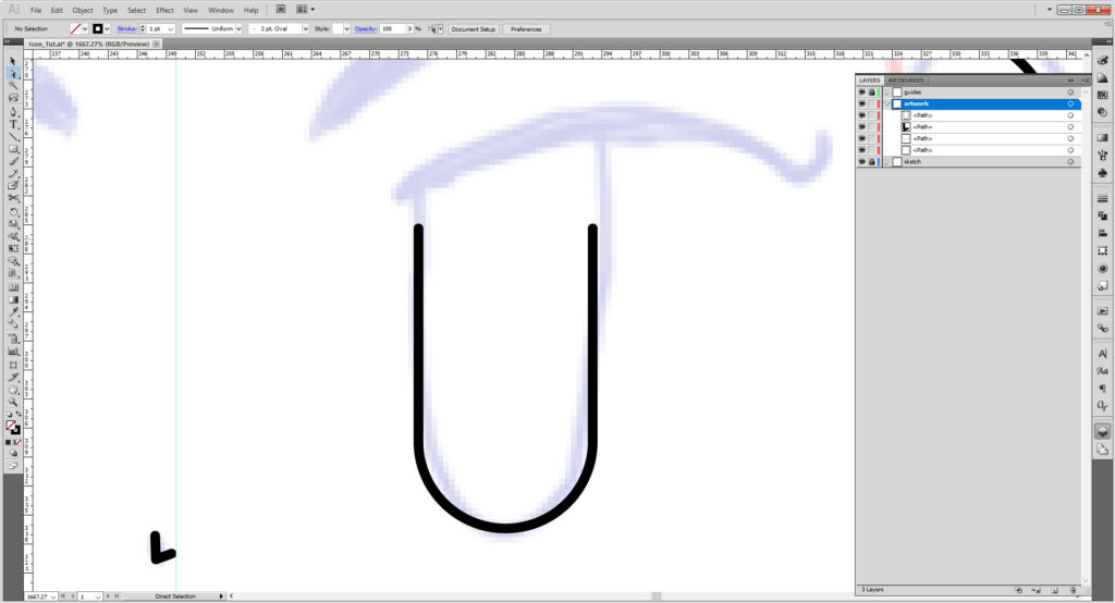
Select on one of the top anchor points. Using the arrow key, use it to mpve the point up along the artwork. Repeat it with the second point until it matches the best with the image.
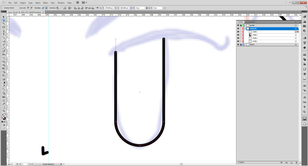
Use the pen tool to make a closed shape that best matches the sketch. There are two ways to go about it: you can make it a shape or make a simple stroke with as thicker stroke weight and rounded ends (I found 3 points works). Likewise you can do that for the eyebrows the same as well.
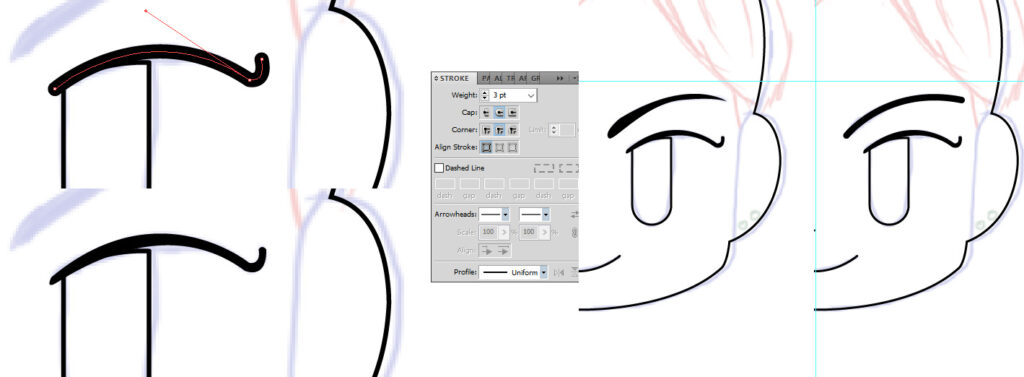
When you have finished the details on half of your face, select the paths/shapes and hit Cntrl/Cmd + G to make them into a group. Copy the group (hold down Alt/Option and move it with the arrow key) and reflect (Object > Transform > Reflect, just as with the head above. And if you wish to center them further, group the two groups into a third group and align them like we did the guides, but only with the horizontal center align.
(It’s okay if your sketch doesn’t match at this point, just know as you work you will need to center it as you go along.)
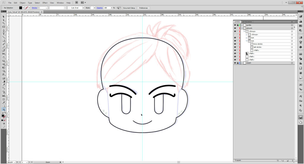
Lock the face and head, and start working on your hair. I am using a different color stroke to help indicate the difference between the head and hair, but you can keep it black for now. Again, don’t worry about seeing shapes; once we start working with fills things will be hidden.
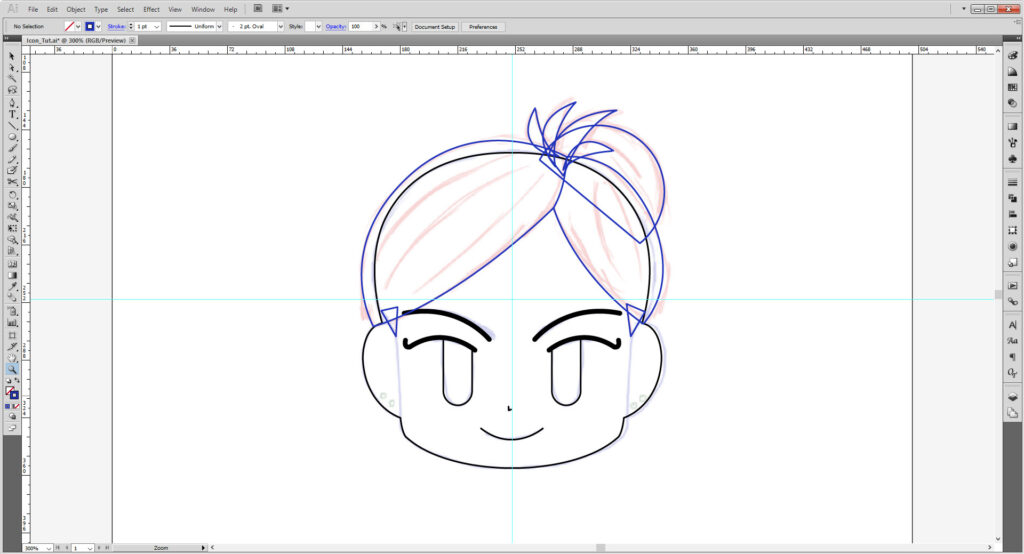
Select all the hair parts and group. Lock the group. Then using the pen tool again, make several arcing strokes that will serve to help illustrate the hair. Go to the Stroke panel and change the stroke weight to 2.5 points and the stroke profile to Width Profile 1. Group and lock.
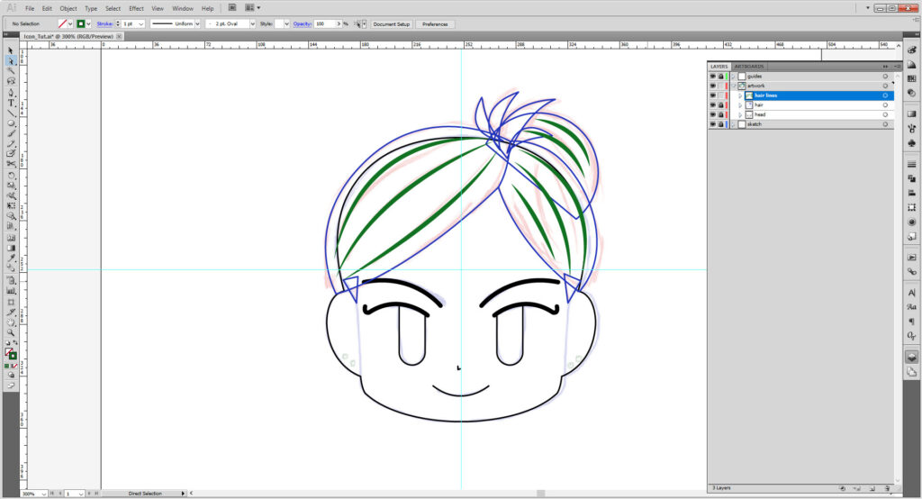
Let’s unlock and revisit the face once more before coloring. Add two more paths over the face to “close” off the ear and face. Again, group, copy, and reflect.
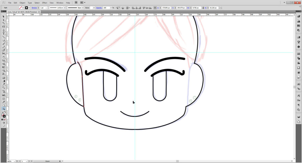
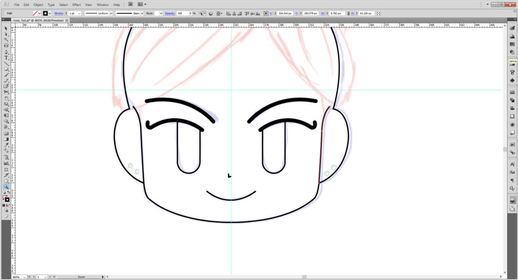
Now time to color!
I sampled colors from my previous emoji tut to match my hair/skin/eyes, but of course feel free to use the color sampler in Illustrator or Web Color Sites to create a palette just for you. Or you can place in images and sample them with the Eyedropper tool (I), or use the Color/Color Guides/Swatches for preset colors.
Mine is as follows:
- Skin Light: #EFD3BF
- Skin Dark: #D6B6A1
- Hair Highlight: #8E5742
- Hair: #5E382A
- Hair Dark: #3A2117
- Eyes Light: #39821E
- Eyes Dark: #2A5916
- Eyes Dark (Gradient): #2A4016
- Nose (Stroke): #A07F6D
- Mouth (Stroke): #56443A
- Earring (Fill): #CCCCCC
- Earring (Stroke): #8E8E8E
- Black: #000000
- White: #FFFFFF
(Note: some of the earlier screenshots have a dark hair base; I changed it after the fact.)
Select you artwork layer and make a copy by dragging the layer to the New Layer button in the Layer Panel. And lock it so in case you might need to edit things later!
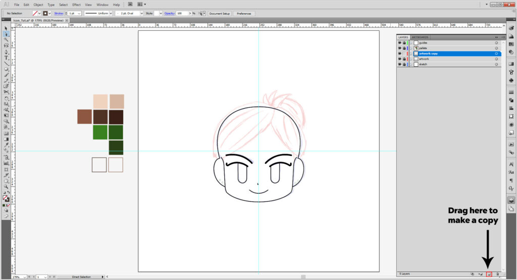
Select the head shape and fill it with the light color. Repeat with the hair, brows, and eyes. If you’ve made them with a stroke rather than a shape, you’ll need to reset the weight and rounded ends.
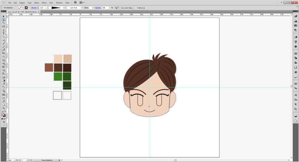
We’re close, but almost there! I’m adding a few strokes here and there to make highlights and shadows to define my hair a little more. You might want to copy shapes and cut them with the scissor tool instead of drawing over the shapes to help speed up the process.
Some are Width Profile 1 which we used before for the strokes on the bangs earlier, others use Width Profile 4, which only tapers off on the one side.
This part may take you some time, as it did with me.
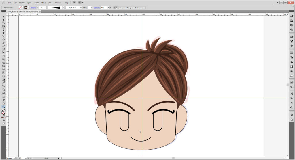
For the eyes, you can go two ways.
For the gradient, copy the eye shape and select the Gradient tool. Select Fade to Black and then go to the little hamburger menu to swap the color mode to Web Safe RGB. Fill in the hex code 2A4016 and do that for both squares on the gradient and adjust at will.
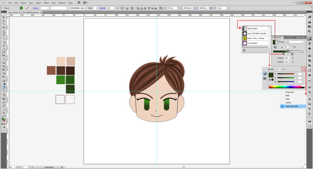
For the block color, copy the eye and cut it with the scissor tool. Delete the lower half and use Cntrl/Cmd + J to close the shape. Fill it with #2A5916.
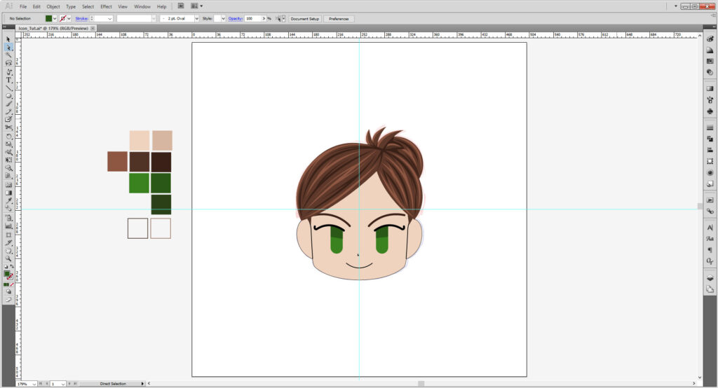
Change the stroke fill to the nose and mouth. Change the stroke weight to 2 points.
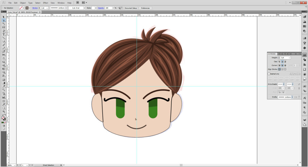
Remember those lines we made near the ears? Find those and make the stroke color # D6B6A1 and the stroke weight 2 pts. Use the scissor tool to cut the long ones in half. Then select the bottom halves and set their stroke profile to Width Profile 4.
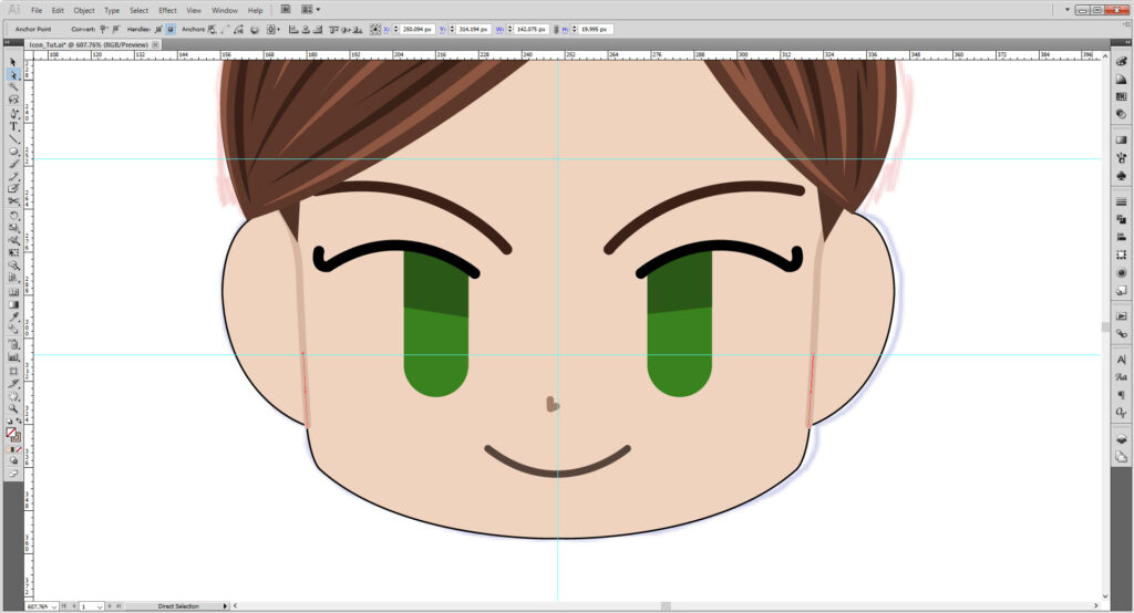
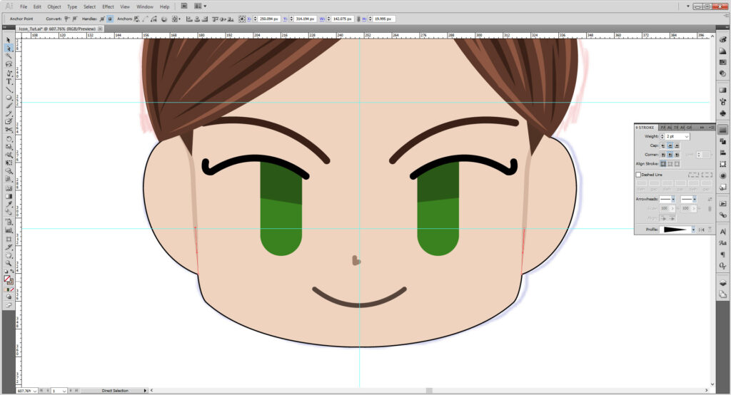
If you want, at one more little curved stroke to define the ear. You may not need to do this if your design covers them.
And finally, I used the ellipse tool with a stroke and fill to make earring studs, copied and reflected and placed on the other side.
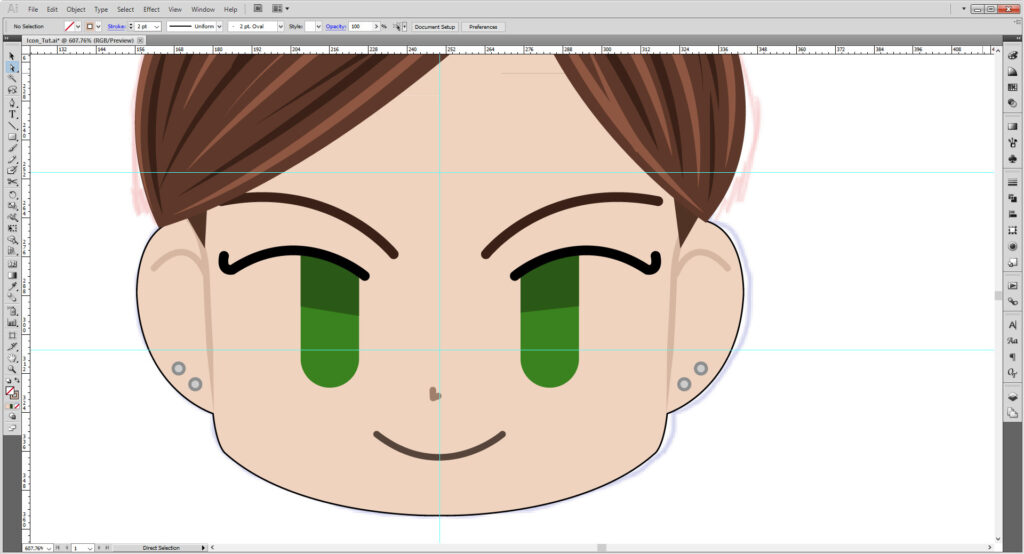
When you are satisfied with your design, copy that layer and lock and hide the previous one. Select everything in this layer and makes sure none of your sublayers/groups are locked.

Go to Object > Expand Appearance. Repeat until you see Object >Expand and then use that. Repeat again until every part of your artwork is now a shape. That way if we scale up or down, you won’t need to fix stroke weights and the like.

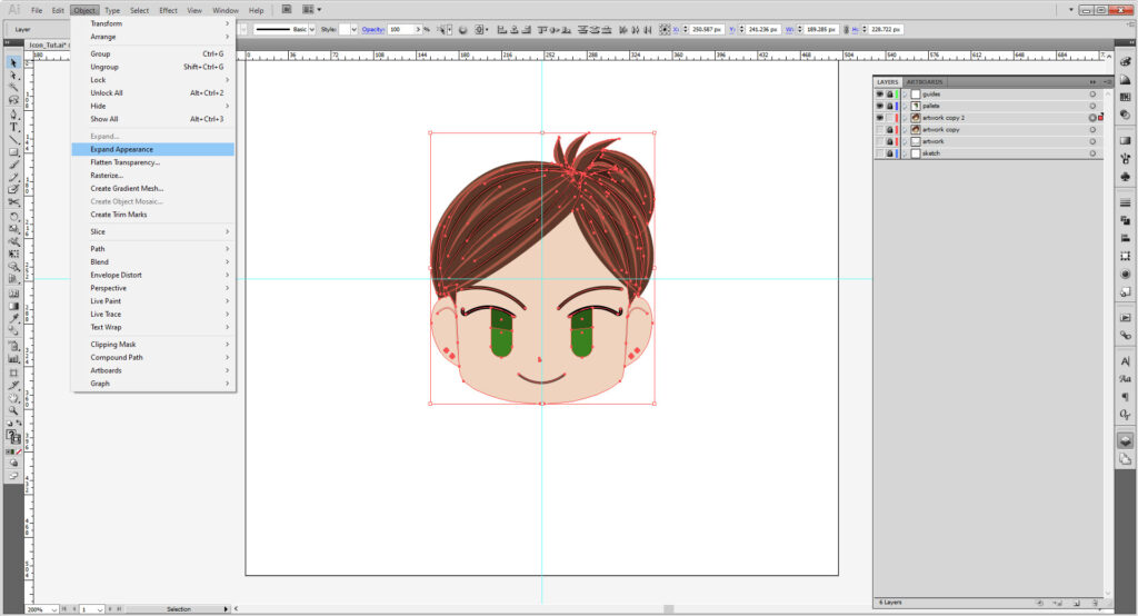
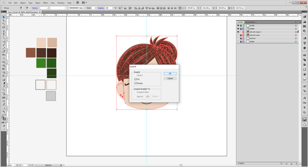
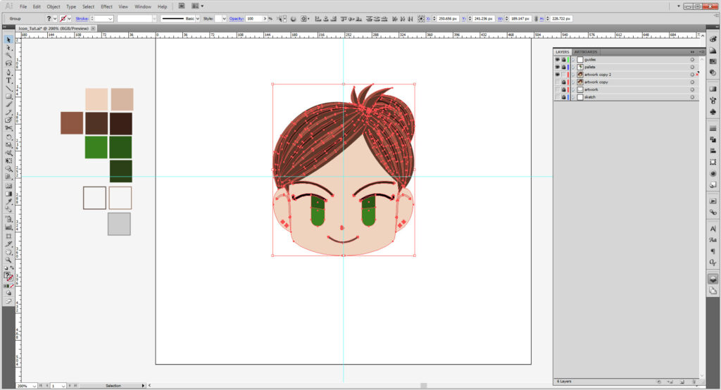
Copy that layer and lock the previous layer. Making sure everything unlocked is selected, go to the Pathfinder panel, and choose Unite.
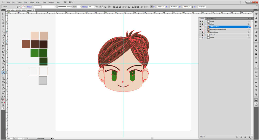
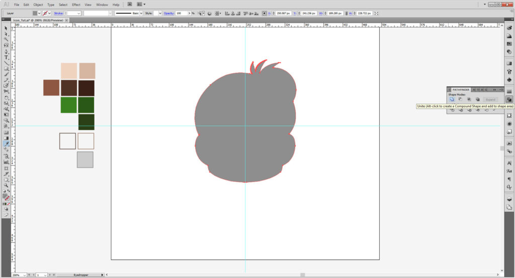
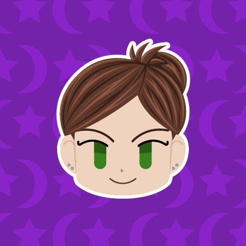
Turn that fill into a white, 5 point stroke with rounded corners and aligned outside of the shape. Expand that shape. You may want to preemptively make your background layer and fill it up to help see the stroke better. Expand that too.
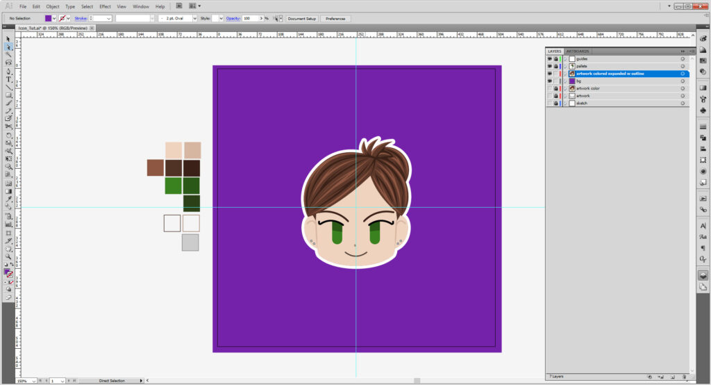
Now time for a background! If you haven’t already, make a new layer and move under the active artwork. Lock the artwork. Using the rectangle tool, fill the space with a solid color. You may also play with shapes and gradients and transparency too. You may also want to scale up your head to fill up the space as well, but it’s not necessary.
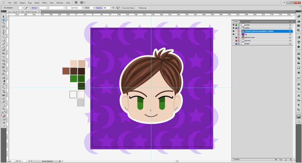
Now we are ready to save!
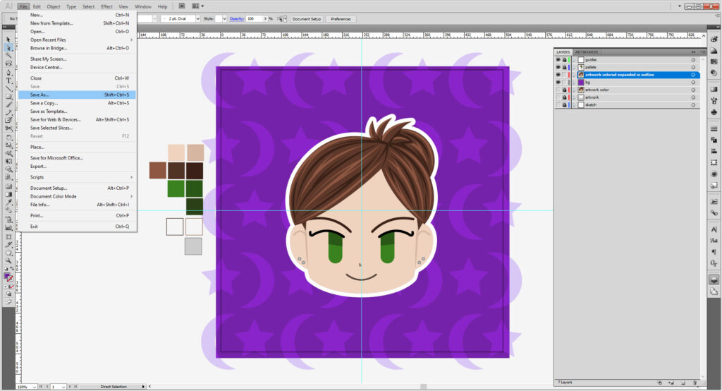
Go to File > Save Asand save as an Adobe Illustrator (.AI) File.
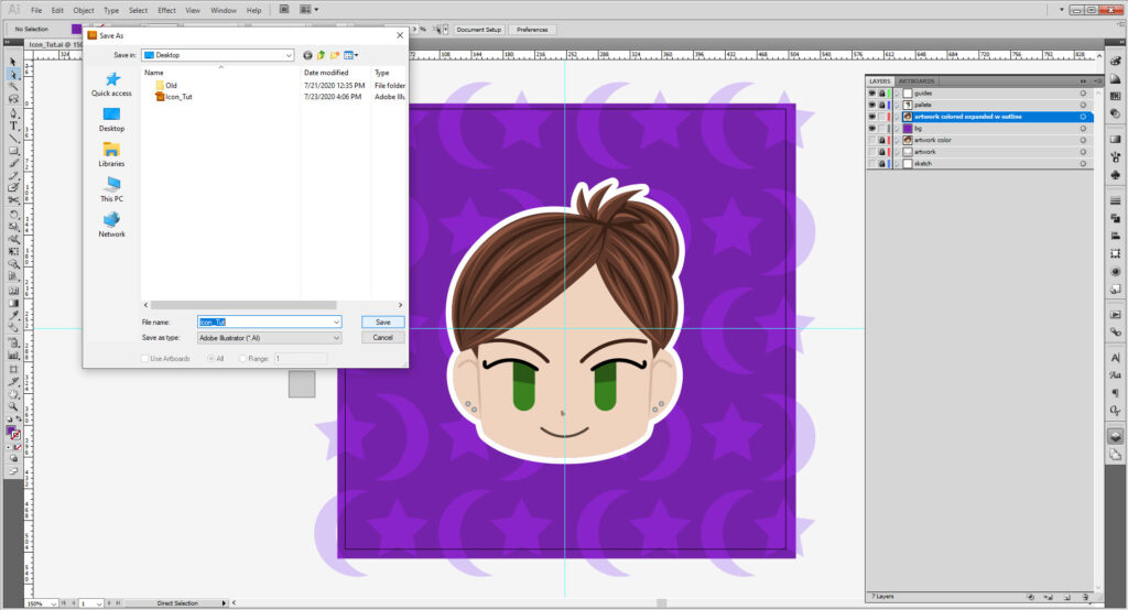
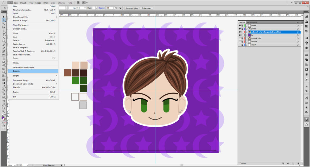
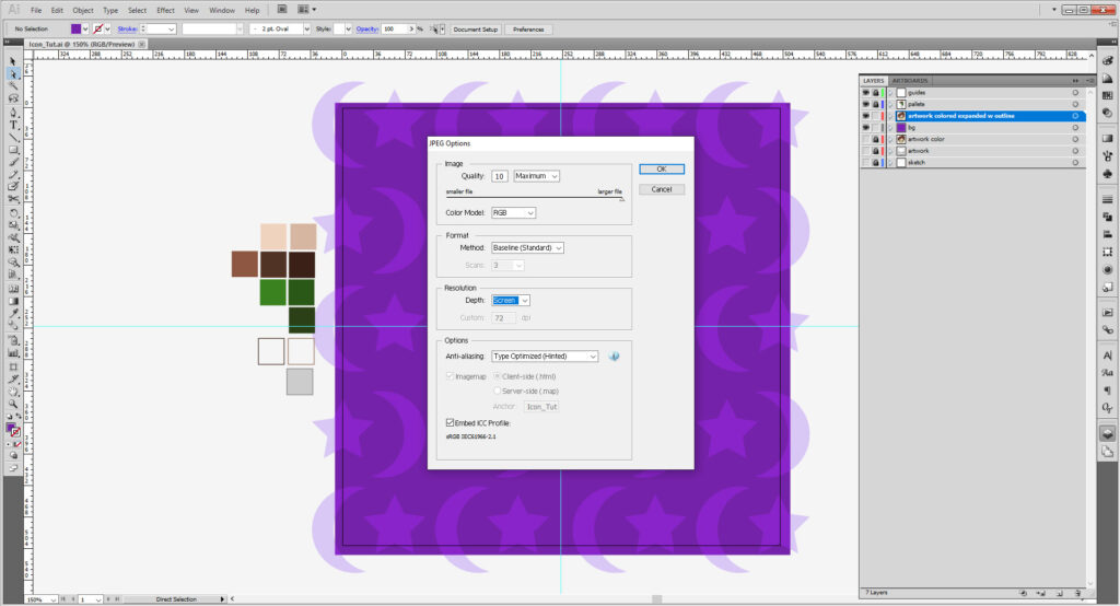
Now that we have the source file saved for future use, now go to File > Export. Exporting is as a JPEG or PNG file works best. Make sure the Use Artboards box is checked. Hit Save, then hit okay. You can resave from the AI file as a higher quality image later if need be, but we want to set the resolution to 72 dpi, which is good for web use.

And there is your fancy new icon!
And if you want to prep the file for one of our machines, here’s how to do it for the Laser Cutter and Vinyl Cutter!
Show us what you made! Send it to bmcc.makerspace@gmail.com or reach us at bmcc.makerspace on Instagram (or use the the #bmccmakerspace tag) to be highlighted on our page!
Other Links
- Gareth David Studio: Beginner’s Guide to Illustrator
- Dansky: Illustrator Basics in 3 Minutes
- Flow Graphics: Learn Illustrator in 5 Minutes
- Tech & Design: Illustrator Tutorial: Part 1 | Part 2
- Adobe’s Illustrator Shortcut List
- Inkscape provides their own tutorials. And even have interactive ones in the software!
- TJ FREE: Inkscape Tutorial
- Logos By Nick’s YouTube Channel has some Fantastic tutorials on working in Inkscape!
Please note if you are using Inkscape, Laser Cutter files must be saved as an EPS, Vinyl Cutter files as both an EPS and DXF.


