In order to have a fully responsive web page you need three things:
- Fluid Layout: the width of the layout is set in fluid units like percent or fr units. This allows the layout to expand and contract to fit the width of the browser window.
- Flexible Media: images, video etc can also adjust their width to fit the size of the container holding them.
- Media Queries: Media Queries are used to change the layout and related design elements based on the width of the browser window.
We have already covered Fluid Layout. When you use FR units (grid-template-columns: 1fr 1fr; ) you are creating a fluid layout.
This post outlines the third item, Media Queries. Media Queries are CSS rules that allow you to apply CSS styles only when certain conditions are met. For responsive design we use them to change the layout of the web page based on the width of the browser window.
Let’s look at a media query and then break down the parts:
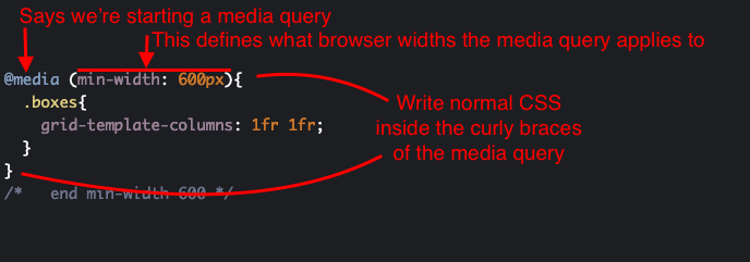
Breakdown
- @media: this is required at the start of the media query
- (min-width: 600px): this is the media feature rule that defines what is targeted by the media query. In this example the media query will apply to all screen widths 600px and above.
- { }: note that like CSS rulesets you’ve used before, curly braces are used. The only difference is that for media queries you write other CSS rulesets inside of the curly braces. In this example the ruleset starting with .boxes is applied.
And that’s the basics. The complexity is more with figuring out how to use them. You can use as many media queries in a CSS file as you like. We will start by just using two or three to allow us to have different layouts at different device widths. There are a few more terms that we will use to help talk about this.
Media Query Examples
In this page I go through examples of some of the main types of media queries
https://profstein.github.io/media-query-examples/
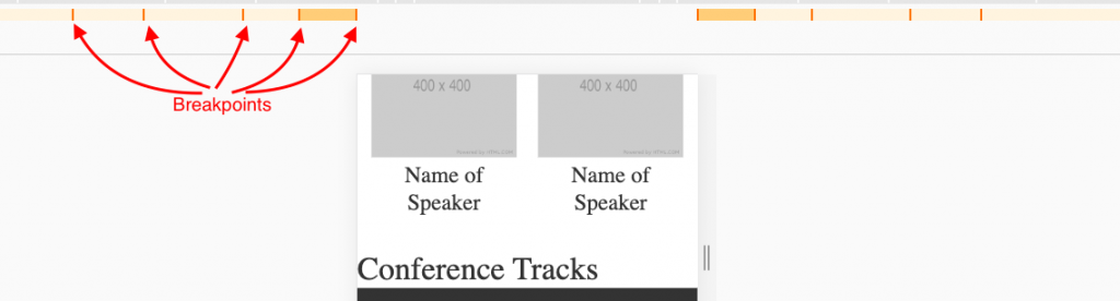
Breakpoints
This is a term we use in Responsive Design to refer to the width of the browser window where the layout changes. The image below shows how Chrome visualizes breakpoints in the inspector.
Practically you set a breakpoint when you add a media query for a particular width. To keep things simple for now we will just use pixels for our breakpoints. You are allowed to use other units like em or rem. This code below shows setting a breakpoint at 600px. This will only apply to browsers with a width of 600px or more.
@media (min-width: 600px){
  /* css goes here */
}
/*   end min-width 600 */
Here is a presentation we will look at about breakpoints:
https://docs.google.com/presentation/d/1Z8FMGl_MBRpIDZi5hyKNamKKzy3zJqA-qgyChE4CSfM/edit?usp=sharing
Mobile-first, Min-width Media Queries
In order to both keep things simple and to focus on making sites usable for mobile devices first we will use
In order to keep things simple and to focus on designing for mobile devices first we will start with only using min-width media queries. When you use min-width media queries it means that each breakpoint applies to a specific width and wider.
This means were will first define rules that are not inside a grid or media query so they apply to all browsers.
Then we will add media queries and start modifying the layout at different breakpoints.
Here is a blank set of media queries that work for most sites and most devices. You will need to change this based on your specific site content and layout needs.
/* CSS here for every devices (import fonts, set base typography, base responsive styles, colors etc). */

@supports (grid-area: auto) {

    /* Css here for your base grid that applies to mobile devices */


   @media (min-width: 600px){

         /* this applies to mobile in landscape and some tablets in portrait */

    }/*   end min-width 600 */


    @media (min-width: 900px){

          /* this applies to tablets */

    }/*   end min-width 900 */


    @media (min-width: 1200px){

          /* this applies average laptops */

    }/*   end min-width 1200 */


    @media (min-width: 1800px){

          /* this applies to large laptops and desktops */

    }/*   end min-width 1800 */


}
/* end @supports */
Example
You can practice with this CodePen:
https://codepen.io/profstein/pen/MWWBKMw?editors=0100
It is already set up with the above CSS and some HTML to let you get started right away.
Fork the pen (you need to be signed in to do that) and post your examples in the comments below.
1 comment