Contents
Overview
The Portfolio Brief is a document to describe the site that you will be creating for your Portfolio Project. It includes a number of areas where you will write about the project or create visualizations to show what it will be like.
Due Date
Because we’re going on break, the due date is after the break:
Tuesday, September 14
We will have a class on Monday, 9/13 before that. The brief will not be the focus of the class but there will be some time for questions, during that class.
Submitting the Portfolio Brief
This page has more information on how to submit the midterm and schedule your presentation time. View Submitting the Portfolio Brief post.
Portfolio Brief Scoring Rubric
SCORING RUBRIC
| Scored Areas | % of Overall Score |
| Organization Clear Sections for all content areas – Project Name – Description – Target Audience – Goals – Look and Feel – Research – Site Map – Wireframes | 10% |
| Description Describe what the project is. | 10% |
| Target Audience Describe the people who will visit the site (demographic information, interests, profession etc) | 10% |
| Goals Describe your goals: why are you making the site. Describe the users’ (target audience) goals. What do they want to see? What information are they looking for? | 10% |
| Look and Feel Describe the visual design and how you want the site design to make people feel. If there are interactive elements, describe those as well. | 10% |
| Research Provide two to three sites that provide inspiration. For each site: – name of the site – link to the site (can make the name the link or show url separately) – reason the site was chosen – optional screenshot | 10% |
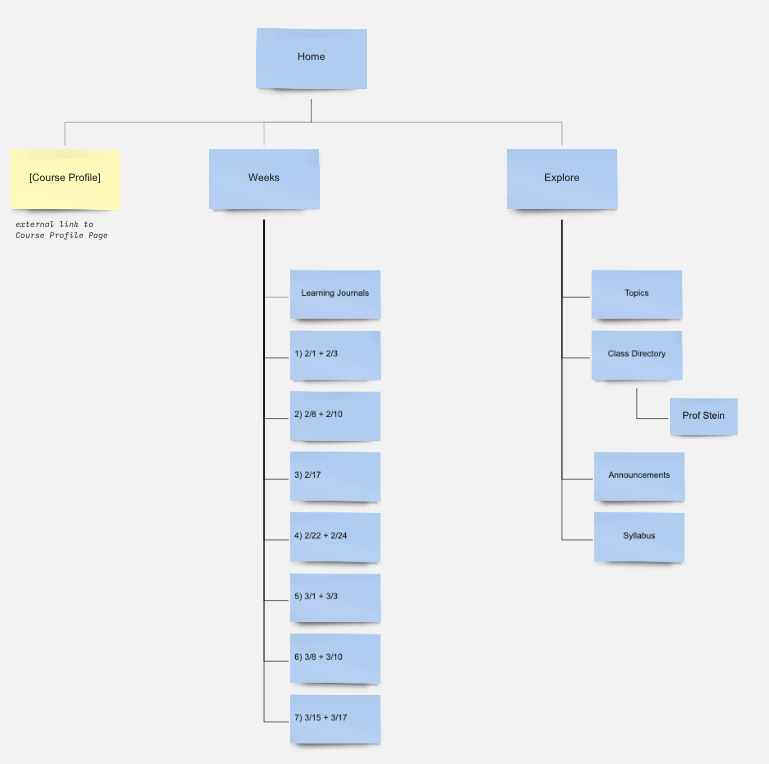
| Site Map A site map that has a rectangle for each page of the site. The lines connecting the pages show how navigation works. You can use an org chart diagram in Word/Google Docs to draw this. | 10% |
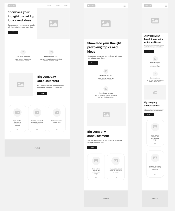
| Wireframe Each type of page in your site map should have a wireframe for it. You can produce a lo-fi wireframe. You do NOT need to have hi-fi or mockup. Each page should have at least two versions (large and small/mobile) but preferably three (large/medium/small also written as desktop/tablet/mobile). | 30% |
Visualization Examples
You will create two visualizations for your brief.
Examples on this Miro Site Visualizations Board
- Site map
- Wireframe (low or high fidelity, mockups also accepted)
Sitemap

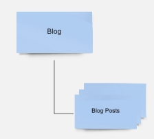
Blog posts
Example of representing a group of pages with overlapping rectangles

Wireframes
Lo-fi wireframe
These generally block out content areas of the page without showing the actual individual content items (title, text, list, image etc.) in detail.

Hi-fi wireframe
These wireframes do show individual content items, but DO NOT show typography or color and other visual design elements.
