Welcome to Weeks #9 – 11
Here is this week’s re-cap, info & resources
*Did you miss Week #7&8’s Post? Go Here
Welcome back! Tonight we will begin our class by looking at student work in progress as well as completed works that are ready for critique! Please share your screen and show us what you are currently working on, or need some class advice on how to make improvements and updates. Reminder – Please don’t forget to add your works in progress to our google drive (you have a folder there) and keeping your production files there allows for me to help you troubleshoot asynchronously through out the week.
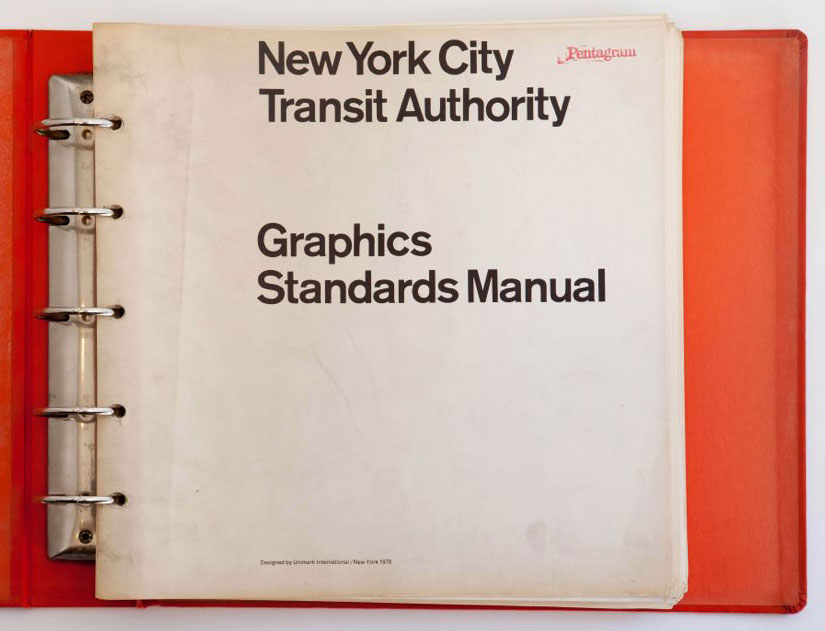
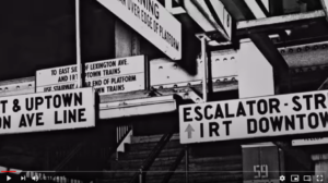
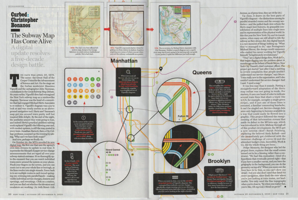
But wait! Remember Vignelli? Massimo Vignelli, The NYC Subway Map and the Graphic Standards Manual designer we talked about in Depth? New York Magazine published this piece in its current edition, how timely! What do you think?
(Click the image below to expand and download the PDF.)
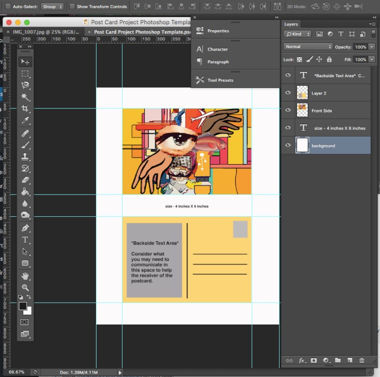
Assignment #3 – Is well underway as we continue to engage in our first project working predominantly with Adobe Illustrator. What are you thoughts and noticeable contrasts between photoshop and illustrator so far?
Class Exercises & Lab Tutorial :: Adobe Illustrator continued. Last week’s video tutorial continued an emphasis on creating shapes with the pen tool, applying the pathfinder and the versatile shape builder tool. We discussed generating shapes, forms and simplifying our results. We looked at the the adobe color palette which is now accessible directly in the properties panel. More tonight on working with color, locating color books and pantone colors.
Assignment #3 link to assignment sheet
**Below is the video recording from class on 11/4 – this tutorial covers part 2 of Assignment #3

Passcode: Ye$ev#6*
**Here is the video tutorial that shares and explains Part 2 of Assignment #3 – and shares the many potential “byproducts” the process may produce (recorded on 11/11/20)

Passcode: ti=C7b#M

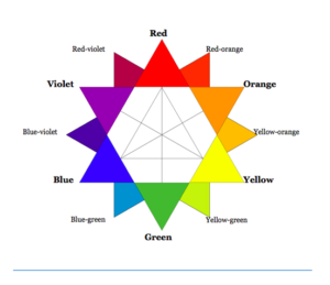
Color Theory! Adobes awesome Color Wheel Simulator – you will apply the use of this tool for this assignment (and likely, many others)

Weekly Design / Designer Resource –
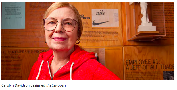
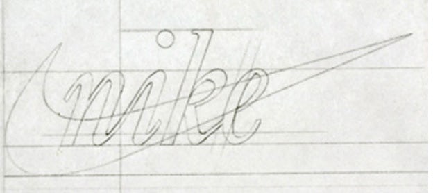
Carolyn Davidson
(Image & content source quoted from – creativebloq.com)
*Please leave your reactions/responses in the comments section below.
Questions to consider: What do you think about the initial payment for the icon / design job? Were you aware of this story / designer? Do you think that the Nike “swoosh” still holds up today? What do you think it symbolizes beyond the description below? How do you think the Nike company will remain relevant over the next 10 years +, how will design play a role?
“There aren’t many logos that are more recognized the world over than Nike’s iconic swoosh. It’s often the simplest ideas that are the best and the Nike mark proves it.
Graphic designer Carolyn Davidson designed the logo as a student at Portland State University in 1971 – and was paid $35 for it by Nike founder Phil Knight (Knight met Davidson in an accounting class he was teaching.)
The tick-like logo was seen as a symbol of positivity, but it’s actually the outline of the wing of the Greek goddess of victory whom the brand was named after. In 2011, Davidson told OreganLive.com that “it was a challenge to come up with a logo that conveyed motion” and that Philip Knight was very impressed with the stripes of rival company Adidas – it was increasingly hard to come up with something original.
As Nike grew in the 1980s, Philip Knight gave Davidson an undisclosed amount of Nike stock (making up for the tiny fee for the logo, we’re sure).”
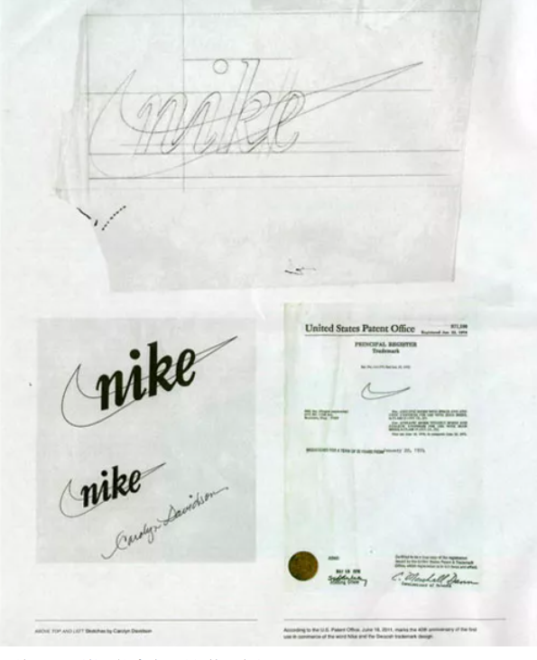
More Source Info – https://www.creativebloq.com/graphic-design/names-designers-should-know-6133211