
When you want to set what font is used to display text you set the font-family property. The value for the font-family property is a comma separated list of fonts. Here is an example: Font Stack The list of fonts in the value for font-family is often referred to as […]
Design
18 posts
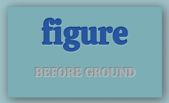
When we look at something we try to determine what is important and needs our focus, figure, and what is not important and we can ignore, background. Another way to say this is foreground (figure) and background (ground). If you’ve done art you might have also heard of positive space […]
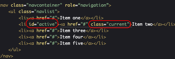
Links on a web page are made through an anchor (a) element: When we’re styling them in addition to styling the basic a element you can also style different states of the link: visited: what it looks like when someone has already cliked the link before hover: what it looks […]
The basic way to use this principle is to pay attention to the spacing around your elements. If a few elements are all in a group and related to each other then the spacing between them should be less than the spacing between the group and the rest of the […]
The examples I’m going to use are from the Listamatic web site. http://css.maxdesign.com.au/listamatic/ This site is out of date, but in this case that’s a good thing. It means that our navigation will work in older versions of browsers. Navigation is essential to your site and you want to make […]
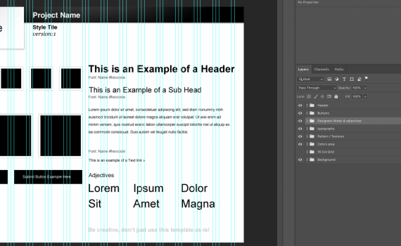
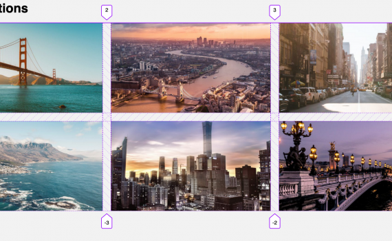
For this assignment we are going to do a version of a Style Tile for your midterm site. To complete the assignment you can either Option 1: Download the Style Tile PSD file and complete it. This option is best if you are already comfortable with Photoshop. If you aren’t […]
Class on 10.23.19 Quizlet We will start with the quizlet live games How to get on: Download the app and put in the code I will show on the board. Search for Quizlet in your App Store Go to quizlet.live and enter the code I will show on the board […]
Class on 10.21.19 Assignment 6 Q&A We are going to start the day answering questions about assignment 6 and making sure that everyone understands the Midterm content. Then we are going to move on to the Gestalt Principles. Gestalt Principles Today I will briefly introduce you to the Gestalt principles. […]
A big part of graphic design in general and the web design we do in this class is communicating a message to a particular group of people (audience). The Gestalt Principles were created to help explain how people make sense of what they see. They are particularly useful for web […]
Class on Wednesday, September 25 Today we will work in roughly two parts. Part 1: Review of Assignment 3: CSS Grid and Assignment 4: Typographic Hierarchy Part 2: Adding images and Grid to Assignment 4. Part 1: Review of Assignment 3: CSS Grid and Assignment 4: Typographic Hierarchy We will […]

Today were are going to go deeper into typographic hierarchy. PART 1 What is Typographic Hierarchy We will look at and discuss my (updated) post on Typographic Hierarchy: https://openlab.bmcc.cuny.edu/mmp-240-fall-19-stein/2019/09/16/typographic-hierarchy/ PART 2: Examples and Inspiration Next we will look at the following for examples and inspiration related to typography and hierarchy: […]
CLASS 6 on Monday 9/16/2019 Today we are going to look into typography and how to implement it on the web using CSS. Typography Basics We will start with looking at typography basics. This post covers that and more. Don’t worry if you don’t pick it all up right away. […]
This post presents the basics of typography through a set of rules to follow. Like all rules they are made to be broken, but you should learn them first before you start breaking them. If you follow these rules your web typography won’t suck. It will most likely be pretty […]
These are some of the more commonly used properties for typography and creating typographic hierarchy. Font (Typeface): This controls the font that is used. Also see the information on fonts in the CSS section of the Web Design Resources. CSS Property: font-family Example: font-family: "pt sans", sans-serif; https://developer.mozilla.org/en-US/docs/Web/CSS/font-family Font Weight This controls the weight (boldness […]
Most of the web is text so much of what you have to design is text. A typographic hierarchy helps the user to quickly scan a page and find information. Also, done right, it will make the page more visually attractive. Typographic Hierarchy tells the reader two basic things: what text is more or […]
This is a LONG list of web fonts. It’s meant to be used as a resource that you can come to when trying to find the right fonts for your web sites. Fonts with multiple weights These fonts have at least six weights including normal and italic versions Sans-Serif Alegreya […]
In your sites you generally don’t want to use more than 2 or 3 fonts. More than that can start to look a bit chaotic and can represent too many different tones. This video talks about choosing fonts and also talks about hierarchy and some other basics about typography. The video is just […]