Welcome to Weeks #9 – 11
Here is this week’s re-cap, info & resources
*Did you miss Week #7&8’s Post? Go Here
Welcome back! Tonight we will begin our class by looking at student work in progress as well as completed works that are ready for critique! Please share your screen and show us what you are currently working on, or need some class advice on how to make improvements and updates. Reminder – Please don’t forget to add your works in progress to our google drive (you have a folder there) and keeping your production files there allows for me to help you troubleshoot asynchronously through out the week.
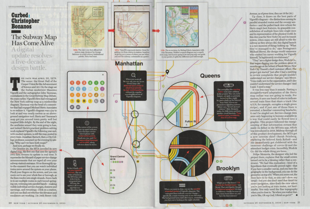
But wait! Remember Vignelli? Massimo Vignelli, The NYC Subway Map and the Graphic Standards Manual designer we talked about in Depth? New York Magazine published this piece in its current edition, how timely! What do you think?
(Click the image below to expand and download the PDF.)

Assignment #3 – Is well underway as we continue to engage in our first project working predominantly with Adobe Illustrator. What are you thoughts and noticeable contrasts between photoshop and illustrator so far?
Class Exercises & Lab Tutorial :: Adobe Illustrator continued. Last week’s video tutorial continued an emphasis on creating shapes with the pen tool, applying the pathfinder and the versatile shape builder tool. We discussed generating shapes, forms and simplifying our results. We looked at the the adobe color palette which is now accessible directly in the properties panel. More tonight on working with color, locating color books and pantone colors.
Assignment #3 link to assignment sheet
**Below is the video recording from class on 11/4 – this tutorial covers part 2 of Assignment #3

Passcode: Ye$ev#6*
**Here is the video tutorial that shares and explains Part 2 of Assignment #3 – and shares the many potential “byproducts” the process may produce (recorded on 11/11/20)

Passcode: ti=C7b#M

Color Theory! Adobes awesome Color Wheel Simulator – you will apply the use of this tool for this assignment (and likely, many others)
Weekly Design / Designer Resource –

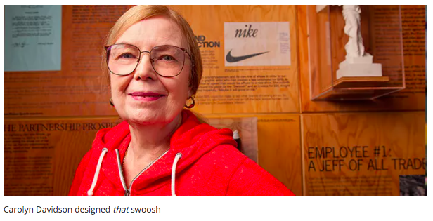
Carolyn Davidson
(Image & content source quoted from – creativebloq.com)
*Please leave your reactions/responses in the comments section below.
Questions to consider: What do you think about the initial payment for the icon / design job? Were you aware of this story / designer? Do you think that the Nike “swoosh” still holds up today? What do you think it symbolizes beyond the description below? How do you think the Nike company will remain relevant over the next 10 years +, how will design play a role?
“There aren’t many logos that are more recognized the world over than Nike’s iconic swoosh. It’s often the simplest ideas that are the best and the Nike mark proves it.
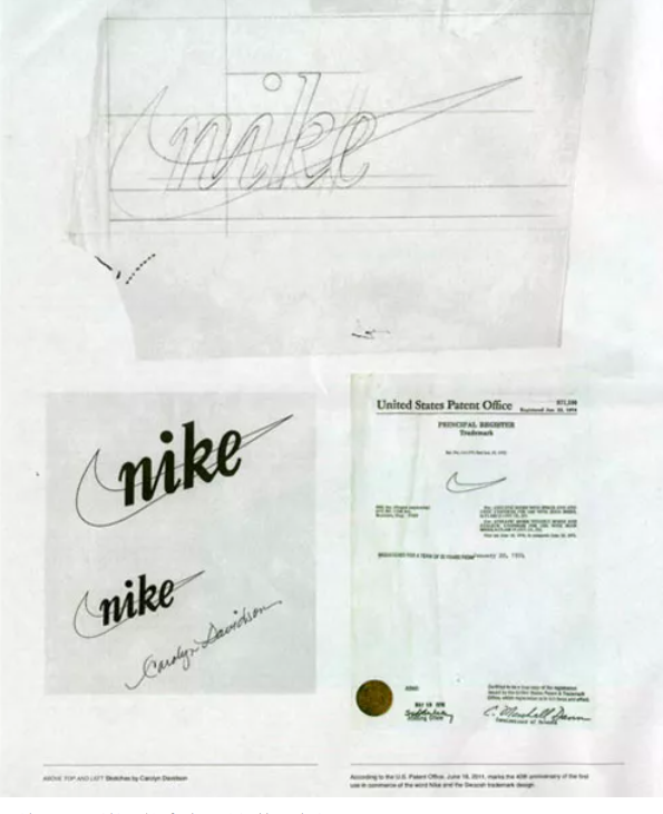
Graphic designer Carolyn Davidson designed the logo as a student at Portland State University in 1971 – and was paid $35 for it by Nike founder Phil Knight (Knight met Davidson in an accounting class he was teaching.)
The tick-like logo was seen as a symbol of positivity, but it’s actually the outline of the wing of the Greek goddess of victory whom the brand was named after. In 2011, Davidson told OreganLive.com that “it was a challenge to come up with a logo that conveyed motion” and that Philip Knight was very impressed with the stripes of rival company Adidas – it was increasingly hard to come up with something original.
As Nike grew in the 1980s, Philip Knight gave Davidson an undisclosed amount of Nike stock (making up for the tiny fee for the logo, we’re sure).”

More Source Info – https://www.creativebloq.com/graphic-design/names-designers-should-know-6133211


It is astounding that Carolyn Davidson was initially only paid $35 in exchange for her contribution to the Nike brand. Considering the impact and prestige this design now holds, the notion of her having first been given such a paltry sum is shocking. I was vaguely aware of this story and designer prior to this reading, but never knew much of the specifics regarding either. It was interesting to learn more about both.
The Nike “swoosh” definitely still holds up today. It is such a simple, yet dynamic design, which allows it to retain its appeal and impact despite the passage of time. Beyond being an abstract interpretation of the wing of the Greek goddess the brand is named after that cleanly denotes motion, this logo also symbolizes modernity in its sharp, sleek simplicity. It is so effective without being ornate or excessive in any way, which is definitely a factor in its continued success. The Nike company will remain relevant so long as it continues to visually evolve this design over time, as it has done since its inception. In this way, design will play a prominent role in Nike’s continued relevancy as it is the most crucial, immediate, and effective manner of communicating the essence and feeling of a brand to the consumer.
Thanks so much, Tara! Excellent response and so so true on all fronts! That swoosh is so so simple and so so effective! It is burned into my psyche forever, lol! Thanks so much for the great insight and reaction here.
After reading this the price that the swoosh was sold for was the most shocking part. I would consider the Nike logo the most known logo of all time, for me at least. Back then 35 dollars was worth a lot more and it’s understandable because at the time who knew how big that logo was gonna be. I think the Nike swoosh is even bigger today and has shaped a huge part of culture throughout the years. I know while I was growing up everyone always wanted the newest Nike or Adidas and it was mainly known for athletics. But now Nike has countless collaborations with athletes, designers, artists, and other brands. I think Nike as a brand will not lose any fame anytime soon if anything it will continue to grow across the world even though almost everyone on earth has seen the logo or heard of Nike. Who knows what the future holds for Nike. All I know is that it has been and will stay a huge part of my life and has played a role in making me who I am today.
Awesome! Thanks so much for this thoughtful and reflective response! Agreed!
I was not aware of this story however, I was aware of the designer who created the “Nike Swoosh”.
The iconic symbol most definitely holds up today in professional sports; particularly in the basketball world.
I was surprised about the fact that Carolyn Davidson was only paid 35 dollars for the design. I would have expected her to be paid a margin within the hundreds because she created this design for a company. I do believe by now, she should have gotten paid a lot more such as royalties because of how huge Nike as a company has become.
I believe the design was supposed to be simple like a regular check-mark. However, I believe Carolyn Davidson wanted the circular motion on the check-mark to be unique and stand out to the spectators viewing it. This caught the eye of prominent sports figures such as Michael Jordan, Lebron James, Kevin Durant, The Late Kobe Bryant, etc.
In the next ten years and beyond, Nike will and always remain relevant. This is because of the impact and significance it has among the basketball community and inner city. For many years, the “Nike Swoosh” symbol has been used as part of a series of amazing designs and endorsed by one of the biggest sports icons of them all, Michael Jordan. This making Nike the top sports apparel company in the world.
Excellent, and well said! I think we are all in agreement on this and anticipate “what they are cooking up?” for the future!
I love the minimalist design of the MTA live map. And I could watch those little trains traveling on the lines all day. The simple silhouette is enough that most people will know that it’s a train. One feature I noticed was that some of the stations show where the entrances/exits are when you zoom in. Again, especially because they are the standard MTA arrow design, most people would get that it’s the exit or entrance. This can be really helpful at those station where the entrances are around corners. I do think there should be a legend for some of the elements, like the arrows, and what the dashed line tracks are. And I’m a fan of the nighttime dark mode too.
Overall, it’s a great start. I know people constantly complain about the MTA but they are making efforts, especially in design, to get our ancient subway system up to speed. If anyone is interested, I used to see these exhibitions at the Hudson Yards 7 Train Station when I was on a gig . The new trains the MTA are purchasing are gorgeous. They’ve pretty much redesigned everything. I’m especially excited for the new readable digital displays that will be located above the doors!
https://www.core77.com/posts/70976/Todays-Urban-Design-Observation-Checking-Out-the-Design-Upgrades-on-NYCs-Future-Subway-Cars
Excellent!
Agreed! I’m a fan of the nighttime dark mode too!
Great link ! The trains are so sweet! Thanks for sharing that!
I already knew the story of Carolyn Davidson and her creation of the “swoosh”. This time I went out of my way to use an inflation calculator to properly judge the payment of $35 and it seems that today, those $35 are around $230. Considering how important a logo is for a company (one could say the logo is the “face” of a company) I feel like $35 is just too low, especially with the context of how recognizable the logo is now.
Yes, one could argue that nobody knew Nike was gonna be this big but in 1971 Bill Bowerman and Phil Knight (the founders of Nike) were already planning on making the brand a success, since they were gonna introduce their first footwear line.
But still, the “swoosh” definitely holds up to this day, only going through small changes throughout the years compared to other companies (Adidas). I believe Nike will still be in the same place they are in 10+ years. They have already established the idea of their products being of a high quality in everyone’s mind. Furthermore the fact that they have collaboration after collaboration with current or relevant artists make them accessible to the “hip” audience.
Well said Jean! Lol! Love that experiment, great idea! $35 – $230 today! That is INCREDIBLY LOW, and taking advantage of the designer, regardless if one knows “what the future” of the company or product will be.. A logo Is the FACE of the company and that has far more value in its ability to communicate than this price. Great points here! Thank you!
I definitely late on the reply for this article but better late than never,
I find it almost absurd how much little she was paid for this design especially with how much work she clearly put into it. You could tell by the first images she really thought back and forth on the finalized design. I found out recently that $35 in 1971 is equivalent to $225.03 in 2020 ( I don’t know how much of that is true) but I do feel like it’s worth noting,
Was Nike already established as a recognizable brand during that time? Or was it after the introduction to the logo that really put them on the map?
What I always gathered from the Nike symbol as a kid was I thought of it as a pair of wings rather than a checkmark. My immediate comparison would be of the story of Hermes the messenger of the Gods.
Design-wise it is a logo that can’t really be improved or changed, I can’t imagine the Nike logo without the swoosh. I personally can’t even think of the word “Nike” without thinking of the swoosh
Great insights and I love the reflective connection! The “wings” have stayed with me as well!