
Dear Students – Today, Wednesday 5/8 is our last working in class-Lab session. We will devote it to working on our final project.
Please remember, next Wednesday 5/15 – all CUNY students will follow a MONDAY class schedule to make up for the snow day.
**We will meet on Wednesday 5/22 for a Final Presentation of our final project from 5:30 – 8pm. This is mandatory.
Welcome to MMA100 Week #14
Here is this week’s useful information and class resources:
*Did you miss Week #13’s Post? Go Here
- ZINE collab! – If you haven’t already, Please print your Type project –
at the 11″X17″ tabloid layout size we have discussed. (I have about half of the classes work at this point)
2. FINAL Project TIME! 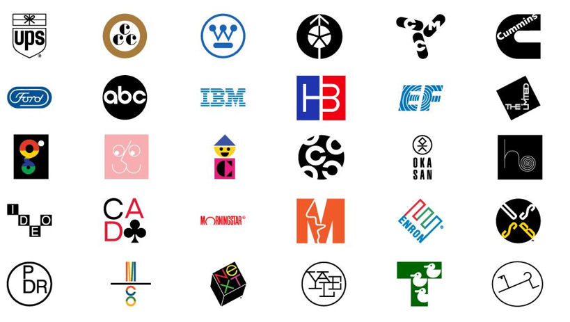 **FINAL PROJECT – Logos and Visual Identity**
Assignment specifications –
Part 1 – Students will create a fictional company. The company can produce any kind of product or service that you wish. Students will generate a description about the company, its products and services. The company will need a new logo and visual identity created from scratch to help bring its presence to life.
Part 2 – Creating a design brief and doing the research – Now that you have decided on the type of company, its products and services, who is the competition out there that already exists? What do those logos look like and are they effective? Who are your companies customers? What is the age range of your customer? Where will they find your business? Online or offline? Describe why. The more you know about your business, its products and services (and the believe in them) the more you can offer a solution to your client. A logo is usually the first thing that they will see. How will you grab their attention with your companies visual identity?
Part 3 – Sketch and development. Watch Draplin’s video (see the link below.) He has a great style and technique for the process. Create a series of sketches in pencil. I suggest making small thumbnail sketches as we have discussed in our class.
Part 4 – Iterations, variety and development, using art boards and making decisions on type, colors schemes and scale.
Part 5 – Production and application. Formatting business cards, letter heads and related usage for both print and the web.
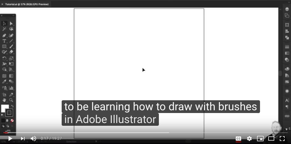
**We will be using Adobe Illustrator for this project from start to finish.
Inspiration, Resources & helpful Info can be found in Week 13’s post here


