
While Chrome is a good overall browser it continues to lag behind Firefox in tools to inspect your CSS Grid. This plugin is a step to bridge the gap: Gridman: CSS Grid Inspector. Follow the link when in the Chrome browser to install. Once you install it to use it […]
Resource
27 posts

Resources related to using media (images, video, audio) in your sites. ATTRIBUTION Even if the site does not require you to attribute the image, I am requiring you to do it for your web site projects. Images Where to Find Usable Images I collected a number of sites and resources […]
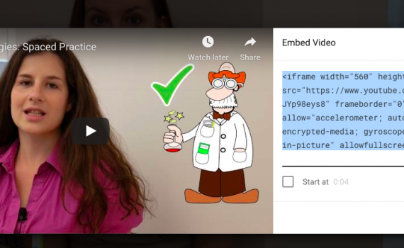
Here are some CodePens on embedding responsive Media. They all follow the same basic principle: Wrap the embed code (usually an iframe) in a div with a class and then do most of the styling on the div in your CSS. Responsive Video Embed With video, it is important to […]
When you use an image on a web site, you must obey copyright law and only use images you have an explicit right to use. So, searching Google Images is NOT the way to find them (unless you take additional steps shown below). The general rule of thumb is: Only […]
Here are the steps to convert a project that doesn’t use Sass to use Sass. Step 0: Make sure you can compile Sass If you haven’t already figured out a way to compile (technically transpile) Sass into CSS then you need to do that. The simplest way is to use […]
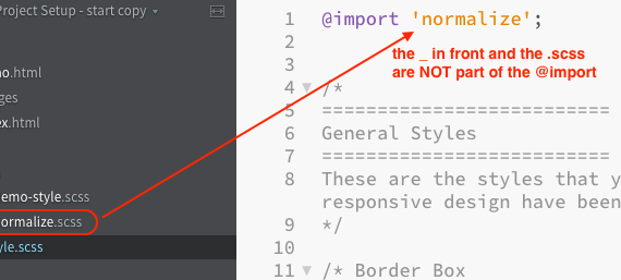
When you write in Sass (SCSS) you need to have those files converted (transpiled) into CSS. Scout App, is a quick way to do this. This video walks through installing Sass on macOS. Note that you can install Sass on the Desktop or Documents so you can add it to […]
Every website uses anchor tags to style links. This is an example of a way that you can use Sass to quickly style links. You can define the link color with your other colors for your site and then by changing the Sass $link-color variable you’ll change the color for […]
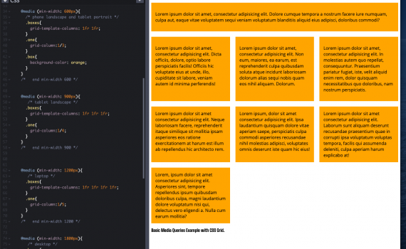
In order to have a fully responsive web page you need three things: Fluid Layout: the width of the layout is set in fluid units like percent or fr units. This allows the layout to expand and contract to fit the width of the browser window. Flexible Media: images, video […]
These files can help with the midterm Base HTML You can copy this Gist and use it as the base HTML for each file: open Gist. Remember to click the Raw link before copying. Navigation This post shows two simple ways to add in your navigation: https://openlab.bmcc.cuny.edu/mmp-240-fall-19-stein/2019/10/28/simple-navigation/ Midterm Content This […]
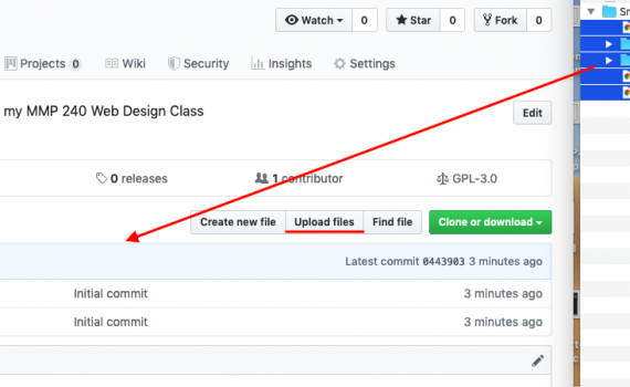
This tutorial shows the simple way to create a GitHub repository and upload files using the GitHub web site only. It’s meant to be a first step and a quick way to get your files onto GitHub and able to publish with GitHub Pages. As you learn more we will […]
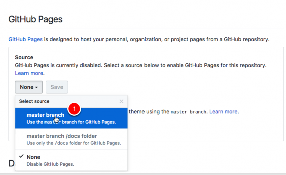
This page describes how to publish a site using GitHub Pages. The same information is presented both as a video walkthrough and as written instructions. Video Walkthrough Written Instructions Publish a Web Site on GitHub Pages GitHub allows you to publish your public repositories on the web using what they […]
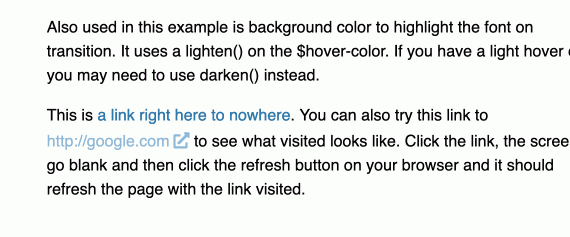
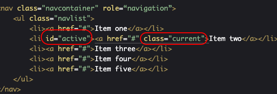
Links on a web page are made through an anchor (a) element: When we’re styling them in addition to styling the basic a element you can also style different states of the link: visited: what it looks like when someone has already cliked the link before hover: what it looks […]
The basic way to use this principle is to pay attention to the spacing around your elements. If a few elements are all in a group and related to each other then the spacing between them should be less than the spacing between the group and the rest of the […]
The examples I’m going to use are from the Listamatic web site. http://css.maxdesign.com.au/listamatic/ This site is out of date, but in this case that’s a good thing. It means that our navigation will work in older versions of browsers. Navigation is essential to your site and you want to make […]
Class on 10.23.19 Quizlet We will start with the quizlet live games How to get on: Download the app and put in the code I will show on the board. Search for Quizlet in your App Store Go to quizlet.live and enter the code I will show on the board […]
A big part of graphic design in general and the web design we do in this class is communicating a message to a particular group of people (audience). The Gestalt Principles were created to help explain how people make sense of what they see. They are particularly useful for web […]
There are times when you need to save or send an entire folder of files. Also, sometimes you need to make a file smaller in file size. Compressing or zipping the file is a way to be able to do both. In this class you may be asked to submit […]
The content for the midterm version of the web site can be found in the Word files in the Dropbox folder linked below. You will download the files and then convert them to HTML. We will cover this in Class 12 and Class 13 and the initial conversion is part […]
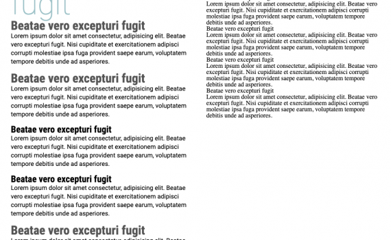
This post presents the basics of typography through a set of rules to follow. Like all rules they are made to be broken, but you should learn them first before you start breaking them. If you follow these rules your web typography won’t suck. It will most likely be pretty […]
These are some of the more commonly used properties for typography and creating typographic hierarchy. Font (Typeface): This controls the font that is used. Also see the information on fonts in the CSS section of the Web Design Resources. CSS Property: font-family Example: font-family: "pt sans", sans-serif; https://developer.mozilla.org/en-US/docs/Web/CSS/font-family Font Weight This controls the weight (boldness […]