Assignment #2 – Elements & Principles

Assignment #2 – Elements & Principles

Assignment Specifications: Students will generate a series of visual examples and solutions to define, communicate and illustrate the vocabulary of the elements & principles of design. Each term will display a visual example using the vocabulary below:

Elements – Color, Line, Mass, Movement, Space, Texture, Type & Value

Principles – Balance, Contrast, Direction, Economy, Emphasis, Proportion, Rhythm & Unity

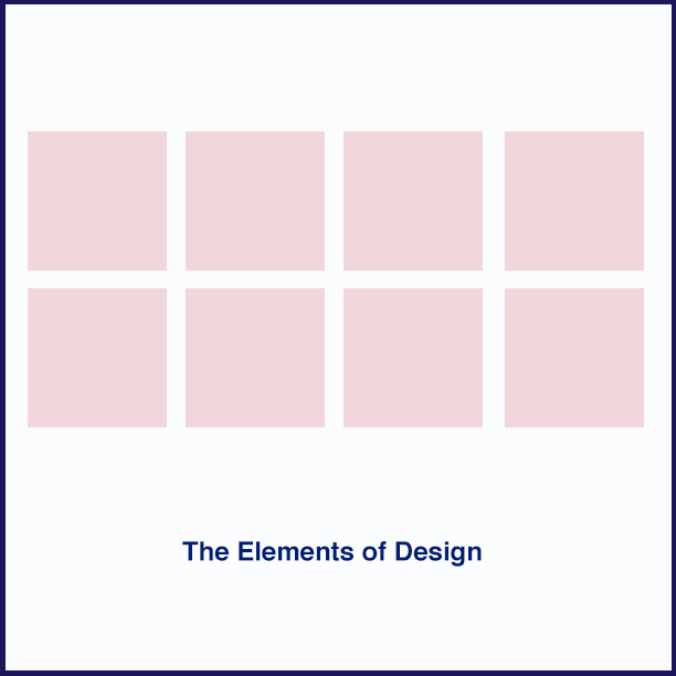
Size: – 8.5″ X 8.5″ – The final suggested design will be 2 composites of 8 squares composed and arranged by each student. (2 files will be created)

Working with Photoshop – Lets apply additional layers, filters and image manipulating techniques to customize our progress. Class demonstrations will take place on 2/13.

Process: 

Part 1 – Student will first create a balanced layout in adobe photoshop. Images will be found from research and investigation via the Internet and class resources. Each term for the elements of design of design will be illustrated and applied by cutting, formatting and placing the example into a composite (the example below is simply one example, you can create your own)

Part 2 – Students will generate their own examples of each term using techniques learned in class with photoshop.

R&D – Where will you find visual inspiration and research? Add your links to the comments section below.

Production:

Students will prepare their final works in screen resolution format and  application on the web (RGB).

Due dates for next week: We will be starting and working on and this project in class  beginning 2/13. The project will be due, completed and submitted by Wednesday 2/27

Blank Template example of the layout. (not including the border around the image)

Assignment #1 – Post Card

Assignment #1 (Part 1) – Post Card Design

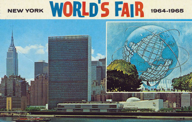
We will be designing a standard sized Postcard to promote and communicate one of the following messages below (students must choose one)

1– A cause or message that you are passionate about –

OR

2 – An up and coming event that you would like to promote

Assignment Specifications:

Size: The final design will be 4″ X 6″ in size. (Students should decide on the arrangement of the height and width, will your postcard be a horizontal or vertical image? You will be designing both the front and back side of the post card with the full intention of mailing it so space must be allotted for the address and postal stamp.

Process: 

R&D – Where will you find visual inspiration and research? Flickr? NYPL Digital Archives?

1 – Thumbnail sketches – Students will generate a series of 2-3 thumbnails sketches using a pencil / pen and their sketchbooks to brain storm and illustrate their process.

2 – Roughs – Students will select from the 2-3 strongest thumbnail sketches and develop them into 1 rough scaled to the 4″X6″ size in pencil or “other medium”.

3 – Students will be encouraged to produce a final comprehensive pencil rendering scaled to size ready for scanning and application using photoshop. Students will experiment with various image manipulating techniques and styles to develop contrasts and visual interest.

Production:

Students will prepare their final work for both print out up in (CMYK) as well as presentation and application on the web (RGB).

Due dates for our next class week: 

What images will you be referencing and using? Where did you find them? Are they free to use, if so, how do you know? Please bring all of your resources and research to class. Thumbnail studies and a rough lay out will be due at the beginning of our next class 2/6 – @5:30pm

The final Post card will be completed, printed and presented in class on 2/13.