
Hey Hey, Welcome back to MMA100 Weeks #6 & 7!
Here is this week’s useful information and class resources: Please keep in mind, there is a lot to see here below, take your time through out each week to explore what is below, if you have any questions or reactions please add them to the comments section. The comments section is helpful for extending our in class dialogs and gaining clarity by organizing your thoughts in a written format.
*Did you miss the post from Weeks #4 &5 – go Here!
The Zoom recording for class on 10/13 is below:
Passcode: 5X5?&q3B
Zoom Recording from class on 10/20 – Intro to Adobe Illustrator & assignment #3
Passcode: *7z^JPnj
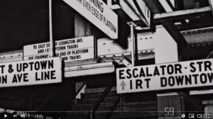
Lets jump back in and start with some NYC Design History!! Behold, the NYC Transit Authority Graphics Standards Manual. See below

Inspiration – The NYC Transit Authority Graphics Standard Manual
The link above will you take you to a page with an active full PDF version of the manual. I would like for EVERYONE to please leave a comment at the bottom of this page after exploring the manual and answering the questions below (you can work on this outside of class over this week or next)
Designed by Massimo Vignelli and Bob Noorda, Unimark, 1970
I would love to hear your reactions and feedback in the comments section below!
**after you “post” your comment I will have to manually approve it – you may not see it show up right away. No need to post the comment twice 🙂
Some Questions to ponder and react to:
- What is your general feedback on the manual? Do you like it? Dislike it? Please Explain. Do you find it to be well designed, illustrated and clear in its application?
2. The manual was published in 1970. Does it still hold up for today’s world? Why or Why not?
3. What is missing or should be added for today’s world to help and expand the NYC Transit System?
4. What additional questions are you left with?
Video – Micheal Beruit from Pentagram Design discusses the manual here – Link to the video above – https://www.youtube.com/watch?v=Qg03z1H6cfA
Imagine being offered the opportunity to visually solve, design and illustrate the entire NYC transit system!? What goes into this process and research? Do you know who is responsible for this? How much does the designer charge for a project of such scale? Lets dig in and discuss.
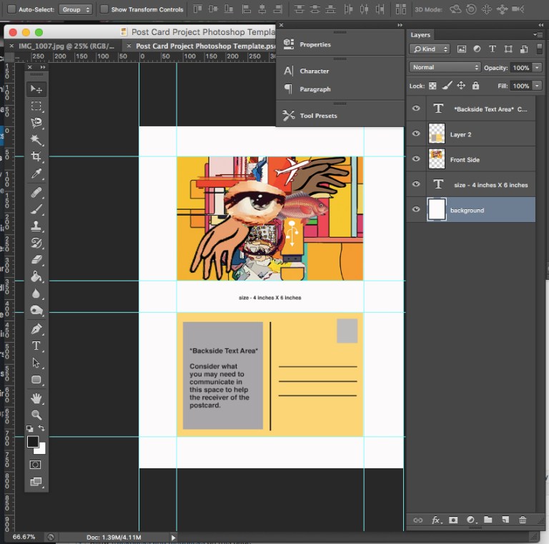
Last week we continued talking about Assignment #2 – The Post Card project ! Lets look at student work and talk about your progress and the potentials of the project. There is a lot of room for image manipulation and creating aesthetics with your work. Students will share their work via Zoom. Discussions about presentation methods and why presentation is so important. Please navigate to the assignment #2 page to view the assignment details with me again.
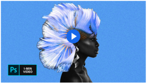
Tonight’s Video tutorial will cover some image manipulation techniques and applications.
Photoshop Video Tutorials –
- Creating Layer Masks / Photo Composites – The video below is great example – click here or the image below to view it.

2. Double Expose Technique – Click here or the image below to get started
The Zoom recording for 10/13 is below:
Passcode: 5X5?&q3B
<———{ week 6 transmission snip }———–>
Color Theory!
Adobe’s awesome Color Wheel Simulator (must see)

Several up and coming assignments will surely benefit from the use of understanding Color Theory and the Adobe Color Wheel!

*Above – Color Theory Continued -> GREAT RESOURCE – Must Read

*Above – Color Theory Continued -II >https://99designs.com/blog/tips/the-7-step-guide-to-understanding-color-theory/
Let’s Talk about Adobe Illustrator!
During week #7 we will take a class tour of Adobe Illustrator and get talking about Assignment #3
You can also take an additional tour with Adobe Wizard – Terry White
10 Things Beginners Want To Know How To Do with Adobe Illustrator (subscribe to Terry’s Channel!)

Adobe has a great series of videos on their channel on YouTube:
Check this series with a focus on Illustrator
https://www.youtube.com/c/AdobeCreativeCloud/search?query=illustrator
Designer Inspiration :: You need to know Paul Rand
Wow, a ton of things went into making the graphics in the subway system. The manual is very precise so there’s no error when you need to recreate an old/damaged sign in the subway.
Only thing I’ve never liked is the sticker line map (shown on page 76). It’s still on the older train models and its hard to see from afar and when crowded. Of course, they have changed the inner train station maps to be digital and that helps a lot. Now the robotic conductor clearly says the upcoming/current station which is a huge improvement from the past.
Not everything has to be digitized as most signs you see in the station aren’t yet. But I believe they chose the typeface because it is easy to read and not difficult to get around with practice.
Well said! Great points here! The NYC subway made Helvetica famous! :))
The Mta manual is very thought out and put together so it could be easy to read, watching that video and seeing how difficult it was to get around in the train system. i think it does hold up with todays illustrations because of how well thought out and designed it was looked modern.
Paul Rands work is so amazing, i honestly feel he was very ahead of his time, he has so many design works that are being used to this day, he really went out of the box with many designs my favorite logo has to be the NEXT logo, the little booklets he made as well was phenomenal, step by step to the logo design was brilliant, so simple and effective.
Indeed! Glad you enjoyed the content! Well said!
Being from a different state, Hawaii, I was always impressed with how city kids instinctively navigate the subway. Nevertheless, at the same time, I was fascinated by the number of people from New York City who did not know how to drive. In those early years of living in Manhattan, I found the NYC subway system highly confusing. It was so intimidating that I avoided the subway at all costs for the first 20 years of living in NYC (1995-2015).
After diving into the NYC Transit Authority Graphics Standard Manual, I realized that riding the train is not instinctual but an effort by designers Massimo Vignelli and Bob Noorda. In the 1960’s they reinvented an outdated and perplexing subway system.
My appreciation of the efforts by Vignelli and Noorda grew deeper after watching the following video – https://www.youtube.com/watch?v=Qg03z1H6cfA.
After diving into the NYC transit manual, I have a new profound appreciation for the serious attention and analysis they poured into a highly dysfunctional subway system. I can only imagine what it would have been like to navigate before the ’70s.
I admire all the new technology implemented into the subways, such as automated displays which update travel delays or emergencies. However, I think both Vignelli and Noorda created a comprehensive system that still functions today because of its simplicity and directness. It is fascinating that 50 years later, their manual is still guiding this massive transportation system and steering the footprints of everyday NewYorkers to their offices and schools.
I do not have many critiques for the way information is presented in the modern NYC subway system. Instead, the critiques I have reflected the cleanliness and safety of the subways.
Excellent! Thanks so much! I can imagine, for an out state (or country) person to visit the subway system here in NYC for the first time, it must be super intimidating! I have many friends who have shared a similar story of avoiding the subway for many years while living in the city. The video is helpful for the context for sure, Im curious how things will update in the future, will they keep the integrity of manual in terms of format and style but simply update to digital monitors? We shall see!
It is impressive to see how much thought and attention to details were necessary to create a subway system that works! The manual specifications certainly lead me to appreciate better the way typography and size are being used, color combinations, the position in which certain signs are displayed to be seen easier, and the minimalistic and satisfying geometry of the entire design.
Even though the manual was created decades ago, it is totally functional and helpful today because your smartphone can tell you what train to take or the station’s location, but some stations are very big and you don’t necessarily know what train goes uptown/downtown, what platform to go or even how to get there. Also, there are different types of signs that give instructions in case of emergency, tell you what is allowed and forbidden in the system, what days the trains run local/express or when to take them at a different platform, etc.
There are elements that have become obsolete or replaceable, like the telephone sign or the directory in pages 75 and 79 of the manual. Now we have maps that show all the trains destinations and stops, which is really helpful for visitors and new residents. On the other hand, there are elements that have been added, like COVID safety measures or digital screens that deliver different messages. However, most of the elements and aesthetics of the original design remain the same.
Overall this manual was a great way to open my mind to think more about details for my own designs. Thank you for sharing it with us!
Thank you! Yes, so well said, indeed, it is funny how some things are totally obsolete now like the telephone signs.. (as well as many of the older subway lines themselves!) I also believe there is a lot to learn from this manual and the planning, process and thoughtfulness itself. Im excited to see how this all upgrades in 5-10 years!
I really enjoyed going through the manual. As a non New Yorker the subway always amazed me because it is something we do not have in Venezuela. They way it works, how fast it takes you from point A to point B, and how well indicated everything is (something that helped me a lot during my first year here).
The design is very simple but straight to the point which I believe is what the designers wanted to achieve, something for everyone to understand. The Typography is something that I enjoyed looking at. The fact that they used the same typography throughout the subway system, same colours, and styles.
Even today in 2021, the manual is still relevant, the subway system still works and it is understandable. Also, although they have kept the core of the design, they have updated a few things to match our era, such as, taking down the telephone signs, adding the subway map both on the platform and subway, and recently adding COVID safety information shown on smart tv stand in the middle of the platform. I would not changed anything from the current subway system but I do wonder why is it that the city does not take better care of it by keeping it cleaner.
In conclusion, I was really an eye opener to see the hard work behind the creation of the subway system, and it has made me appreciate the subway even more.
Wonderful! Thank you for the thoughtful response! :))
I really love and enjoy the manual, I was fascinated by It’s Designs, color coding, color swatches, Type face, Type sizes, alphabet upper and lowercase numerals. Using the nyc transit as a kid, I was always running around, having fun as if I was in a mystical underground city, I really like it. It’s well design, illustrated and clear in it’s application. The manual still holds up for today’s world, anyone who has yet to read the manual would know it’s as exciting as ever. I’ll have to agree with Jaquelyn that the city should start taking care of the nyc transit system by keeping it clean. I have no other questions other than falling in love with the design over and over again. Looks like It’s time for me to run and have some fun and be a kid again! See you later.
Excellent! Haha, I totally agree, as a kid the subway seemed like its own little city under the city, it activate my imagination! Glad you enjoyed the manual!
I love the “Creating Layer Masks” video tutorial. It’s amazing what layer masks can do, especially when applying the Brush Tool and exchanging the color swatches for the foreground and background using the x key as well as using the Bracket keys to change the sizes of the Brush Tool. I like how it talks about a really important concept, where white reveals the layer and black conceals it, allowing you to see through to the layer underneath. I also love the Photo Composite tutorial. Seeing a bettafish.psd file onto a character and using the move tool and clicking the Show Transform Controls to rotate and warp the bettafish and applying a layer mask and selecting the Brush Tool to change the general brushes to make changes to the artwork was very unique.
Great! I love all these little tricks too, especially the keyboard shortcuts (like making the brush or eraser size larger with the bracket kets!) that save time and movements! lol 🙂