Quick Design Check
- Are the site title, header/nav and footer consistent on every page?
- Can people tell one section of the page from the next?
- Does the typography express the correct feel for the site?
- Have you used color to help set the right mood AND to convey information (information hierarchy, page sections, highlight important info)?
Examples
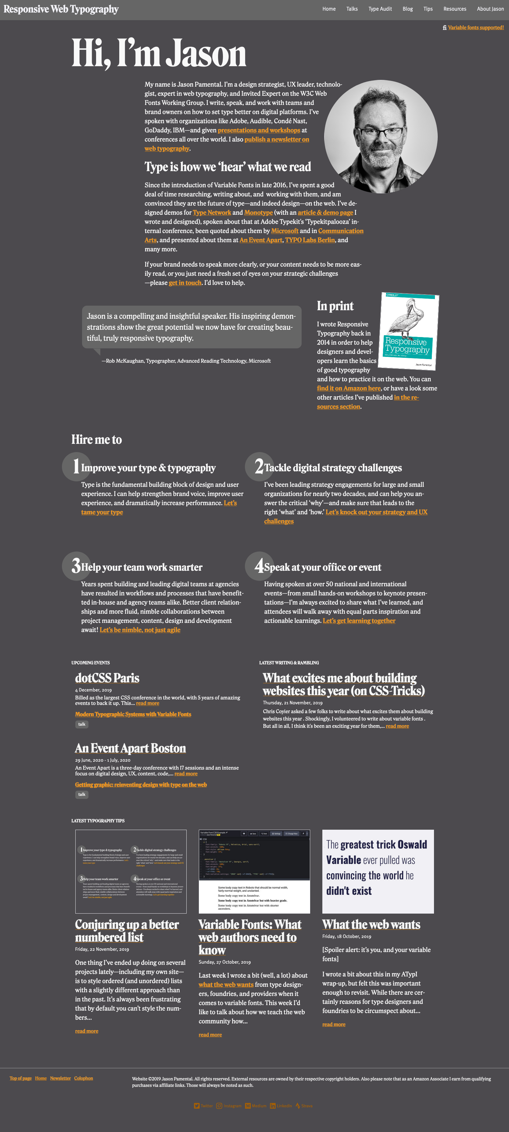
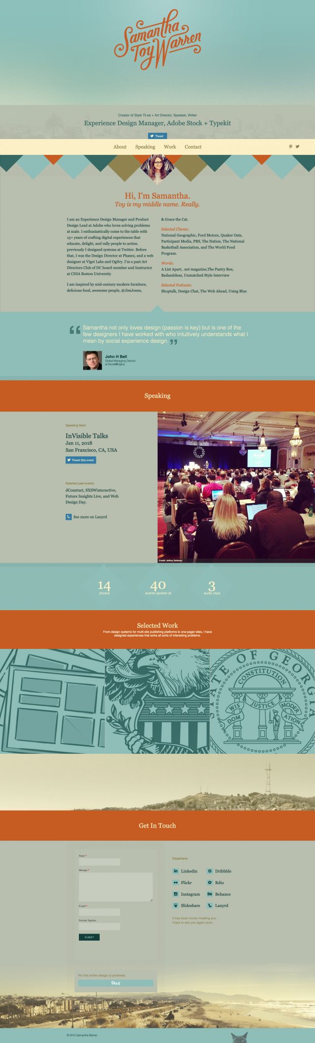
Consistent title/header/nav/footer. Jason Pamental’s Responsive Web Typography site. This site does it simply with a different background color in the title/nav and a simple line above the footer. This is an example where the page title is larger than the site title (Responsive Web Typography. Click on images for larger view.
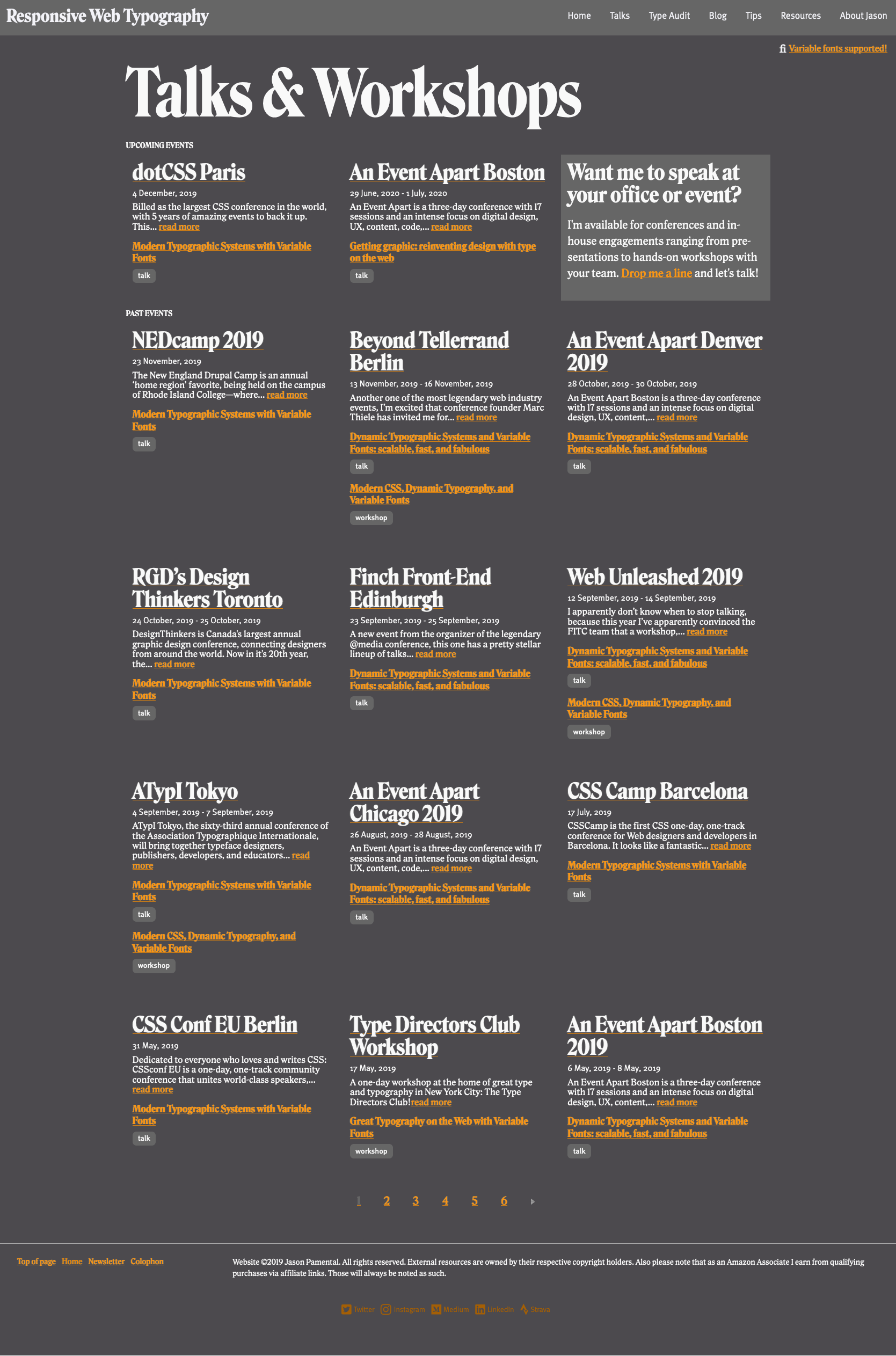

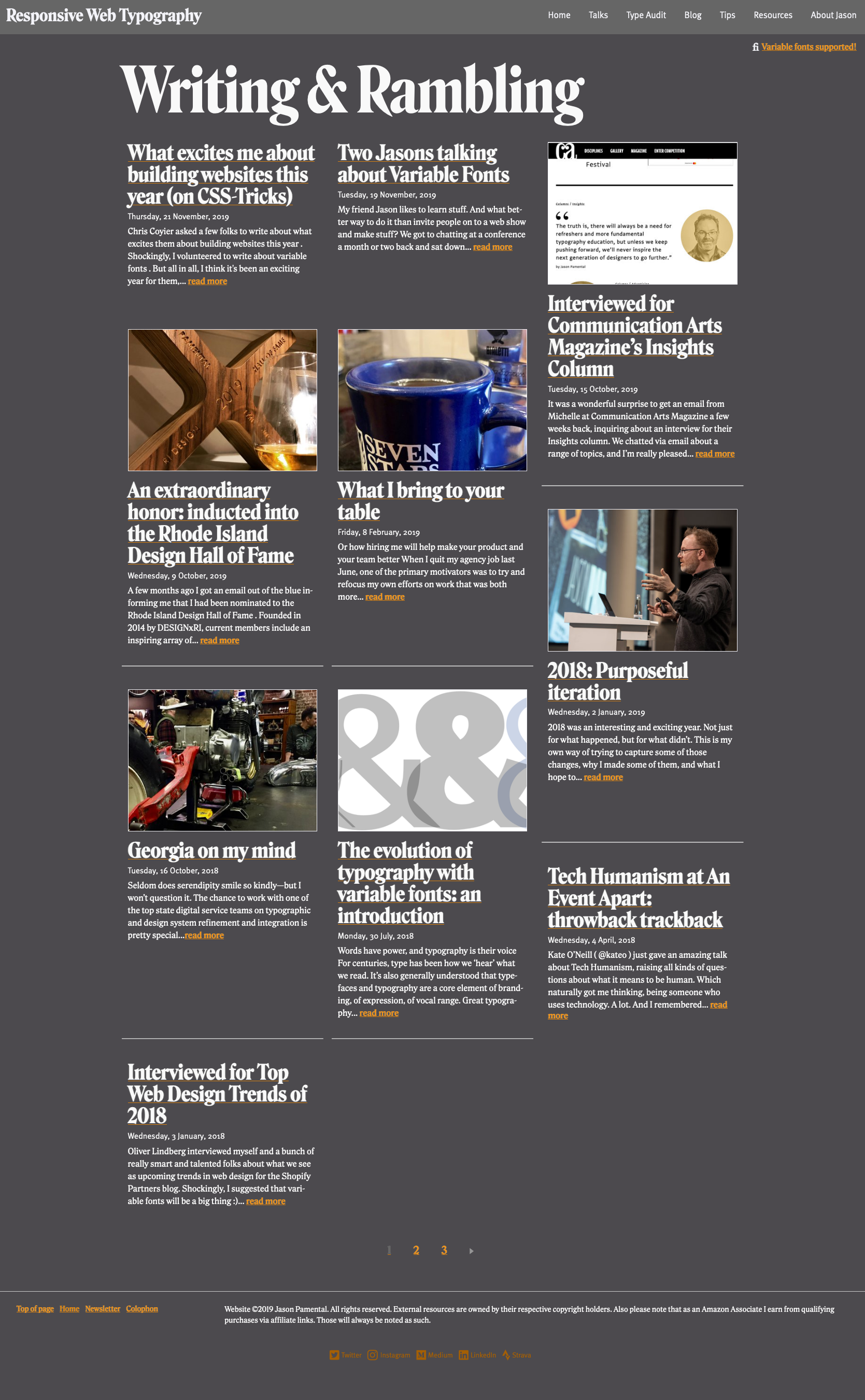
These examples show different ways to separate page sections, mostly with: Color, Spacing or Lines
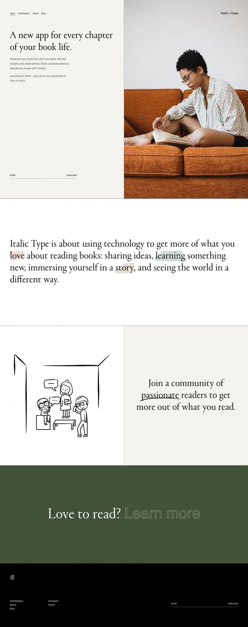
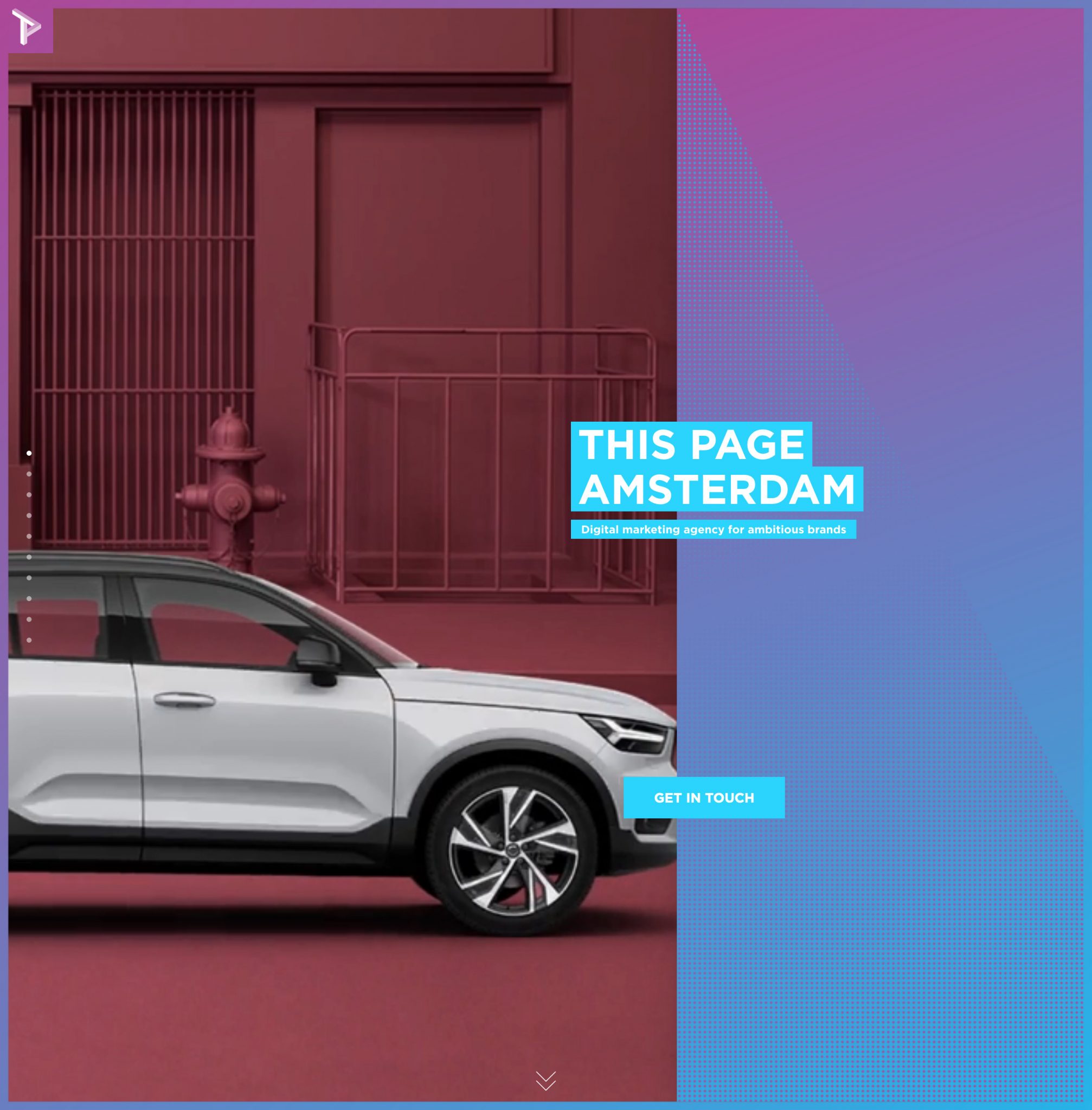
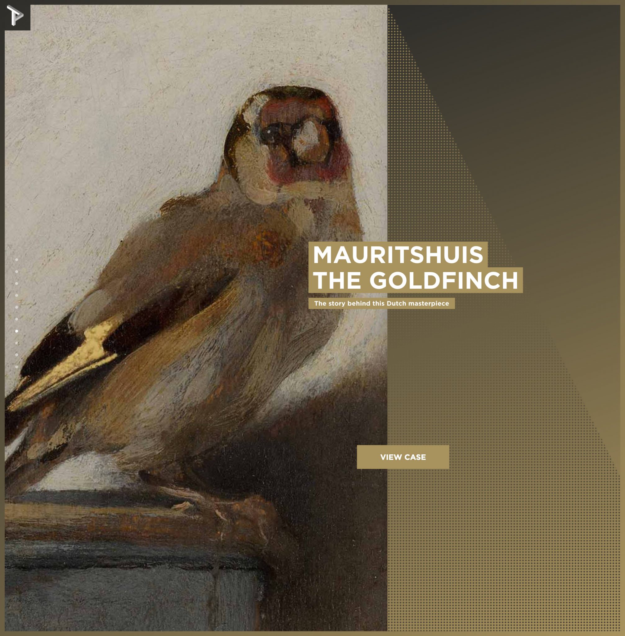
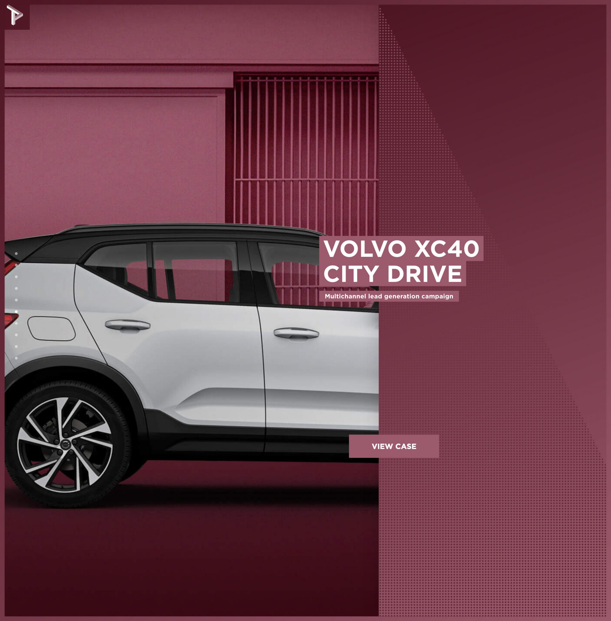
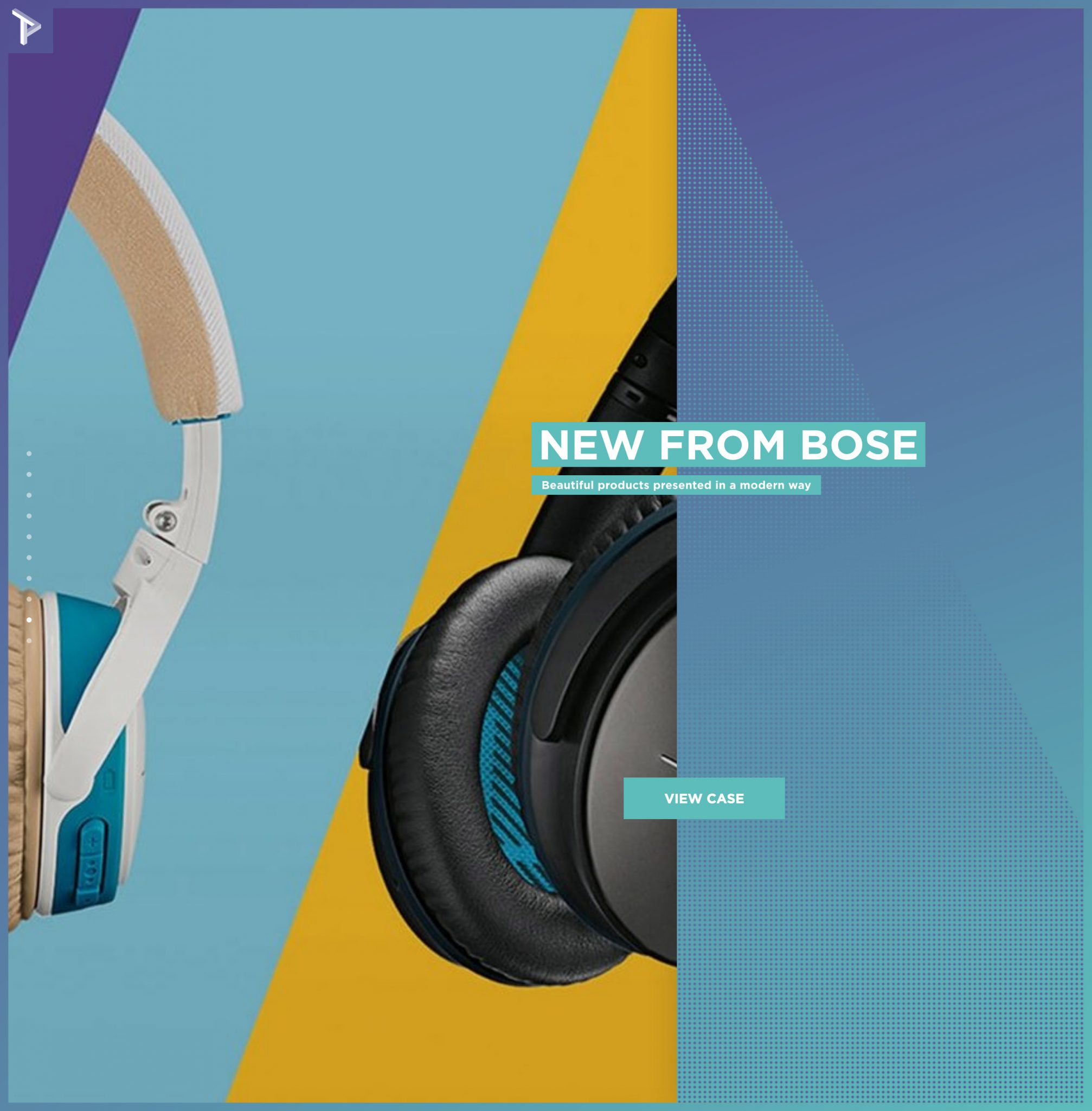
These examples from https://thispage.amsterdam show color used to match images. Also, when your color and images are bold and energetic, sometimes it’s best to use a more neutral font, like they did here (Gotham Bold).
Gestalt Principles
Throughout the semester we’ve gone over some of the Gestalt Principles. These are a fundamental part of design as they deal with how people understand what they see. They work best in combination with other aspects of design. You need to know you content and also the goal of what information or feeling you want to convey to your audience. Then once you’ve determined which content is more or less important and what should be grouped together you can use the
View Gestalt Principles post.
Inspiration
Visit web sites and look at how they are tackling challenges and checking off the areas of the quick design check above. The sites below are a few examples of places that gather links out to good design.
- https://muz.li/
- https://dribbble.com/ [https://dribbble.com/shots/popular/web-design]
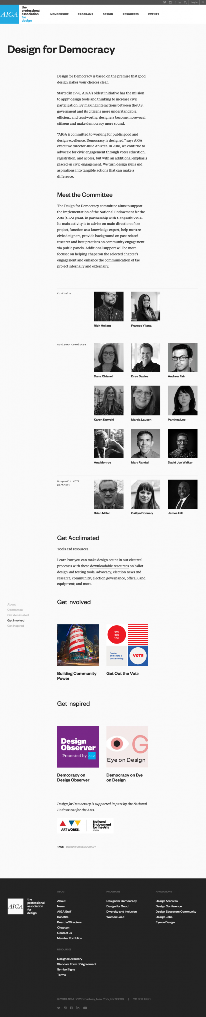
- https://www.aiga.org/
- https://www.behance.net/galleries/interaction