Here are some CodePens on embedding responsive Media. They all follow the same basic principle:
Wrap the embed code (usually an iframe) in a div with a class and then do most of the styling on the div in your CSS.
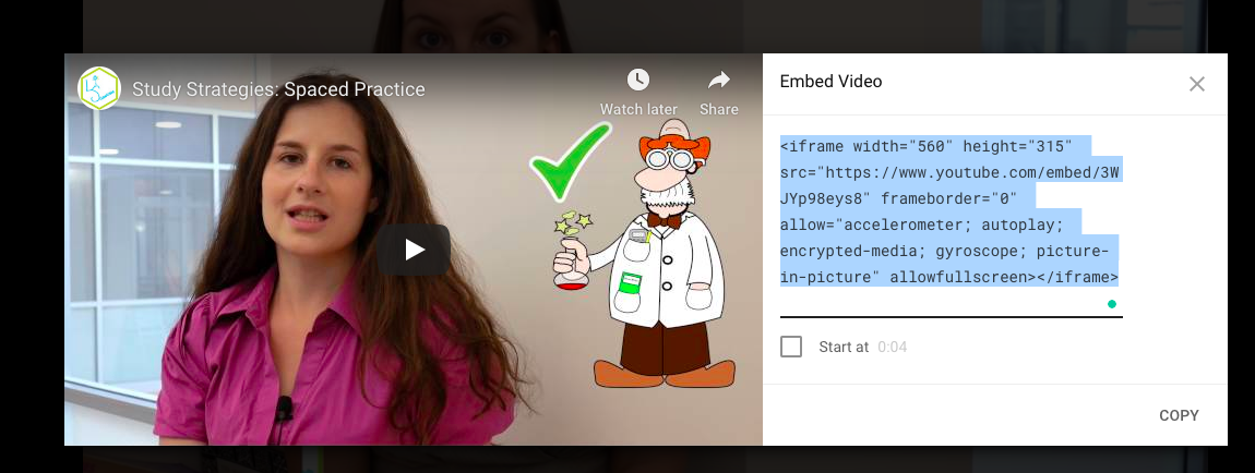
Responsive Video Embed
With video, it is important to keep the aspect ratio (the relationship between the width and the height of the video) the same. Otherwise you will get black bars or stretching as your site changes width and the video tries to accommodate.
The CodePen below shows how to use a trick where you wrap the video in a div and then set the div height to 0 but include a bottom padding that is a percentage. Using a percentage in this way make the height a percentage of the width and so keeps the correct aspect ratio.
See the Pen Responsive Video Embed by Christopher Stein (@profstein) on CodePen.
Responsive Google Map Embed
This CodePen shows how you can embed a Google Map on a site in a responsive way.
See the Pen Responsive Google Map Embed by Christopher Stein (@profstein) on CodePen.
Responsive Google Calendar Embed
This CodePen shows how you can embed a Google Calendar.
See the Pen Responsive Google Calendar Embed by Christopher Stein (@profstein) on CodePen.

One thought on “Responsive Media Embeds”