A big part of graphic design in general and the web design we do in this class is communicating a message to a particular group of people (audience). The Gestalt Principles were created to help explain how people make sense of what they see. They are particularly useful for web design where we’re using a few basic items, shape, color, line, text, images, to communicate our message.
A brief history, the principles were created by German psychologists Max Wertheimer, Kurt Koffka and Wolfgang Kohler in the 1920’s to help explain how people make sense of all of the visual images that we see as we go through our day. They found that humans try to create order and meaning out of everything that we see. They detailed how we do this in a set of principles that are called the Gestalt Principles. For a long time, graphic designers have used these principles to help them make their designs easier to understand. To read more visit
Instead of listing all of the principles at once, I will add them here one at a time as we go over them in class. If you’re interested and want to skip ahead, you can read the resources linked to at the bottom of the page.
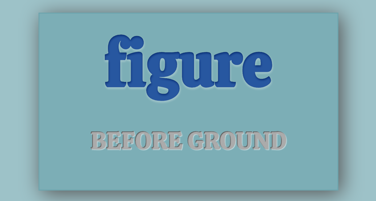
Principle 1: Figure / Ground
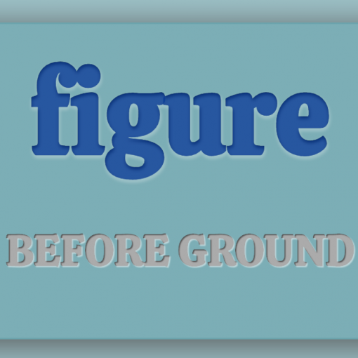
When we look at something we try to determine what is important and needs our focus, figure, and what is not important and we can ignore, background. Another way to say this is foreground (figure) and background (ground). If you’ve done art you might have also heard of positive space (figure) and negative space (ground).
Read the Figure/Ground post.

Principle 2: Proximity
Proximity is a simple yet powerful principle. To quote Andy Rutledge “things that are close to one another are perceived to be more related than things that are spaced farther apart”

Principle 3: Connectedness

Principle 4: Similarity
We tend to group things if they look similar to each other. These similarities can be based on a number of properties like size, shape or color.
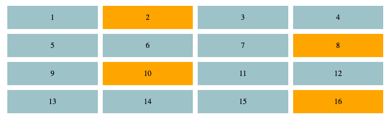
In typography, the most common properties to use are color, font-family, font-weight, and font-size.

Resources
Andy Routledge series on Gestalt Principles
- Figure Ground Relationships: https://www.andyrutledge.com/gestalt-principles-1-figure-ground-relationship.html
- Similarity: http://andyrutledge.com/gestalt-principles-2-similarity.html
- Proximity, Connectedness, Good Continuation: http://andyrutledge.com/gestalt-principles-3.html
- Common Fate: http://andyrutledge.com/common-fate.html
- Closure: http://andyrutledge.com/closure.html
Overview
- General overview and explanation of some of the principles. Includes a video explanation of the principles.
- https://www.interaction-design.org/literature/topics/gestalt-principles
CSS Box Model
- Mozilla Developer Network in-depth explanation: https://developer.mozilla.org/en-US/docs/Learn/CSS/Building_blocks/The_box_model
- CSS Tricks Explanation https://css-tricks.com/the-css-box-model/

One thought on “Gestalt Principles and Web Design”