
Images are by default inline elements that are a certain size and will take up that space on your web site.
For responsive web design we need our images to be able to shrink in size if the container they are in is smaller than the image. For example:
The following needs to be in place for that to happen:
- The image must be inside a container.
- CSS is applied to the container to give it a responsive width (ie it’s part of a CSS grid with an fr unit, or the container has a % width)
- CSS is applied to the image to allow it to change size to shrink if needed.
Put the Image inside a container
This is relatively simple. Just remember to use a block element like div, section, paragraph, figure. Also it should have a class applied to the container (not required but easier to style later).
<div class="imageContainer">
   <img src="images/myimage.jpeg" alt="image of something cool">
</div>

<figure class="imageContainer">
    <img src="images/myimage.jpeg" alt="image of something cool">
    <figcaption>Image of something cool by Awesome Person</figcaption
</figure>
Apply Responsive Width to the Container
This one is hard to show an example. It depends on how you’re doing the layout for your page. If you’re using CSS grid then just make sure you use responsive units, like fr, for the widths of your columns.
Apply CSS to the Image to Allow it to Shrink
Notice we did not say anything about growing. Generally, you DO NOT want the image to grow to fill its container. It could become pixellated and not look good. At first, we will load in images that are large enough to fill the space we need. Another post will show a more advanced responsive method that can load different sized images.
/* Basic Responsive Images and Video */
img,video{
  width: auto;
  height: auto;
  max-width: 100%;
}
Setting the width and height to auto allows it to change size. Setting the max-width to 100% means it won’t grow larger than its original size.
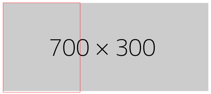
Here is an example of an image inside a container that is smaller than the image where no CSS has bee applied to the image:
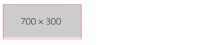
And here is the same image with the CSS applied


3 thoughts on “Basic Responsive Images”