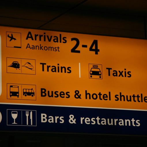
Most of the web is text so much of what you have to design is text. A typographic hierarchy helps the user to quickly scan a page and find information. Also, done right, it will make the page more visually attractive.
Typographic Hierarchy tells the reader two basic things:
- what text is more or less important,
- what kinds of text are on the page (titles, dates, links etc).
Altogether, this information greatly helps people to quickly scan the page, understand what it’s about and find what they’re looking for quickly.
Rules to Keep in Mind
Once you have a basic understanding of hierarchy keep a couple of things in mind:
- Know the Content. You can’t create a hierarchy for content you don’t understand.
- Make sure the most important items stand out from the rest.
- Each different kind of content needs a different type treatment (color, font, size etc).
- The same kinds of content should get the same type treatment.
Things you can style to show hierarchy
- Size: the bigger the text the more important it appears.
- [CSS Property Example]
font-size: 2rem; - Using rems allows you to make the sizes relative and consistent to the base font for the page
- [CSS Property Example]
- Color: different color makes items stand out or fade. Remember to keep contrast between text color and background color.
- [CSS Property Example]
color: #888888; - This controls the text color of elements with text.
- [CSS Property Example]
background-color: #000000;
- [CSS Property Example]
- Weight: The boldness of the text. You can only use 100,200,300,400,500,600,700,800 or 900. 100 is the lightest, 900 is the boldest. Default text weight is 400, default bold weight is 700.
- [CSS Property Example]
font-weight: 900; - By default in browsers text inside of <b> and <strong> elements is given a bold weight. Also many browser give bold weight to heading <h1>-<h6> elements.
- [CSS Property Example]
- Text Style: Here you add special styling like alignment, italics, and UPPERCASE.
- [CSS Property Example]
text-align: right; - [CSS Property Example]
text-transform: uppercase; - [CSS Property Example]
letter-spacing: .2rem; - [CSS Property Example]
font-style: italic;
- [CSS Property Example]
- Font: Changing the font itself is another way to differentiate text.
- [CSS Property Example]
font-family: Lato, Helvetica, Arial, sans-serif; - Remember to end the font-family stack with the appropriate one of these five generics: 1)serif, 2)sans-serif, 3)monospace, 4)cursive, 5)fantasy.
- [CSS Property Example]
- Distance/Spacing: elements that are part of a group should be closer to each other. Groups should have space betwen them.
- [CSS Property Example]
line-height: 1.5;- This controls the distance between lines in an element (like paragraph).
- [CSS Property Example]
margin-bottom: 2rem;- This controls the distance between elements
- [CSS Property Example]
- Repetition: style the same type of text in the same way.
- [CSS Property Example]
h2.article-title{font-size: 2rem;}
- [CSS Property Example]
Articles
Overall Typographic Hierarchy on the Web
https://webdesign.tutsplus.com/articles/understanding-typographic-hierarchy–webdesign-11636
This article does a good job of explaining typographic hierarchy. It’s part of a larger series on web typography so read more if you like.
General Type Hierarchy Article
http://thinkingwithtype.com/text/#heirarchy
This one isn’t as focused on the web but it has some great explanations and examples. See the Crime Blotter project examples at the end for how different the same piece of text can look based on different type treatments. Also, this is a great web site in general for learning about type in more detail.
Brief Video Explanation.
sThis is not as complete as the above article. It’s a quick intro at just under 3 minutes.


6 thoughts on “Typographic Hierarchy”