Welcome to MMA100 Week #11 & #12
Here is this week’s useful information and class resources:
*Did you miss Week #10’s Post? Go Here
**Lets talk about Exporting work from Illustrator into high resolution .JPG images that work best on the Web**
Week #11 – TYPOGRAPHY – Applying type to images, fonts, typefaces, composition, formatting and output for print & the web..
(click the images below to enlarge)
Typefaces and Fonts are built out of shapes and forms. Integrated with color and interesting compositions they become a powerful tool for creative output and the ability to solve design problems through visual communication.
Resources: https://www.creativebloq.com/features/font-types-a-designers-guide
Video Resources to explore:
https://www.youtube.com/watch?v=wOgIkxAfJsk&t=20s
https://www.youtube.com/watch?v=dZl5I_mbnwE
————————————–
Assignment #5 – PART 1 –
Assignment 5 – Poster Design with Type & the Alphabet.
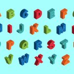
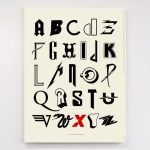
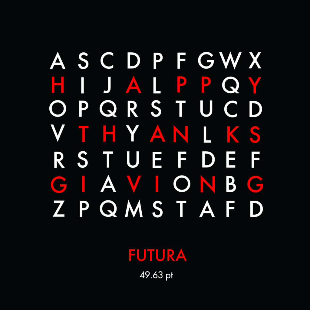
Create 3 (YES – three variations) a new poster design series using and applying balanced typography in adobe illustrator. Students will generate and demonstrate both a balanced and unconventional composition using each individual letter of the alphabet. (A-Z) The examples above are just a few potential ways to display style, simplicity, order and efficiency. A demonstration will be given in class.
Size requirements – 8.5 inches -X- 11 inches (or larger – 11″ x 14″)
Typefaces – Limit yourself to no more than 2-3 different fonts and 4 color values.
Step 1 – Find and discover your own inspiration and share the URLs in the comments section below. Each student will add 2-3 URLS of their inspiration in the comment section before starting this assignment.
Things to consider – Layout & balance – Using rulers, guides and grids. Free transformation & typesetting style.
*COMPOSITION and command over the picture plane and its chosen dimensions.
Step 2 – Students will create a new 11″X17″ tabloid layout set for print in Adobe Illustrator. Students will apply a series of their designs from part 1 into a collaborative magazine for print and the web.
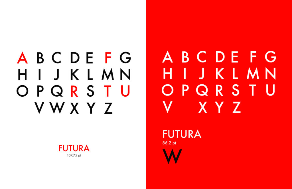
Typography Assignment – PART 2 – (as discussed in class on 4/10 and will continue on 4/17)
We will have a class critique on the Wednesday after spring break. A printed version of this assignment will be presented by each student. You will select two of your designs from Part 1 and print them as a single tabloid page.
Students will create a new 11″X17″ tabloid layout set for print in Adobe Illustrator. (You may use use multiple art boards to create iterations) Students will apply a series of their designs from part 1 into a collaborative magazine for print and the web.

*Student submissions of the completed project:
Students will submit both Part 1 & Part 2 of the project to me via e-mail saved as a .PDF file. Please send to – rseslow@bmcc.cuny.edu no later than Friday 5/3/19


