The examples I’m going to use are from the Listamatic web site. http://css.maxdesign.com.au/listamatic/
This site is out of date, but in this case that’s a good thing. It means that our navigation will work in older versions of browsers. Navigation is essential to your site and you want to make sure that everyone can see it (one of the reasons I don’t recommend using CSS Grid to style navigation unless you have a fallback).
There will be a couple of things we will change in the HTML and CSS
HTML Changes
One thing we will change is the element used to wrap the navigation. They use a div, we will use a nav element. We will also add our class and roles to it. They use IDs which means that technically you can only have one navigation list on the page. We will change those to classes so they can be used more than once.
HTML Code
You can use this code for both examples
<nav class="navcontainer" role=“navigation”>
    <ul class="navlist">
        <li id="active"><a href="#" class="current">Item one</a></li>
        <li><a href="#">Item two</a></li>
        <li><a href="#">Item three</a></li>
        <li><a href="#">Item four</a></li>
        <li><a href="#">Item five</a></li>
    </ul>
</nav>
EXAMPLE 1: Simple Horizontal navigation
The first example is just making the list stretch vertically across the page with no bullet points. [original listamatic page]
.navlist li
{
    display: inline; /* brings nav elements up next to each other */
    list-style-type: none; /* removes the bullet points */
    padding-right: 20px; /* spaces them out from each other. Adjust to suit your needs */
}
Here is an example on CodePen
See the Pen Simple Horizontal Navigation by Christopher Stein (@profstein) on CodePen.
EXAMPLE 2: Rollover Nav Bar
This example adds background color to make the nav look more like buttons. There is also change of color for rollover. [original listamatic page]. You can change the background-color and color settings to match your web site.
.navcontainer ul
{
    padding-left: 0;
    margin-left: 0;
    background-color: #036;
    color: White;
    float: left;
    width: 100%;
    font-family: arial, helvetica, sans-serif;
}

.navcontainer ul li {
    display: inline;
}

.navcontainer ul li a
{
    padding: 0.2em 1em;
    background-color: #036;
    color: White;
    text-decoration: none;
    float: left;
    border-right: 1px solid #fff;
}

.navcontainer ul li a:hover
{
    background-color: #369;
    color: #fff;
}

/* change current item to be the highlighted rollover color */
.navcontainer ul li a.current {
    background-color: #369;
    color: #fff;
}

/* NOTE: to be save add the following to the block element right after the Nav in your HTML. Change .WhateverNextElementIs to a selector for the element. */

.explanation {
    clear: both;
}
Here is an example on CodePen
See the Pen Rollover Navbar by Christopher Stein (@profstein) on CodePen.
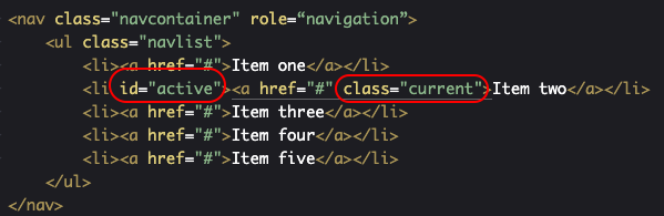
If you use the code as above that highlights the active page then you have to move which element of the nav gets highlighted for each page on your site by moving the #active id and .current class to the appropriate li and a elements. This image shows the parts you need to move circled:
If you don’t want to have a highlighted current nav element then remove or comment out this line:
/* change current item to be the highlighted rollover color */
.navcontainer ul li a.current {
    background-color: #369;
    color: #fff;
}
2 thoughts on “Simple Navigation”