Respond to at least 1 prompt on this page (you are welcome to respond to more). For instructions on how to submit a journal entry, please follow these instructions. FORMATTING FOR THIS WEEK: Use the title format “[FirstName] [LastName] W9” and select the Category “Journal Entry – Week 9”
Prompt 1
Work from the UPA studio was noted for its use of color, abstract patterns, stylized drawing and limited movement. Watch “Rooty Tooty Toot” in it’s entirety. Describe how it uses color, patterns, drawing and movement. Do you think it is effective and tells the story using these means? Why?
Prompt 2
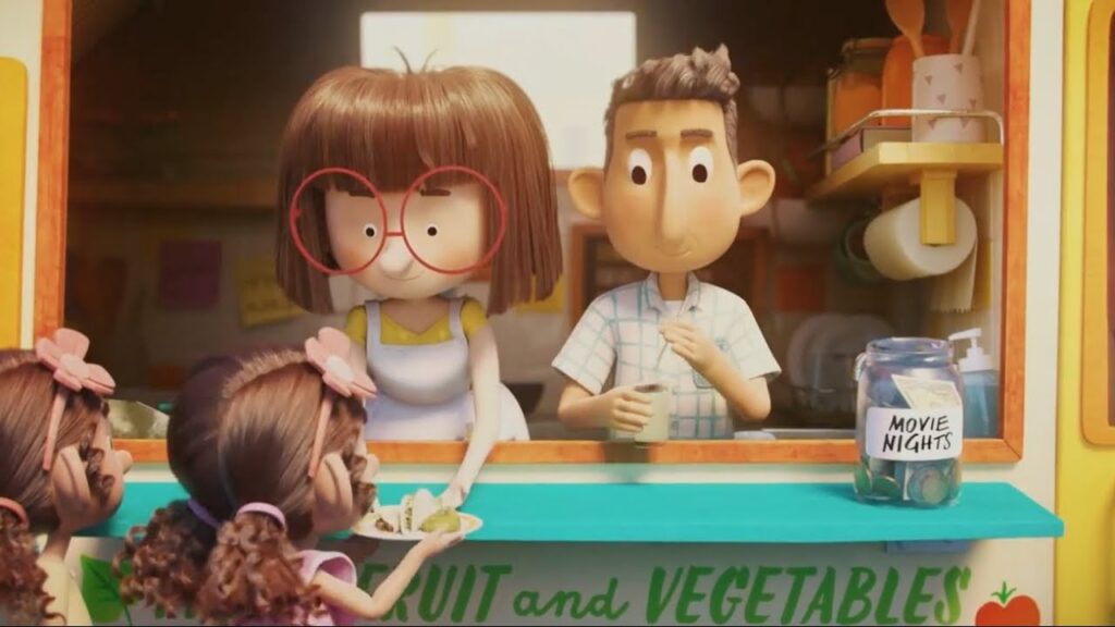
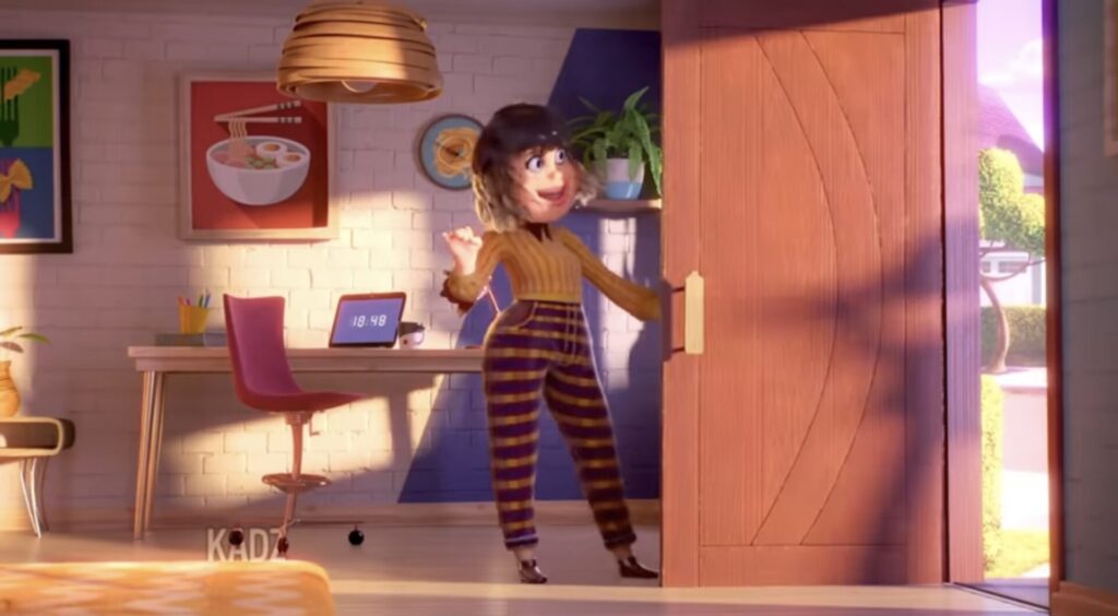
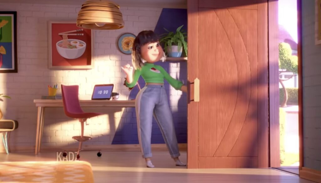
We see that animated advertising became more prominent during this period. Pick an animated current commercial. Write about why you think it works, or doesn’t work, in terms of movement, color and storytelling. Include screenshots.