Daily Archives: April 12, 2022

4 posts

Melissa Guri-journal entry-week 9-prompt 2

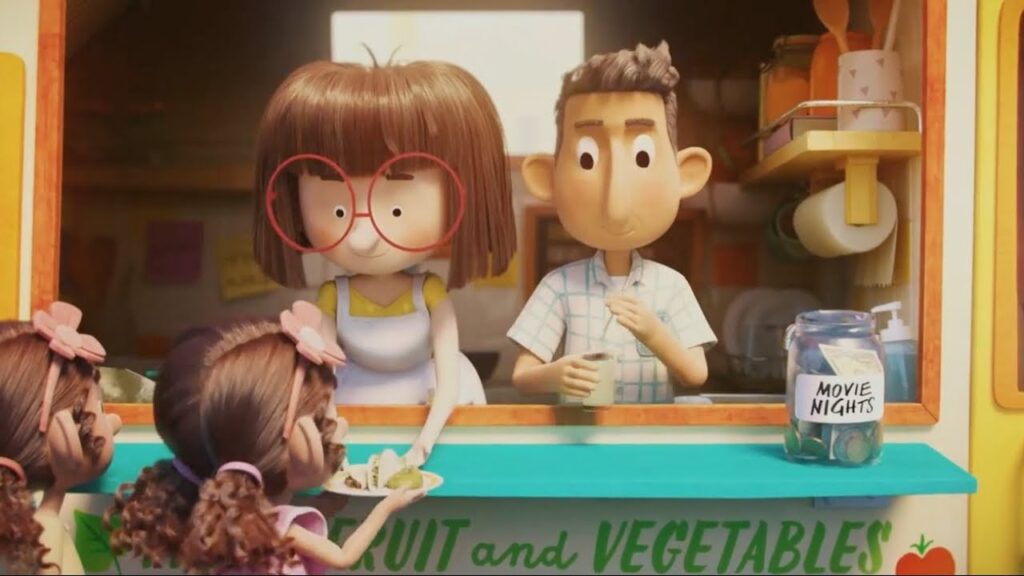
Here we have an advertisement for Chipotle. It’s very colorful and the quality is good. The people seem to appear with the same body and face shape as we are used to seeing them in cartoons and other animated films. I think that now the advertisements are being represented in very simple, short and attractive forms so that everyone can be interested in it. Also, it is important to show care for the customers which this picture shows very well.

natalia ruzzi – W9 Prompt 1

“Rooty Toot Toot” is for sure an animated feature for adults, even with its simplistic style. All its characters are sort of geometrically shaped, like the Mr. Men cartoons, but differs in that it has a sort of water color look to it. The short looks as if it was painted then the lines were drawn on in a thin black pen, or vice versa. Because of its rather artistic look, I think this is what separates it from being too “child-like”, on top of what the characters are singing about. As for colors, everything is muted and moody; none of the colors in it could read as happy in anyway. Theres often monochromatic scenes, like one blue one for the past, where a character will just be fully white in order to stand out. I quite like the contrast of these scenes, as it makes me feel like thought was put into each design aspect. All the characters have some movement quirks to accentuate what they are saying, like the woman witnesses’ arms moving in a spiral as she sang. While this sort of thing would usually be attributed with kids cartoons, I think it just keeps the viewer interested by following the 12 principles of animation. I think all of this together makes the video fun to watch, and helps it hold up even today because of its unique style you don’t see much anymore.

Yusuf Aldacher W9: Prompt 2

The UPA cartoon studio animated short films for advertising products like snacks and drinks. One animated advertisement “Nabisco Snack Crackers Triscuit” advertised a diverse amounts of crackers by Nabisco company that was being advertised by UPA cartoon studio. The reason that these animated advertisement worked is because they appealed to younger audience that were children. The simple cartoon characters, the black and white background was something that entertained children even during the time of 1950’s where cartoons were very popular amongst children. The whole focus of the animated advertisement were the products that were being held or shown by the character of the animated film.

Tyree McQueen W9: Prompt 1

UPA studios employs a variety of distinctive forms and design choices in “Rooty Tooty Took,” which not only adds eccentricity and vitality to the animation but also complements the narrative being delivered. At first sight of the animated short, I was struck by the visual styles of the characters, which appeared to be heavily influenced by art deco and modernism. This may be seen in the geometric, streamlined shapes of the characters since the majority of the aforementioned characters are quite angular and have a smooth-lined, sleek appearance, as well as the bold, polychromatic hues utilized to accentuate the characters, as well as the background setting. Given the prominence of art deco, impressionism, and modernism in the 1920s and 1930s, particularly during the roaring ’20s, it’s understandable why the symmetrical and linear characters and settings inspired by said era are accompanied by swing jazz-inspired music that both sets the tone for the animation and serves as a storytelling mechanic.   With music playing a significant factor in the tale being told, it’s clear why the authors chose this strategy; it adds auditory sensation and enjoyment of the experience, as well as assisting in emphasizing the comedy of the short. Even just looking at the characters’ movements; since their models are much more condensed and simplified, they can express much more fluid and smooth movement. It’s a good thing that their minimalist designs contribute significantly to this; if they were more detailed, I’m not sure if the impact would be the same. The short’s distinctive look is as expressive and endearing as any animation from this era, but what makes “Rooty Tooty Took” so unique is that it uses its style to illustrate the action and witty humor conveyed throughout the story, and the geometric, angular forms characteristic of art deco designs assist a lot in emphasizing said the characters’ actions, and also help shape the short’s overall tone, Through these inventive and modernity designs, UPA animation really did know how to proffer the future potentiality of what could be accomplished through the medium of animation.