A video recording of the synchronous sessions for the week will be uploaded after each class to this folder (https://www.dropbox.com/sh/s8lpbwnw768exvp/AAD_wCFERsLKwgi2EAHeBdGya?dl=0) (the password can be found on the “Welcome” page of this course’s Blackboard site – email me if you can’t find it)
Color
While your sketches are likely to be mostly monochrome, at this point you should start thinking of the color palette you will be employing in your campaign project. Wether you are thinking of using a lot of saturated colors to go with a fun/cute message, or a subtle and muted palette for a more solemn tone, your colors and their usage should be clearly defined.
Terminology
Here are useful terms from color theory that will help you define and pick colors:
- Hue: the name of a color (blue, red, orange etc.)
- Saturation: the intensity of a hue (a highly saturated color will be very bright, while a desaturated one will be very dull).
- Value: the degree of lightness or darkness of a hue
- Shade: created by adding black to a hue
- Tint: created by adding white to a hue
Combining colors
Edited from
Combining colors can be challenging. Understanding and using the different types of color schemes can help. There are 5 main types of color schemes:
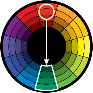
1) Complimentary: This is the most basic palette. A second color is selected directly opposite to the key color on the wheel. This “opposite” color is referred to as the complementary color. Virtually all color palettes (except Analogous) are a variation of the complimentary one.
The high contrast of complementary colors creates a vibrant look especially when used at full saturation but can be jarring if not managed properly. This is the most common color scheme and is easy to find in all sorts of designs. Hulk’s pants are purple to complement his green skin. Christmas themed artifacts are red and green etc.
Complementary color schemes are tricky to use in large doses, but work well when you want something to stand out. Complementary colors are really bad for text as both colors have a similar “strength” and the background and text will fight for attention.
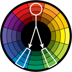
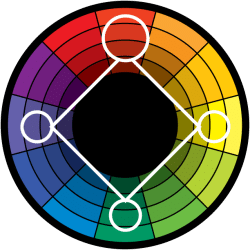
2) Split Complementary: Rather than using the point directly opposite the key color on the wheel, the split complementary takes the two colors on either side of the complementary color. This allows for a wider range of colors while still not deviating from the basic harmony between the key color and it’s complement.
This color scheme has the same strong visual contrast as the complementary color scheme, but has less tension.
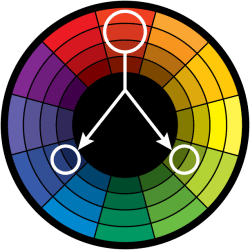
3) Triadic Harmony: Also called Triadics or Triads. This refers to the color two spaces to either side of the key color’s complement. Essentially, with the triadic harmony, you are using three equally distanced colors on the color wheel. As such, you’re stretching the basic idea of color harmony.
Too much of each color and your design appears to have too many colors and can be too vibrant.
To use a triadic harmony successfully, the colors should be carefully balanced—let one color dominate and use the two others for accent. Or, desaturate all your colors and only use the triadic colors in small spots or touches.
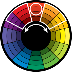
4) Analogous Harmony: Also referred to as related colors,these are the colors directly on the left and right of your key color. This can create a serene and comfortable design. While this color harmony can be pleasing to the eye, it can also come across as monotone. If you are going for a design that’s primarily one color, this is a good choice.
5) Tetradic Harmony: Similar to the Triadic, except that there are four points, all equally distanced on the color wheel. This is a color harmony I’ve only seen mentioned in more recent texts on the subject of color harmony and should be used sparingly.
The meaning of colors
Overtime, colors have come to connote different emotions. Context is important (i.e: different cultures interpret colors differently and the way colors are juxtaposed will also change their meaning) but here are a few qualities that might help guide your choices.
- Red: energy, power, passion
- Orange: joy, enthusiasm, creativity
- Yellow: happiness, intellect, energy
- Green: ambition, growth, freshness, safety
- Blue: tranquility, confidence, intelligence
- Purple: luxury, ambition, creativity
- Black: power, elegance, mystery
- White: cleanliness, purity, perfection
This page has more examples and resources.
More tips
Edited from https://www.invisionapp.com/inside-design/quick-guide-color-palette/
Use the 60-30-10 rule. Use your colors in a 60% + 30% + 10% proportion. This old interior design rule is meant to give balance to your colors. The formula works because it allows the eye to move comfortably from one focal point to the next. It’s also incredibly simple to use: 60% is your dominant hue, 30% is your secondary color, and 10% is for an accent color. Even if your palette has more than three colors (but please, no more than five), keeping things in balance will be cleaner to the eye and more comfortable for your users’ brains.
Take inspiration from nature. The best thing about looking to the environment for design solutions is that the palette is always changing. Sunrises, sunsets, beach scenes… these all have unique palettes that can be adapted to suit your needs. Use an app like Adobe Capture (more about it in the next section) to isolate a color palette from a photo.
Useful tools
There is a plethora of online tools to help you create color palettes here are a few popular ones:
- Colorhunt.co
- Coolors.co
- Adobe Colors CC
- Mycolor.space
- Colormind.io
- Canva Color Palette from an Image
In-class exercise: color analysis
Find a website or poster you like and analyze its colors: which type of palette is it using? Do the colors relate to the subject matter? In which proportion is each color used? How is color applied to text? Be prepared to share your findings with the class
Typography
Choosing the right font for your project is very important – the right font can help set the correct tone… while the wrong one can dilute or even corrupt your message. For basic typography terminology and tips on legibility & readability, please visit the related workshop page.
More tips
From https://www.invisionapp.com/inside-design/quick-guide-color-palette/
Limit your font palette to (in most situations) 3 fonts: While some projects will call for more elaborate font combinations, like when you’re designing a particularly decorative aesthetic, most layouts will benefit from restraint and forethought. If you do choose to use a variety of fonts, the overall effect should be harmonious without being conflicting or cluttered.
A good way to refine your font choices is to ensure that each font has a specific role or purpose in your design. If you can’t find a specific job for a font, it might be time to take a look at your choices.
Use contrast wherever possible to create a visual hierarchy: Qualities such as size, weight (or boldness), and spacing (including leading, the space between lines, and kerning, the space between letters) all play a role in how the viewer should navigate the page and what text should attract his or her attention first.
Decide what parts of your design are essential and which are less important, and let your font choice reflect those priorities. More often than not, the more important a text element is, the larger and weightier its font will be.
Keep an eye on moods and history: This is where the process stops being technical and begins to get a bit more subjective. You’ll want to ensure that the moods evoked by your choices fit the intent of the project. An invitation to a child’s birthday party has a little more leeway when it comes to decorative fonts than does a professional resumé or a portfolio page.
You should also keep an eye on the genre or historical context of a font, particularly when designing a project with cultural leanings. Font styles can play a big role in cementing the overall look of your design, especially if you’re going for a certain aesthetic, so do some research and you’re more likely to find the pitch-perfect font choice.
Understand your brand and know what you want to say: Are you designing a project that has a bit of personality? Or are you putting together a presentation for your company’s board of directors? Knowing what you want to say and the audience to whom you’re speaking is important for both content and presentation.
Likewise, if you’re designing materials for your brand, make sure your font choices reflect your brand’s values. A company like Airbnb can utilize a font with a bit more whimsy than, say, General Electric or IBM. Choose fonts that work with your existing branding and you’ll run a lower risk of sending mixed messages to your audience.
Trust your gut: The decision about whether or not two or more fonts complement each other can feel like something of a guessing game. You’ll often find yourself relying on instinct or a gut feeling. That’s ok. You’ve got this.
If you make a point of noticing how fonts combine well (or not) out in the real world—on products, in magazines, on websites, and in books—you’ll start to develop an innate sense for what works and what doesn’t.
Useful tools
Here are a few resources to help you select, test and combine type:
In-class exercise: typography
Find a website or poster you like and analyze its use of fonts: How many font-families can you recognize? How are they used to focus the attention of the viewer? How is size and color used within a single font-family? How would you describe the fonts used (i.e: playful? classic? modern? etc.). Be prepared to share your findings with the class
Deliverables
- For next week, select the colors you will be using. You may use one of the tools listed above to come up with a palette. Specify which one will be the dominant color. If your campaign project includes a website with text, navigation etc. specify which color will be used for what design element (background, paragraphs, headers, links etc.).
- Also select the font(s) you will be using for your project (maximum 3). If your campaign project includes a website with text, navigation etc. specify which font will be used for what design element (background, paragraphs, headers, links etc.).
- Create a style guide (you may use this template or create your own) to share your typography and color choices. Clearly name your file (i.e: TeamName_styleGuide_date) and place it in your shared folder.