What is Typography?
“Typography is the art and technique of arranging type to make written language legible, readable and appealing when displayed.”
https://en.wikipedia.org/wiki/Typography
Typography is all around us:on street signs, books, our social media feeds, text messages, emails, posters etc. The way the text looks on any of these media was a deliberate choice on the part of a designer.
Choosing the right font for your project is very important – the right font can help set the correct tone… while the wrong one can dilute or even corrupt your message. In this workshop we will review basic typography terminology and concepts to help you choose the best fonts for your projects.
Font vs. Typeface
Before we go any further, let’s clarify the subtle but important difference between two terms often used interchangeably:
A typeface is a particular set of characters that share a specific design (i.e: Times New Roman is a well known typeface).
A font is a particular set of characters within a typeface (i.e: 12 point Times New Roman is a font, and 10 point Times New Roman is a separate font within the same typeface).
Classification
Typefaces can be broken up into two main categories serif and sans serifs (literally without serifs).
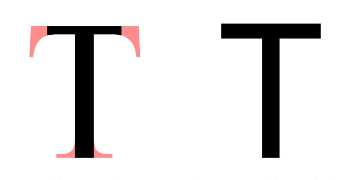
The content in Italic below is from: https://www.adobe.com/creativecloud/design/discover/serif-vs-sans-serif.html
Serif Fonts
Serifs are the small lines attached to letters. Their origins are a mystery; one theory suggests they arose when scribes using brushes or quills left small marks with the writing implement as they finished each stroke. This evolved into deliberately adding smaller strokes in more regular, artful ways, and those decorative strokes became an expected part of the letters.
Serif fonts can look authoritative, professional, and suggest the weight of history or experience. Serif typefaces like Times New Roman are suggestive of typewriters’ old style — The New York Times and other reputable institutions that have existed for over a century still use this font. “They feel a little bit more old-timey,” says designer Madeline DeCotes.
“Serif fonts can have a more clinical and institutional look to them,” says Todd, who uses serif fonts to evoke earlier eras. When working on book design for a story set during World War II, Todd used serif fonts to give readers the feeling they were in a world that existed prior to modern design conventions.
Serifs aren’t just aesthetic, though. They also have real functional value as body copy. “Serifs often lend a bit more legibility at smaller scales,” says DeCotes. “When you’re reading a 9.5 font in a printed book, serifs help you distinguish the letterforms and create flow as you’re reading.
Serif fonts can be broken into subcategories. Here area a few important ones and examples within each:
Humanist 1460
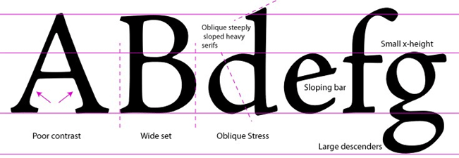
Old Style 1495
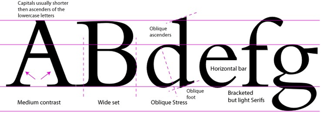
Transitional 1750
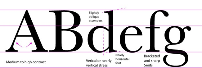
Modern 1775
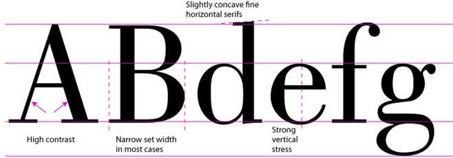
Slab Serif 1825

Sans Serif Fonts
While some older writing is serif-free, such as Norse runes, sans serif fonts are mostly associated with modern typefaces. In 1928, Futura became one of the first popular sans serif fonts and other typefaces like Helvetica soon followed.
Sans serif typefaces were controversial when they first appeared and were sometimes called “grotesque” typefaces. But when modernist designers like the Bauhaus movement embraced sans serif typefaces, they became associated with cutting-edge design, commerce, and modernism’s attempt to break with the past.
That association still holds; for example, Todd uses sans serif for a comic book set in a contemporary, cosmopolitan, and fashion-oriented Los Angeles. However, sans serif typefaces can also evoke today’s handwriting, which is missing the extra strokes that were a product of the brush or quill. “The conventional wisdom is that sans serif fonts are supposed to mimic handwriting, which has more of a flow to it,” says Todd.
Sans serif fonts also work well where there’s very little room for copy. Signs, text in apps, and names on maps tend to be sans serif. (There are exceptions, of course. Some sans serif font families, like Arial, are meant to work as body copy — text that goes on for more than a sentence or two.)
“If you’re building an app or designing a site, sans serifs are generally the way to go,” says DeCotes, because legibility is a concern on screens that are small or have lower resolutions. She adds, “Sans serifs are for wayfinding or signage applications.” One of the most recognized fonts in the United States, Clearview, is a sans serif font. It was specifically designed for highway signs. Drivers needed to read a small amount of type from a long distance away and, in that instance, sans serif fit the bill.
Serif fonts can be broken into subcategories. Here area a few important ones and examples within each:
Grotesque
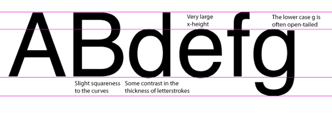
Geometric

Anatomy of Type
Let’s first look at the different characteristics and terminology used to describe type. This will help us differentiate and analyze fonts when choosing them:
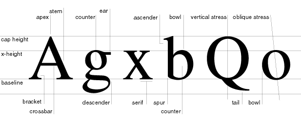
- Baseline: The invisible line on which the characters sit
- X-height: : The height of the lowercase x
- Cap height: The distance from the baseline to the top of uppercase letters
- Apex: The highest point of a character
- Stem: A stem is often the main “body” of a letter (i.e: the vertical line of an upper case “B”; the primary diagonal line of a “V”)
- Bowl: An open or closed circular line that creates an interior space (i.e: in the lower case “e” and “b”)
- Counter: The empty space inside a bowl
- Ear: A stroke that projects from the upper right bowl
- Ascender: The part of a character that extends above the x-height
- Descender: The part of a character that extends below the baseline
- Vertical/Oblique Stress: In a curved letter, the thickening of curved strokes and the position or angle of this thickening in relationship to the vertical axis (derived from writing created with a broad-edged writing instrument)
- Tail: The short stroke extending downward in a letterform
- Serif: A short line or finishing stroke that crosses or projects from stems or strokes in a character. Serifs have many shapes, including hairline, bracketed, wedge, and slab.
- Spur: A type of serif extension (usually a short one)
- Crossbar: A horizontal (or sometimes diagonal) stroke that intersects with or connects one or more stems
- Bracket: The shape that often appears in a character at the junction of a serif and a main stroke
Measuring Type
Deciding the size and spacing at which a typeface will be displayed is an important factor in successfully designing with type.
Units
A typeface’s size can be measured in points or picas:
- Point: 1pt = 1/72″ (72 point = 1″). Most type is available in sizes ranging from 5 points to 72 points. Type that is 14 points and less is used for setting text and is called text type or body copy. Sizes above 14 points are used for display type.
- Pica: 1p = 12pt (6 pica = 1″). Line length, which is the horizontal length of a line of type, is measured in picas.

SCREENS
Although 5 to 72 points is a standard or default setting based on the metal pieces and printing presses that were used for print, today’s digital technology has no limits on the size of type that can be used (technically… not aesthetically).
When setting font size for screens, you should use relative units whenever possible:
The content in Italic below is from: https://typographyhandbook.com/
- Use
em(not px) forfont-size. font-size: 100%listens to the browser’s font size settings instead of overwriting it. By default in most browsers, this would place1emat16px.- Changing the value of the
font-sizeof thehtmlwill also affect everyemelement. This can be useful for implementing responsive web design. - User preference is important, so do not stray too far from
font-size: 100%and1em. - Use
em, or%for element positioning (margin,padding, etc). - Use
emfor media query dimensions. - For large headings or when text is grouped with an image, use FitText (or another JS library) to achieve scalable headlines. Stray away from
vwandvhdue to incomplete support, difficulty in precise configuration, and because it does not listen to browser font or zoom settings.
Spacing
The content in Italic below is from: https://openlab.citytech.cuny.edu/clarkeadv1227/type-elements/type-measurements/
When designing with type you also have to be aware of the spacing in-between the lines of text and also the length, or width, of a line of text. This must go hand-in-hand with the size of type you select. Certain type sizes look better to the eye when reading if the proper amount of spacing is present. Let’s look at some of the techniques that are used for spacing.
- Line spacing: Line spacing is the distance between two lines of type measured vertically from baseline to baseline. Line spacing is measured in points.
- Leading: Leading is a term still used today when talking about line spacing. Leading was a term used to distinguish the line spacing in the metal type era.
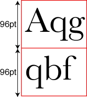
72/96 Type (72pt type with 96pt leading)
- Line length: Line length is the horizontal length of a line of type. The length of a line is measured in picas.
- Kerning (letterspacing): Kerning or letterspacing is the spacing in-between certain letters. Today’s word processors automatically correct the kerning problem, but sometimes a minimal adjustment is required for sufficient reading.
- Tracking (wordspacing): Tracking or wordspacing is the spacing in-between certain words. Most word processors automatically correct the tracking problem, but in some cases a slight adjustment on the tracking may be needed.
- Em-Quads: Em-Quads are used for paragraph indents. An em-quad is a square of a specific type size. If the type size is 12 point then the em-quad would be 12 points by 12 points.
- Ems and ens: The em space is based on the em quad, which is the square of the type size. For example, the em quad of 48pt. Futura is 48 pts. high by 48 pts. wide. The em space measures 48 points.
Legibility
Legibility refers to the ease with which a reader can recognize and differentiate between letterforms. These are factors that affect legibility:
Style of a Typeface
- Familiarity
- Serif vs. Sans Serif
- Typeface style
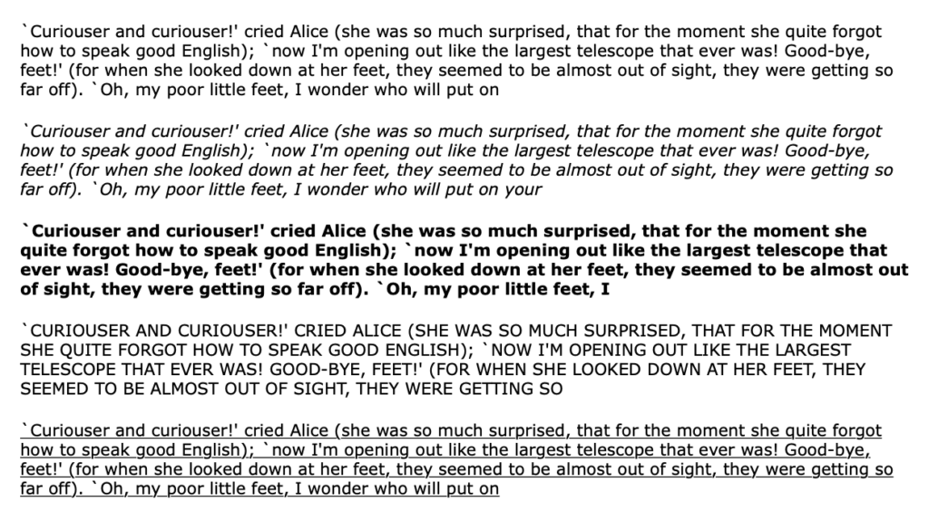
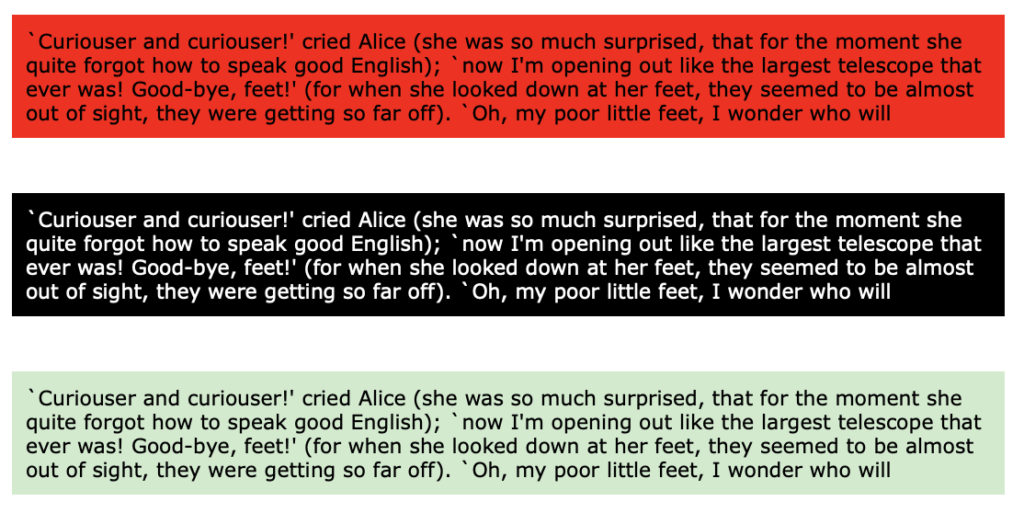
- Color and Value
- Typographic color
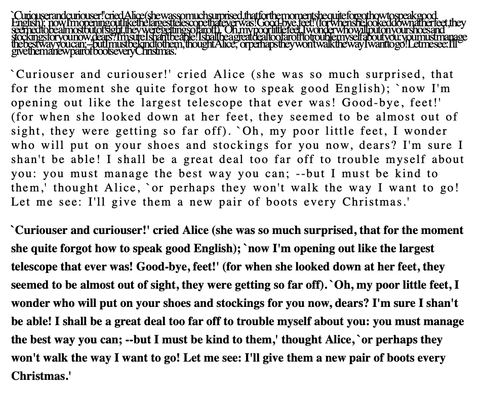
- Texture of type
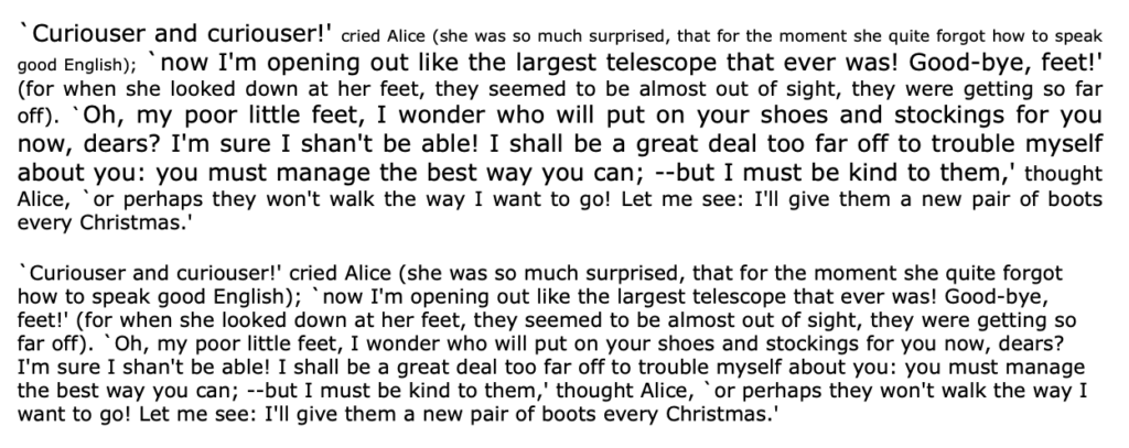
Size and Shape of Type
- Stroke weight

- Contrast

- Set width (width of letters)
- Point size
Background
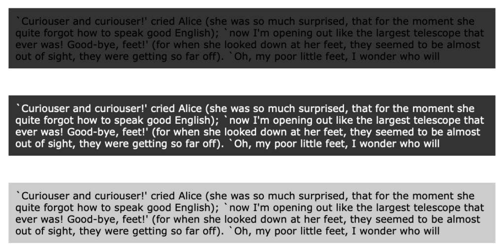
- Contrast between text and background
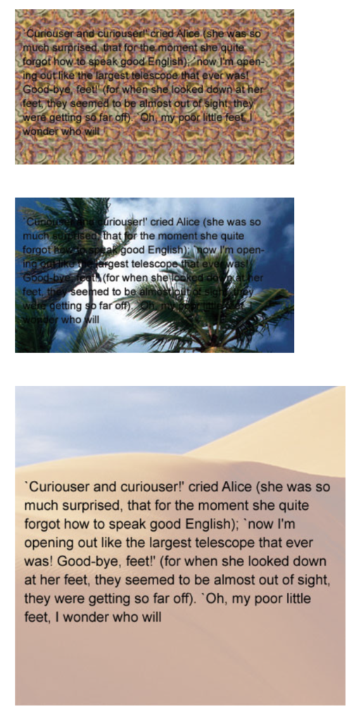
- Texture of background
- Surface (of paper or screen)
Readability
Readability refers to how easily a page of text can be read and navigated. These are factors that affect legibility:
Arrangement of Letterforms
- Number of typefaces
- Alignment
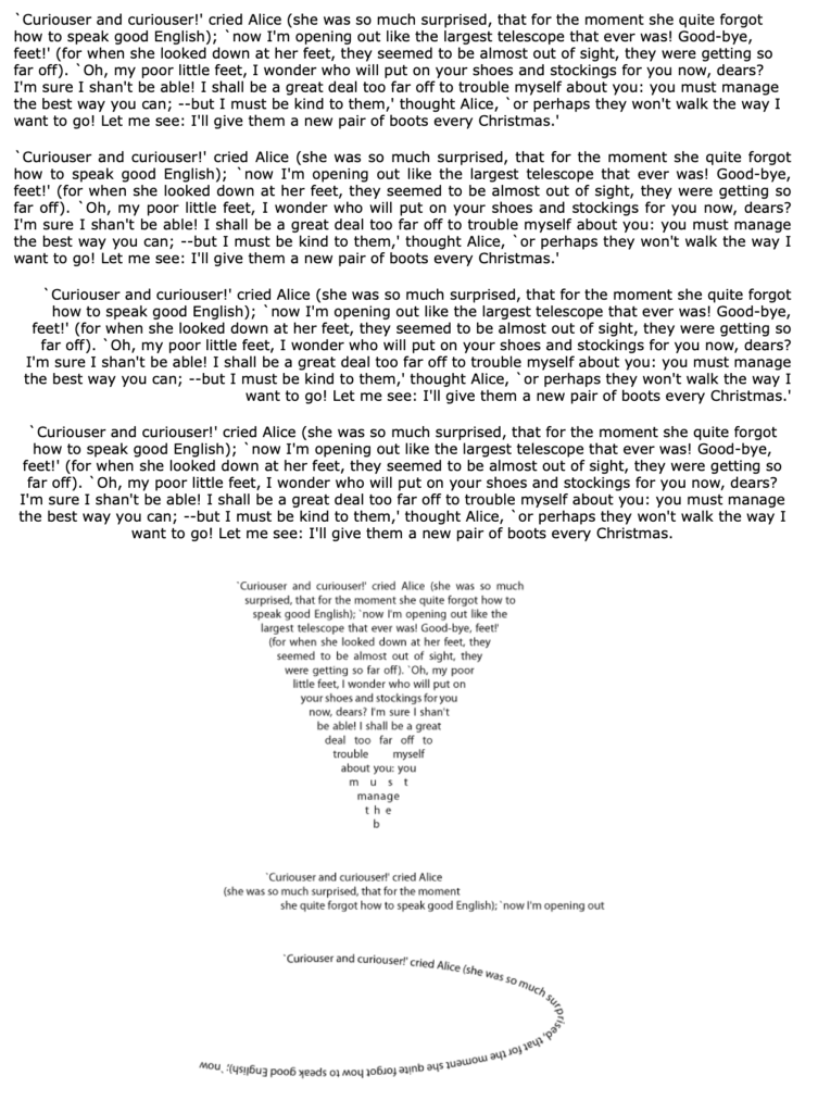
- Measure

- Widows and orphans
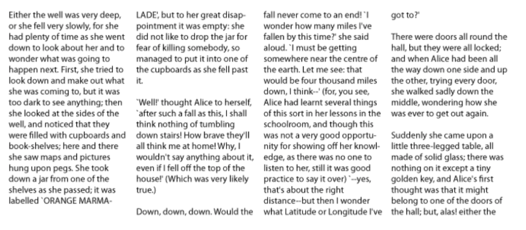
Use of negative spaces in a layout
- Letterspacing, tracking, kerning, and word spacing
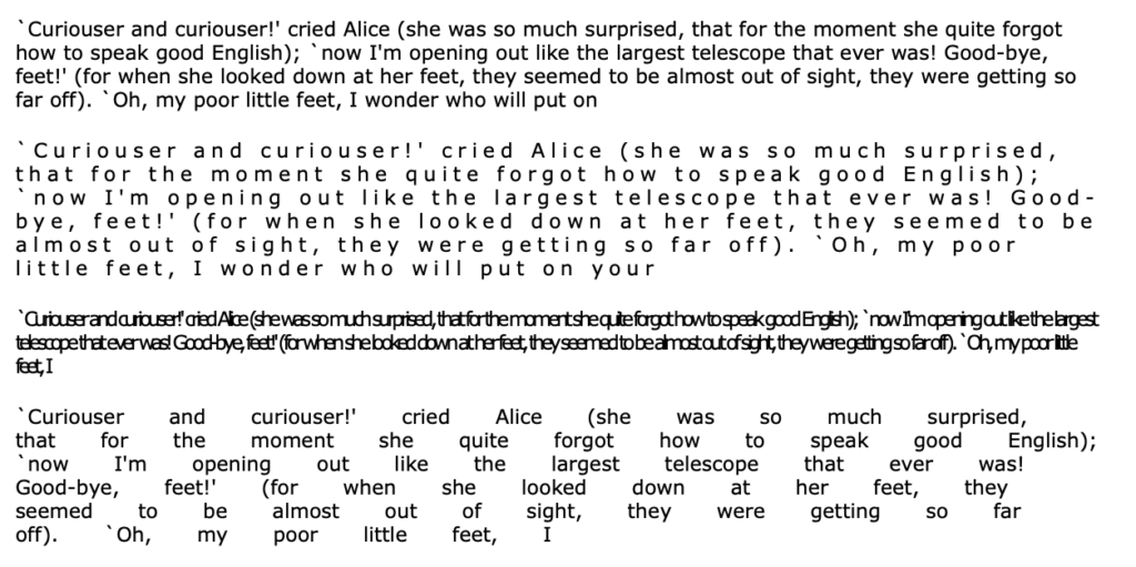
- Leading

Your Audience
- Physiology of reading: eye focusing
and reading gravity - Spelling
While all of these considerations are applicable to both print and screen, here are some more specific tips for web typography.
Designing with Display Type
Selecting Display Type
Here are some things to consider when selecting a display font:
- Where will the display type be used? For example, a magazine article, a poster, a book, a billboard advertisement, an app etc.
- Who is the audience? In what conditions will they be viewing your work?
- The relationship between the display type and the text type: contrast or harmony.
Arranging Display Type
Capitalization can drastically change the look of your display type:
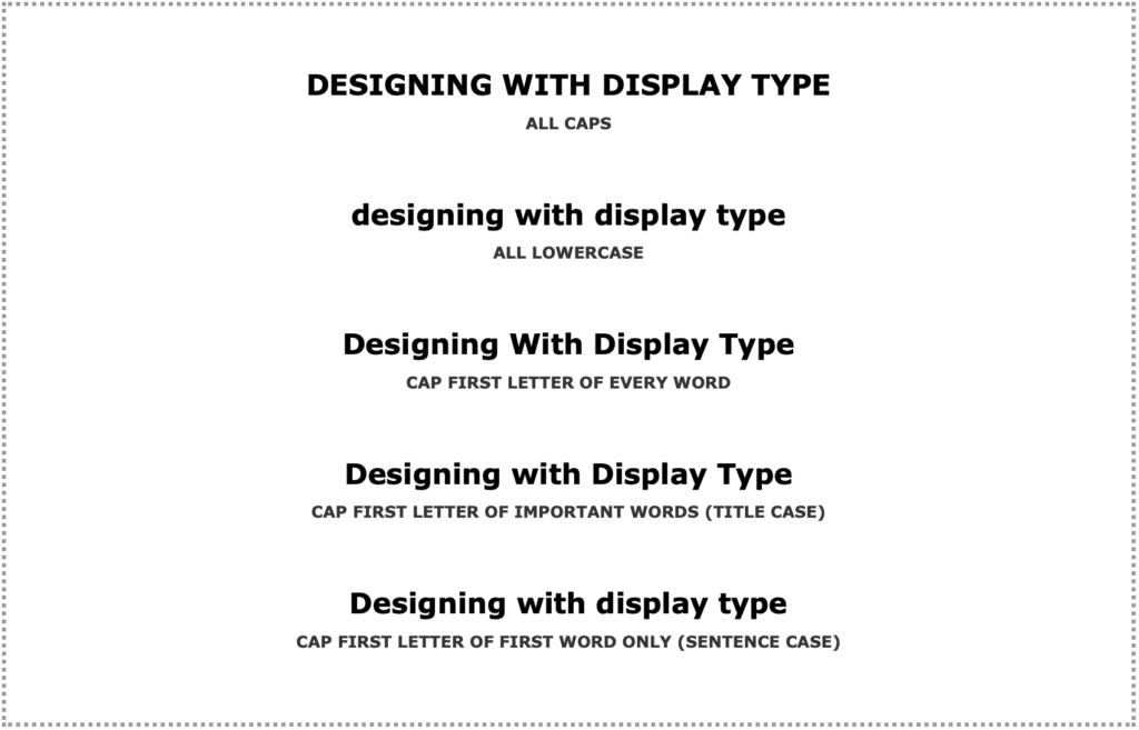
Line length / the way you break down words (or don’t) will also strongly impact your design
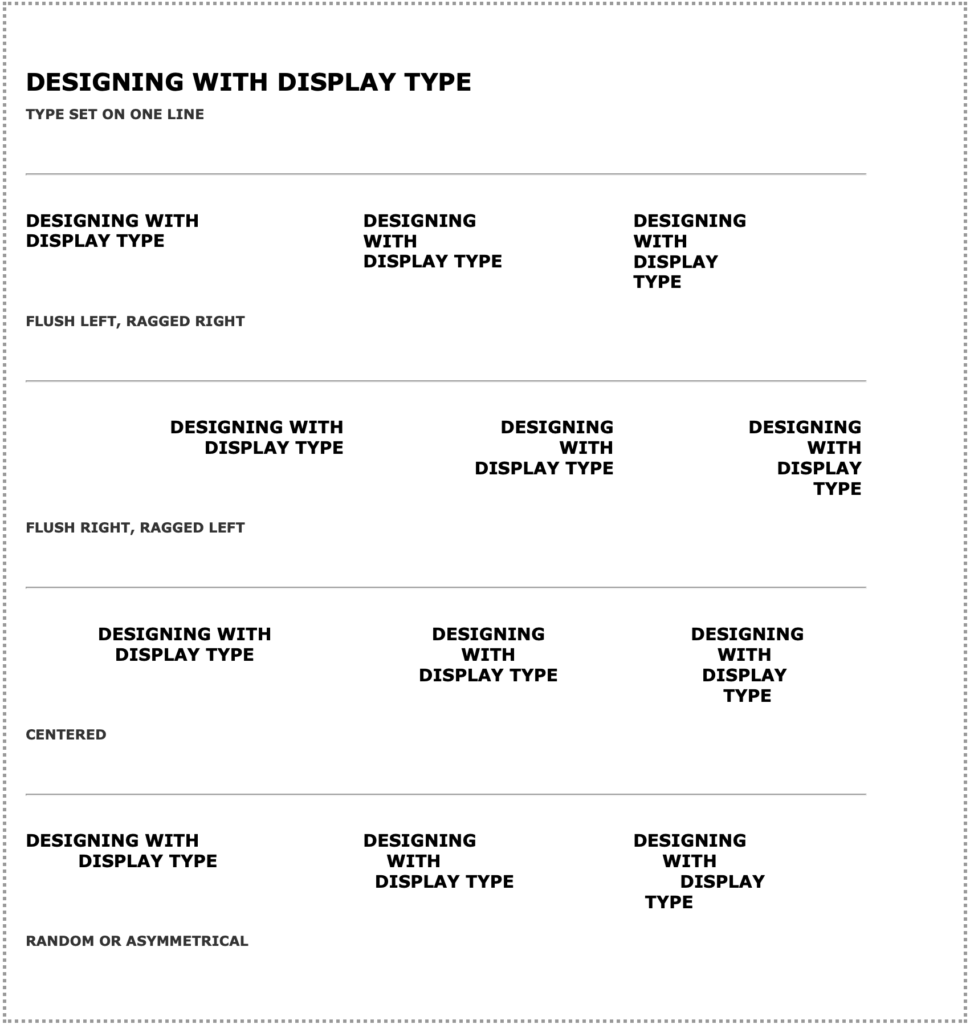
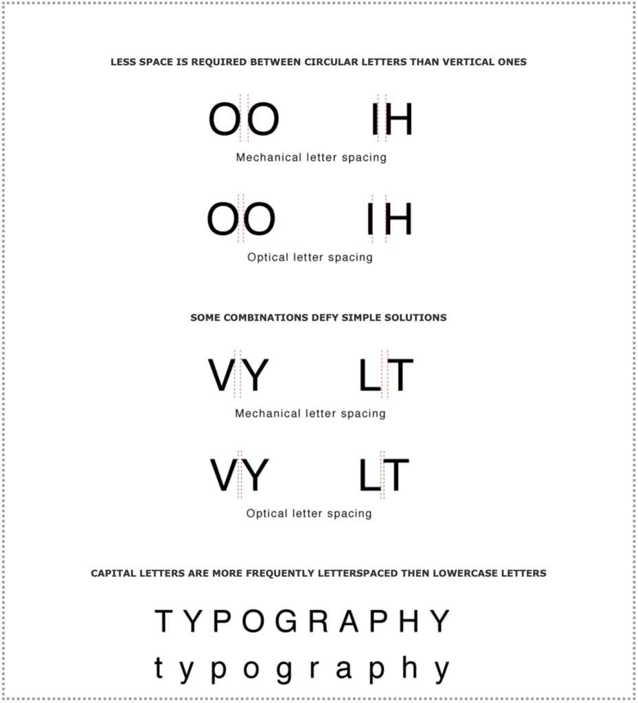
Optical Considerations
You can increase the legibility and impact of your display type by keeping these concepts in mind:
In-class Exercise
Pick a website and describe some of its typographic attributes. What works or doesn’t? Can you recognize any of the typefaces? How is body vs. display type treated? Is color and style an important factor in creating the visual hierarchy of the text? etc.
Food for thought
Typography is a wast universe you could spend the entire semester or your entire career exploring. Here are some more resources to dig further into the topic and or to help you pick fonts for your project:
- Typewolf.com – Tips, articles and links to other resources
- Thinking With Type: A great web summary of Ellen Lupton’s book
- Fontmap.ideo.com – Fun tool to explore typefaces and how they relate to one another
- https://igfonts.io – Site to customize your Instagram caption font
- TypeConnection: A fun game to practice pairing fonts
- TypeWar: Another fun game to train your eyes to recognize typefaces
- Google fonts – Easy to use web fonts
- “My Life in Typefaces” – TED Talk by Matthew Carter
- “The Power of Typography” – TED talk by Mia Cinelli