These are the 3 different designs of the same character that I came up with.


These are the 3 different designs of the same character that I came up with.
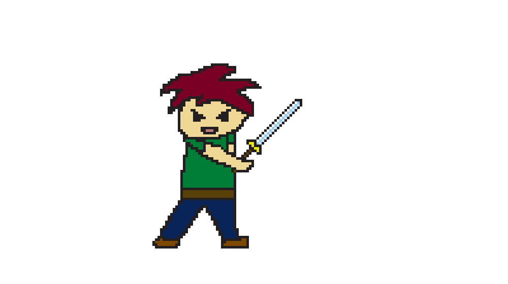
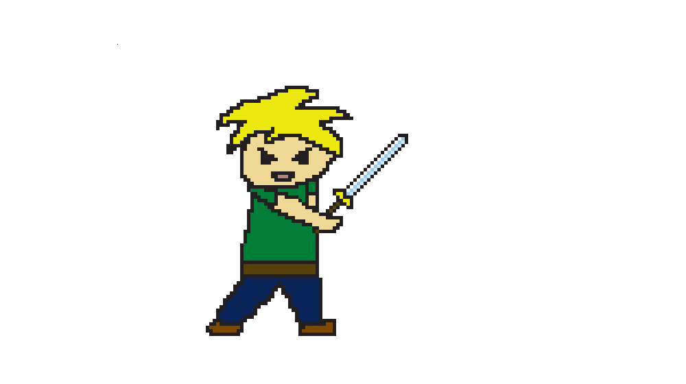
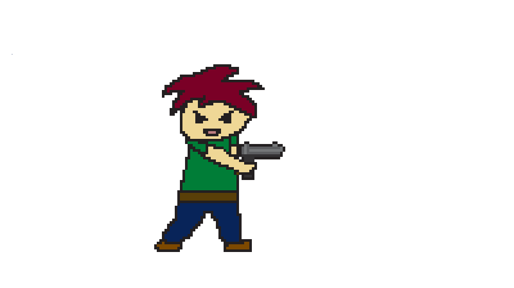
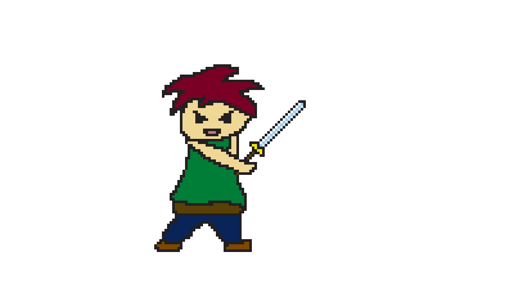
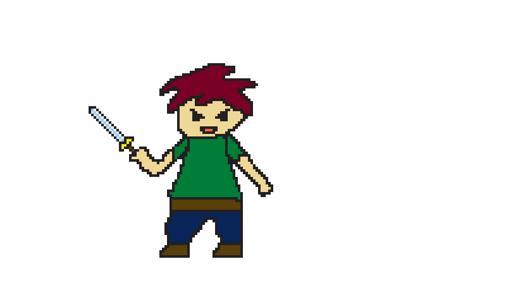
I named this character Soma. He is a 17 year old kid who is a hunter. He hunts monsters for a living. I made three designs of Soma.

My designs are based on structures of shapes. The designs of these characters flow within how straight, round, curvy, and etc they are.

This is my first variant that I will be using. He is the least realistic since he got some simple or geometric structure within him and less detailed than the other variants.
This is my second variant. This is the most realistic due to how much detail this one carries like eye patch and scar in his right eye. His little shirt carries a little design.
This is my third variant. This one is the middle ground of realism. Less detailed and the structure is a bit curvy (This variant is the ghost version of the character.)
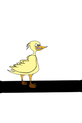
Walking

Jump
Idle

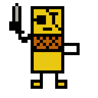
I made my three character designs and I will call Little Robo because I like some future stuff. I designed Three characters from smaller to bigger. The first one has 8 bits of pixels. The second one was made some improvements like adding more colors and shadows. Also, the head had changed. The third one has much better because it has 16 bits like the definition of SNES. Just like the pixel had been involved in the new generation.


The Animations:


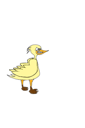
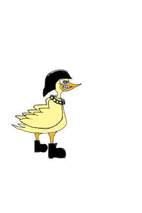
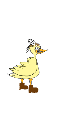
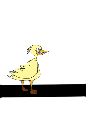
My 3 sketches are based on ducks with a cartoon style. I chose it to be a little abstract and not realistic.

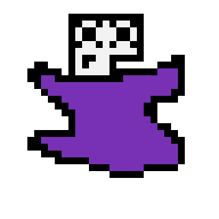
The character I came up with is called Dark Boxy. (Not the best name or design ever, but this was my first try at something like this.) His design is very early Arcade/Atari 2600-esque.

Dark Boxy went through 3 forms before I decided to settle on his cube-like appearance (as well as his name). One of them was a purple blob guy, the next was a tree guy, and the last one was the design I went with, As you can plainly see, none of my designs are realistic in the slightest.
The Animations

Idle Animation

Walking Animation

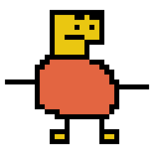
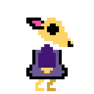
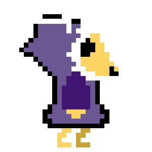
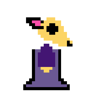
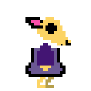
I call this little character I came up with Wendigold. The inspiration for this character comes from the mythical creature called the Wendigo. My three designs include an unhooded version, one where his hood is up and one where he is wearing a cloak.
This is probably the design I’ll be going with. I find it to be most realistic because having the character’s hood down reveals more details such as the entire eye and the ear and where the antlers meet the head. It’s also the most iconographic.
This design is the least realistic. Having the hood up hides more of the character’s details and makes him less relatable in my opinion.
This design falls in between most realistic and least realistic. Although the face is uncovered and recognizable you can’t see the character’s feet or how he moves.
Animations


Powered by: