I wanted to put all of the effects as much as I could in this projects. It originally comes with background music so I didn’t have to blend the layer. I hope you guys enjoy the final result. Thank You So Much.
CREDITS
“MY FIRST VLOG” by Casey Neistat. CC License CC BY https://www.youtube.com/watch?v=gnHCw87Enq4&list=PLTHOlLMWEwVy52FUngq91krMkQDQBagYw Mar 26, 2015.
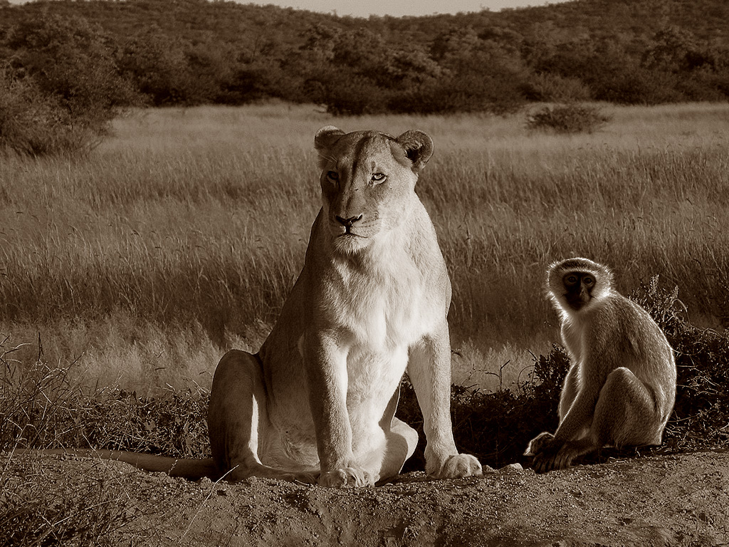
Title: Peaceful Lion and Monkey in a peaceful Jungle
Semester: Fall 2023
Software: Adobe Photoshop
For this project, I picked the image of the lion in a forest from the internet, I also saved an image of the donkey that was sitting on branch tree. I used photoshop to select the monkey and put it near the lion, I cropped it change the color to make it smilar to the lion color. For this image to look real, I change the color and used “photo repair-sepia” to make it look it original.
This project is an illustration to tell people that we can leave in peace and harmony and stop all kind of wars or division. If a lion and a monkey can be together leaving without fighting; what about us, human beings that have consciousness ?
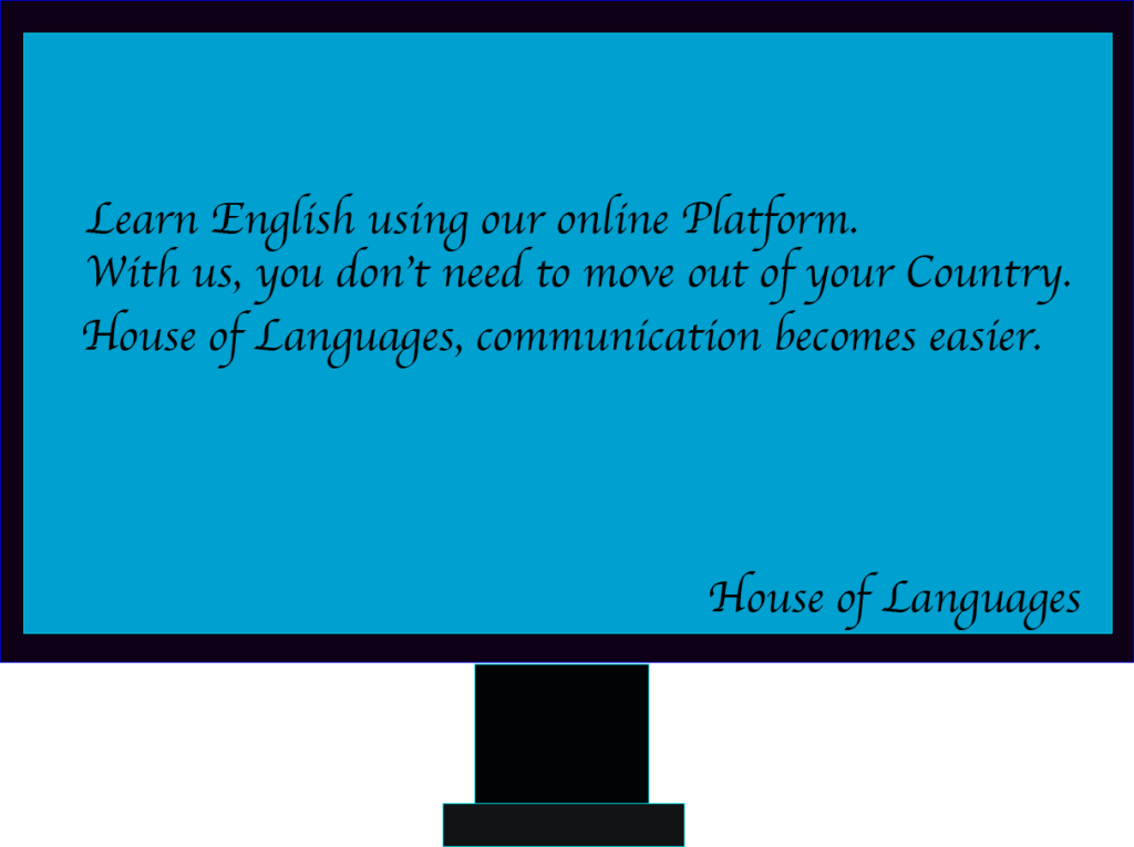
For this Project, I took the occasion to create a logo or image to advertise a business that I have on my mind: Giving English to non native speaker.
I used shapes, color, text and other options and buttons of the toolbar to draw a computer where I wrote a text to really say the main objective of the business.
I wanted to put together the chaotic sounds of the NYC Subway system. I first recorded the sounds of my daily train ride home from school on the 2 train, then I used the theme music of Subway Surfer – a game I used to play on my phone. Then I layered the regular sounds of announcements and the guys dancing on the train. I wanted to show my love for New York. The most challenging part of the project was looking for other sounds besides the theme song and what I recorded on my phone. The Showtime dancers I found on YouTube so I had to convert the video to audio to add it in.
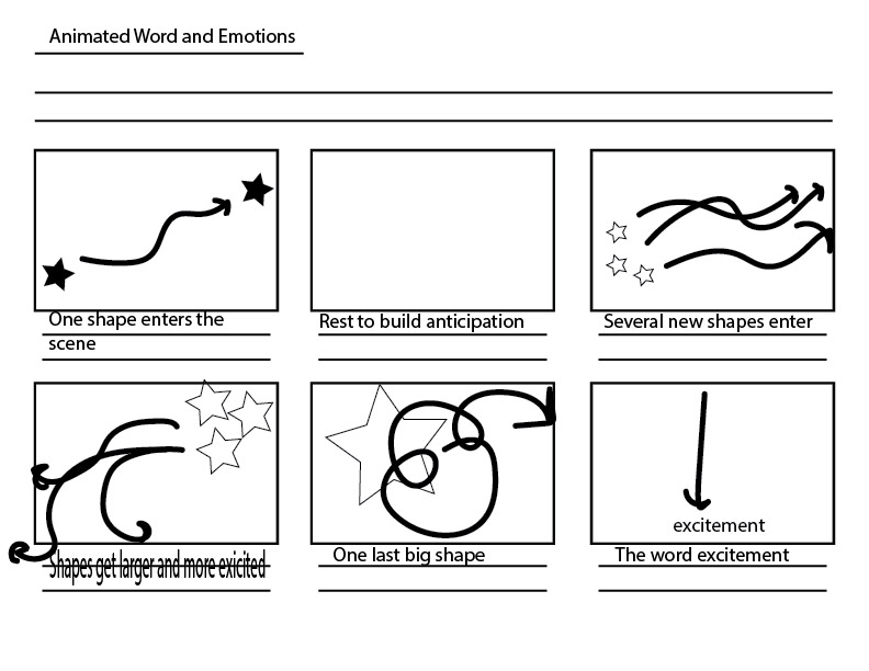
i decided to animate to a song, it’s one of my favorite songs and I wanted to go for an overall happy vibe. i chose shapes that I liked, round shapes, hearts, and stars. the colors came from the album cover being green and after I was bored with that I started to hue it more and more toward red, ultimately ending on that. as for the text and/or accents, I just slightly made them more saturated and brighter/desaturated and darker so it stays cohesive. the timing came from the song, I tried to use text to match up the words on time and make the transitions go with the beat. I think the most challenging part of this assignment was coming up with more creative ways to display text or do typography, something I think I struggle with outside of this assignment.
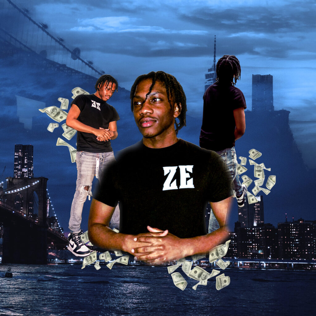
My photoshop self-portrait shows me being from Brooklyn, NY with an image of the Brooklyn Bridge in the background, one of favorite places to go in NYC. Plus, three images of me and my ambition to make money.
My illustrator self-portrait is of me with my hair and my favorite color blue as the color of my shirt and a Z logo to represent my name.
Credits Pexels.com Michal Ludwiczak “Photography of Brooklyn Bridge Amazon stock image falling money
theme: the theme of this animation is to complement each color that is used in animations, videos, and art designs in animation as a whole and I think the colors red, and blue represent most used colors that even pro animators use often to make their work stand out.
I used polygons in this animation project to symbolize the colors that I like the most in anything whether it be a design or something else. the reason why I picked red is because it’s my first favorite color that I like because it also goes well with black and white. the reason why I picked blue as my second favorite color is because it has much more combinations it can go with than red can which why picked this color as well.
the picture is a little bit better hopefully everyone can see it.
I just animated 2 shapes meeting. I animated the shapes moving around the screen. Made the word Sayonara fade in & out as well as the shapes fading out.
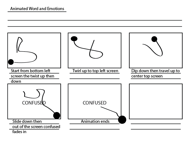
For this project I decided to make a mini animation about the emotion of confusion using After Effects. We had to include text of the word itself and I thought that it might be interesting if I made each letter move on its own to communicate confusion and chaos. I chose grays and black and white because I liked the simplicity of it and it reminds me of older animations and videos, like the ones we saw in class. Timing and pacing wasn’t too difficult because this project is only ten seconds.


