I am a VAT major and I am a big fan of film directors David Fincher (Fight Club, The Social Network, Gone Girl) and James Cameron ( Avatar, Terminator, Titanic) In this post I used basic image layers and images posted with a creative commons license to convey the differing yet equally valid approaches to filmmaking taken by both men. They each have made many fantastic films that take you a journey while also providing commentary on society and humanity but choose to do things for different reasons.
This game was suppose to release on the Nintendo switch a while back in 2021 now 2 years later we have not heard about it ever since so gg Hoyoverse. We know nothing about an official release for it so we just hack it into our switches so gg Genshin community.
For this self-port I put 4 gaming platforms into the sky. I used the sky background because I think a lot about gaming so I used photoshop to make the consoles blend in with the sky.
Image Credits: “Xbox series x” By Hannah DaviesLink NonCommercial 2.0 Generic. filckr. June 23, 2022. “Nintendo Switch” By Sinchen.Lin Link February 15, 2018 CC BY 2.0 DEED “Playstation 5” By Marco Verch Link November 22, 2020 CC BY 2.0 DEED “Acer TravelMate” By TravelMate Link July 1, 2023 CC BY-SA 4.0 DEED
Description (3-4 sentences giving the person looking at your work insight into your creative and technical process. For example: Why did you choose these images – how do they represent you? How many images did you combine? What were your sources of inspiration? What was the most challenging part of the project and how did you solve it? etc.):
My goal in making this composition, which features the famous Golden Gate Bridge, was to both capture the bridge’s ageless beauty and add a dash of my interpretation to it. The choice of a vibrant sunset as the background represents both the end of the day and the best parts of life. I carefully stitched together several photos to merge the elegant structural lines of the bridge with the warm colors of the sky. I wanted to inspire feelings of curiosity and nostalgia, therefore I looked to vintage postcard aesthetics for inspiration. The most difficult part of this job was bringing divergent parts together seamlessly. This was accomplished by paying close attention to every little detail and using sophisticated photo-editing methods. Ultimately, this work is a tribute to the intersection of nature and human ingenuity, encapsulating the spirit of an enduring symbol in a unique and personal light.
For my self portrait I choose images centered around the photo of me. I wanted to create a fantasy world, that I thought would be really cool to live in. The three main background images that I chose were glittering stars, Saturn, and a photo of a flower field. I specifically chose those images for my world settings because imagine if our sky was to look like that, with the moon being replaced by Saturn and the huge rings around it and looking up a stars that glitter, that would be very cool. I chose to add the flower field because I love flowers and greenery and it only felt right to add myself sitting in a flower field. The most challenging part was making sure that none of the backgrounds of each photo were noticeable, to solve that I just took my time with the refine edge brush tool.
I wanted to have a weird distorted portrait just to make it more fun and bring out creativity. I chose to have a lot of the black, purple and light pink circles in the background because purple is one of my favorite colors and the hit of pink makes it really pop more. For the actual face portion of the portrait I wanted to do something inspired by Pablo Picasso’s self portraits. When I think of self portrait, his iconic art style always comes in mind. The most challenging part of this project was truly understanding all of the tools and how to get them to do what I wanted. I just played around with everything till I got somewhere close to my vision.
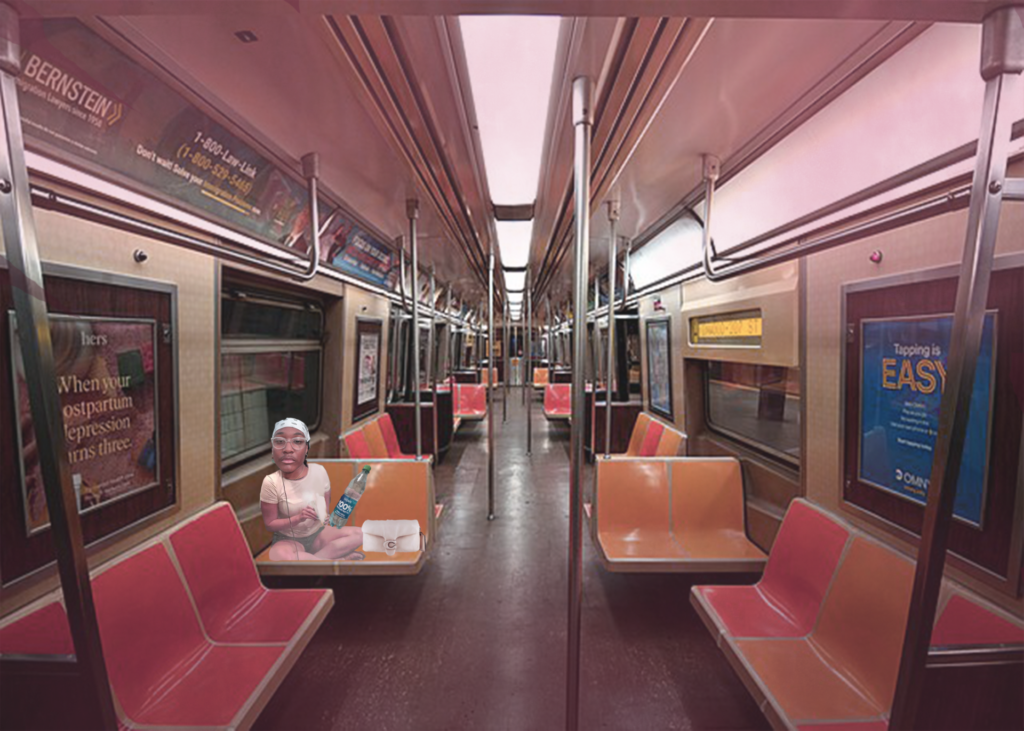
For my self portrait I used object selection tool (also the lasso tool), and cut the extra to get what I want in the picture, when I was thinking of making this collage is how I looked like In the train, I used some dark purple and light purple to give it that effect filter. And then just blend it to really create depth. It’s almost like it’s giving off a sense that I’m somewhere else…i depicted myself in the train because its very New York and I consider myself NYC at heart.
One thing, this is my second illustration of my self portrait. My original somehow didn’t save and I had to start over. I just wanted to put a general image of me because this illustration depicts me in a different hairstyle. I used a lot of layers and my main tools was the pencil tool and anchor point selection. I just wished I put a little more effort into the color and background.
This picture takes places in Brazil, my favorite place to go on vacation to explore nature, and enjoy delicious fruits and dishes. I chose this picture, because it’s my personal favorite photo, it reminds me of a nice place, and I wanted to show the visualization of my perception of what’s going on in the picture. I’ve used two gradient maps and masking in order to balance the two in abstract. The photos of the sushi and hotdogs are my own, and they’re also some of my favorite foods. The most challenging aspect of this portrait was getting the lighting right on every other subject, such as the food, or the subjects in the foreground.
Title: Self Portraying Vector
Semester/Year: Fall 2023
Program Used: Illustrator
For this program, I had shapes and abstraction in mind while again using a spectrum of my favorite colors. This segment of the self portrait project was really fun, it felt like I summarized myself with the vectorized portrait; through color, style, and emotion. Some of my challenges for this project included figuring out how to trace over a sketch, and figuring out how to outline the fingers without making the lines look off-putting. As for the process, I primarily used the shape, and pen tool.
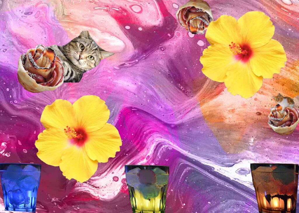
For my self-portrait I used the Mask tool and Eraser to add the photos that I felt represented me. I found a background that is colorful because I like to draw and paint, colorful drinks since I like to try new drinks, flower pastries because I like sweet things, cats because I have a pet cat, and yellow flowers because I like how flowers look.
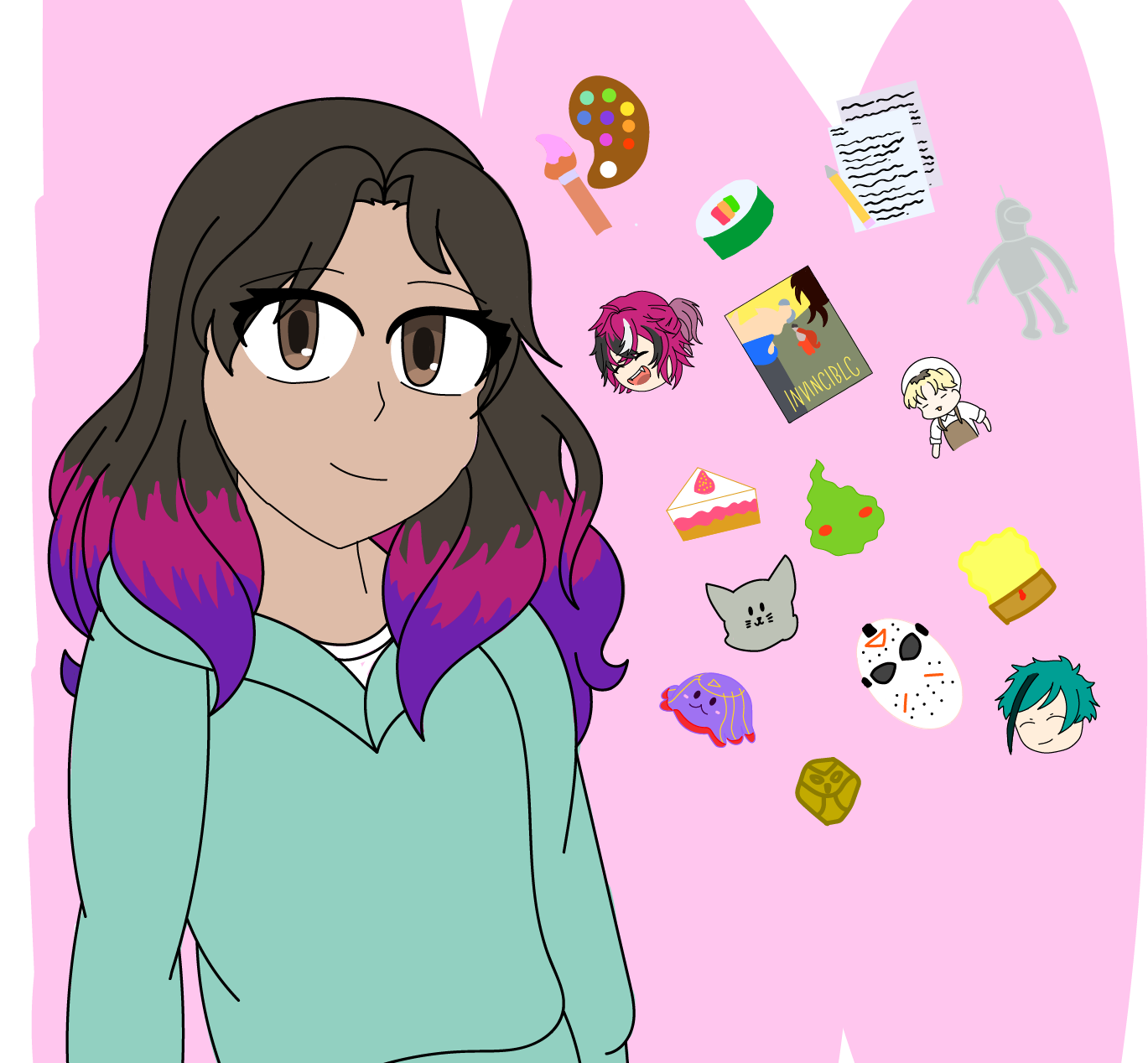
When making my self-portraits I used the pen tool as well as the paintbrush. I drew myself in a blueish-green sweater, I call it my iconic sweater because I would always wear it every time. I have dyed hair which I had for 3 years, the colors are based on my favorite character. I also drew the things I like, my hobbies, favorite shows, and food.
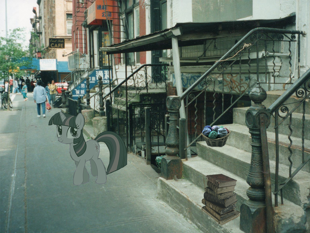
For my self-portrait I found an image of the Lower East Side because that’s where I’m from. I then masked and used smart filters to add elements that represent me. Such as a stack of books because I like to read, a bucket of yarn because I enjoy crocheting and finally Twilight Sparkle because she’s My Little Pony which is one of my favorite shows.
Image Credits:
“Vector All the Ponies”, By 90Sigma. Creative Commons Attribution-Noncommercial-Share Alike 3.0 License. DeviantArt.com. May 16, 2021. All pony characters and My Little Pony: Friendship is Magic are the property of Lauren Faust and/or Hasbro. https://www.deviantart.com/90sigma/art/Vector-All-the-Ponies-SVG-Files-302442314
“Cotton Wool Yarns”, By Brittany Wells. BrownSheep.com. Jan 11, 2017. https://brownsheep.com/knitting-is-for-kids-too-how-knitting-fosters-positive-childhood-development/
“Books, stacked of books”, By Anonymous. “HiClipart is an open community for users to share PNG images, all PNG cliparts in HiClipart are for Non-Commercial Use, no attribution required.” Hiclipart.com. Sep 8, 2018. https://www.hiclipart.com/free-transparent-background-png-clipart-vbxag/download
“New York City- New York City – Lower East – 1997”, By Onasill-Bill Badzo. Attribution-ShareAlike 2.0 Generic. Flickr.com. March 18, 2021. https://www.flickr.com/photos/onasill/51050065701/in/photostream/
No changes were made to “New York City- New York City – Lower East – 1997”
Illustrator Vector Self Portrait
Title: Self Portrait (Muppet Miriam)
Semester/Year: Fall 2023
Software: Illustrator
I created a Muppet inspired version of myself using the shape and pen tool. I created a gradient background to have a theme of happy bright colors that I enjoy looking at. I also tried really hard to make it look like she’s happy to make her less scary. I really liked the Muppets as a kid and even still to this day as well as the Sesame Street characters. However I would say that Jim Henson himself inspired my take on this project. I find his work fascinating.
The images I chose are images of where I’m from and have lived (Brisbane, Australia and Manhattan), with some animals which are also from there. The background is meant to look like a comic because they’re a big part of my life. In the foreground is an easel with a “painting” of myself on it, representing how I like art. In total I used seven images. I was inspired by the demo, which was a New York pigeon sitting on a building. This led me to want to make an image mainly based on where I’ve lived and to include animals that live there. The most challenging part about this project was thinking of new ways to add images, or how to use new effects. I ended up giving the rat laser eyes to try and use more effects.
For this project I mainly used the polygon tool to make shapes and combine them to make a face. I thought it’d be easier and more fun to try and create a cat face rather than my own face. The colors are mostly beige and blue, which I think go well together. A lot of the clothing I own is either navy blue or beige. I was mainly inspired by the example of the vector self portrait shown and I wanted to depict a face. The collar has the letter C on it for my name. A challenge I went through was not knowing how to center the C properly. It kept snapping to places that weren’t the center. I think maybe if I changed the text into a shape it would have let me move it to where I wanted it to go. One of the most challenging things that I did solve was how sometimes I would seemingly randomly be on the wrong layer. After a while I realized that when I hit undo I’d sometimes be transported back to a previous layer. This also caused me to edit shapes and paths that I was done editing instead of a new shape that I wanted to create. Once I figured out what was happening I was able to solve my issue.