For this project I wanted to tell a story with fear. It took me a while to get used to After Effects as this is my first time using it but eventually I got there. I used the many transformations to tell a story of the small red rectangle being frightened and fearful of the bigger green rectangle. I used position, scale and opacity to convey fear as well as changing the color of the solid background.
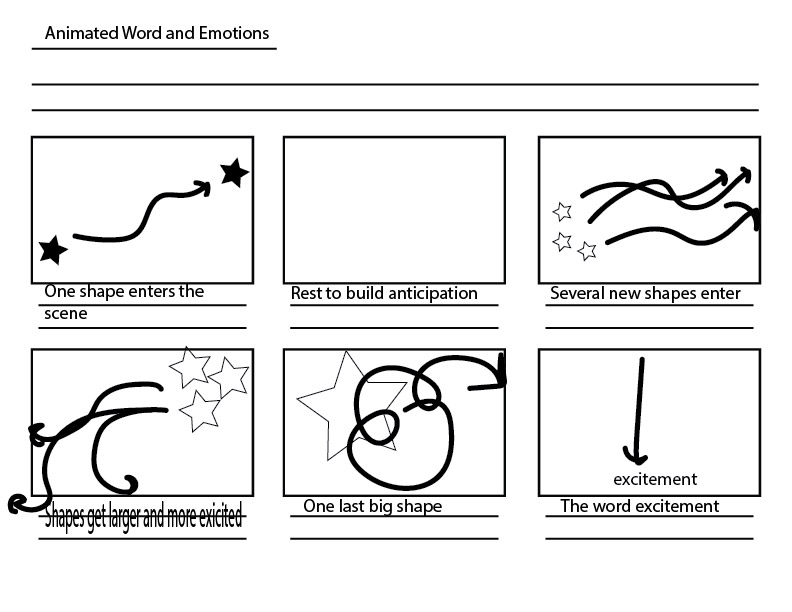
i decided to animate to a song, it’s one of my favorite songs and I wanted to go for an overall happy vibe. i chose shapes that I liked, round shapes, hearts, and stars. the colors came from the album cover being green and after I was bored with that I started to hue it more and more toward red, ultimately ending on that. as for the text and/or accents, I just slightly made them more saturated and brighter/desaturated and darker so it stays cohesive. the timing came from the song, I tried to use text to match up the words on time and make the transitions go with the beat. I think the most challenging part of this assignment was coming up with more creative ways to display text or do typography, something I think I struggle with outside of this assignment.
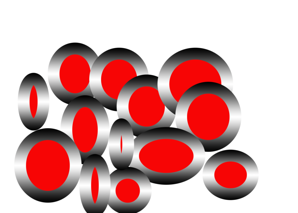
theme: the theme of this animation is to complement each color that is used in animations, videos, and art designs in animation as a whole and I think the colors red, and blue represent most used colors that even pro animators use often to make their work stand out.
I used polygons in this animation project to symbolize the colors that I like the most in anything whether it be a design or something else. the reason why I picked red is because it’s my first favorite color that I like because it also goes well with black and white. the reason why I picked blue as my second favorite color is because it has much more combinations it can go with than red can which why picked this color as well.
the picture is a little bit better hopefully everyone can see it.
I just animated 2 shapes meeting. I animated the shapes moving around the screen. Made the word Sayonara fade in & out as well as the shapes fading out.
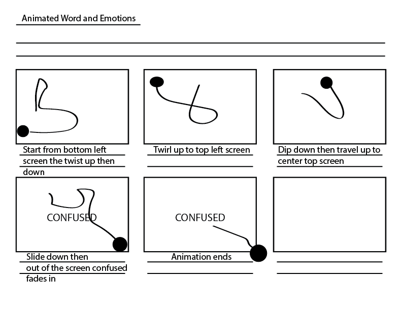
For this project I decided to make a mini animation about the emotion of confusion using After Effects. We had to include text of the word itself and I thought that it might be interesting if I made each letter move on its own to communicate confusion and chaos. I chose grays and black and white because I liked the simplicity of it and it reminds me of older animations and videos, like the ones we saw in class. Timing and pacing wasn’t too difficult because this project is only ten seconds.
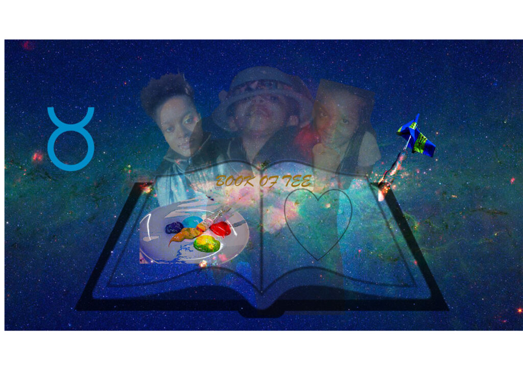
Part I raster: The images that I chose to combine to represent myself is a book, a heart, a paint brush, a book, the bajan flag, 3 images of me at different points in my life and a galaxy. I chose to put these images together because I wanted to show how spiritual and knowledgeable I consider myself to be. The Galaxy shows my interest in the stars and the moon and how connected I feel to them. The paint is to show my creativity and the heart is to show the love I have for different things in my life. The book is to represent my knowledge. The pictures of myself shows my evolution over the years. I think the hardest part of incorporating these image is trying to create the illusion that the pictures of me are coming out of the book as well as making the paint and heart look like the content of the book
Part II Vector: The taurus symbol that I’ve chosen to put into my project is to show that I am the year of the bull. I ghost to use the color blue because I think that it goes well with the galaxy that I have in the background. I also chose the 3D effect for my “TRAGEDY TO TRIUMPH’’ because I want the person who views my portrait to feel like the words are coming towards them. I want them to see in bold letters the path that I am trying to go down in my life. I also chose to make the ‘’Book of Tee golden to show that I think that the contents of my life are very important. When you see gold you think of high quality and I feel like I have a heart of gold. I also added stars that I distorted just to go with the theme of space.
for my Photoshop file at home, I made this image for homework that we got first day of multi-media and the things I would learn doing this class and how i would improve over the course of this class and i hope to make my images better for any animation job I go into and i also hope to improve my skills with this type of animation.
furthermore, the reason why i used this image is because it was much easier to add more shapes and make it stand out more than the robot eyes image that i uploaded.
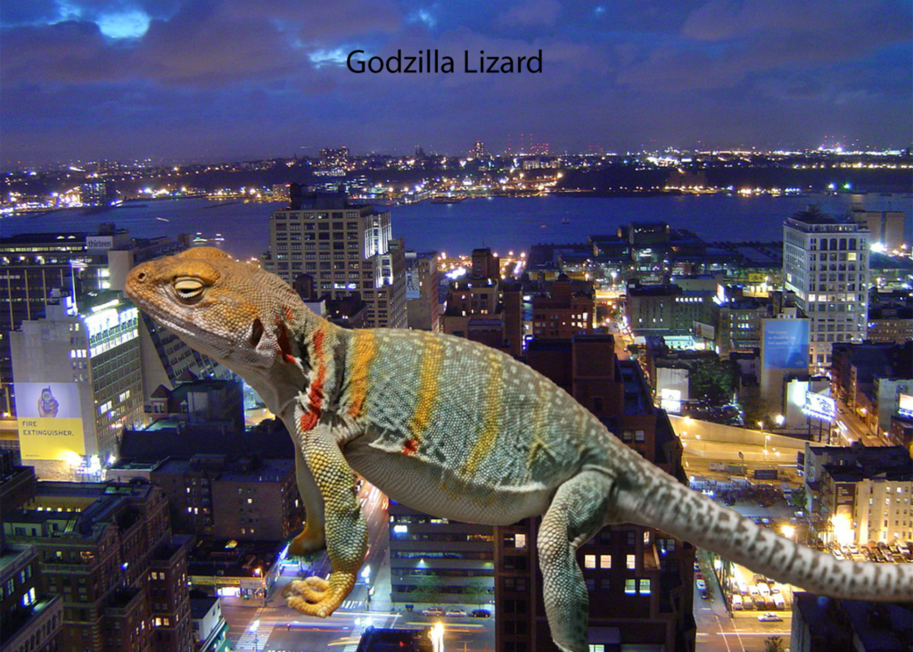
Images: Midtown New York City JPG/Lizard
Model: Sony DSC-P72
Exposure time: 1:30 sec
ISOSpeed Ratings: 100
Max aperture Value: F2.8
Flash: Fired (Compulsory/Return light not Detected)


.png)