I found this video very interesting, i think the way that many people can find their way to explode their passion i their unique style is priceless and how all that energy can be transmitted to more people struggling to find their own style, Tony i think achieved this goal in the most human and artistic way possible, his effort, his energy, his passion for what he loves is just very inspiring, i really loved his style, is very unique, very original and i think that’s the most important thing, how he able to go beyond the normal standards and make something completely new that works.
Category Archives: DISCUSSIONS
Imported from Brooklyn
At the beginning of the video I was surprised and identified a lot since sometimes it happens that you are bored at your job and you want to change it or you make a bad decision and you want to change it since you don’t want to be at a job or a boring place for a long time but doing what you like best since you would live happily. That’s what inspires me every day. I’m also surprised by the type of typeface that he has done for a long time and how he gets along with everyone either at work or in class, he has been an inspiration and I also agree that ‘Imported from Brooklyn’ is very beautiful, for me it is unique and has a free style like Tony’s.
Giulia Feleppa_Mistery Font
It was interesting and at the same time fascinating to read about the Choc font which looks familiar to me because I saw it many times while walking around the city. The Asian writing resemblance and the old vibe of the sign have always transmitted the authenticity of the restaurant and invited me in. Before reading this article, I thought it was a font designed on purpose with oriental nuances which must have been trendy and easily accessible at the time and for this reason became so common. The association of this font to Asian businesses came automatic to me. For this reason, the use of Choc for other kind of businesses like shoe store, the beauty salon or even the Mexican restaurant seems like a forced dislocation of the font, which doesn’t really work for me.
However, after reading about the Choc author and origin, I looked at this font in a different way. Roger Excoffon, the French typographer and graphic designer who created Choc was strongly influenced by the Modern Movement and it is visible in other typefaces he designed during the 1940s and ’50s. Choc is actually “abstract, modern and artistic” as said by Mr. John Chen, a New York-based restaurateur who claimed to be the first to use the font in the city. The mean reason why this font was picked is because it is powerful and heavy. It doesn’t go unnoticed. The article criticizes the font aesthetic, which is irregular and hard to read especially with a tight kerning as in the Mexican restaurant sign, and at the same time celebrates it for its effectiveness. Infact it actually makes Asian restaurants signs stand out, they make an impression. It is impressive to see how a font can transmit the same feelings and become so successful in expressing a concept that probably was different from the designer’s one. The article doesn’t state that this font was made to feel exotic by imitating design elements associated with the Asian culture. Even visually the letters seem designed with a brush, but they weren’t.
I don’t dislike Choc font, even though it is not the most perfect one. It actually works well for headings, printing and signs. However, I think that its overuse made lose its appeal.
Bracetty, Juan
Juan Bracetty
My Response
The Mystery Font That Took Over NY
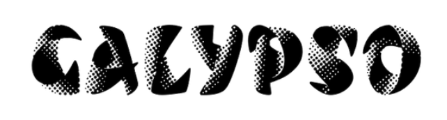
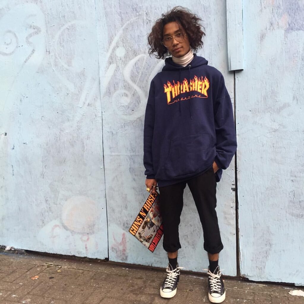
This was a very fun article to read. There are so many storefronts and signs attacking us everywhere we go, demanding our attention. It can be daunting. Rumsey Taylor, the author of this piece is right, Choc is here, there, everywhere, right under our noses. Her description of the typeface design in her words an “inherent contradiction, like a Nerf weapon” is spot on! Before I started reading this piece, I found a picture of the full Choc typeface letter forms A-Z and jotted down some descriptive words that came to mind spicy, warm but sharp, culture, zesty. And low and behold I was describing food! Choc is heavily used on restaurant storefronts, Asian themed restaurants in particular. It’s like I’ve been programmed to associate this font with food. The power of graphic design is remarkable and terrifying. I don’t think twice when I see this font atop an Asian restaurant, it just feels like it makes sense. It’s amazing how a font can essentially take on a life of its own. And to think it originated in France. The Author mentions some more notable typefaces by designer Excoffon that I looked into. Two of which piqued my interest the first being Banco. Which turns out to be the font used on Thrasher Magazine. Or those Thrasher sweatshirts that all the young kids including my skater boy brother would wear. And Calypso that I just find absolutely beautiful. All in all, good read, kudos to the author.
Mystery Font Response
I thought the subject of the article, “The Mystery Font that Took Over New York” by Rumsey Taylor was interesting. It talked how the typeface, Choc was developed and spread to areas like New York where it is very common to see. The first paragraph even describes that this typeface can be seen on Broadway and Canal Street and other areas like Fifth Avenue within the southern part of Brooklyn, New York.
Choc was a typeface that was created by a French designer of the name of Roger Excoffon in 1955. He made multiple typefaces between the 1940’s and 1950’s, but was mostly known for his scripted ones and many others such as Banco, Mistral, Calypso, and Diane. However, Choc was not embraced in the beginning compared to those typefaces. This particular typeface wasn’t established and used during the 1960’s due to the impact of phototype. According to the article, “The Mystery Font that Took Over New York” by Rumsey Taylor states that, “As an industry, type design was at this time slow-going, and its applications more limited than it is now. It wasn’t until the spread of phototypesetting in the 1960s that Choc could be used efficiently for large-scale applications”. Taylor furthers goes on to say that business owners had to get this typeface hand painted in order to get their name across.
I noticed throughout the article that there were a lot of opinions on Choc. One quote by Sandra Chamaret from the article, “The Mystery Font that Took Over New York” by Rumsey Taylor states, “Choc expresses a certain violence. It seems spattered on the page, the letters going in all directions.”. Basically, she is saying that this typeface has seems very rigid and thick lines. Some of the letter designs flow differently or do not look that appealing than others. The article even describes some of the letter designs within the eleventh paragraph. For example, the lowercase “r” design for Choc sort of resembles a “z” shape. Other examples include how the lowercase “g” design mimics a capital “S” shape. Another example that this article didn’t mention the capital “G” resembling a lowercase “a”. It is interesting how this typeface’s letter designs have different appearances, but still look like other letters and having this paint brush like style. Steven Heller, co-chairman at the School of Visual Arts’ M.F.A. program, in the article, “The Mystery Font that Took Over New York” by Rumsey Taylor referred to Choc as “chaos”, while Taylor refers to it as “cacophony of typography”. Basically they are saying that it is too jarring and vexing. It may seem a little off at first and is not the typeface design, but I think it is still a decent design for the most part.
Steve Fajardo’s Choc font reaction
After reading the article, I learned that the Choc typeface, even though some people may not be appealed by the visuals of it, it is still used by certain people. More specifically, Choc is mostly used in Asian storefronts and restaurants. Either way, the typeface was designed by a French typographer and graphic designer named Roger Excoffon, whose work departed from the Modernist trends that characterized midcentury type design. Coming from Marseilles, Excoffon created a diverse array of typefaces during the 1940s and ’50s, but his script typefaces have become his most enduring work. Overall, with his design aspect of the choc typeface, it has a bit Asain writing system with how it is formed. Personally, I find it unique in the expression of how it stands out in Asian restaurants I sometimes go because it gives the feeling of authentic and welcoming in a sense. On top of that, I think when this typeface is used by them, it shows how different they want to be from the other stores/restaurants who used other fonts to give the impression to the public who they are and what they do, as a form of identity.
Giulia Feleppa’s comment on History of Type
“A Brief History of Type” gives a short but intense view of the evolution of type from its first use centuries ago, to standardize communication and the commerce to the new era where type is used in a more artistic way. What appears from the video is that the evolution of type wasn’t uniquely caused by the development of the printing system which lead to the mass printing production. Definitely the work of the scribes and the first ceramic types in China and metal ones in Korea, the movable types used in the printing of the Gutenberg’s Bible, the invention of the Linotype by Otmar Mergenthaler which dominated most of the XX century, the Monotype system, the Litography and the new computer technology played a fundamental role in the history of type. However, type evolved mostly under an esthetical aspect. After the publication of the Gutenberg’s Bible, people like Nicholas Johnson started focusing on the readability of the type. The visual evolution of type actually started with his first beautiful work which became inspiration for big names of typography like Baskerville, Batoni, Caslon, Garamond and right after Benguiat, Gill, Zapf. Even though their purpose might have been mostly utilitarian, the transformation of the type design mainly reflected the spirit and style of the different eras in which the type was created. During the Renaissance and Einlightment period type was the expression of the pursue of excellence and beauty, during the Industrial Revolution, the need of a better and faster communication, but also became a mean to drive the attention to the printing (which created a new industry, advertising), during the 1960s and 1970s type expressed the revolutionary spirit and the research of modern new looks. In the late 90s, graphic designers started giving a more hand lettering typographic design because they wanted less traditional types.
The “Fun History Of Type” video shows instead how the type had to adapt to the different writing supports. When Egyptians introduced the papyrus because easier to transport than rocks and to write on, they simplified the alphabet. Then the papyrus was substituted by the parchment, which was more expensive, so the type had to become smaller and thinner to fit as many words possible into one page. After the introduction of Gutenberg’s movable characters, typography suddenly subsisted calligraphy in fact Johnson and other important names in the history of typography created more readable typefaces once printed. With the spread of computers and the digital media, newspapers produced digitally, appeared exactly as the printed version which resulted as really difficult to read on pixelated screens. Carter had to invent the Verdana font to make those newspapers easily readable on the screen. Nowadays phones are the main devices used to read, so new typefaces have been created to cleanlier appear on small screens. Hence, with the constant evolution of the new technology, the type design will continue to thrive extensively.
So I had the impression that in the first video the type evolved to be graphically more pleasant and stylish and in the second video it evolved under an utilitarian pressure. However, in an era with so many accessible and free typefaces, I hope that we will have an improvement in the quality of free fonts (not only estethically but also ecofriendly) and not only in the quantity.
2 History of Type videos
In the video, “A Brief History of Type” by Rob Leushcke talks about how types evolve from past to now. This video was interesting to know that the first movable form of type was created in China using ceramic materials and then a short time later metal type was being used in Korea. In the West, Johannaes Gutenberg created the first mas-produced book the Gutenberge Bible. In 1470s, the French artist Nicholas Jensen was the first to create a Roman face. In 1800s, Otmar Mergenthaler developed a machine that would cast a hot lead alloy of metal into lines of type. In 1898, Talbert Ianceton created the mono type system and it was used by most of the large publishing houses and newspapers. In the mid-1980s, the typographic industry prepared for a technological transformation so the type design could be found on everything. By the 1990s font development software had became reasonable for the graphic designer. Today, the trend of new creative thought design is getting stronger as the development of software allows artists to use powerful tools at will.
3 Typography videos
Font Men
In this video, it was interesting that two men decided to make their company together. They said they love this work and it is fun but also it is really hard. I found that letters “H”, “O” and “D” are the decision about the weigh, about the width, the serif and spacing, tradition weigh of the thick to thin. Also, the most surprising is that typeface is made by living designers today.
Mike Langley
Mike Langley loves the old, he doesn’t like the new. He claims that letters are human feelings and no two letters are going to be same. He says that mistake and profession are interesting. I agree with him because the painting by hand more interesting to look the designer works than created by science.
Dan Rhatigan on Ryman Eco
He says a good typeface is expressing that a kind of personality for someone who work with and reponse to. Ryman Eco is a typeface design to minimize the surface area of every letters and it is a font that trying to save the link.
Video Commentary – Week 3
The history of typography is much more elaborate than I had thought. It has shown me that there truly is an innate need to express ourselves through written word and symbols, otherwise the intensive labor people have put into creating and working with typography would be unnecessary.