Category Archives: Mystery Font Week 6

The Mystery Font That Took Over New York

Choc is a quirky calligraphic typeface made by a French graphic designer in the 1950s that took over New York and ended up on storefronts everywhere. The Choc typeface has a brushed look to it that gives off a delicate look overall. This typeface can be found in almost every borough and is used in numerous locations such as sushi spots, restaurants, salons, etc. I personally never heard of the font until now and surprisingly, my go-to sushi place (attached photo) that I go to every week has the Choc font! Even before hearing or knowing anything about the font, I used to look at it and love the way it looked. It was quite amazing that a font type I’ve never heard of before was something that was right in front of me this whole time. I personally love the Choc font and it gives me an abstract yet modern feeling to it. It also gives off an Asian style theme.

Mystery Font

This article was interesting because I discovered that the Choc typeface was similar to the calligraphy form of the Asian alphabet system, and used it on many Asian store signboards. I think no matter what font people use on their store signs, they can focus on communicating the meaning they seek and how to differentiate themselves from other restaurants

Mystery font

This article was very interesting, i like the fact that many fonts designers think this chop font is a mess or just a crash of different styles, but is actually very popular now. i like how this font were used in many restaurants, specially Asians, but they work well, even other restaurants from different cultures use this and still works, this font is used in many other type of store other than restaurants which means that this font became really famous and welcome in New York. I like the style of the chop font, i think it looks very attractive and because it looks like was made with a brush is not, and that gives it a more refined touch. One think i found interesting is how many designers found this font very aggressive and a very special way to do something different, but there are other designers that really hate this design because they think it looks like a graffiti and just chaos. in the end this is one of the most amazing and original font I’ve ever seen and i think it works really well in most every environment

Giulia Feleppa_Mistery Font

It was interesting and at the same time fascinating to read about the Choc font which looks familiar to me because I saw it many times while walking around the city. The Asian writing resemblance and the old vibe of the sign have always transmitted the authenticity of the restaurant and invited me in. Before reading this article, I thought it was a font designed on purpose with oriental nuances which must have been trendy and easily accessible at the time and for this reason became so common. The association of this font to Asian businesses came automatic to me. For this reason, the use of Choc for other kind of businesses like shoe store, the beauty salon or even the Mexican restaurant seems like a forced dislocation of the font, which doesn’t really work for me.   

However, after reading about the Choc author and origin, I looked at this font in a different way. Roger Excoffon, the French typographer and graphic designer who created Choc was strongly influenced by the Modern Movement and it is visible in other typefaces he designed during the 1940s and ’50s. Choc is actually “abstract, modern and artistic” as said by Mr. John Chen, a New York-based restaurateur who claimed to be the first to use the font in the city. The mean reason why this font was picked is because it is powerful and heavy. It doesn’t go unnoticed. The article criticizes the font aesthetic, which is irregular and hard to read especially with a tight kerning as in the Mexican restaurant sign, and at the same time celebrates it for its effectiveness. Infact it actually makes Asian restaurants signs stand out, they make an impression. It is impressive to see how a font can transmit the same feelings and become so successful in expressing a concept that probably was different from the designer’s one. The article doesn’t state that this font was made to feel exotic by imitating design elements associated with the Asian culture. Even visually the letters seem designed with a brush, but they weren’t.  

I don’t dislike Choc font, even though it is not the most perfect one. It actually works well for headings, printing and signs. However, I think that its overuse made lose its appeal.

Bracetty, Juan

Juan Bracetty

My Response

The Mystery Font That Took Over NY

This was a very fun article to read. There are so many storefronts and signs attacking us everywhere we go, demanding our attention. It can be daunting. Rumsey Taylor, the author of this piece is right, Choc is here, there, everywhere, right under our noses. Her description of the typeface design in her words an “inherent contradiction, like a Nerf weapon” is spot on! Before I started reading this piece, I found a picture of the full Choc typeface letter forms A-Z and jotted down some descriptive words that came to mind spicy, warm but sharp, culture, zesty. And low and behold I was describing food! Choc is heavily used on restaurant storefronts, Asian themed restaurants in particular. It’s like I’ve been programmed to associate this font with food. The power of graphic design is remarkable and terrifying. I don’t think twice when I see this font atop an Asian restaurant, it just feels like it makes sense. It’s amazing how a font can essentially take on a life of its own. And to think it originated in France. The Author mentions some more notable typefaces by designer Excoffon that I looked into. Two of which piqued my interest the first being Banco. Which turns out to be the font used on Thrasher Magazine. Or those Thrasher sweatshirts that all the young kids including my skater boy brother would wear. And Calypso that I just find absolutely beautiful. All in all, good read, kudos to the author.  

Banco Fontsyle

Mystery Font Response

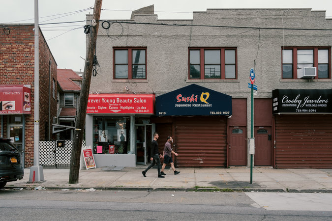
I thought the subject of the article, “The Mystery Font that Took Over New York” by Rumsey Taylor was interesting. It talked how the typeface, Choc was developed and spread to areas like New York where it is very common to see. The first paragraph even describes that this typeface can be seen on Broadway and Canal Street and other areas like Fifth Avenue within the southern part of Brooklyn, New York.

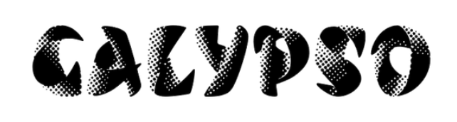
Choc was a typeface that was created by a French designer of the name of Roger Excoffon in 1955.  He made multiple typefaces between the 1940’s and 1950’s, but was mostly known for his scripted ones and many others such as Banco, Mistral, Calypso, and Diane. However, Choc was not embraced in the beginning compared to those typefaces. This particular typeface wasn’t established and used during the 1960’s due to the impact of phototype. According to the article, “The Mystery Font that Took Over New York” by Rumsey Taylor states that, “As an industry, type design was at this time slow-going, and its applications more limited than it is now. It wasn’t until the spread of phototypesetting in the 1960s that Choc could be used efficiently for large-scale applications”. Taylor furthers goes on to say that business owners had to get this typeface hand painted in order to get their name across.

I noticed throughout the article that there were a lot of opinions on Choc. One quote by Sandra Chamaret from the article, “The Mystery Font that Took Over New York” by Rumsey Taylor states, “Choc expresses a certain violence. It seems spattered on the page, the letters going in all directions.”. Basically, she is saying that this typeface has seems very rigid and thick lines. Some of the letter designs flow differently or do not look that appealing than others. The article even describes some of the letter designs within the eleventh paragraph. For example, the lowercase “r” design for Choc sort of resembles a “z” shape. Other examples include how the lowercase “g” design mimics a capital “S” shape. Another example that this article didn’t mention the capital “G” resembling a lowercase “a”. It is interesting how this typeface’s letter designs have different appearances, but still look like other letters and having this paint brush like style. Steven Heller, co-chairman at the School of Visual Arts’ M.F.A. program, in the article, “The Mystery Font that Took Over New York” by Rumsey Taylor referred to Choc as “chaos”, while Taylor refers to it as “cacophony of typography”. Basically they are saying that it is too jarring and vexing. It may seem a little off at first and is not the typeface design, but I think it is still a decent design for the most part.

Steve Fajardo’s Choc font reaction

After reading the article, I learned that the Choc typeface, even though some people may not be appealed by the visuals of it, it is still used by certain people. More specifically, Choc is mostly used in Asian storefronts and restaurants. Either way, the typeface was designed by a French typographer and graphic designer named Roger Excoffon, whose work departed from the Modernist trends that characterized midcentury type design. Coming from Marseilles, Excoffon created a diverse array of typefaces during the 1940s and ’50s, but his script typefaces have become his most enduring work. Overall, with his design aspect of the choc typeface, it has a bit Asain writing system with how it is formed. Personally, I find it unique in the expression of how it stands out in Asian restaurants I sometimes go because it gives the feeling of authentic and welcoming in a sense. On top of that, I think when this typeface is used by them, it shows how different they want to be from the other stores/restaurants who used other fonts to give the impression to the public who they are and what they do, as a form of identity.