The video was interesting to see how typography affects the passion of artists. And I was surprised that there wasn’t an artist in his family. I very much liked Tony’s various logos and designs. I think his efforts are going to transcend the art age and tell stories of his past. Also, one thing I want to remember is the logo, which tells tales.
Category Archives: DISCUSSIONS
A BRIEF HISTORY OF TYPE and A FUN HISTORY OF TYPE
In the brief history of type, I learned that the first movable versions of type were founded in china. Lettering has evolved greatly over time and it amazed me that typography even goes so far back. The industrial revolution created an age of newly wanted printed material. Typographic technology has greatly changed and advanced over the years. This video was very informative.
In A Fun History of Type, I learned that the tools used, help define different types of typography. The linotype system was created to make typing faster and more type was being produced. Typography grew even further through the invention of Macintosh and the use of mobile devices. People would now stay on their phones reading typography.
The Mystery Font That Took Over New York
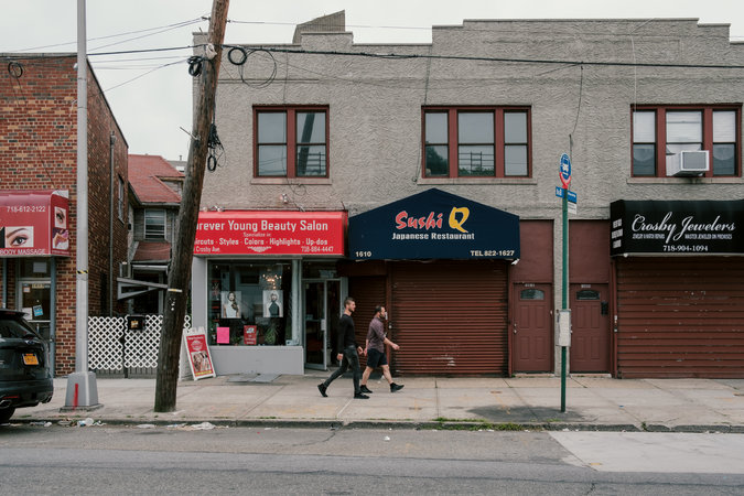
Choc is a quirky calligraphic typeface made by a French graphic designer in the 1950s that took over New York and ended up on storefronts everywhere. The Choc typeface has a brushed look to it that gives off a delicate look overall. This typeface can be found in almost every borough and is used in numerous locations such as sushi spots, restaurants, salons, etc. I personally never heard of the font until now and surprisingly, my go-to sushi place (attached photo) that I go to every week has the Choc font! Even before hearing or knowing anything about the font, I used to look at it and love the way it looked. It was quite amazing that a font type I’ve never heard of before was something that was right in front of me this whole time. I personally love the Choc font and it gives me an abstract yet modern feeling to it. It also gives off an Asian style theme.
Mystery Font
This article was interesting because I discovered that the Choc typeface was similar to the calligraphy form of the Asian alphabet system, and used it on many Asian store signboards. I think no matter what font people use on their store signs, they can focus on communicating the meaning they seek and how to differentiate themselves from other restaurants
Imported From Brooklyn Response
Imported from Brooklyn
The video was interesting to see how typography affects artists’ passion. And I was surprised that there was no artist in his family. I really liked Tony’s various logos and styles. I think his achievements can transcend the age of art and tell stories about his history. Also, one thing I would like to remember is the logo, which tells stories.
Mystery font
This article was very interesting, i like the fact that many fonts designers think this chop font is a mess or just a crash of different styles, but is actually very popular now. i like how this font were used in many restaurants, specially Asians, but they work well, even other restaurants from different cultures use this and still works, this font is used in many other type of store other than restaurants which means that this font became really famous and welcome in New York. I like the style of the chop font, i think it looks very attractive and because it looks like was made with a brush is not, and that gives it a more refined touch. One think i found interesting is how many designers found this font very aggressive and a very special way to do something different, but there are other designers that really hate this design because they think it looks like a graffiti and just chaos. in the end this is one of the most amazing and original font I’ve ever seen and i think it works really well in most every environment
Imported from Brooklyn
After watching the video, I realized that typography can be very impactful to those who cherish the structure of words and letters. It was very amusing to see the amount of passion Tony has implemented into his work. I was surprised to see the different logotypes he made with his own hands and how nicely aesthetic it is by the arrangement. Moreover, I was surprised that he came from a background where his parents weren’t artists. However, Tony decided that he can become a commercial artist, and later on, he made a legacy for himself. I admire the “IMPORTED FROM BROOKLYN” typographic design he made. Finally, when the video was about to end, one of the things that made me chuckle was when Douglas stated: “He’s an Italian guy who wears a French buret, he should lose it and can get more respect if he wears a Fedora.” Also, the retakes/bloopers where Tony would show the middle finger and his own moments.
Imported From Brooklyn
This video was a very interesting watch from beginning to end. It was inspiring to see Antonio Di Spigna change his life for a life that allows him to express his passion. Not only to express his passion but to inspire and influence people’s lives. His steady hand art are very detailed and precise with great balance. His contributes to the idea that art can be timeless and can tell a story of it’s history. I can see why he pretty tough on his students and be brutal of their work but that’s his way to motivate his students to the a standard to make art as influential as his.
Imported from Brooklyn BY GiuliaFeleppa
What a beautiful example of living life with passion and transmit it to people around you!! Tony Di Spigna realized in early age he had to find his passion and make it a job. With the big fortune of working for the Lubalin Studio Center, he developed his skills and unique style, and he decided to teach it to young generations. The uniqueness of Di Spigna was his ability to reproduce with a simple pencil harmonious letters based on the Spencerian script which was common in the 1800 before the adoption of typewriter. This script usually created with a fountain pen expresses joy and freedom with a sense of movement, amazing heavy curvatures, variety and contrast. Di Spigna added his personality to it and he mastered it so well that he created something new. Something so unique and expressive that is timeless. Infact his Spencerian artworks are full of energy, elegance and modernity even though he used centuries old script.
This video opened a new world to me, giving a name to most of the gorgeous fonts, logos and works I always admired but I didn’t know the authors. Between all his works shown in the video I was really moved by the Harry and Megan pencil sketch. Being able to create something so perfect without the use of the computer nowadays is astonishing and admirable.
Even though he has been described as a tough professor and maniac for excellence, I would love to be one of his students. His strong personality and way of heavily judge his students might show him in a bad light but that‘s part of his personality and his way to get emotional about some students from whom he expects more. Aren’t intense professors the ones from who we learn the most? I believe the fact that Herb Lubalin was extremely meticulous in his work and expected the same from his employers, influenced Di Spigna to constantly look for perfection and it brought him to excel as graphic designer.
(Being from South Italy too, his story motivated me to keep working and keep aiming for excellence).