
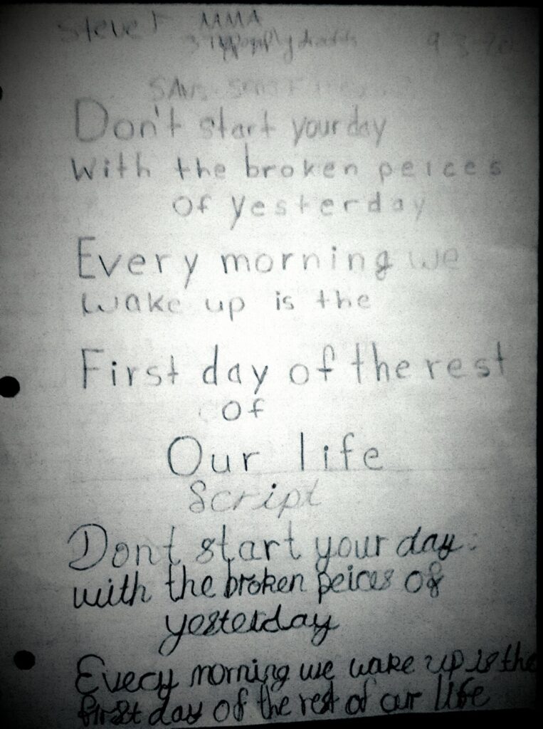
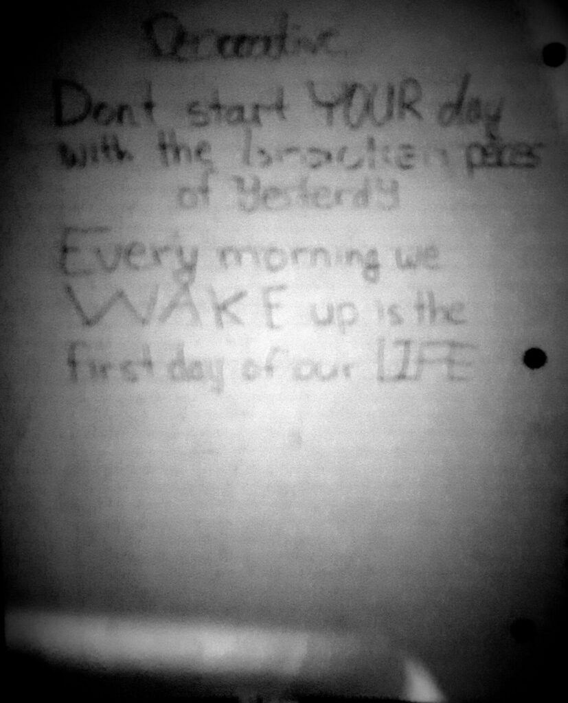
Final Letterform
After reading the article, I learned that the Choc typeface, even though some people may not be appealed by the visuals of it, it is still used by certain people. More specifically, Choc is mostly used in Asian storefronts and restaurants. Either way, the typeface was designed by a French typographer and graphic designer named Roger Excoffon, whose work departed from the Modernist trends that characterized midcentury type design. Coming from Marseilles, Excoffon created a diverse array of typefaces during the 1940s and ’50s, but his script typefaces have become his most enduring work. Overall, with his design aspect of the choc typeface, it has a bit Asain writing system with how it is formed. Personally, I find it unique in the expression of how it stands out in Asian restaurants I sometimes go because it gives the feeling of authentic and welcoming in a sense. On top of that, I think when this typeface is used by them, it shows how different they want to be from the other stores/restaurants who used other fonts to give the impression to the public who they are and what they do, as a form of identity.
In the “History of type”, I learned that typography went through many changes from centuries past to the present, especially how type was made. For example, type before was used in dyes, currency punches, and seals, and then one day in the 11th century, China created the first movable type using ceramic materials and in Korea, was the first metal type. Moreover, people like Johannes made the first massively produced Guttenberg bible that included movable type. With type being the main focus, a lot of emphasis on the type was usedfor many things such as posters, books, plays, and there were even nbewer ways in which type was gooing to be created for much convenience. In the case of Otmae Mergenthaler, he created the hot lead alloy metal type which allowed typing to be less cumbersome. As the years go on, type was used in advertisiment and for commercial use.
In the ” Fun history of type” I learned that during the ages of humankind, different ways of calligraphy and typography were used in different time periods. In ancient Egypt, papyrus was used to write out hieroglyphs, stone tablets in Ancient Rome. When Guttenberg came along, he massively produced the Guttenberg bible using first ever movable printing press. With the printing press being movable, many establishments like schools and churches used it to write more books, texts, etc. Advertising was heavily used during the industrial time period with different, fancy typefaces and when apple came along in the 1980’s, a new reading habit appeared with the pixelated letters. Finally, in the 90’s and nowadays, types are heavily digitized with using a computer to moving our screens on our mobile, tablet devices.


source quote : Konstantina Verv
image source: Pinterest
https://www.pinterest.com/pin/407364728771010863/?d=t&mt=login
Hi, my name is Steve Fajardo( the j in my last name makes the h sound) and I am majoring in multimedia programming and design. While I am still learning the concepts of graphic design, apparently over the summer, I started to have interests in learning how to code/program. Now I am not saying that I have mastered yet because honestly, I am still learning the basics especially in HTML and CSS and one day learns JavaScript afterward. But one day, After mastering these three, I would love to practice even more programming languages especially Python and more. I am looking forward to either become a web developer/ or software engineer. However, I am willing to refresh my graphic design skills so taking this class, especially in typography, would be useful. I plan to be in the freelancing business myself as well one day.
Powered by: