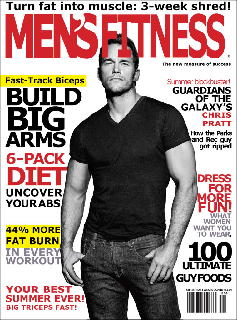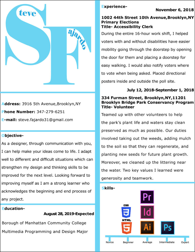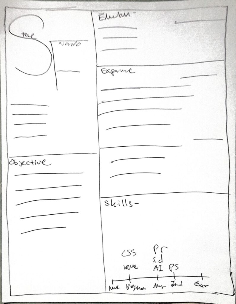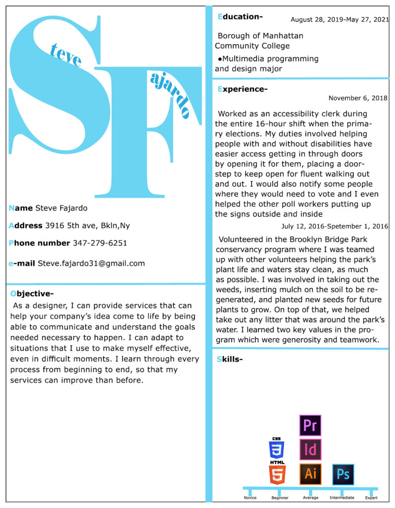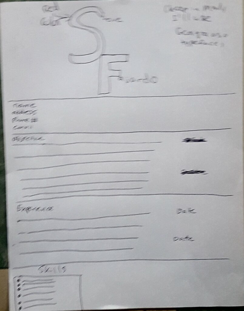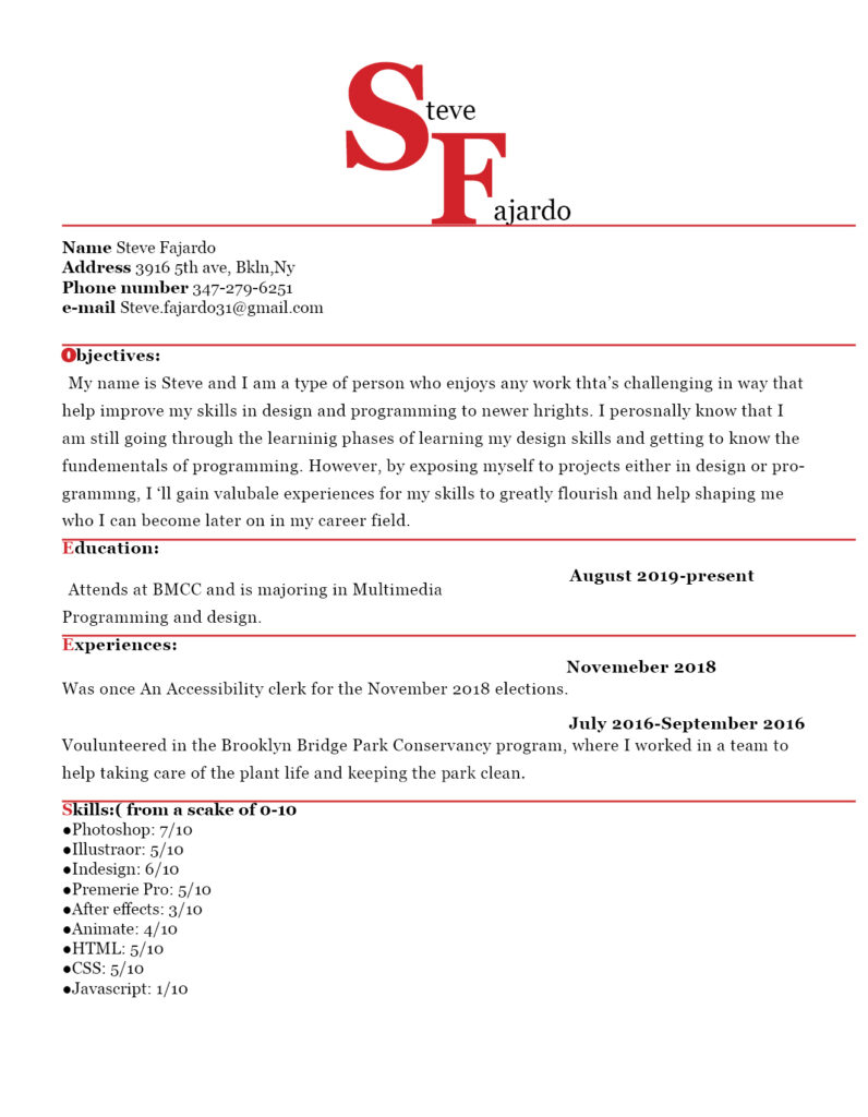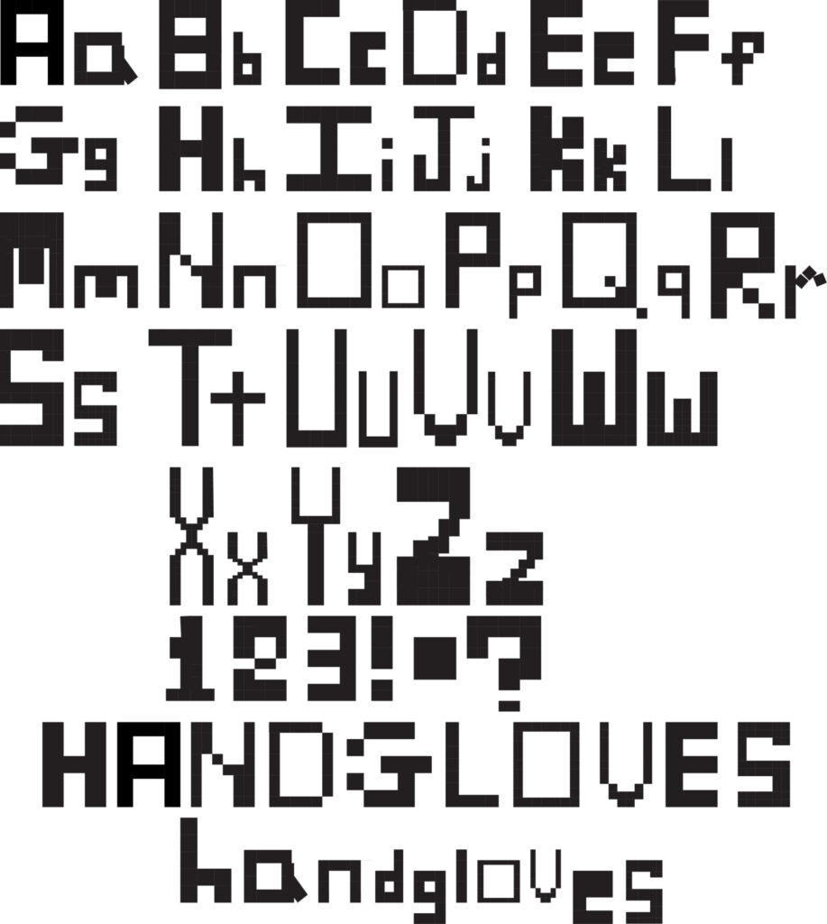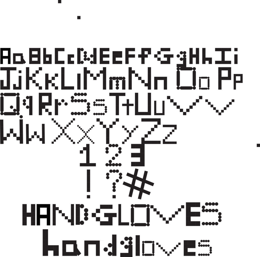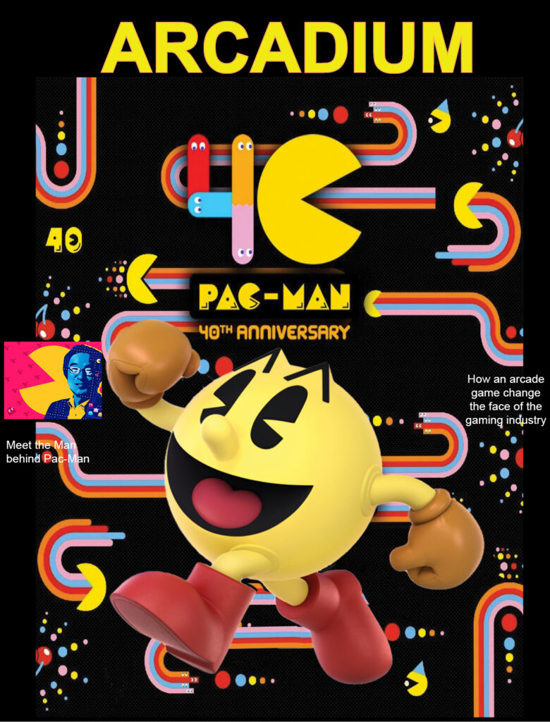
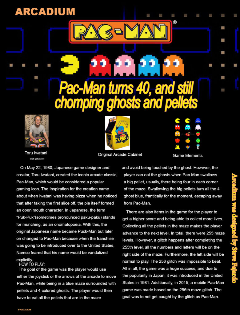
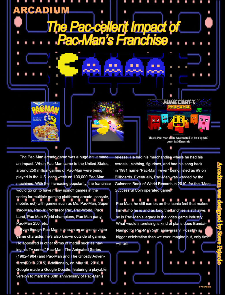


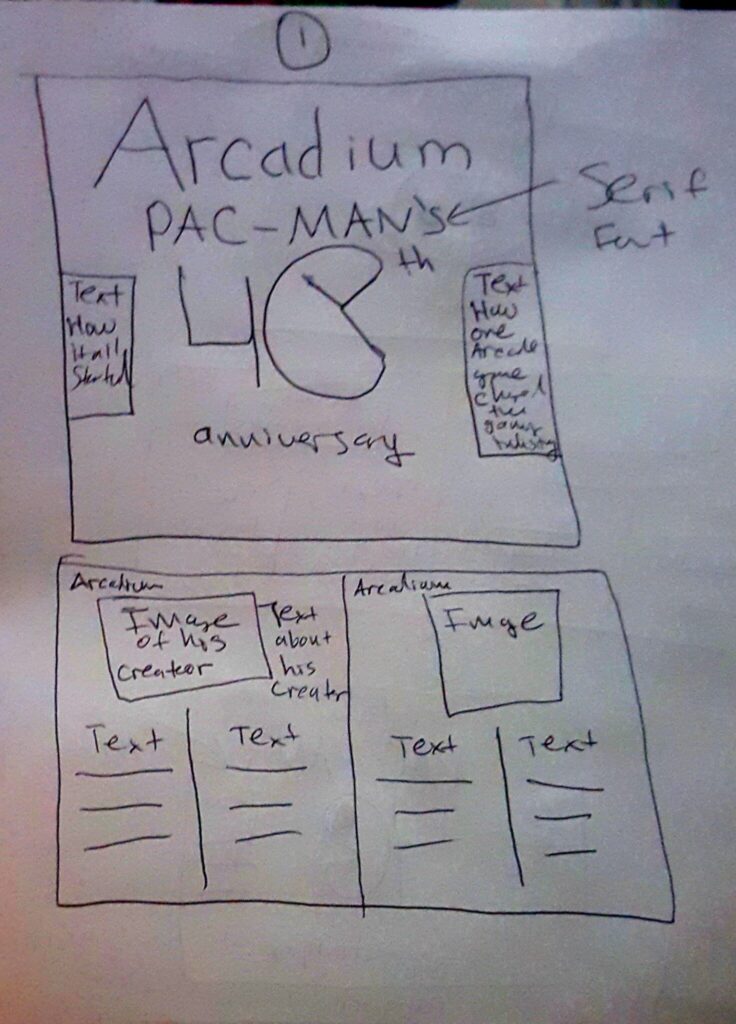
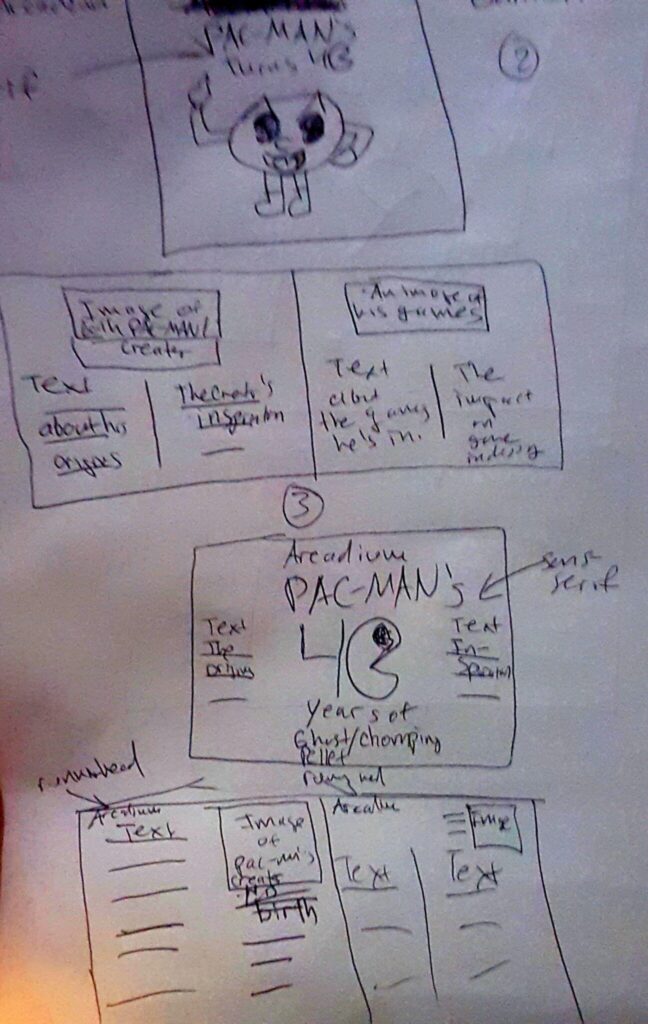
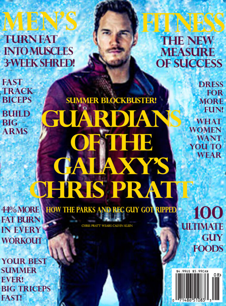
A Tiny notice, the first draft, I was suppose to say sans serif for the text on the cover while on the third it should say serif. My bad.
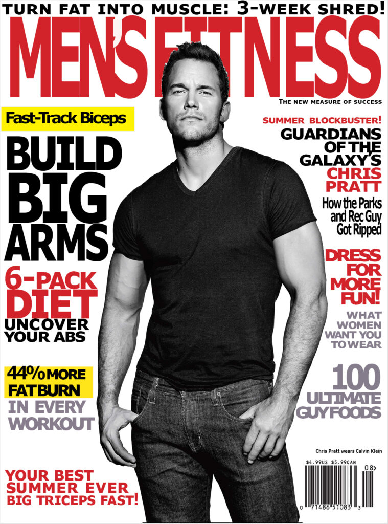
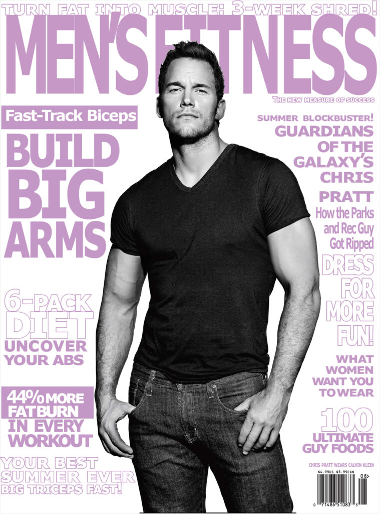
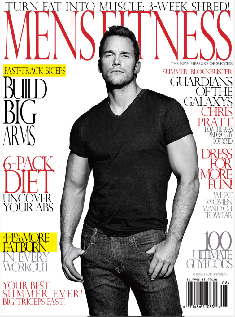
After watching the video, I realized that typography can be very impactful to those who cherish the structure of words and letters. It was very amusing to see the amount of passion Tony has implemented into his work. I was surprised to see the different logotypes he made with his own hands and how nicely aesthetic it is by the arrangement. Moreover, I was surprised that he came from a background where his parents weren’t artists. However, Tony decided that he can become a commercial artist, and later on, he made a legacy for himself. I admire the “IMPORTED FROM BROOKLYN” typographic design he made. Finally, when the video was about to end, one of the things that made me chuckle was when Douglas stated: “He’s an Italian guy who wears a French buret, he should lose it and can get more respect if he wears a Fedora.” Also, the retakes/bloopers where Tony would show the middle finger and his own moments.
