This article was interesting because I discovered that the Choc typeface was similar to the calligraphy form of the Asian alphabet system, and used it on many Asian store signboards. I think no matter what font people use on their store signs, they can focus on communicating the meaning they seek and how to differentiate themselves from other restaurants
All posts by Minjee Go
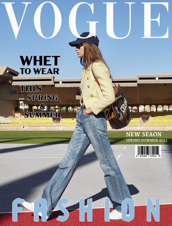
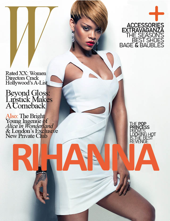
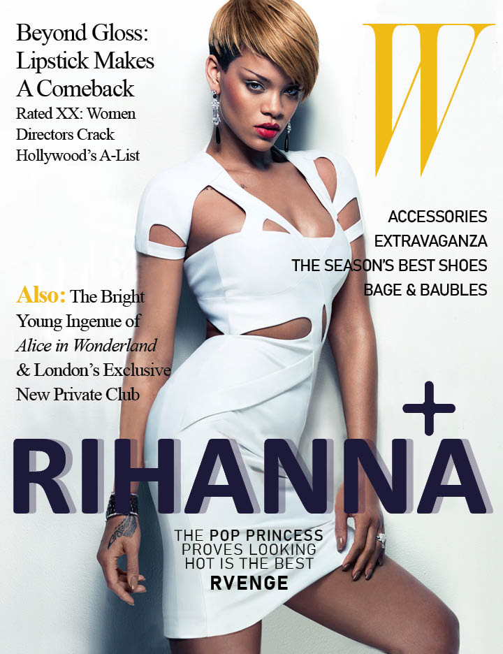
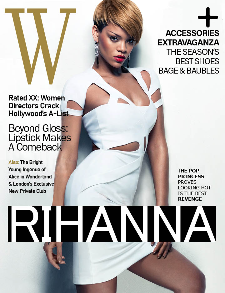
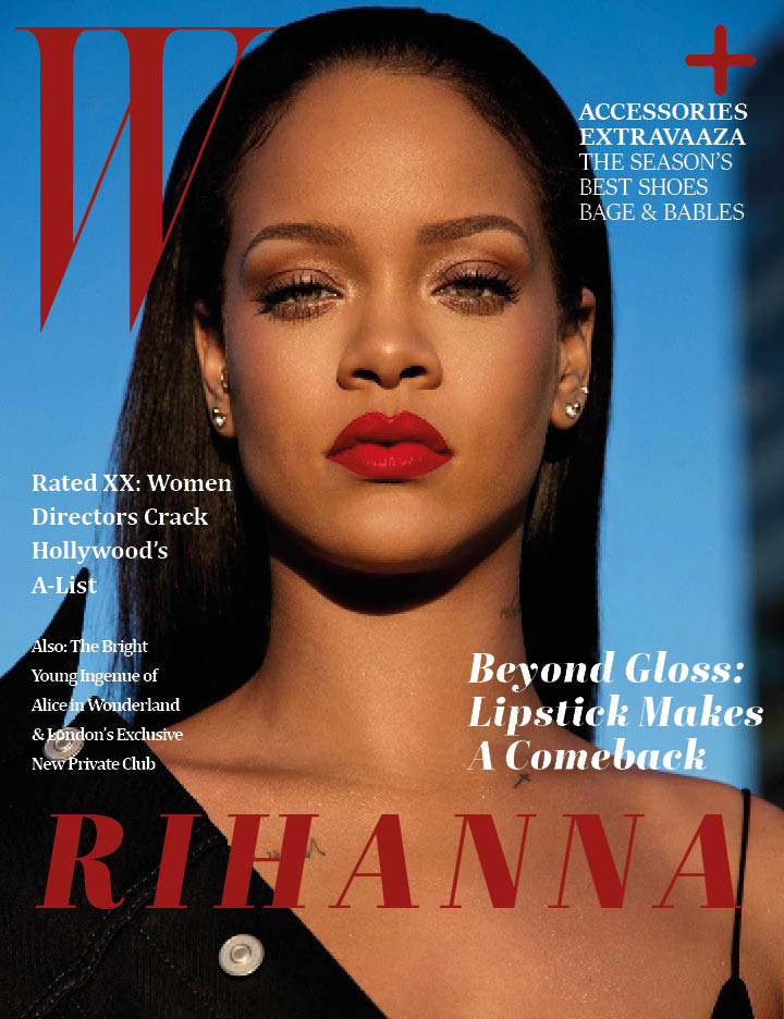
Magazine Final

Imported from Brooklyn
The video was interesting to see how typography affects artists’ passion. And I was surprised that there was no artist in his family. I really liked Tony’s various logos and styles. I think his achievements can transcend the age of art and tell stories about his history. Also, one thing I would like to remember is the logo, which tells stories.
Magazine 1st draft
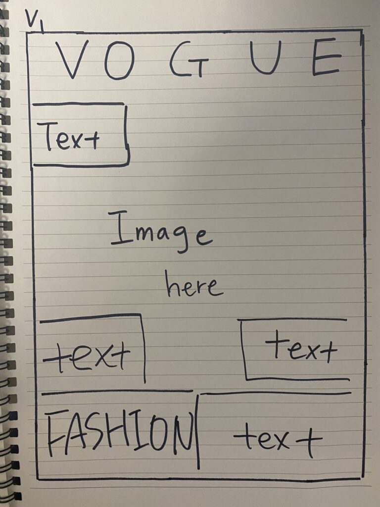
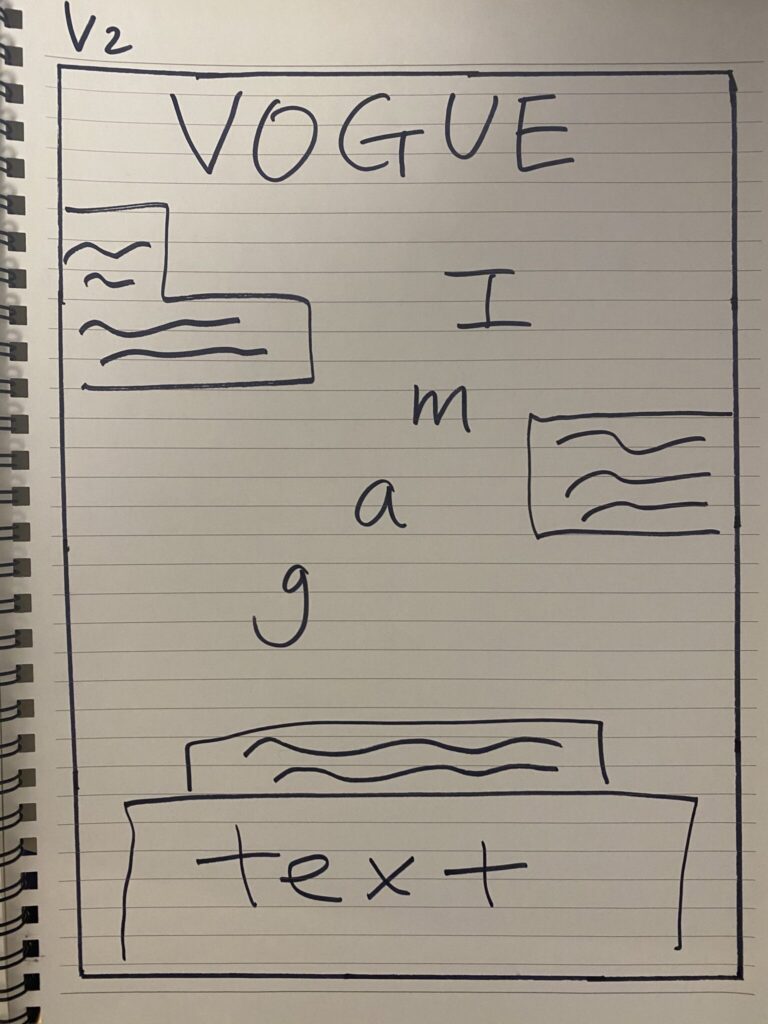
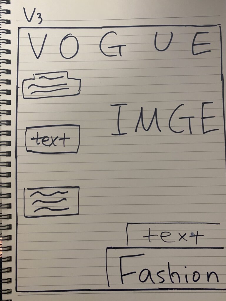
Layout Replication
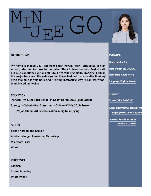
Resume Design Final

Resume Designs 2nd Draft
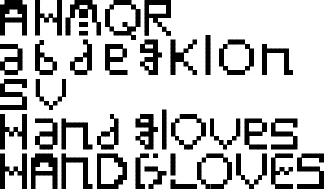
Bitmap Alphabet Final
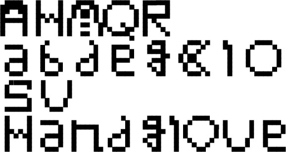
Bitmap Alphabet draft
Letterform Final
