All posts by Maliq Ruffin
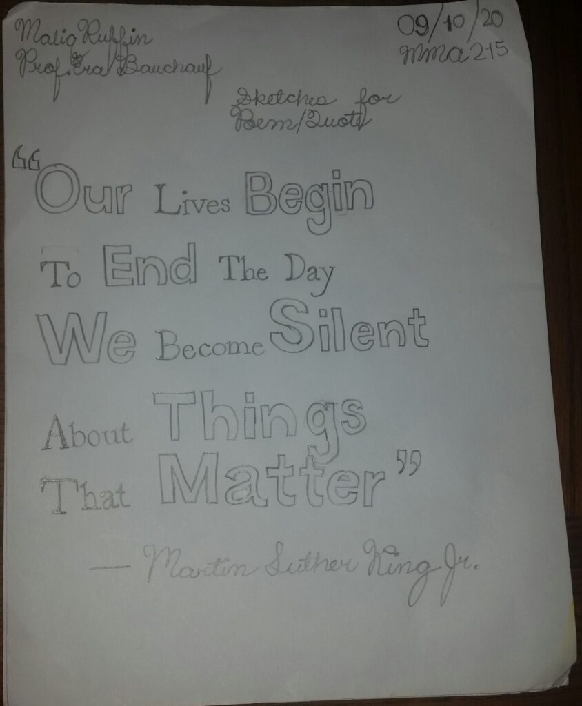
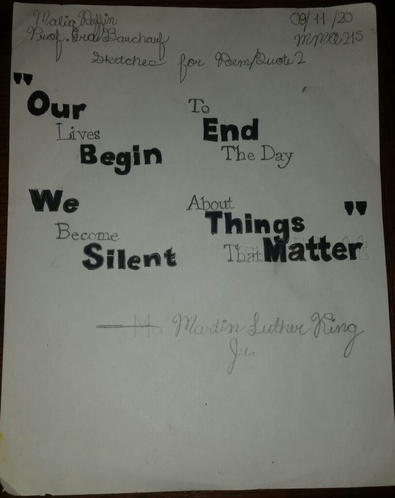
Bitmap Designs (Draft)
Mystery Font Response
I thought the subject of the article, “The Mystery Font that Took Over New York” by Rumsey Taylor was interesting. It talked how the typeface, Choc was developed and spread to areas like New York where it is very common to see. The first paragraph even describes that this typeface can be seen on Broadway and Canal Street and other areas like Fifth Avenue within the southern part of Brooklyn, New York.
Choc was a typeface that was created by a French designer of the name of Roger Excoffon in 1955. He made multiple typefaces between the 1940’s and 1950’s, but was mostly known for his scripted ones and many others such as Banco, Mistral, Calypso, and Diane. However, Choc was not embraced in the beginning compared to those typefaces. This particular typeface wasn’t established and used during the 1960’s due to the impact of phototype. According to the article, “The Mystery Font that Took Over New York” by Rumsey Taylor states that, “As an industry, type design was at this time slow-going, and its applications more limited than it is now. It wasn’t until the spread of phototypesetting in the 1960s that Choc could be used efficiently for large-scale applications”. Taylor furthers goes on to say that business owners had to get this typeface hand painted in order to get their name across.
I noticed throughout the article that there were a lot of opinions on Choc. One quote by Sandra Chamaret from the article, “The Mystery Font that Took Over New York” by Rumsey Taylor states, “Choc expresses a certain violence. It seems spattered on the page, the letters going in all directions.”. Basically, she is saying that this typeface has seems very rigid and thick lines. Some of the letter designs flow differently or do not look that appealing than others. The article even describes some of the letter designs within the eleventh paragraph. For example, the lowercase “r” design for Choc sort of resembles a “z” shape. Other examples include how the lowercase “g” design mimics a capital “S” shape. Another example that this article didn’t mention the capital “G” resembling a lowercase “a”. It is interesting how this typeface’s letter designs have different appearances, but still look like other letters and having this paint brush like style. Steven Heller, co-chairman at the School of Visual Arts’ M.F.A. program, in the article, “The Mystery Font that Took Over New York” by Rumsey Taylor referred to Choc as “chaos”, while Taylor refers to it as “cacophony of typography”. Basically they are saying that it is too jarring and vexing. It may seem a little off at first and is not the typeface design, but I think it is still a decent design for the most part.

