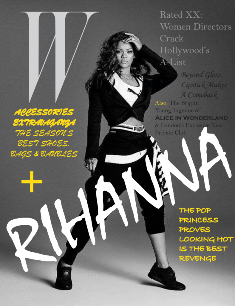
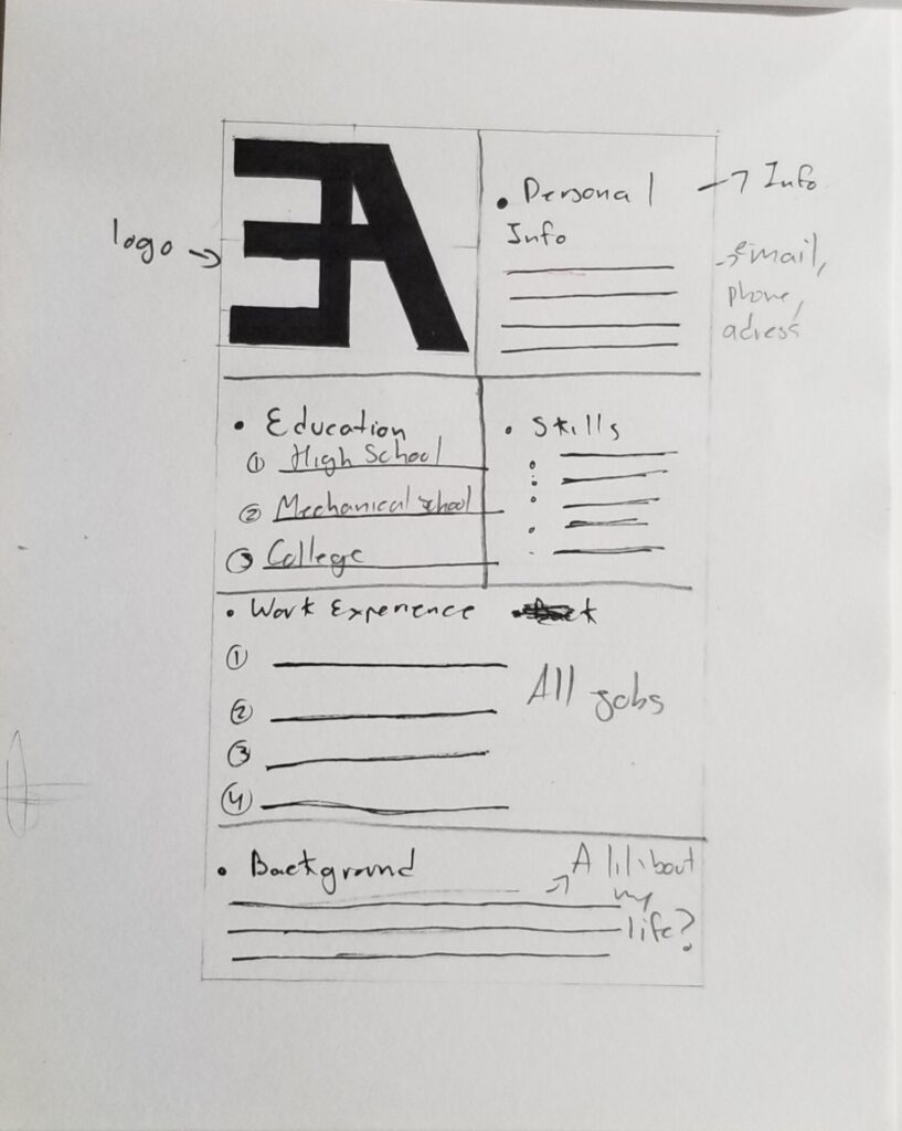
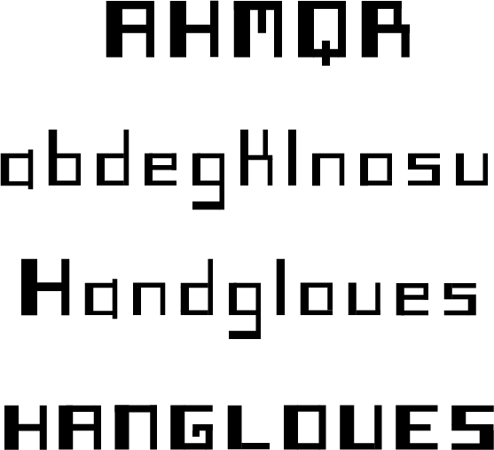
cover page
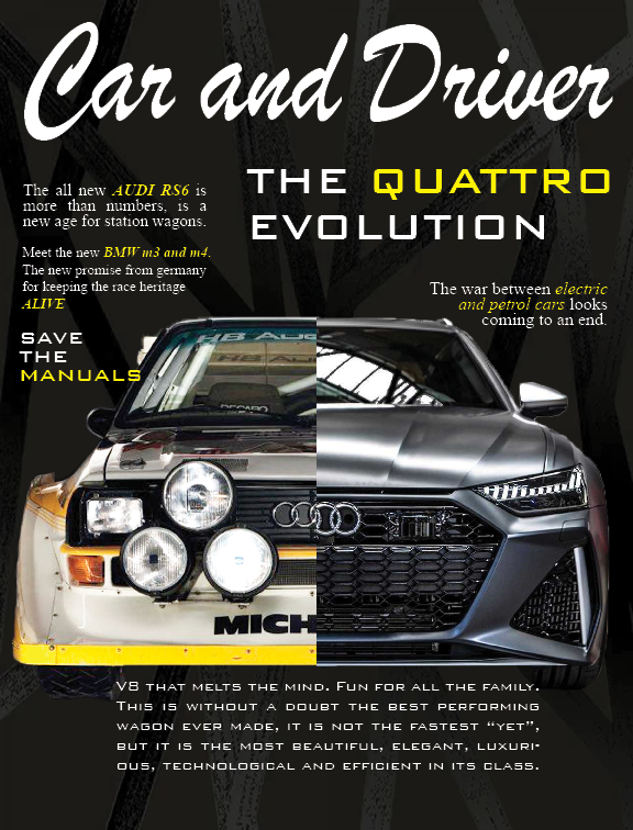
spead page 1
spread page 2
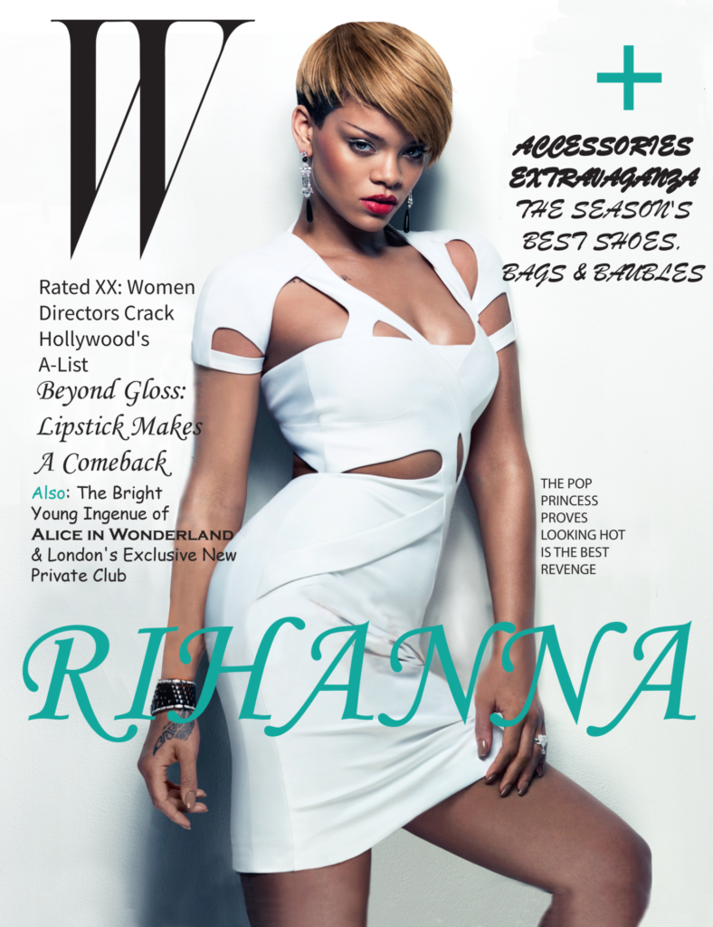
cover page

spead page 1

spread page 2

This article was very interesting, i like the fact that many fonts designers think this chop font is a mess or just a crash of different styles, but is actually very popular now. i like how this font were used in many restaurants, specially Asians, but they work well, even other restaurants from different cultures use this and still works, this font is used in many other type of store other than restaurants which means that this font became really famous and welcome in New York. I like the style of the chop font, i think it looks very attractive and because it looks like was made with a brush is not, and that gives it a more refined touch. One think i found interesting is how many designers found this font very aggressive and a very special way to do something different, but there are other designers that really hate this design because they think it looks like a graffiti and just chaos. in the end this is one of the most amazing and original font I’ve ever seen and i think it works really well in most every environment
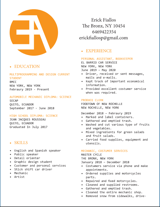
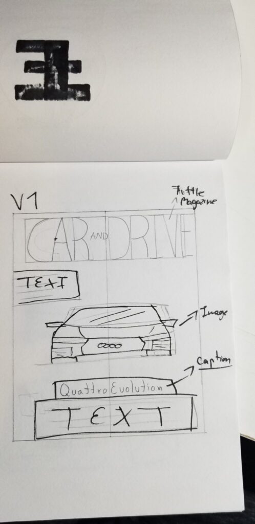
version 1
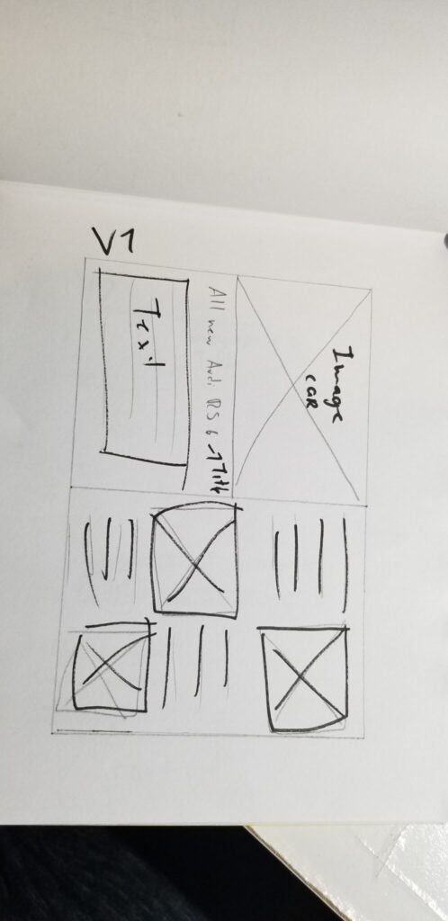
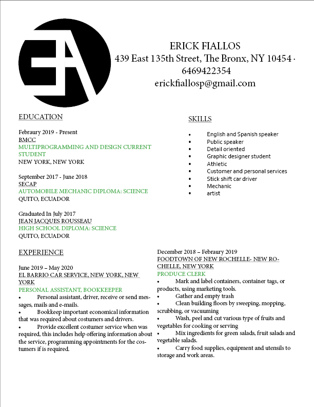
version 2
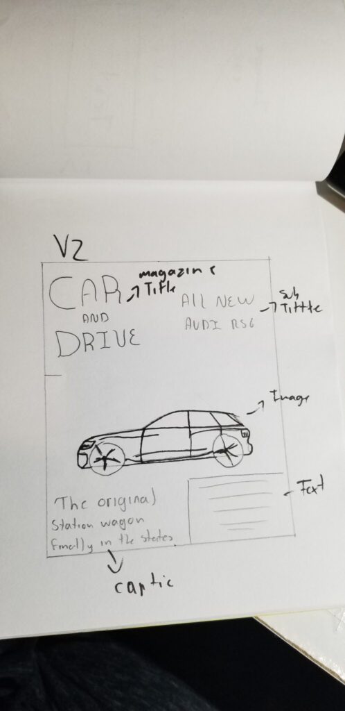
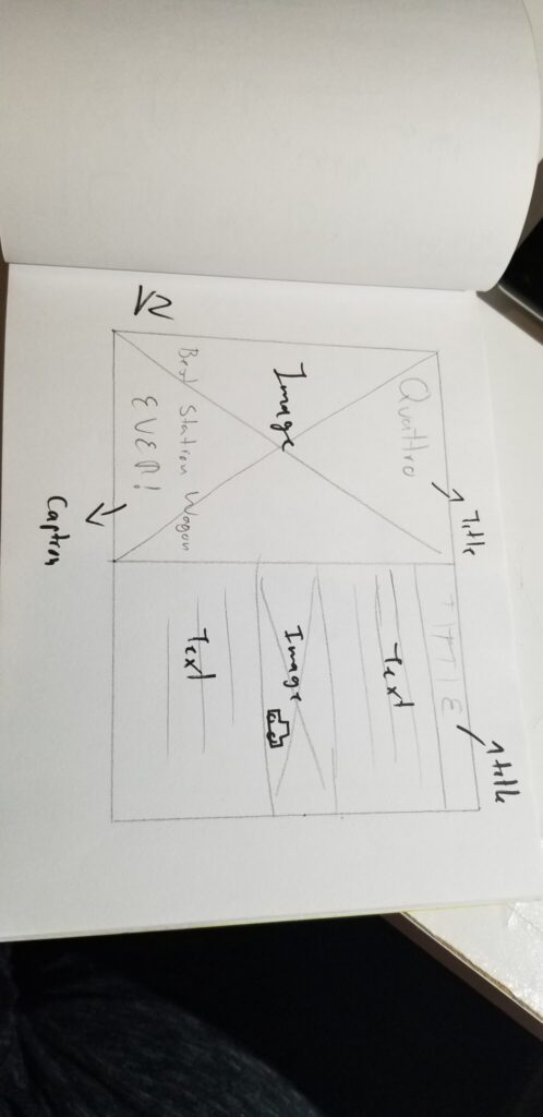
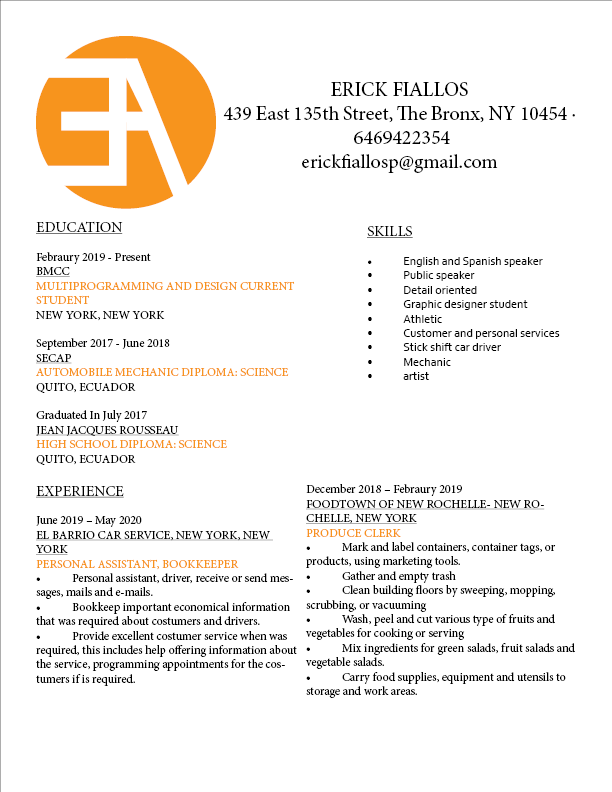
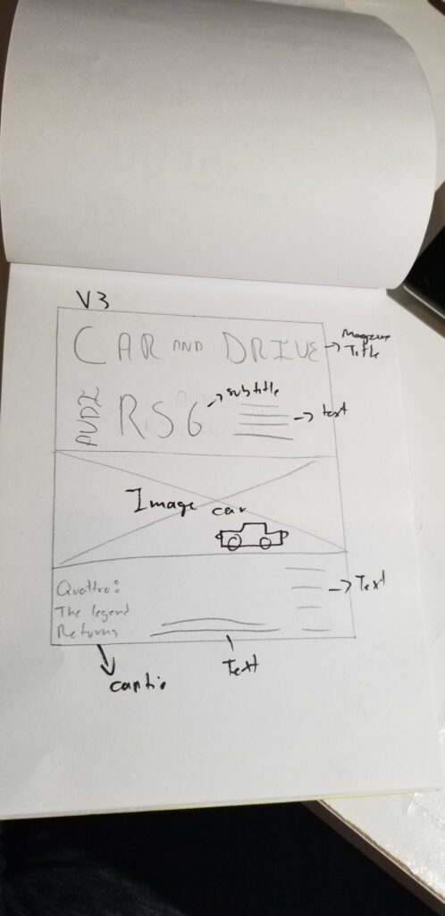
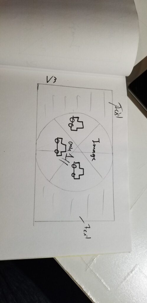
version 3
I found this video very interesting, i think the way that many people can find their way to explode their passion i their unique style is priceless and how all that energy can be transmitted to more people struggling to find their own style, Tony i think achieved this goal in the most human and artistic way possible, his effort, his energy, his passion for what he loves is just very inspiring, i really loved his style, is very unique, very original and i think that’s the most important thing, how he able to go beyond the normal standards and make something completely new that works.
VERSION 1
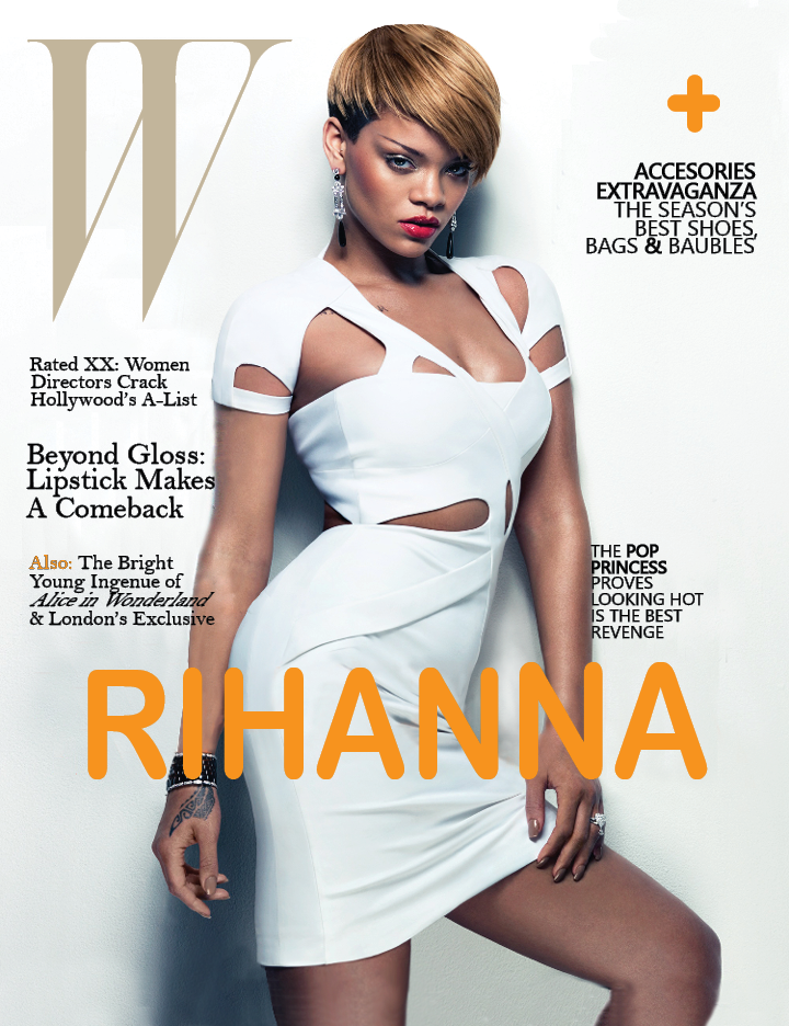
VERSION 2
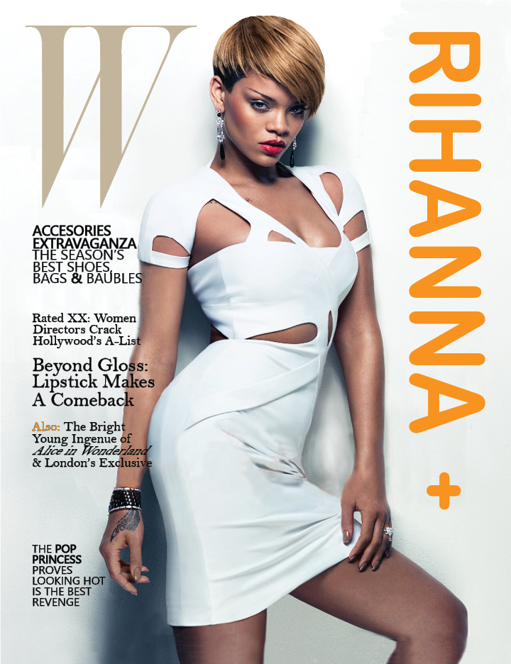
VERSION 3
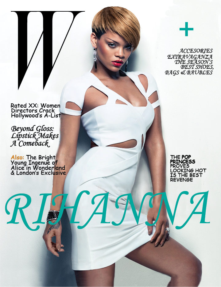
VERSION 4
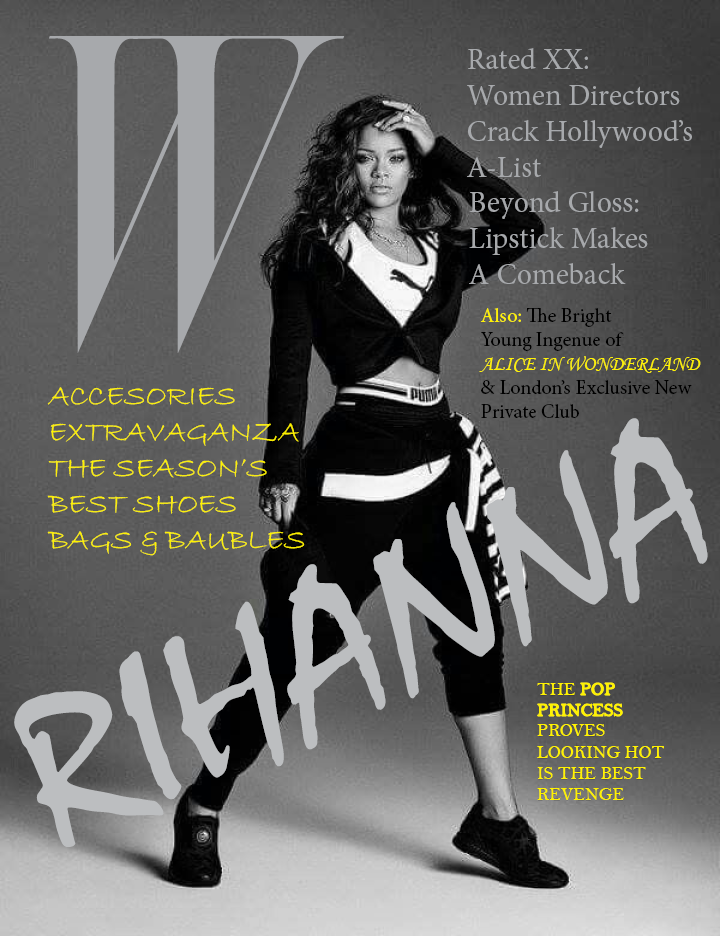
version 1

version 2

version 3
version 4
