
Bracetty Juan


Juan Bracetty
My Response
The Mystery Font That Took Over NY
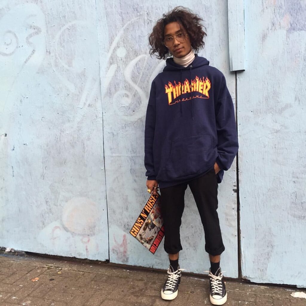
This was a very fun article to read. There are so many storefronts and signs attacking us everywhere we go, demanding our attention. It can be daunting. Rumsey Taylor, the author of this piece is right, Choc is here, there, everywhere, right under our noses. Her description of the typeface design in her words an “inherent contradiction, like a Nerf weapon” is spot on! Before I started reading this piece, I found a picture of the full Choc typeface letter forms A-Z and jotted down some descriptive words that came to mind spicy, warm but sharp, culture, zesty. And low and behold I was describing food! Choc is heavily used on restaurant storefronts, Asian themed restaurants in particular. It’s like I’ve been programmed to associate this font with food. The power of graphic design is remarkable and terrifying. I don’t think twice when I see this font atop an Asian restaurant, it just feels like it makes sense. It’s amazing how a font can essentially take on a life of its own. And to think it originated in France. The Author mentions some more notable typefaces by designer Excoffon that I looked into. Two of which piqued my interest the first being Banco. Which turns out to be the font used on Thrasher Magazine. Or those Thrasher sweatshirts that all the young kids including my skater boy brother would wear. And Calypso that I just find absolutely beautiful. All in all, good read, kudos to the author.


Juan Bracetty
Font Men
I guess it’s common knowledge, but I find it incredible that you can create your own fonts. That there are teams of people in specialized fields of typographic design that come together to build a font. That these two guys built an empire designing them. It feels like a well-oiled machine with multiple parts churning out font designs. Hoefler says in the video, the “design of the typeface is validated by the market” They’re a business, designing with a purpose, to sell.
The Sign Painter
This video unlike the other two focuses on a more human approach to typography. The sign painter Mike Langley reminds us of the natural beauty of hand painted signs, flaws and all. He presents himself as a nostalgic. I wonder if this approach to typography will eventually be lost in time. There will probably always be a niche market for it. I think it’s pretty interesting that this coffee company used Langley’s story as a promotional tool.
Ryman Eco
I absolutely love that there’s an environmentally conscious font in the world. And it’s beautifully designed. Why aren’t we all using Ryman Eco?
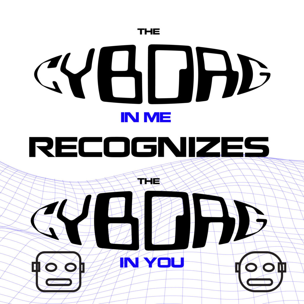
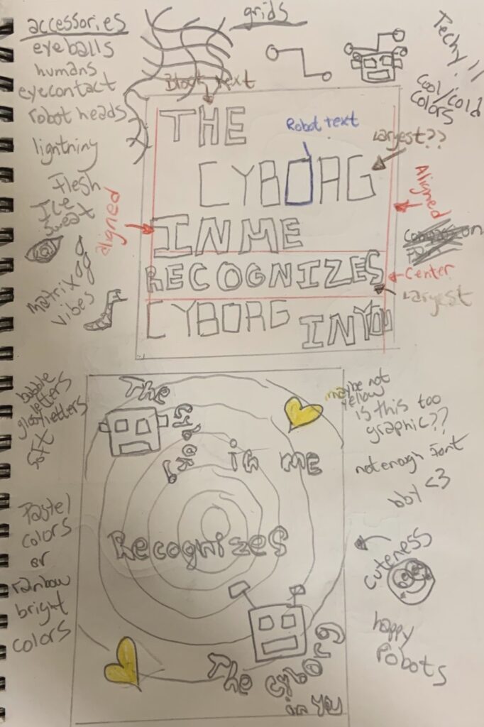
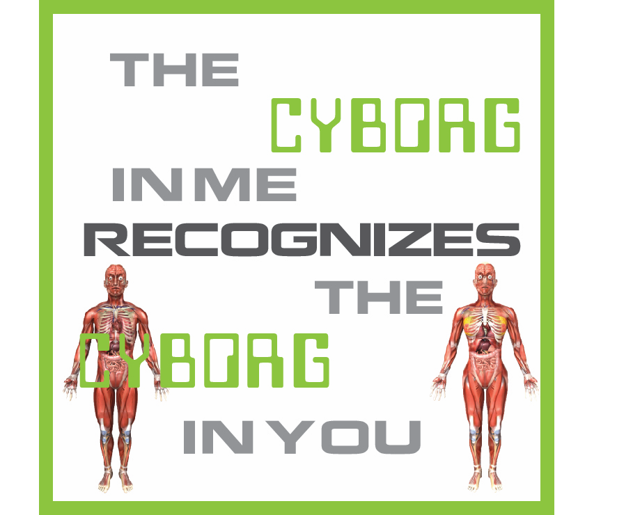
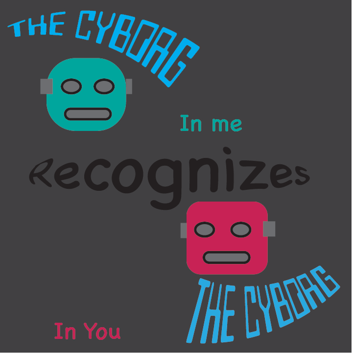
“The Cyborg In Me Recognizes The Cyborg In You”
-Gabi Abrao (SighSwoon)
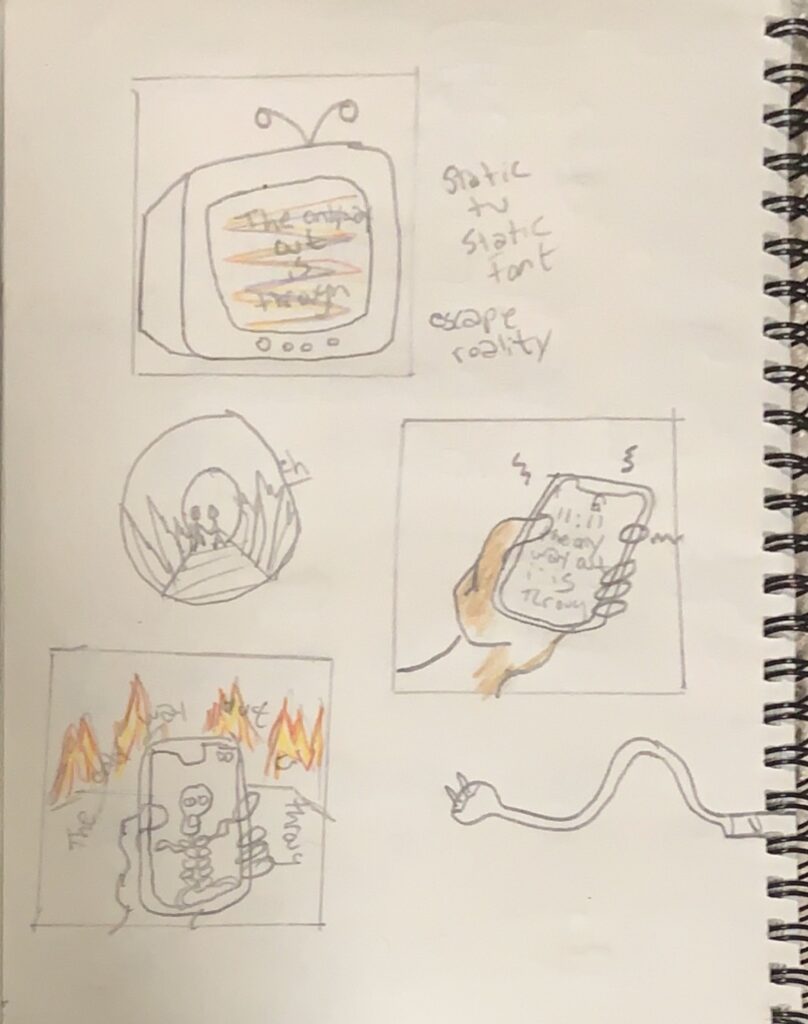
“The Only Way Out Is Through”
-Robert Frost
My name is Juan Bracetty, I’m majoring in Multimedia Programing and Design. This is my second official semester at BMCC. I’m not sure where my life will take me but i’m certain it belongs somewhere in the art world. This last year has been tuff for most of us, iv’e been focusing my free time at home learning my way around the adobe sphere. I love creating things, bringing my ideas to life! Typography is a medium i’ve never explored before. So i’m super excited to get to know you all and expand my knowledge.