Juan Bracetty
My Response
The Mystery Font That Took Over NY
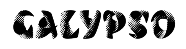
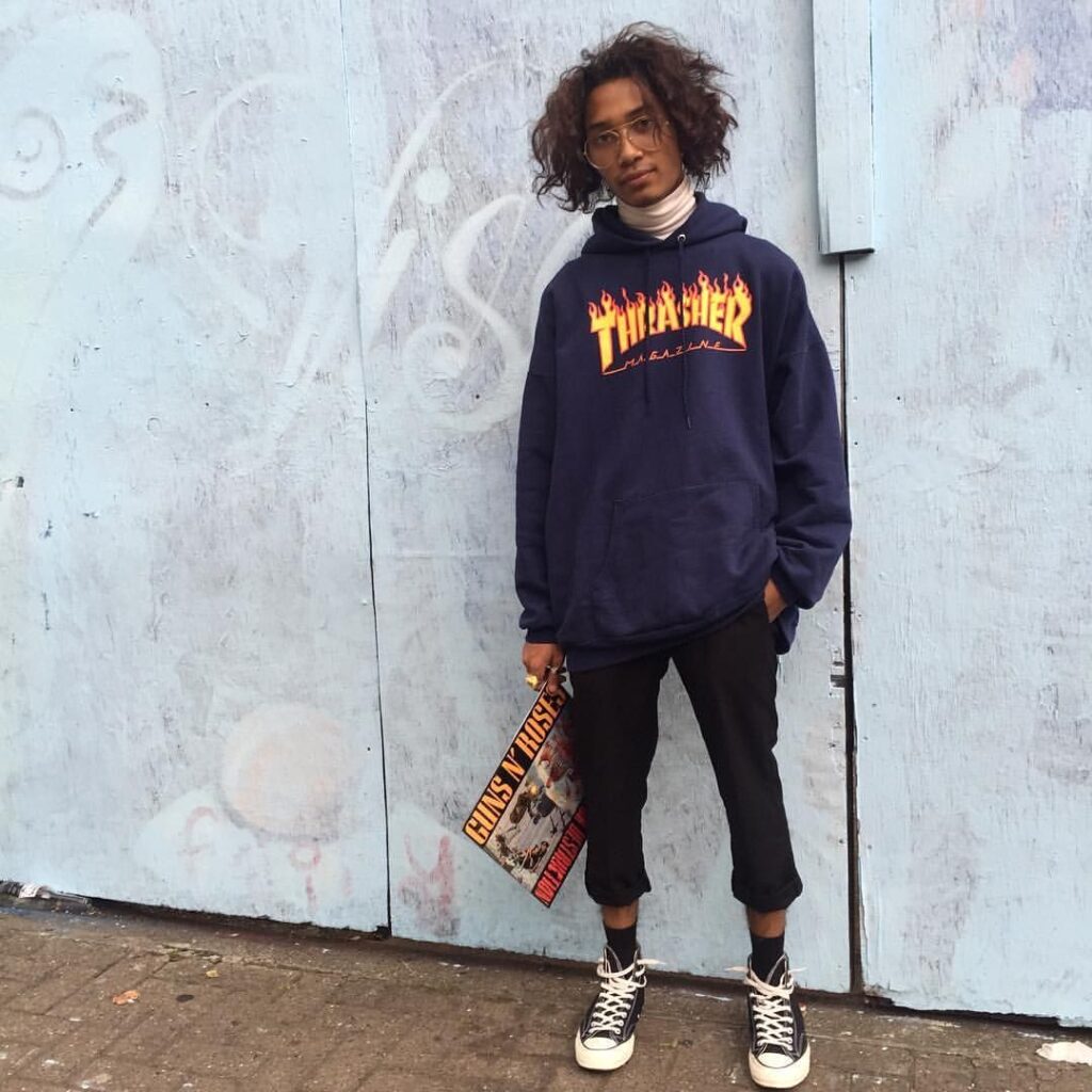
This was a very fun article to read. There are so many storefronts and signs attacking us everywhere we go, demanding our attention. It can be daunting. Rumsey Taylor, the author of this piece is right, Choc is here, there, everywhere, right under our noses. Her description of the typeface design in her words an “inherent contradiction, like a Nerf weapon” is spot on! Before I started reading this piece, I found a picture of the full Choc typeface letter forms A-Z and jotted down some descriptive words that came to mind spicy, warm but sharp, culture, zesty. And low and behold I was describing food! Choc is heavily used on restaurant storefronts, Asian themed restaurants in particular. It’s like I’ve been programmed to associate this font with food. The power of graphic design is remarkable and terrifying. I don’t think twice when I see this font atop an Asian restaurant, it just feels like it makes sense. It’s amazing how a font can essentially take on a life of its own. And to think it originated in France. The Author mentions some more notable typefaces by designer Excoffon that I looked into. Two of which piqued my interest the first being Banco. Which turns out to be the font used on Thrasher Magazine. Or those Thrasher sweatshirts that all the young kids including my skater boy brother would wear. And Calypso that I just find absolutely beautiful. All in all, good read, kudos to the author.