Assignment #4 – Illustrator!
Shapes, Forms, Composition & Color
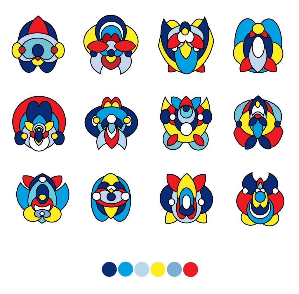
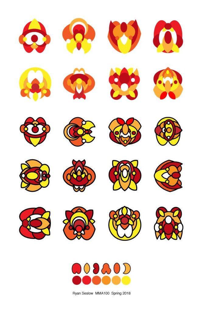
(See Example #1 Above (its a template that can be opened in Illustrator) & example #2 below)
Tutorial Process from class on 11/30 – Parts 2 & Part 3
Passcode: m90+$kf.
Tutorial Process from class on 11/23/22 – Part 1
Passcode: 7Y?9pVTR
Tutorial Process from class on 11/16/22 – Part 1
Passcode: kT%@LF@3
Let’s chat about the process –
1. Open Adobe Illustrator and create a new document sized at 11″ X 17″. (or something similar but keep the orientation vertical)
Consider, how will you set your guides to equally balance and format the graphics evenly? Will you use a grid? Do you have a preferred method for layout? Let’s explore what this means.
1A. Allow yourself to be experimental! There are numerous ways, methods and techniques to generate shapes and forms. I suggest working with one single color to emphasize the forms and use of positive and negative space.

2. Generate a new series of “subjective” graphic Icons following the layout and arrangement above. (Don’t re-create my example) make your own, but follow the balanced composition. Experiment! Make a page full of shapes and forms! (see my example from class on 11/16)
3. Limit yourself to 6 values of 1 complimentary color scheme. Consider referring to the color wheel for reference – (Located here)
4. Limit yourself to creating and composing your graphics with no more than 6 shapes created with the pathfinder or the shape builder tool. Begin without using a stroke around your shapes and then apply a stroke for contrast later.
5. Save your work as an Ai. file (adobe illustrator) as well as a .pdf

PART 2 – Each student will follow the images in the gallery below as a guide to further extend and develop their designs.
Size – Use a square shape for this series of designs. I suggest 8″x 8″
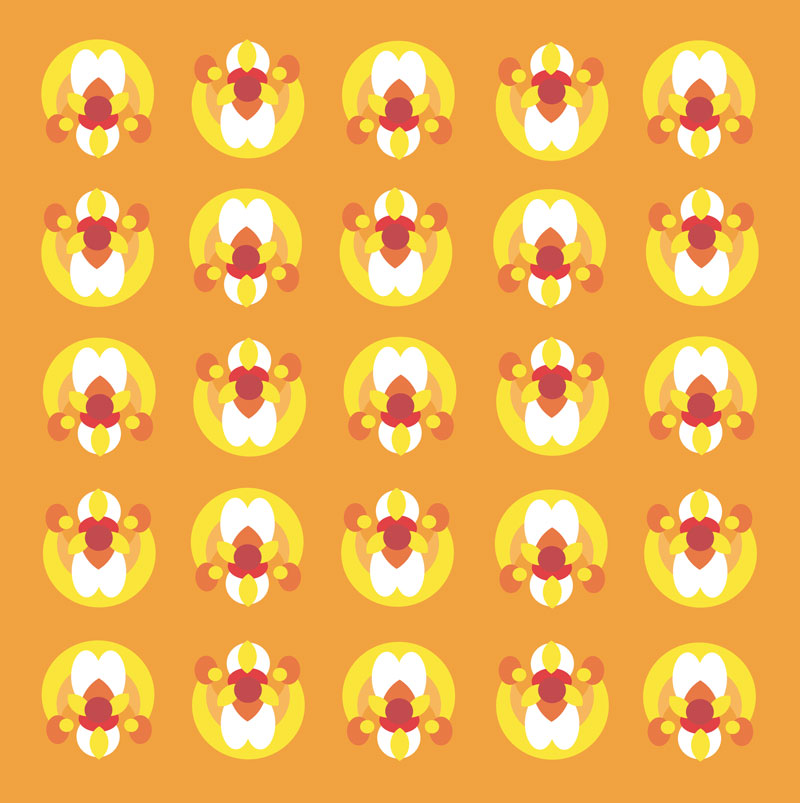
Students will select and isolate their strongest single icon/graphic from the original layout in Part 1 of the assignment – 1 version will include a stroke and one with out(example below). Students will explore a 4-part color variation drawn from their selected color palette as well as 1-3 balanced patterns using their icons. (We will discuss the examples in class)
Part 3 – Create a “digital Illustration”(or a series of them) of your choice that combines a series of your forms together. The size is up to you! Prof. Seslow will share examples in class on 11/3 and place the video under this verbiage. See below for an example of how part 3 can take form. What will you Make?


