- Discussion
- Hidden Messages in Marketing
Hidden Messages in Marketing
You must be logged in to reply to this topic.
-
AuthorPosts
-
-
November 23, 2021 at 6:10 pm #12055

Brielle BucklerParticipantLogos come in all shapes, sizes, and colors, all representing brands or products a company wants to make memorable. Many of these logos have hidden messages! You may already know how some brands have been designed to incorporate additional symbolism, but before participating in this discussion, watch this video on YouTube from Be Amazed and find out more.
Then:
- Search for a logo you’re familiar with or have encountered in your daily life that contains a hidden message (not a logo included in the video you just watched). Include the logo or a link to the logo here.
- Explain the hidden message and what it represents. Did you know this hidden message existed, or did you just learn about it?
- How do you think the brand is attempting to position its product in the marketplace? Do you think it’s working?
—————
In order to receive full credit for this assignment, all components of this assignment are due by 11:59pm ET on Sunday, August 21, 2022. You should first contribute a thoughtful post of your own before viewing/commenting on the posts of others. You must respond meaningfully to at least two classmates to receive full credit for this assignment. Students should review others’ submissions and comment meaningfully (refer to this guide from MSSU for reference) to at least two other students. For reference, here is the difference between a comment and a post — you will be using both for this assignment.
This assignment is worth a total of ten (10) points — 6 possible points for your original post, and up to 2 points for each of the two responses to your classmates’ posts. Please reference our Discussion Rubric for more information.
-
This topic was modified 2 years, 11 months ago by
 Brielle Buckler. Reason: Updated Date / Rubric Link
-
This topic was modified 2 years, 10 months ago by Brielle Buckler. Reason: Added MSSU Guide
-
August 6, 2022 at 3:26 pm #13644

Dilson AbreuParticipant- Search for a logo you’re familiar with or have encountered in your daily life that contains a hidden message (not a logo included in the video you just watched). Include the logo or a link to the logo here.
<span style=”font-weight: 400;”>Starbucks:
</span>
2. Explain the hidden message and what it represents. Did you know this hidden message existed, or did you just learn about it?
<span style=”font-weight: 400;”> Starbucks is a logo that I come across almost regularly, There is a Starbucks close to my home and I always see people crowded inside of it. I always wonder what makes this coffee company so fam</span><span style=”font-weight: 400;”>ous. Is it the coffee? logo? Or is it just a trend to buy at Starbucks? I did some research on the logo and found some interesting hidden messages that the logo represents. </span>
<span style=”font-weight: 400;”> It all began when the Starbucks founders, </span><b>Gordon Bowker</b><span style=”font-weight: 400;”>, </span><b>Zev Siegl</b><span style=”font-weight: 400;”>, and </span><b>Jerry Baldwin</b><span style=”font-weight: 400;”> were advised by a strategist specialist that a company with the “st” would be powerful, as it says in the article “7 food logos with hidden messages” by Kiersten Hickman. The founders believed that using a siren, a mythical creature who lured sailors to shipwrecks on their island, was an appealing way to attract customers, as stated in the article. Furthermore, the mermaid logo was used to “seduce” customers into buying coffee and pastries. Lastly, in Greek mythology, the sirens served as a warning that looks can be deceiving, as they are both beautiful and deadly. </span>
3. How do you think the brand is attempting to position its product in the marketplace? Do you think it’s working?
<span style=”font-weight: 400;”> The company’s market positioning is customer-centric, giving more than the consumer need. Starbucks began as a coffee company, but it is currently growing to meet the demands of its consumers by offering beverages such as hot and cold tea, juices, lemonades, and so on. I feel this is effective because I believe that humans cannot limit themselves to just one thing in life, and in this case, coffee beverages, which become repetitive and uninteresting. That is why Starbucks enhanced its drink selection to give a more satisfying experience for customers.</span>
-
This reply was modified 2 years, 9 months ago by
 Dilson Abreu.
-
August 6, 2022 at 3:32 pm #13646
Dilson AbreuParticipantI could not find a way to insert the logo so I included the link to it.
-
August 18, 2022 at 8:24 am #14025

Gal kedemParticipantHi Dilson,
I was very curious about the comment you raised. It is interesting to see how much thought and strategy were put into a company’s logo. As the logo is the face of the company, I guess it is extremely important to plan every detail of it so it will be the most effective and customer attracter as it can be.
-
August 21, 2022 at 8:20 am #14069

Parhoun FarrokhiniaParticipantHi Dislon!
You have explained the hidden message about Starbucks very well. I think Starbucks is one of the most useful stores in the world. As we all know, we are busy and sometimes we can’t make our coffee. And we decide to buy it outside to save our time. So, Knowing the hidden messages behind them is really important. Also, some people don’t like coffee and they prefer other beverages to order. As you have mentioned, it is crucial to have other beverages besides coffee. -
August 21, 2022 at 9:38 pm #14089

Mubtasem AliParticipantThe choice to use a niche greek symbol for mythology is an interesting choice from a business point of view. The meaning may not be the most recognizable but the icon has become iconic despite it. I think Starbucks offering more drink selections is smart, their cafes are used as places to hang out and study. Many people don’t drink coffee but may drink tea or one of their non-caffeinated options letting customers have an option and I would assume leading to more customers who go to Starbucks to sit down to buy their products.
-
August 17, 2022 at 1:17 pm #14018
Gal kedemParticipant- https://images.app.goo.gl/19xMgZCjvscYmP258
- Beats by Dr. Dre is my favorite headphones brand. I got my first pair ten years ago, and since then, I have continued to purchase their edge-cutting, high-quality products. I have decided to do research on the brand’s logo and see what attracts so many customers besides the high quality of the products. And so, the Beats by Dre logo is essentially a red circle with the letter b inside it at first glance. But the red circle is also meant to depict a person’s head, with the b standing in for a set of Beats headphones covering their ears. After learning about the hidden message in their logo, I have to admit that it attracts me even more.
- The way the brand is tempting to position its product in the market is unique as well. Beats by Dr. Dre is a leading audio brand founded in 2006 by Dr. Dre and Jimmy Iovine. Beats by Dr. Dre altered how people thought about music listening. The plan is for Dr. Dre, a well-known rapper and performer, to sponsor audio equipment in a manner similar to how athletes endorse athletic footwear. What makes them so popular and keeps them as a significant player in the market are three major things. One of the reasons is that they have intentionally been designed to vary from all other headphones, the majority of which seem pretty utilitarian and are only intended to provide sound. Beats products are meticulously constructed, just like Apple products. The second aspect of branding is Beats By Dre, the ‘cool’ headphones created by Dr. Dre and Jimmy Iovine. They are becoming identified with music industry heavyweights who buy and wear them. The success of those headphones virtually rocketed since no other headphones on the market up to that moment attempted to achieve the aforementioned two things. Finally, They are pricey to demonstrate their status as a luxury item and to create an air of exclusivity.
In conclusion, I believe that the branding of the product through a well-known figure and differentiating the product as a quality and beautiful product through its design lines and the price stabilizes the place of Dr. Dre headphones in the market. All of these factors increase market demand by giving consumers a sense of belonging to a socially elite group.
-
August 17, 2022 at 6:29 pm #14022

Mohinabonu SaidovaParticipantHello Gal
You mentioned a great brand and explained it well. I didn’t know about this brand before. After your explanation I found out and I will also try to use this brand logo.
-
August 18, 2022 at 8:26 am #14026
Dilson AbreuParticipantHey Gal,
I learned a lot from your response, I did not know that Dr.Dre headphones were founded in 2006 by two individuals, I just thought they were founded just by Dr.Dre. I also agree that there inst many of competitors for the Dr.Dre beats headphones since as you stated (1) they have intentionally been designed to vary from all other headphones, (2) the brand and image behind them, and (3) their price to demonstrate their luxury. One brand which I believe could be a competitor would be the Apple earpods, but I believe people just buy them because they are from apple, and it’s easy to connect to their apple phones.
-
August 19, 2022 at 6:29 pm #14045

Paris CurtnerParticipantHi Gal,
Wow, this is a very interesting logo. I have never noticed the hidden message in this logo before. I wasn’t too familiar with these headphones before and have never used them but I think you explained everything there is to know about this company very well and makes me want to try out the product.
-
August 21, 2022 at 8:34 am #14070
Parhoun FarrokhiniaParticipantHi Gal!
I didn’t know about the meaning of the logo. At first, I guessed the meaning of the B letter in the middle of the logo but I was not sure. I haven’t used this brand before but I know that this brand is famous. Also, their prices illustrate that this brand is a luxury brand. I love the design of the products. They are really beautiful! -
August 21, 2022 at 9:57 pm #14090
Mubtasem AliParticipantHi,
This makes a lot of sense, had no clue. The logo is a head with headphones on makes it very intuitive and smart. Beats as a luxury brand make sense, they have prioritized fashion over function. As well as spent heavily on sponsoring celebrities. Their target audience seems to be those focused a luxury look rather than comfort or function.
-
August 17, 2022 at 6:22 pm #14020
Mohinabonu SaidovaParticipant1. https://en.m.wikipedia.org/wiki/Google_logo
2. My favorite brand is G which is “Google” It was the first thing I searched for, about 6-7 years ago I used it. I have since learned that they are of high quality and very easy to learn. I think a lot of people use Google, that is the brand logo G and this site is of high quality. What attracts many customers in one line is immediately effective, which includes support through direct video chat with its specialists. Google also recently announced that they have improved their CSAT (customer satisfaction) scores by 100% with their advertising clients.
So, at first glance, the Google logo is divided into a white square with the letter G on it (red, blue, green, yellow. Red can evoke excitement, urgency, or passion, while conservative blue represents trust and security. Yellow cheerful and bright and optimistic.3. Google is an American technology company focused on search engine technology, online advertising, cloud computing, computer software, quantum computing, e-commerce, artificial intelligence, and consumer electronics. Founded September 4, 1998, Google multi-segment positioning. The company offers a wide range of products and services targeting multiple customer segments, including Search, Android, Maps, Chrome, YouTube, Google Play and Gmail. Positioning in standby mode. Brand positioning is the acquisition of a unique position in the mind of the target consumer. Simply put, brand positioning is about gaining a unique position in the mind of your target consumer and expressing what you want your brand to be to consumers. While retailers have several options for driving traffic to their websites through free listings or shopping ads, many use Google buys to give shoppers a convenient way to purchase an item as soon as they find it. Google Marketplace is free for sellers. Google Cloud Marketplace allows you to quickly deploy functional software packages that run on Google Cloud.
-
This reply was modified 2 years, 9 months ago by
 Mohinabonu Saidova.
-
August 18, 2022 at 8:34 am #14027
Dilson AbreuParticipantHello Mohinabonu,
I really did not know the clear message behind the goggle logo but you explained it very well!
As you stated the letter “G” in google has the colors red, blue, green, and yellow because red resembles evokes excitement, Yellow for being cheerful and optimistic, Blue for trust and security, and I could not see the green explanation but I’m guessing the color green for the climate change support or tress support since one of google main goal is to resolve the climate change issue.
-
August 19, 2022 at 6:33 pm #14046
Paris CurtnerParticipantHi Mohinabonu,
This is a very interesting description about this logo. I had no idea that a logo that appears so simple at a first glance had so much meaning behind it. I would have never thought about the colors in the G representing different meanings I thought it was all sort of random. This has really opened my eyes and makes me wonder what other logos out there have a hidden message by using different colors.
-
This reply was modified 2 years, 9 months ago by
-
August 17, 2022 at 7:31 pm #14023

Allah WilliamsParticipant<div class=”ck-content”>
The dark pink LG Electronics emblem initially appears to be a winking face. However, if you look a little closer, you’ll notice that the “nose” of the face is a “L,” and the “facial contour “‘s is a “G.” Even some fans have pointed out how similar LG’s logo is to a modified Pacman. I never knew that the log message have just learned now
LG improves people’s lives with its powerful brand identity and reputation. Due to its innovative product features, user-friendly functionality, and superior performance, choosing LG has currently become a way of expressing one’s personality and assuring satisfaction.
https://logolook.net/lg-logo/
</div>
<div class=”mt-3″></div>-
August 18, 2022 at 8:15 am #14024
Gal kedemParticipantHi Allah,
Thank you for sharing about LG.
I think that their logo’s hidden message is very unique.
As you mentioned, their innovative products position the company in the market. As they are a technology firm, in today’s dynamic market, you must be innovative and keep on coming up with new ideas and products in order to keep up with the market’s paste and to be relevant.
-
August 21, 2022 at 2:47 am #14061

kfranParticipantHi Allah, thank you for saying that. I just looked into it, and you are correct. It’s incredible how creative people can be with such a logo; it just shows that every little detail counts. Lastly, I wanted to add in I heard that LG stands for “Lifes Good.”
-
August 21, 2022 at 11:40 pm #14092

bryanna inoaParticipantHi Allah,
Although I have seen the face on the LG logo before but never paid attention to realize that is an actual “LG”. It is so cool to know more about these different logos and the creativity that goes on behind it.
-
-
August 19, 2022 at 6:17 pm #14044
Paris CurtnerParticipant- https://www.stickpng.com/img/icons-logos-emojis/pepsico-company-brand-logos/tostitos-logo
- With NFL season starting in less than a month I think it’s only right to talk about the Tostitos logo. In this logo, the second and third “T’s” represent two people, the red dot represents a bowl of salsa and the yellow triangle represents a tortilla chip. This is supposed to represent two people coming together to enjoy chips and salsa as the two people are dipping the tortilla chip into the salsa. I had no idea this hidden message existed until starting this assignment but once you see it you can’t unsee it.
- I think Tostitos is doing a great job at marketing its customers with this hidden message in the logo. They are marketing everything their brand has to offer which are various types of chips and different types of salsa’s/queso. A product like this best enjoyed with your family or some buddies on an NFL Sunday which I really like how the logo represents two people sharing and coming together. I think this marketing tactic is genius and I know for a fact now the next time I go into the store and see that logo it will make me want to get Tostitos branded products as I loving sharing chips and salsa with people in my life who are close to me while watching football.
-
August 21, 2022 at 2:54 am #14062
kfranParticipantHello Paris, you do learn something new every day! Yes, I agree with you about Tostitos being great at marketing. The fact that they can come up with these different chip flavors and shapes is beyond me! Because these are my mom’s favorite chips to share with me, I can not stop thinking about the logo’s meaning!
-
August 21, 2022 at 12:45 pm #14078
Mohinabonu SaidovaParticipantHi Paris,
I agree with you that Tostitos is great at marketing. You have brought up a very wonderful subject, and you have described it well. They can come up with all these different chip flavors and shapes! you always tell me about new things.
-
August 21, 2022 at 11:44 pm #14093
bryanna inoaParticipantHi Paris,
I love the thought behind the Tostitos logo, I appreciated the creativity and how they used two of the letters to show two people eating their product. Tostitos marketing has always been amazing and the thought behind their products really shows who they are as a company.
-
August 21, 2022 at 4:05 am #14063
kfranParticipantLink to the logo: https://logos-world.net/dove-logo/
Dove is a body care brand based in the United States during 1955. The cosmetic brand Dove has a modern logo with the silhouette of a dove on it. It signifies the “purity of the soul, openness, and hope.”I have been using Dove for the longest time, and it makes my skin not only feels smooth, but the scent of the product lasts for a long time; when I thought of what brand I use pretty often, I just thought of what products I put on to feel fresh and Dove was the first thing that came to mind. Dove’s brand strategy is to help females feel satisfied in their skin and be themselves. Dove products are arranged as personal care products that cater to females all over the world. They focus on forming their brand around factors of womanhood and beauty that communicate to females. In its advertisements (videos and short films), Dove puts people of all ages, body sizes, and races. Today the brand sells soaps, moisturizers, deodorants, and hair care products for all hair types. I believe they do men’s products too. It is honestly a powerful marketing strategy.
Also, this video perfectly illustrates everything I have said in my explanations ( feel free to watch it if you’d like ).
-
This reply was modified 2 years, 8 months ago by
 kfran.
-
August 21, 2022 at 4:42 pm #14082

MalcolmParticipantHello Kfran,
Thoughtful post about Dove as a brand. Dove markets their lotion and products through designs, commercials and celebrities. Their catch phrase is something I didn’t know, but their white bottle does stand out amongst a crowded market.
-
This reply was modified 2 years, 8 months ago by
-
August 21, 2022 at 7:53 am #14065
Parhoun FarrokhiniaParticipant1 .
https://images.app.goo.gl/Ny1fwePmR4xLFkyS9
2 .
As I like listening to podcasts and music, Spotify is my favorite app in this case. I use this app every single day and because of this, I was curious about the logo. I searched about this logo 1 year ago ,and I can remember that some people believe that the design of the logo represents sound waves and Wi-Fi.
In addition, I could find an article about this topic which I think is really useful. According to the Article, It says: “The use of a circle is a common one in digital companies looking to create a sense of community. Circles convey connectedness and inclusivity – which are values Spotify holds dear.”
“The circle can also represent the world, which highlights the company’s global reach and ability to access so many different kinds of music.”
“The decision to use green as a central color can mean Spotify wanted a connection with ideas of growth, and creativity – though green wasn’t commonly associated with technology companies before Spotify launched.”
“Green can also represent nature, so this may be why Spotify chose a more “unnatural” green for later versions of the logo, to separate itself from this meaning.”
3 .
Its main revenue source comes from users upgrading to a premium subscription. It has 3 types of plans which you can choose and pay for it. You should search about the plans and choose the best plan that suits you. Spotify premium plans are:
- Individual:
$9.99/month after the offer period - Duo
$12.99/month after the offer period - Family
$15.99/month after the offer period - Student
$4.99/month after the offer period
Another way that Spotify makes money is Ad-Supported Services. Members who do not pay for a premium subscription can access Spotify’s Ad-Supported Services. Such users have limited on-demand online access to the company’s music catalog and unlimited online access to its catalog of podcasts. Users’ streaming experience is interspersed with advertisements. Spotify’s revenue from its Ad-Supported Services segment is primarily generated through the sale of advertising across its music and podcast content.
Link of the articles: https://fabrikbrands.com/spotify-logo-history-spotify-symbol-meaning/
-
This reply was modified 2 years, 8 months ago by
 Parhoun Farrokhinia.
-
This reply was modified 2 years, 8 months ago by Parhoun Farrokhinia.
-
This reply was modified 2 years, 8 months ago by Parhoun Farrokhinia.
-
August 21, 2022 at 3:46 pm #14081
MalcolmParticipantHello Parhoun,
your post about Spotify is solid knowledge. They are one of the biggest streaming services available and that is based around marketing their streaming music service or the podcast they offer. The reason why green was chosen was very insightful.
- Individual:
-
August 21, 2022 at 3:24 pm #14079
MalcolmParticipantThe logo that I have chosen to discuss is that of my beloved NY Yankees. The interlocking NY is arguably the most recognizable logo in sports with the success of the Yankees and the best rapper ever Jay-Z using it as is own trademark look in his glory days.
According to the franchise, the design was inspired by a Medal of Honor created by Louis Tiffany of Tiffany&Co in 1877 and presented to John McDowell, a New York City police officer shot in the line of duty.
As a fan of the Yankees I never knew that was the reason behind the logo as I’m sure many don’t. The Yankees uniform I did know the reason behind which is based on businessman in NY. The no facial hair rule is a Yankees staple and the pinstripes from jersey to pants is a Wall Street clean finance look that The Boss George Steinbrenner wanted from his team.
Yes, the Yankees do a tremendous job of promoting and making their logo the biggest brand in sports with the help of its many famous fans and players also. Walking around NY your more then likely to see a blue Yankees hat on the head of people going to work,gym,bars,dinner and everything in between.
-
August 21, 2022 at 3:40 pm #14080
MalcolmParticipantthe link for the Yankees logo, could not post a picture.
-
August 21, 2022 at 9:31 pm #14088
Mubtasem AliParticipant- Unilever:

- The Unilever logo at first glance is nothing but a U and Unilever and upon a bit more inspection an array of random patterns. However, upon closer inspection, you can see these patterns have specific imagery. Through the use of their site, I was able to find some of these hidden meanings. The symbols are generally meant to embody different characteristics or symbols that represent sustainability. For example, the sun is meant to represent a form of renewable energy, the palm tree represents nature and the cycle represents reducing waste. Despite Unilever stating on their site they are meant to represent sustainability, they have symbols that are outside of that definition. For example, the t-shirt represents fresh laundry and the swirl represents passion for flavors and taste.
- From this logo, Unilever intends to portray itself as a company that values sustainability and builds its products to be sustainable. By doing so they can position themselves to attract customers who also have the same values and would choose to use their products over ones that don’t or even customers who feel guilty for not doing enough for the environment. However, for me personally, I don’t think they’re doing the best job of portraying this through their logo. I have never associated that symbol with sustainability, nor have I ever noticed the symbols. Furthermore, I did not that they were a brand dedicated to sustainability despite buying their products. I feel like companies like Patagonia do a much better job. While in some of these symbols the connection to sustainability is clear like the reduced symbol others seemingly can barely be associated with sustainability. Furthermore, much of the symbolism is hard to identify or characterize, I couldn’t tell from looking at most of these symbols that they were what their site said. Also some of the definitions, like the swirl which according to Unilever “Represents our passion for great flavors and taste” are not common definitions are things people would identify those symbols with. Saying that, Unilever is an international organization and these symbols may mean what Unilever aims to portray in those cultures.
-
August 22, 2022 at 8:06 am #14095

Renique BaimbridgeParticipantHi Mubtasem,
Great discussion. Thank you for showing me something new because I’ve never heard of this brand before. I do believe this logo is effective because it’s very eye catching, so it draws you in and makes you think.
- Unilever:
-
August 21, 2022 at 11:36 pm #14091
bryanna inoaParticipant1. Search for a logo you’re familiar with or have encountered in your daily life that contains a hidden message (not a logo included in the video you just watched). Include the logo or a link to the logo here.
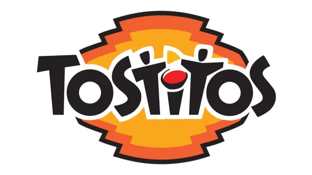
2. Explain the hidden message and what it represents. Did you know this hidden message existed, or did you just learn about it?
The two lower case “t’s” in the middle of Tostitos are two people and they are in between the letter “i” which is supposed to hold a bowl of salsa, which is the red dot on the “i”. I have known the Tostitos sign’s hidden message for a couple of years, and it has been one of
3. How do you think the brand is attempting to position its product in the marketplace? Do you think it’s working?
Tostitos uses their brand to bring people together with their chips, hence the message in their logo. The two people are supposed to show unity in a sense. I do believe it is working because Tostitos is one of the stable party snacks when people host. I can always count on a party I go to, to have a bowl of Tostitos and a glass of their salsa.
-
August 22, 2022 at 8:13 am #14096
Renique BaimbridgeParticipantHi bryanna,
i do agree with your statement that Tostitos represents unity because everytime when you see the ads it shows friends sitting and eating a bowl or everyone separated and then when someone brings out the chips&dip everyone comes together. Great observation.
-
-
August 22, 2022 at 8:03 am #14094
Renique BaimbridgeParticipant- Search for a logo you’re familiar with or have encountered in your daily life that contains a hidden message (not a logo included in the video you just watched). Include the logo or a link to the logo here.
http://logok.org/lg-logo/
Inserted is the link to my logo which is the Lg logo.- Explain the hidden message and what it represents. Did you know this hidden message existed, or did you just learn about it?
Being that the company name (LG) is just two letters. It would make sense why the logo would just have those two letters incorporated. However, the hidden message located in LG logo is a winking face. The dot to the left is the eye, the L is the nose and the G is half of a face. The company’s slogan is Life’s Good, so it would seem as if the logo is winking and you portraying that message. I just discovered this hidden message and it’s actually surprising because I have an Lg tv and the logo comes up when it turns on but it was never something that I noticed.
- How do you think the brand is attempting to position its product in the marketplace? Do you think it’s working?
I believe that Lg is attempting to position their product as simple but effective. As shown in the logo it’s a simple sign but there’s much more behind it and when purchasing their products whether it be a washing machine, television or fridge your life will be good.
-
-
AuthorPosts
You must be logged in to reply to this topic.