- Discussion
- Hidden Messages in Marketing
Hidden Messages in Marketing
Tagged: Hidden Messages
You must be logged in to reply to this topic.
-
AuthorPosts
-
-
November 23, 2021 at 6:10 pm #16076

Brielle BucklerParticipantLogos come in all shapes, sizes, and colors, all representing brands or products a company wants to make memorable. Many of these logos have hidden messages! You may already know how some brands have been designed to incorporate additional symbolism, but before participating in this discussion, watch this video on YouTube from Be Amazed and find out more.
Then:
- Search for a logo you’re familiar with or have encountered in your daily life that contains a hidden message (not a logo included in the video you just watched). Include the logo or a link to the logo here.
- Explain the hidden message and what it represents. Did you know this hidden message existed, or did you just learn about it?
- How do you think the brand is attempting to position its product in the marketplace? Do you think it’s working?
—————
In order to receive full credit for this assignment, all components of this assignment are due by 11:59pm ET on Sunday, April 30, 2023. You should first contribute a thoughtful post of your own before viewing/commenting on the posts of others. You must respond meaningfully to at least two classmates to receive full credit for this assignment.
This assignment is worth a total of ten (10) points — 6 possible points for your original post, and up to 2 points for each of the two responses to your classmates’ posts. Please reference our Discussion Rubric for more information, and to this guide from MSSU to learn more about what it means to respond meaningfully to a classmates’ post.
-
This topic was modified 2 years, 3 months ago by
 Brielle Buckler. Reason: Republish
-
This topic was modified 2 years, 3 months ago by Brielle Buckler.
-
April 30, 2023 at 3:14 pm #17249

NickosParticipant1. The logo I chose to discuss is the Bronx zoo logo.

2. The logo shows 2 giraffes and a few flying birds, if you look closely in the negative white space between the giraffe’s legs you can see some NYC skyline buildings. I was actually unaware of this and did not notice it at first until one of my friends pointed it out during our trip this past weekend together. The designer did a great job selecting buildings that would blend effortlessly into the photos.
3. The brand is trying to position its business as a natural zoo located within close proximity of the city. It depicts this well with the logo, showing that the animals are blended in with the city and it ties together the theme of wilderness in the urban climate. The Bronx Zoo is just a few miles north of Manhattan and is easily accessible via public transit. It also embodies “family friendly” by showing an adult giraffe with a young giraffe, capturing the familial bond between the two.
-
April 30, 2023 at 5:15 pm #17256

ShomariParticipantNever notice the city between the Bronx zoo, its a real creative way to make the zoo feel inclusive in the city
-
April 30, 2023 at 7:40 pm #17262

Adrian ForresterParticipantive actually never been to the bronx zoo nor seen this logo. Its a great logo that doesnt need much explaining once you find the hidden features within it. Great post.
-
May 1, 2023 at 12:17 am #17280

Tenzin LhamoParticipantHi Nickos,
Really cool to see the representation of New York in its logo. The birds remind of the infamous pigeons in NYC. I’m interested to see if there is any meaning for the white bird in the middle? I went to the Bronx Zoo many times so its good to learn something new about it!
-
-
April 30, 2023 at 5:09 pm #17254
ShomariParticipant- Fedex Logo https://logos-world.net/fedex-logo/
- If you look between the e and the X of the Fedex logo you will see an arrow which represents fast and accurate delivery. I always see the Fedex truck in my neighborhood cause they have a parking lot area not that far from my home. I never notice the arrow between the letters and it was purposely put there to represent
- The brand is positioning itself to represent a great delivery service that will get your packages sent out accurately and fast as possible. Its working pretty well cause Fedex is delivers more that 220 countries around the world and is a very successful delivery service for years.
-
April 30, 2023 at 8:48 pm #17267

Osman Goni RifatParticipantwow that’s so thoughtful for a courier company.
-
April 30, 2023 at 7:17 pm #17259

Randy MarteParticipant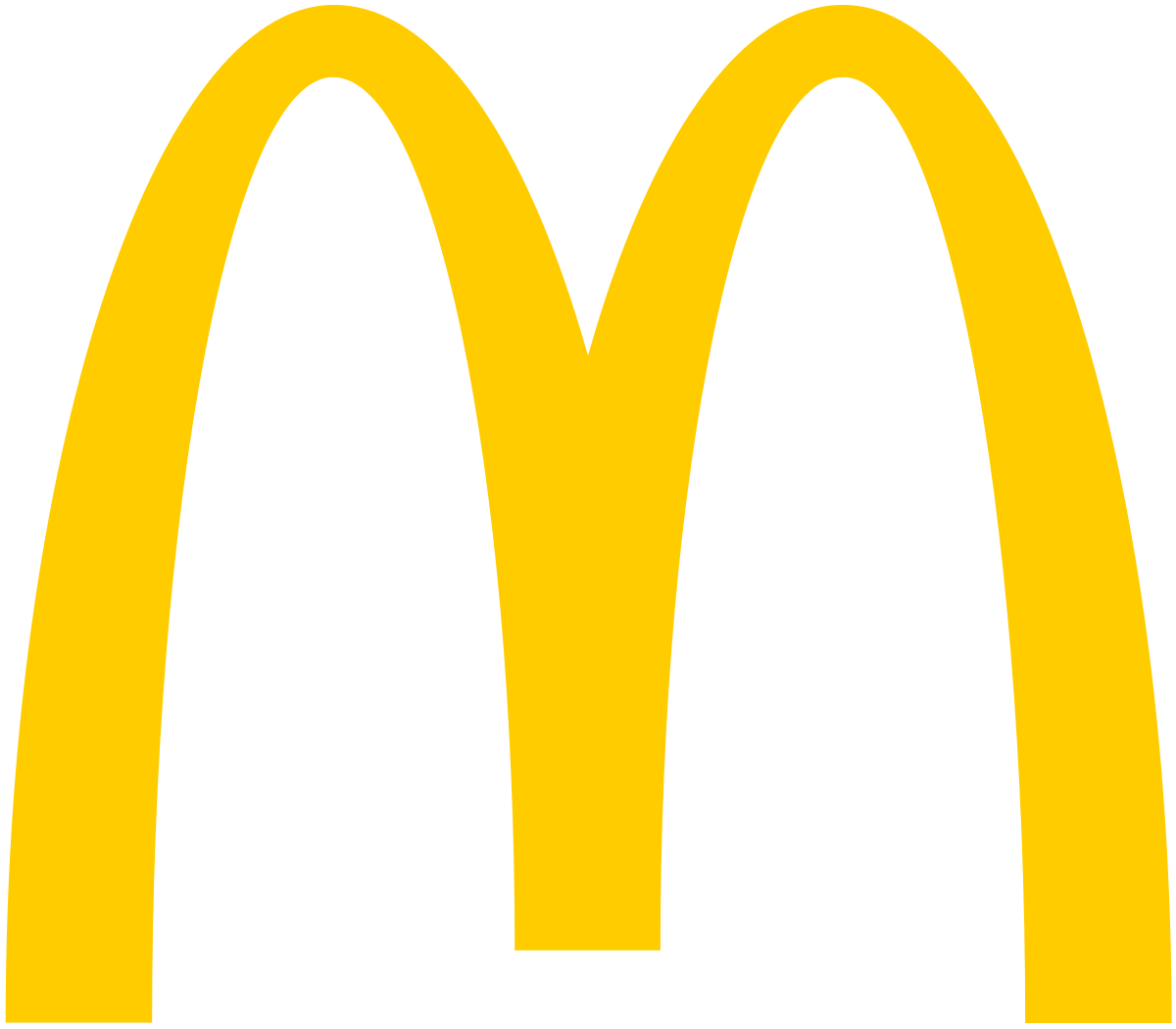
- The hidden message in the McDonald’s logo is the letter “M” formed by the golden arches, which symbolize the company’s architecture and serve as a visual mnemonic for the brand. This logo has been in use since the 1960s and has become one of the most recognizable logos in the world, positioning McDonald’s as a leader in the fast-food industry. The logo is intended to represent McDonald’s as a convenient and affordable option for quick, tasty meals, while also being accessible and welcoming to consumers. Overall, the logo has been successful in creating a distinctive and memorable brand image for McDonald’s.
- McDonald’s has positioned itself in the marketplace as a fast-food restaurant that offers affordable, convenient, and tasty meals. The company has established a strong brand identity with its distinctive logo, memorable marketing campaigns, and a menu that caters to different tastes and dietary preferences. Despite increasing competition, McDonald’s has maintained its market share and popularity among consumers. The company’s success can be attributed to its strong brand identity and ability to adapt to changing consumer preferences.
-
April 30, 2023 at 7:37 pm #17260
Adrian ForresterParticipantLogo: FedEx
Hidden message: The FedEx logo has an arrow hidden between the letters “E” and “x,” which represents the speed and precision of their package delivery service.
I already knew about this hidden message, and it is one of the most famous examples of hidden messages in logos.
The FedEx logo is attempting to position the company as a reliable, fast, and efficient package delivery service. By including the arrow, the logo implies that FedEx can quickly and accurately deliver packages to their destination. This positioning has been very effective, as FedEx has become one of the largest and most successful package delivery companies in the world.
-
This reply was modified 2 years ago by
 Adrian Forrester.
-
April 30, 2023 at 11:58 pm #17277

JustinParticipantFed Ex has a very simple way of showing the hidden part of their logo. It is also hard to notice as well. It’s one of those drawing where you can’t unsee it. I think the design was clever and allows them to flourish in the marketplace they are in because it has a professional logo as well.
-
This reply was modified 2 years ago by
-
April 30, 2023 at 8:44 pm #17264
Osman Goni RifatParticipantAmazon logo
1. Here’s the logo: https://images.app.goo.gl/6f72SkDu2nR5UPYP6
2. At this point you all might be familiar with Amazon logo but ever wondered what that curve arrow meant feature in the logo? If you look closely the curve starts at “A” and ends at “Z” in the word Amazon. This is intended to make you realize the company’s ability to provide customers need from “A-Z”. Also the arrow is little bit curved like smiling which meant to convey the company’s commitment to customer satisfaction and friendly. The color of the Amazon logo is also notable as it is a shade of orange that is intended to convey energy and excitement. Overall, Amazon logo tried to image the ability to give you the product you need also have a great experience while you shop. These hidden small messages through this simple logo quite subtle yet so meaningful.
3.When it’s comes to amazon it is the most successful e-commerce business in the world. Everyone I’ve known had a great experience while shopping at amazon also me. Also the Prime subscription they provide is amazing. It is one of the best subscription service you can ger right now. The refund feature, tracing order, try before buy are some of the features will make your shop at amazon seamless and enjoyable.
-
This reply was modified 2 years ago by
 Osman Goni Rifat.
-
April 30, 2023 at 11:17 pm #17271
NickosParticipantLike you mentioned – Amazon’s presence goes beyond just their subscription, they have web services, Wholefoods, business, video, cloud, and so much more! It really is literally A-Z, though their capitalization into all these spaces have taken the different industries by storm, they’ve made a lot of good contribution in each space.
-
This reply was modified 2 years ago by
-
April 30, 2023 at 11:50 pm #17274
JustinParticipant1.https://1000logos.net/tostitos-logo/amp/
2. The logo shows to people sharing chips and dip. The two T’s represent the people and the dot at the top of the “i” is a bowl of dip. I actually did notice the designs before because I enjoy buying chips from them and analyzed the logo before.
3. This represents the idea of sharing and socializing over a snack. This is what they are pushing for. This is a great way to position themselves as a go to snack when you want to bring people together and socialize with a light snack. It is a simple way to show what they represent.
-
April 30, 2023 at 11:55 pm #17276

Taylen JohnsonParticipant
1. Hidden Message: The Toyota logo spells the name out
2. I never knew about that secret message in this logo I just found out today.
3. The brand is attempting to position its product in the marketplace by selling the best some of the best cars Toyota has been selling cars for years and it has been they have been very reliable throughout the years.
-
May 1, 2023 at 9:18 am #17281

Juana BazanParticipantHi, Taylen
Looks like the Toyota logo has a very simple message but has become a very known brand across the world.
-
-
May 1, 2023 at 12:00 am #17278
Tenzin LhamoParticipant1. Tostitos
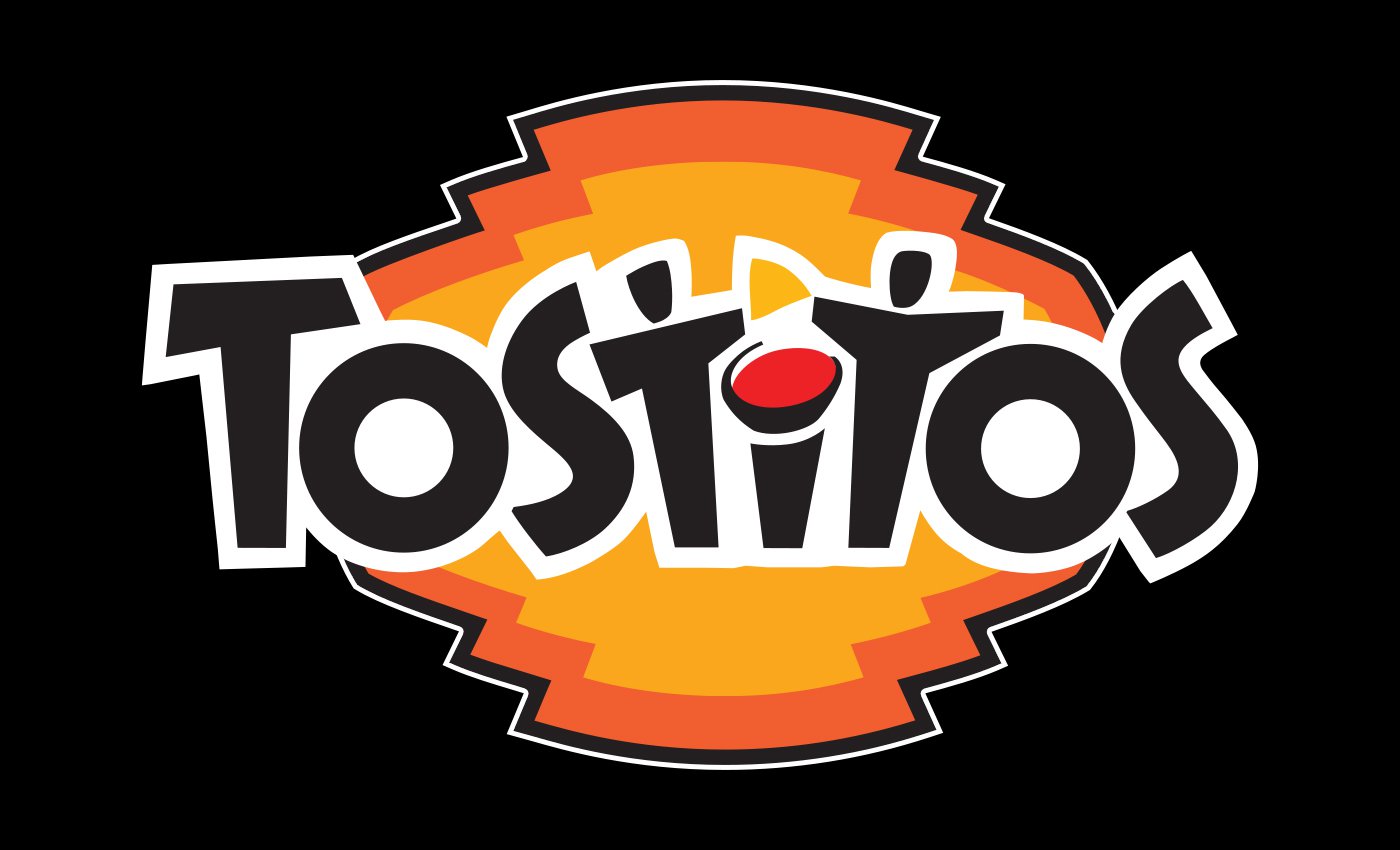
2. Surprisingly, having eaten many Tostitos before I actually did not ever notice their interesting logo. Upon a closer look, you’ll notice that in their logo the two T’s and lowercase “I” represents two people sharing a Tostitos chip with a bowl of salsa.
3. Tostitos is attempting to position its product in the marketplace as a snack that brings people together because it’s almost always at gatherings/parties, even their slogan is “Bring The Party.” I definitely think it’s working and they did a really good job of representing that goal in their logo. -
May 1, 2023 at 9:46 am #17282
Juana BazanParticipant- Nike Company https://1000logos.net/nike-logo/
- The Nike swoosh represents to symbolize motion and speed, representing in Greek mythology, Nike is the winged goddess of victory. The shoe brand borrows the mythological attributes of flight, victory, and speed. I did not know the meaning behind the Nike logo, this finding is very interesting. I used to think it represented a check mark.
- The brand is attempting to position its product in the marketplace as a brand that sells products of victory and speed. We see this brand in anyone, whether they play sports, work out, or retired. I believe this logo has worked for many years and has become a very known logo.
-
This reply was modified 2 years ago by
 Juana Bazan.
-
April 30, 2023 at 12:32 am #17237
Juana BazanParticipantHi Syed,
Your findings about the Baskin Robbin Logo are interesting. It is amazing how many hidden things are behind this logo and it’s significant for every figure, shape, color, etc.
-
April 30, 2023 at 5:12 pm #17255
ShomariParticipantThe Baskin and Robin logo is interesting, I would not have guess that was the meaning behind their logo. Its really creative marketing, and represents really well for their brand
-
April 30, 2023 at 7:43 pm #17263
Adrian ForresterParticipantthis logo is great. its one that you dont notice at all until you find out from someone else. ive never tried Baskin Robbins, maybe I will try it now.
-
April 30, 2023 at 8:46 pm #17266
Osman Goni RifatParticipantI’ve always noticed that 31 in the BR logo but never knew it represents their varieties of flavor. Thanks for bringing that up.
-
April 30, 2023 at 11:20 pm #17272
NickosParticipantI did not know that the 31 was for their 31 types of flavors. I understand it is a great way to market their selection but I wonder if they have ever ran into issues with it being a bottleneck. For example, what if they wanted to introduce more flavors or remove certain ones? Committing to an exact number is a pretty intense business decision!
-
This reply was modified 2 years ago by
 Nickos.
-
This reply was modified 2 years ago by
-
May 1, 2023 at 12:14 am #17279
Tenzin LhamoParticipantHi Syed,
I never knew the 31 in baskin robins meant the flavors! Thats really interesting to find out. But does this mean that they’ll never add more flavors because of this? Do you think its possible from them to add 32? Or would that mess up the hidden meaning behind the logo? I wonder why they chose those specific colors as well.
-
-
AuthorPosts
You must be logged in to reply to this topic.