https://docs.google.com/spreadsheets/d/15i9vDWImS8eqTcNouPpG_08q7W0Z2So1wMx8G1a-hwg/edit?usp=sharing
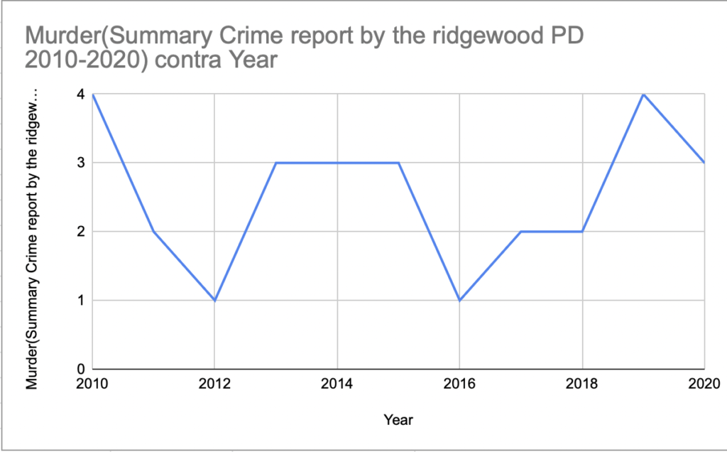
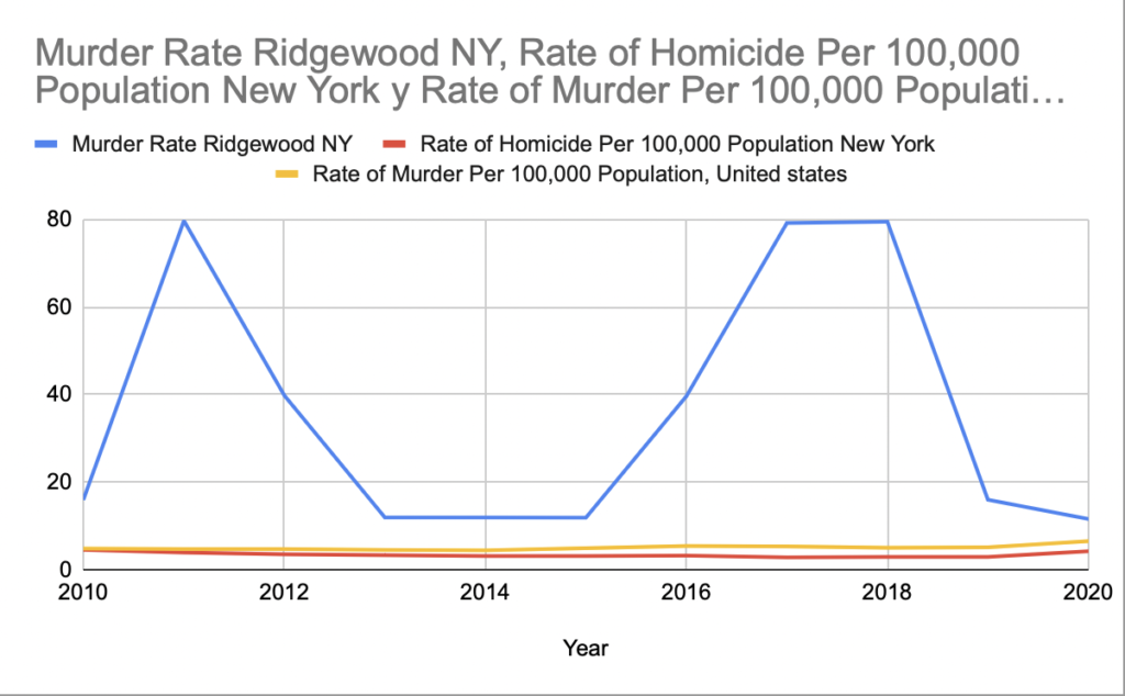
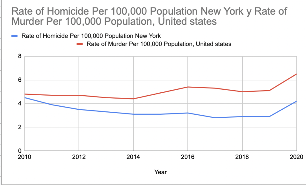
This table help me understand a little more about how the rates are very variable depending on the place and the time. Is very important when you try to have the data about something and these is more organized. The graph help too much because is easier understand and reading the data because you can see and you can’t confused in that, this graphs help you so much understand the percent, the figures and all. It’s very impressive to see how is the difference between the two crimes that I selected, exit a lot difference that the difference is too much and I never imagined how could this change every year and two years ago and how the murder was decreased two years before 2020. I think my hypothesis was supported 50% because I thought the murder can decrease as the years pass, and yes that happens but no too much so that’s why. But I really impressed about the data.


