For some reason projects.newyorker is down
For this reason I’ll be using the example the professor used in the professor’s video overview.
- Do you notice any similarities in the way social class is discussed in readings 4.1 and 4.2? Do you notice any differences in the way these two readings DIFFERENTIATE between social classes?
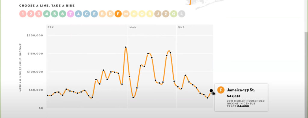
yes, the graph is similar in the way it demonstrates higher class is drastically higher
Yes there are differences in the video the top 1% were on a league of their own on the far right.
2. Pick the station closest to where you live. Using the concepts from Reading 4.1, what social class tends to live in your neighborhood? Are you surprised (or not) by the answer? Do you feel it is an accurate representation of the people living in your neighborhood?
I am not surprised at all with the graph shown. I think it distinguishes Brooklyn, Manhattan and Queens accurately based on income in York Street the mean income is $167k usually wealthy people live around that area where lower manhattan and Brooklyn meet. is the trade capital after all. Brooklyn is shown as the place with the less income, in the far left.
3. Based on Reading 4.2, do you notice a general pattern about social classes in NYC?
yes, wealthy people live mostly in manhattan. I also noticed that Brooklyn has 22 stops and half of them don’t reach $50,000 but there is a steady enough growth between Brooklyn and Manhattan Queens, however, has a steady decline
the graph I used