https://elliesheridan.myportfolio.com/

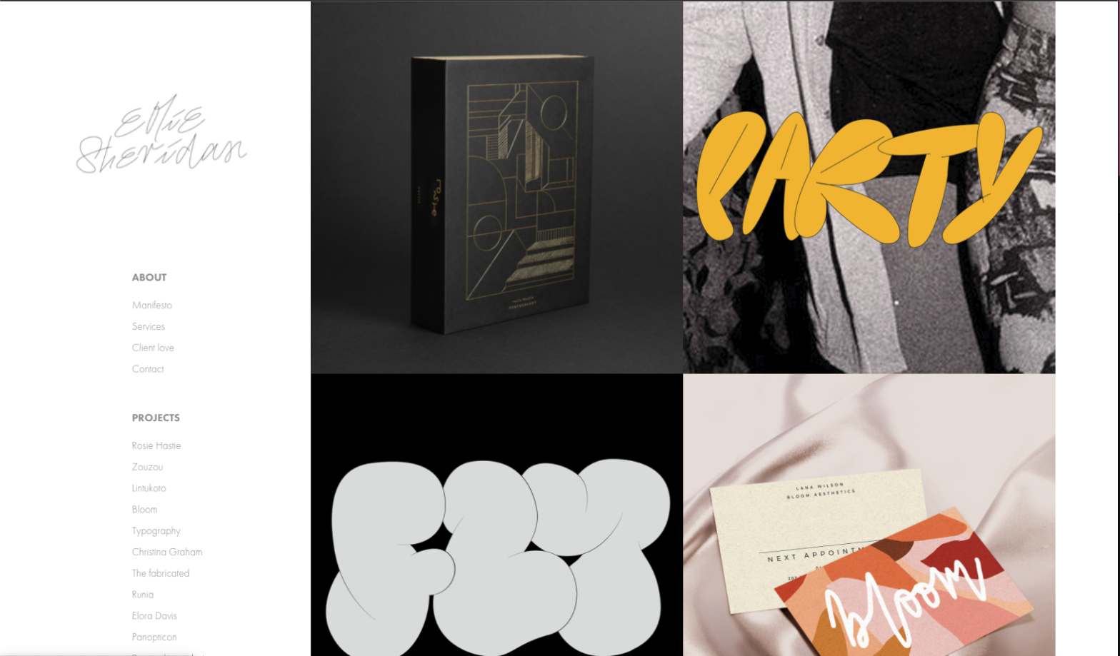
This might be ambitious for my current skill level, but I’m considering this anyway. Last semester I struggled with my grid layouts, so hopefully, I can pinpoint where my mistakes were as we go through the course. The only thing I would change is the white background to black for max contrast since my work is colorful.
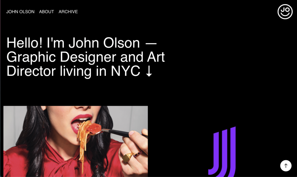
The design above features boxes that show the clients name when you hover over the thumbnails. I love that the designers logo is featured in the top right hand corner also.