Thursday 2/28: RWD, Navigation and Typography
We will start the day with a refresher on what we did on Tuesday: Responsive Web Design (RWD) and have you apply it to a page on your project. Then we will look at Navigation and Typograhy.
Activity 1: RWD Check-in
We will go over the concepts again and then give you some time to try to make one of your pages responsive.
Activity 2: Typography Basics
We will go over the Typography Basics post to cover the basic concepts
Activity 3: Typographic Hierarchy
We will go over the Typographic Hierarchy post.
Activity 4: Navigation
There are many ways to do navigation on a web site. Since we can’t cover them all we will go over some concepts and look at one specific example. All of the information is in the Navigation post.
Tuesday 2/27: Layout with Grid and Media Queries
Activity 1: Check in
We will start with a check-in. Mentimeter link will be in chat and on-screen in zoom
Activity 2: Responsive Design Refresher
Responsive Web Design was coined by Ethan Marcotte in a blog post for the A List Apart web site in 2010. With CSS Grid and other developments, the CSS in that post is out-of-date, but the concepts remain:
- Fluid Grid: The width of the containing elements on your site is fluid. This normally means the width of the elements are in units like % or fr (what we will use with CSS Grid).
- Flexible Media: the images and other media used on a page can adjust their size to fit the fluid grid as it changes with the browser size.
- Responsive Layout (media queries): The site layout changes to match the width of the browser being used to view it (mobile, laptop, desktop etc). Media queries are what is typically used to do this. There are some other options you can also use that we will explore
Activity 3: CSS Grid and Media Queries Challenge
We will use the following CodePen to go through a series of challenges to use Grid Layout and Media Queries
Basic Grid Examples (codepen.io)
Grid Idea 1: Container
Every grid needs a single element that contains all of the grid content. This element is one containing elements.
In your CSS you set this element to display grid
Grid Idea 2: Define Columns
After you define which element is the container, you define how many columns the grid has. You can also, optionally, set a gap to space out the columns. If you don’t specify a gap content from columns will be right next to one another.
.grid-container {
  display: grid;
  grid-template-columns: 1fr;
  grid-gap: 20px;
}
Challenge 1: Create a Three column Grid
write CSS to create a 3 column grid for the section.grid-container element.
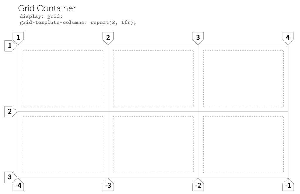
Grid Idea 3: Grid Lines
The columns and rows of the grid are marke by lines. The lines are numbered by default starting from 1 on left for columns and 1 at top for rows. Note that there are always one more grid lines than the number of columsn. So a 3 col grid has 4 grid lines.
Grid Idea 4: Grid Items
The direct children in a grid are the grid items. By default each item fits in once column of the grid.
<section class="grid-contianer" id="one">
  <div class="grid-item">
    <p>lorem ipsum dolor sit amet</p>
  </div>
  <div class="grid-item">
    <p>lorem ipsum dolor sit amet</p>
  </div>
  <div class="grid-item">
    <p>lorem ipsum dolor sit amet</p>
  </div>
</section>
Grid Idea 4: Column Spans
You can allow a grid item to span more than one column. There are two basic ways
- use grid-column: span 2;
- Where the number at the end is the number of columns to span
- specify which grid lines an item should stop and start at.
Challenge 2: Have Grid Items Span multiple Columns
Create a 5 column grid for projects.
Write CSS for the Projects Grid so that the introduction spans all 5 columns.
Have the poster project start at column2 and end on column 4.
Media Queries
We will go through a mobile-first approach to Media Queries.
We will start with a look at the Media Queries post.
Then we will do the following
- For the Images grid (last section) create a grid with one column: container class is .grid-images
- We will need to do a quick diversion to get in place the CSS to make the images responsive
- Then write a media query for the 800px breakpoint to make it two columns
- Then write a media query for the 1200px breakpoint to make it three columns.
Responsive Images and Video: the CSS used in this post is in the style.css file for your Responsive Site project. This post explains that styling in more detail.
Here are some CSS Snippets to help
One column Grid
.grid-images {
  display: grid;
  grid-template-columns: 1fr;
  grid-gap: 20px;
  padding: 20px;
}
A media query that changes columns
@media (min-width: 900px) {
  .grid-images {
    grid-template-columns: repeat(2, 1fr);
  }
}
Activity 4: CSS Grid Practice Quiz
If we have time, we will do a practice CSS Grid quiz. When you’re done, take a screenshot of your results and send it to me on Discord. You should see something like this when you’re done:

CSS Grid Practice Quiz Link