
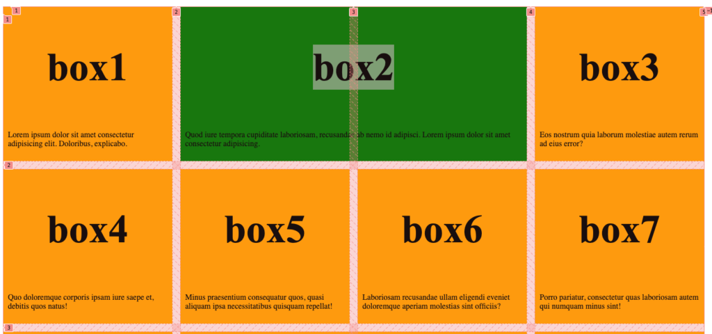
A grid is a layout that you define in CSS that allows you to organize content on your page in Rows and Columns.
In order to have a grid layout you need to combine HTML and CSS. In the HTML you will need:
- An Element to contain the grid. It is very helpful to give the container element a class or id so the Grid CSS can be applied more easily. Usually the element is one of these
- main
- header
- footer
- section
- article
- aside
- div
- An element for each grid item. The grid item contains the content in a section of the grid. The item must be a block element and should be an element that can contain other elements. Most of the time the grid item element will have a CSS Class applied. Common grid item elements are:
- section
- article
- div
- Content in the grid item. This is whatever HTML content you want to have in the item.
Example Creating a CSS Grid
Step 1: HTML Structure
We will use a <section> element as the grid container and include two child <div> elements representing the grid items. Each grid item will contain a heading (<h2>) and a paragraph (<p>).
<section class="grid-container">
  <div class="grid-item">
    <h2>Heading 1</h2>
    <p>This is a paragraph for the first column. It can contain any content you like.</p>
  </div>
  <div class="grid-item">
    <h2>Heading 2</h2>
    <p>This is a paragraph for the second column. Feel free to add more content or adjust the layout as needed.</p>
  </div>
</section>
Step 2: CSS for the Grid Layout
Next, define your CSS to create the two-column layout. You’ll use the display: grid; property on the .grid-container to activate grid layout mode. The grid-template-columns property is where you define the number and width of the columns. We will use 1fr units for the width, which will made the columns equal width. The gap defines how big a gap there is between rows and columns (by default there is no gap).
.grid-container {
  display: grid;
  grid-template-columns: 1fr 1fr; /* Creates two columns of equal width */
  gap: 20px; /* Optional: Adds space between grid items */
}
Step 3: Adding Styles (Optional)
The CSS below includes some basic styling for the grid items (background-color, padding, and border) to help visualize the grid layout. These are not needed for layout and you would use your own styles to match your design requirements.
.grid-item {
  /* Styling for the grid items, optional */
  background-color: #f0f0f0; /* Light grey background for visibility */
  padding: 10px; /* Padding inside grid items */
  border: 1px solid #ccc; /* Adds a border around each grid item */
}
Summary
This setup creates a responsive two-column grid layout where each column takes up half of the container’s width. The 1fr unit for grid-template-columns ensures that each column adjusts its size based on the container’s width, making the layout flexible and responsive. You can add more content within each .grid-item as needed, and the grid will automatically accommodate it.