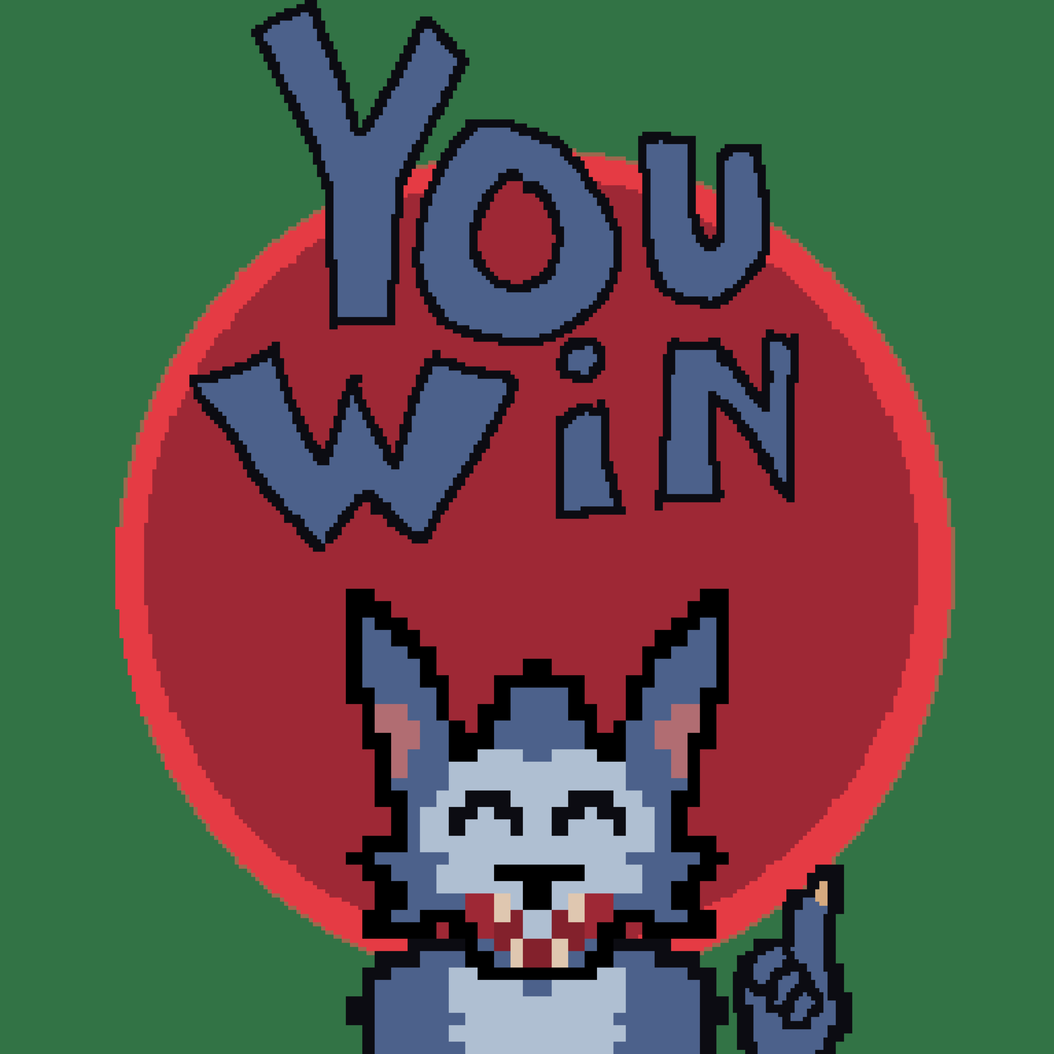
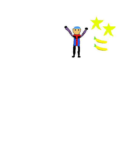
Win screen 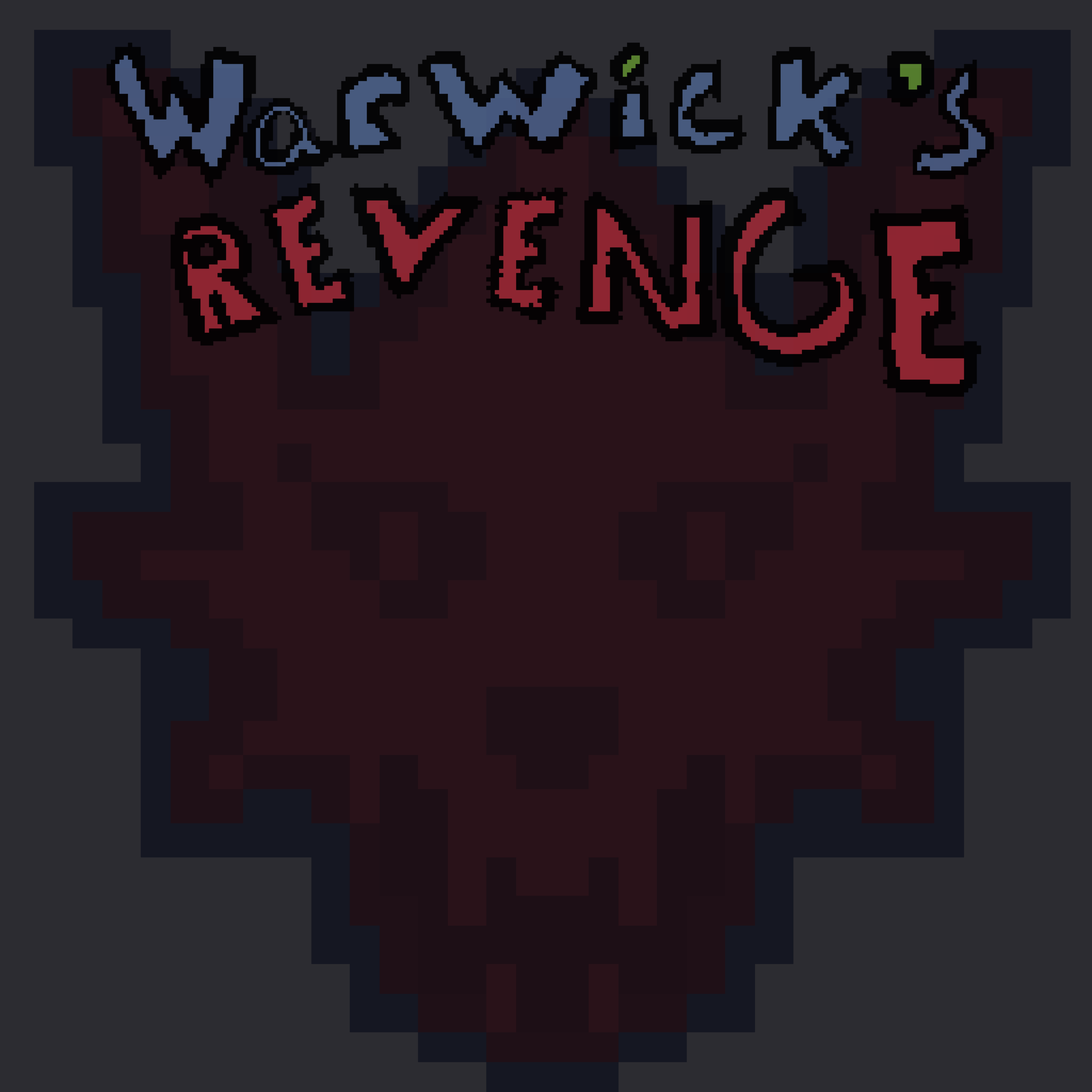
Title Screen 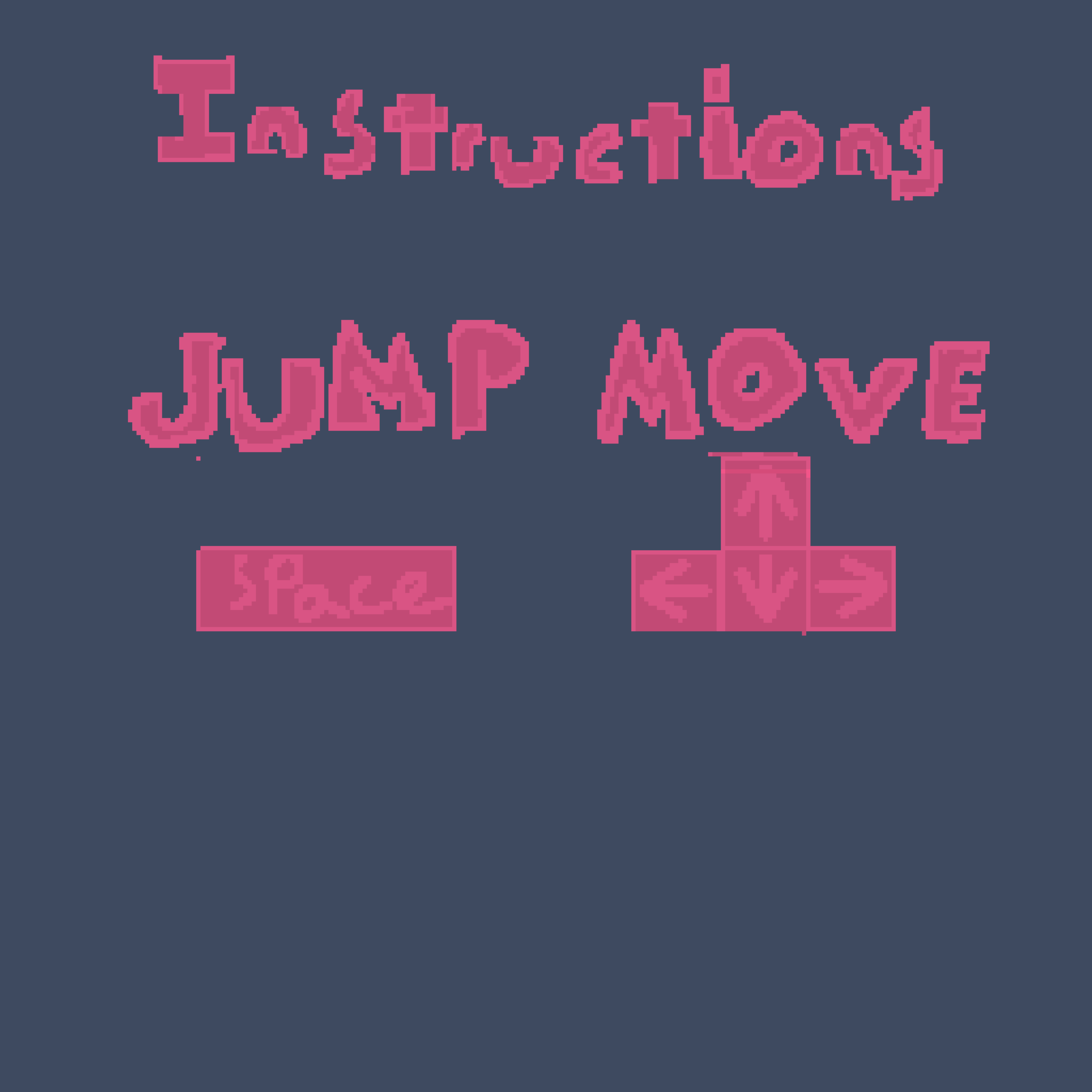
Instructions 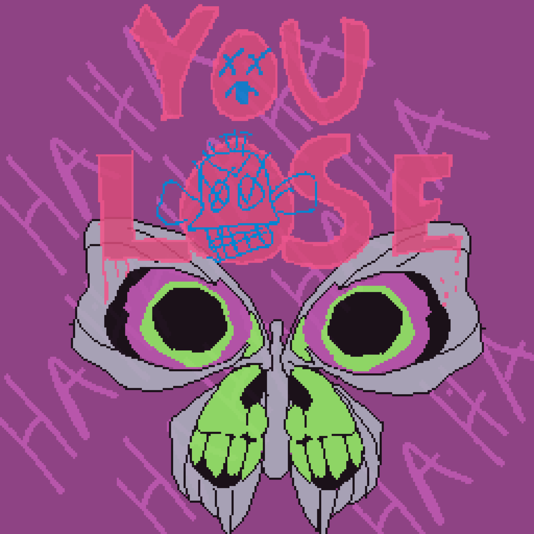
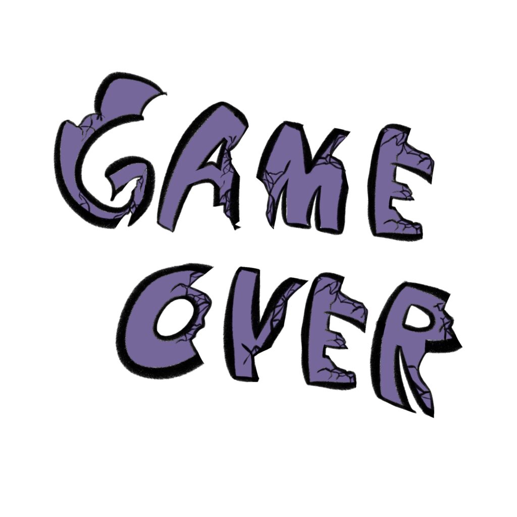
Game Over screen


MMP 270: Introduction to Video Game Design
BMCC Fall 2021


I looked around for some fonts online (for commercial use of course) and stumbled upon this font.




However this one, was made from my own handwriting.
It’ll be in a PNG format when I move it over to a game of course, but I wanted to keep the entire color scheme to be similar. I’m still thinking of a title for my RPG but I also want to animate something for it in the future.
here is a set of designs for buttons and title screens




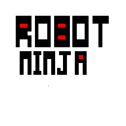
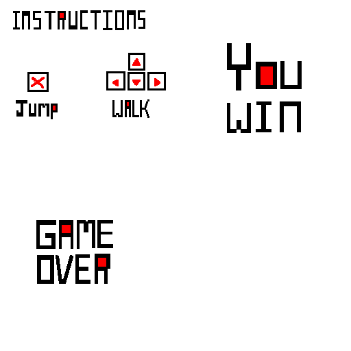
the name of my game is robot ninja. when I was choosing colors I used the some colors as my game character, I wanted it to match.
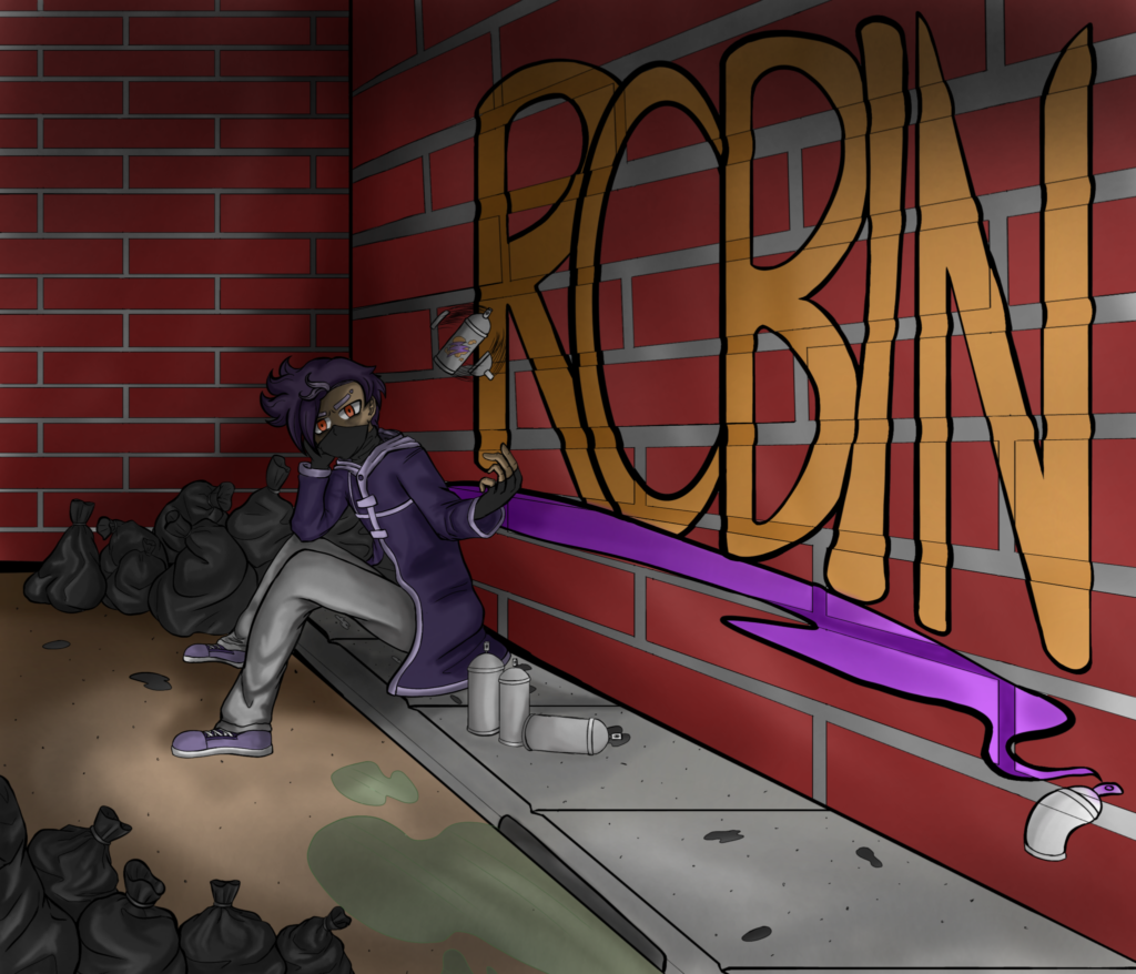
Here is my Title Screen art. This is actually a pre made art that I hade for my character for a while. I didn’t expect to use it for a title screen. But this is how it looks without the buttons.
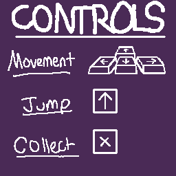
My control screen is a bit basic since it’s a platformer for now. So just the movement controls and item collecting controls work out for now.
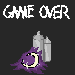
Here is my Game Over Screen


I’m currently doing around 5 labs at once for a thing, but here’s the first that’s completely done. All UI for the game has been designed!
I have the many buttons, a game over screen, a next level screen, and a title screen. I’m quite proud of the artwork for the title. Instead of an instructions screen, I’ve made an “NPC” of sorts that cuts in with instructions to the player, both about how to play and the game mechanics. His name is Agent Mortimer, a mysterious intel agent constantly shrouded in darkness.





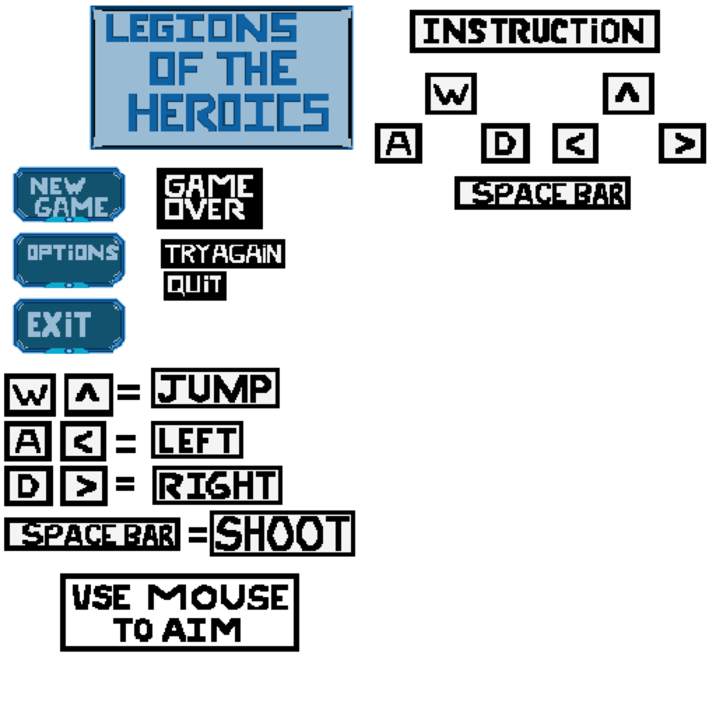
For my User Interface Design, I wanted the home titled screen to have a science fiction style. The name of my game is called “Legions of the Heroics” since the theme of my game takes place in the future. Legions are AI robots and make up the majority in this world. In the options section, will allow the User to look at the instruction of how to control the player.
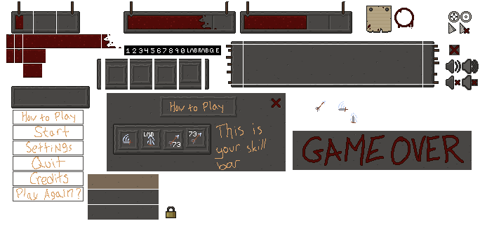
The numbers are all 5×7 pixels, and the letters as well as LMB/RMB are slightly smaller. (Example layout coming soon)