Final Course Completion Information – Weeks #14 & 15
Dear MMA 235 Students,
The end of the semester is upon us…
Here is the final semester wrap up and course completion information in advance:
Please read this information carefully and mark your calendars accordingly.
Please reach out with any questions here – rseslow@bmcc.cuny.edu
1. Thursday May 15th – this will be our last regular class / lab working session. We will use this class session to discuss and share a demonstration on how you can create a final portfolio with Adobe Illustrator (saved as a single file PDF) the portfolio will display and organize all of your completed works. The final portfolio is mandatory- I will also show you how to organize your google drive assignment folders (as a review) as well.
*****The Final Portfolio Tutorial from class on 5/15 is here below:
2. Thursday May 22nd @10am (final exams week) if you wish, you may come into class and present your final portfolio – this is our last and final meeting for the semester – It is not mandatory to present your final portfolio to the class – but highly encouraged – please join us! You can choose to show your work on the big screen!
****All students will need to have all completed work added to their folders in our google drive folder no later than Friday 5/24 at 6pm.
3. Submitting your completed assignments& final portfolio– I know I have mentioned this many many times through out the semester, but all student work needs to be submitted via our shared Google Drive Folder – the link to the shared folder is located on our class’s Brightspace page- You must share all of your production files that include the adobe photoshop files – .psd and all illustrator files – .ai – you can also share any . JPG files and your illustrator work as PDF files.
Please reach out with any questions here – rseslow@bmcc.cuny.edu
Editorial Inspiration: Designing with Purpose & Power
Welcome Back!
We’re entering an exciting phase in the course — Assignment #3: Editorial Design — and this one is all about storytelling through design. You’ve already built strong foundational skills, and now it’s time to bring them into the world of layout, composition, and visual narrative.
Your task is to design a two-page magazine spread that features an article of your choice. This could be something from a current issue, a written piece that inspires you, or even a short essay you write yourself. Think of this as a creative collaboration between design and journalism.
Editorial design is where typography, layout, and hierarchy come together in powerful ways. It’s one of the most timeless applications of design, used in books, magazines, zines, newspapers, and now digital articles. The ability to take text and make it readable, engaging, and beautiful is a core skill in any design discipline.
Plus — it’s fun. You get to play with space, create balance, and guide the reader’s eye. You’re the director here.
Tools You’ll Be Using
This project can be completed in Adobe Illustrator (or InDesign if you wish) but feel free to integrate assets made in Photoshop if that enhances your final composition.
Grid systems
Paragraph and character styles
Column structure
Text/image integration
Pull quotes and captions
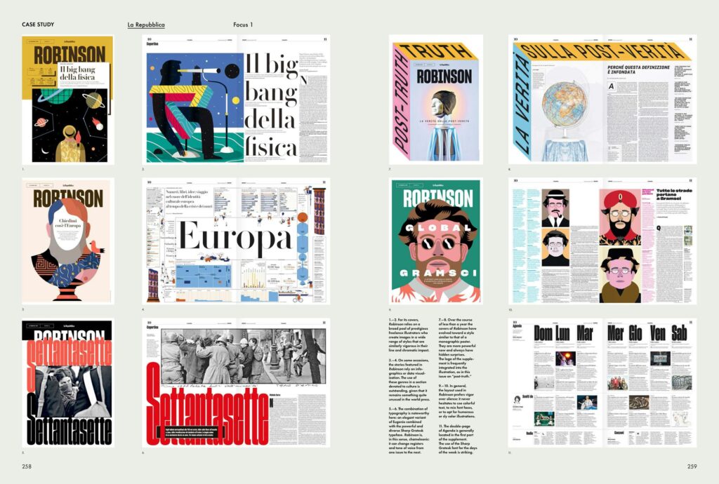
Inspiration Examples
Look at the editorial layouts in The New Yorker, WIRED, The New York Times Magazine, and indie zines. Notice how they:
Emphasize strong visual hierarchy
Use typography not just to communicate, but to express
Create rhythm through contrast and negative space
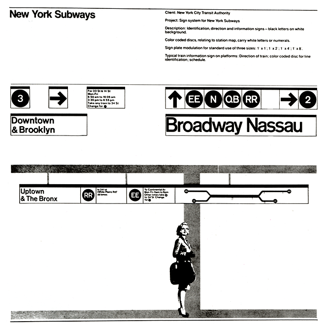
***Also: Look back at Swiss Style layouts from designers like Josef Müller-Brockmann or Armin Hofmann — grid lovers, rejoice!
Start a Mood-board – Get Inspired!
Collect screenshots, clippings, or digital images of magazine spreads that resonate with you. Use Pinterest, a Google Doc, or even a Figma board to drop inspiration and sketch your direction.
Ask yourself:
What fonts are being used?
How is white space treated?
Where does my eye go first — and why?
Your Challenge: Tell a Story Visually
The article you choose matters. Pick something you care about. Design becomes much more impactful when it’s connected to something you believe in — whether that’s a social cause, an artist you love, or a deep-dive feature on something weird and wonderful.
Let your authenticity lead.
Submission Checklist –
2-page editorial spread (facing pages)
Exported as a high-res PDF
Moodboard / inspiration examples
Add all of your files to your google drive folder – this includes the production files.
Final Thoughts
This assignment is about more than just “making something pretty.” It’s about crafting communication. About using design to invite someone into a story. And most of all — about finding your own voice within the format.
You’ve got this. I can’t wait to see your spreads come to life!
It is time to dig into Assignment #2! Lets discuss it and share some insights and information! Please refer to the Assignment #2 page for the assignment specifications – this post will help with the process!
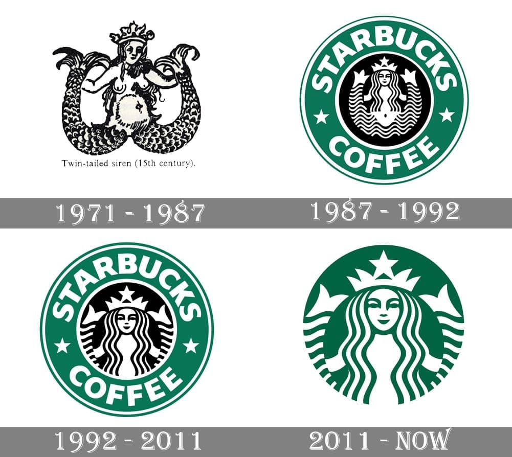
Creating a logo for a nonprofit organization requires a balance of creativity, clarity, and strategic thinking. Unlike corporate logos that often prioritize marketability, nonprofit logos must embody a mission-driven message, fostering trust, recognition, and emotional connection. This post walks through the process of designing a nonprofit logo and symbol system, incorporating historical influences from legendary designers and best practices in branding.
Historical Influences in Logo Design
Before diving into the design process, it’s helpful to look at iconic designers who have shaped the field of branding and logo design:
Paul Rand – Known for timeless and simple logos, Rand’s work (IBM, ABC, UPS) demonstrates the power of minimalism and clarity in branding. (Learn more: Paul Rand’s Legacy)
Saul Bass – Famous for expressive and symbolic logos, Bass’s work (AT&T, United Way, Girl Scouts) showcases how visual elements can communicate deep meaning. (Explore: Saul Bass’s Portfolio)
Chermayeff & Geismar & Haviv – This studio is behind some of the most recognized modern corporate identities, such as the logos for National Geographic, PBS, and the U.S. Open. Their work exemplifies adaptability and bold simplicity. (See: Chermayeff & Geismar & Haviv)<
The Design Process
Step 1: Research & Analysis
Before sketching concepts, it’s crucial to understand the nonprofit’s mission, target audience, and values. Ask the following:
What is the organization’s core purpose?
Who does it serve?
What emotions should the logo evoke?
How will the logo be used (print, web, merchandise)?
Example: If designing for an environmental nonprofit, the logo should convey sustainability, nature, and harmony.
Step 2: Conceptual Sketching
Using the research insights, start brainstorming visual ideas:
Experiment with symbols and typography that align with the nonprofit’s message.
Sketch multiple rough variations to explore different directions.
Consider universal design principles like balance, symmetry, and negative space.
Tip: Many successful nonprofit logos use simple, bold icons that are easy to recognize at a glance (e.g., WWF’s panda (above), Red Cross’s emblem).
Step 3: Digital Development
After refining sketches, translate the best concepts into digital form using vector software like Adobe Illustrator.
Key Considerations:
Scalability: Ensure the logo maintains clarity from large billboards to small app icons.
Legibility: Choose fonts and icons that are readable across different media.
Color Psychology: Select colors that reinforce the nonprofit’s identity (e.g., blue for trust, green for nature, red for urgency/action).
Deliverables: Create 3–5 logo variations to test different styles and refine the best one.
Step 4: Testing & Adaptability
Test how the logo appears in different applications:
Business cards
Websites & social media
Merchandise (T-shirts, mugs, tote bags)
Signage & event materials
Make adjustments based on feedback to optimize readability, contrast, and usability.
Step 5: Refinement & Finalization
Gather feedback from classmates and refine the design:
Adjust spacing, proportions, or typography if needed.
Ensure the final logo works in full color and black-and-white.
Finalize the best version and prepare the necessary files (AI, PDF, PNG, SVG) for professional use.
Step 6: Brand Usage Guide Submission
The final step is compiling a 1–2 page brand/style guide that may include:
Logo variations (primary, secondary, monochrome)
Color palette with HEX, RGB, CMYK codes
Typography guidelines
Clear space and minimum size requirements
Do’s and don’ts of logo usage
Final Submission: Upload the vector files (the “ai”- adobe illustrator files) to your Google Drive folder for easy access. 🙂
A well-designed nonprofit logo is more than just an aesthetic mark—it’s a visual representation of the organization’s mission and impact. By following a structured design process and learning from historical influences, designers can craft meaningful and adaptable brand identities that resonate with audiences.
Need more inspiration? Check out the archives of AIGA’s Logo Design Gallery (AIGA Design Archives) for award-winning nonprofit branding examples.
Note: You will only be able to install CUNY-licensed Adobe Creative Cloud applications using your CUNY Login Credentials—do not use Google, Facebook or Apple credentials.
Designing for Impact: Creating a Social Issue Awareness Poster
Posters have long been a powerful tool for social change, used to educate, inspire, and provoke action. Whether addressing climate change, mental health awareness, or equality, graphic designers play a crucial role in shaping public discourse through visual communication.
Let us explore how to create an impactful social issue awareness poster, drawing inspiration from historical design movements and modern examples.
The Power of Posters in Social Movements
From wartime propaganda to contemporary activism, posters have been central to mobilizing change. Some of the most influential social posters include:
• Black/White: Stark contrast for powerful, minimal designs
3. Digital Draft: Bringing It to Life
Use Adobe Illustrator, Photoshop, (or draw by hand, useProcreate, sketchbook or adobe fresco) to create a digital draft. Test different compositions, focusing on:
✅ Visual Hierarchy: The most important element should grab attention first.
✅ Alignment & Spacing: Avoid clutter—let your design breathe.
✅ Contrast & Readability: Ensure text is legible from a distance.
4. Feedback & Refinement: Test Your Design
Before finalizing,
Ask:
• Does the message come across clearly?
• Is the color scheme effective?
• Does the typography enhance or distract from the message?
Once refined, export your poster from Adobe Illustrator as a high-resolution (300 DPI) PDF with proper CMYK color settings for print. I will also show you how to export a .JPG file.
Mockups Matter!
Present your work using real-world mockups (e.g., posters on a subway wall, billboards, or community boards) to show its impact.
Your social issue awareness poster has the potential to make an impact beyond the classroom. Whether exhibited in a gallery, shared on social media, or printed for protests, design can drive change.