Week #14 & #15 – Info & Resources

Welcome to MMA100 Week #14 & #15!

Here is this week’s useful information and class resources:

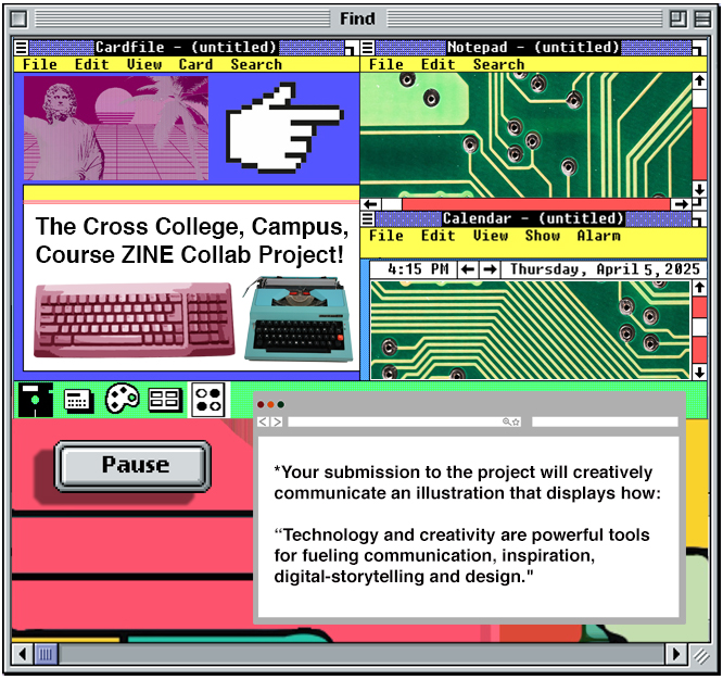
1. Did you complete and e-mail to me your contribution to the Collaborative ZINE Project yet? I need it tonight! Read the info Here – https://netart.commons.gc.cuny.edu/2019/11/12/the-cross-college-campus-course-zine-project/

We will all be leaving a few comments on the project page link above (Ill explain in class on 12/11)

**Class on 12/11 is our last LAB Session – Wednesday 12/18 will be a pizza party and a final critique on the Final Project below.

***All class projects and revisions will be due no later than 12/19 at 5pm!

2. FINAL PROJECT –Assignment #6 – Type & Typography

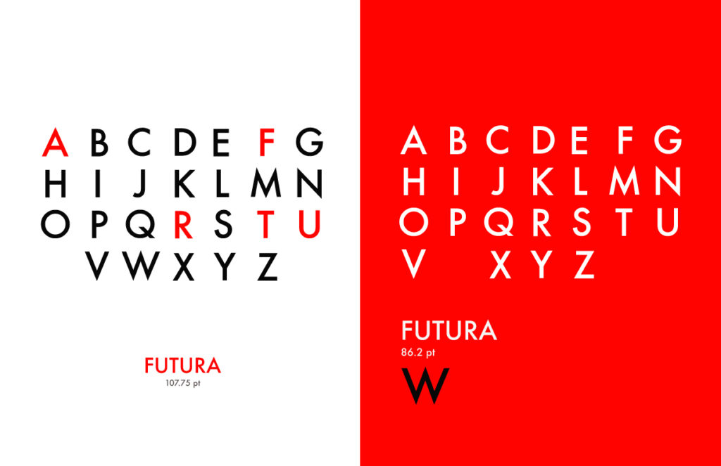
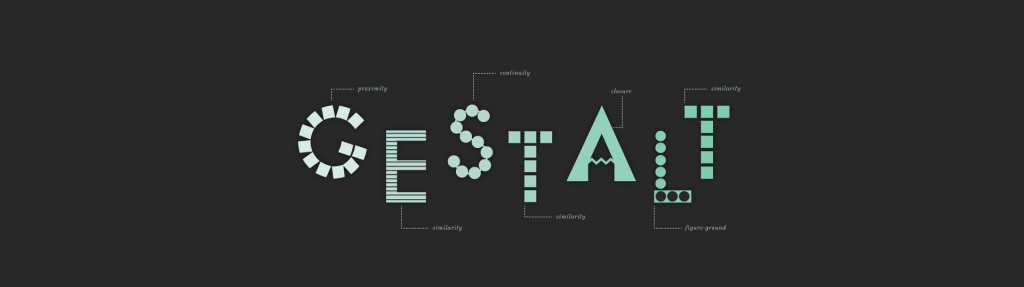
Assignment 6 – Poster Design with Type & the Alphabet.

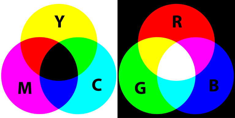
Create 2 new designs using and applying balanced typography in adobe illustrator. Students will generate and demonstrate both a balanced and unconventional composition using each individual letter of the alphabet. (A-Z) The examples (below) are just a few potential ways to display style, simplicity, order and efficiency. A demonstration will be given in class.

Size requirements – 8.5 inches -X- 11 inches (or larger – 11″ x 14″)

Typefaces – Limit yourself to no more than 2-3 different fonts and 4 color values.

Step 1Find and discover your own inspiration and share the URLs in the comments section below. Each student will add 2-3 URLS of their inspiration in the comment section before starting this assignment.

Things to consider – Layout & balance – Using rulers, guides and grids. Free transformation & typesetting style.

*COMPOSITION and command over the picture plane and its chosen dimensions.


We will have a final class critique on Wednesday 12/18. A printed version of this assignment will be presented by each student. You will select two of your designs for the critique.

Students may later wish to create a new 11″X17″ tabloid layout set for print in Adobe Illustrator. (You may use use multiple art boards to create iterations) Students will apply a series of their designs into a collaborative magazine for print and the web.

*Student submissions of the completed project:

Students will submit the project to me via e-mail saved as a .PDF file and a high resolution .JPG file – Please send to – rseslow@bmcc.cuny.edu no later than Thursday 12/19/19

Week #12 & #13 – Info & Resources

Welcome to MMA100 Week #12 & #13!

Here is this week’s useful information and class resources:

*Did you miss Week #11’s Post? Go Here
* Did you miss the Mid-Semester Project Details? Go Here (or see below!)
*Did you miss Assignment #3’s Details? Go Here

**Mid-Semester Project Studio Work Session Continues on 11/20  & 11/27 with a full Lab Work Session & Printing examples.

**and check this out below: LETS Jump IN!

EXCITING COLLAB PROJECT! – Class Demonstrations will take place in class today! I would like to spend a bit of time contributing to this project!

Read Here – https://netart.commons.gc.cuny.edu/2019/11/12/the-cross-college-campus-course-zine-project/


Week #10.5 & #11- Mid-Semester Project Studio Work Session

Welcome to MMA100 Week #10.5 & #11!

Here is this week’s useful information and class resources:

*Did you miss Week #10’s Post? Go Here
* Did you miss the Mid-Semester Project Details? Go Here (or see below!)
*Did you miss Assignment #3’s Details? Go Here

Mid-Semester Project Studio Work Session

Poster Design. We will bring together the applications of a vector portrait, composition, image and typography.

Museum Exhibit Poster (examples will be shown in class – as well as a series of Illustrator vector demonstrations)

Choose one or more of these styles/movements of art to create a poster using a SELF-Portrait:

POP ART, SURREALISM, MEXICAN MURALISTS AFRO-FUTURISM, ANIME/MANGA, POLITICAL ART, FAUVISM, AFRICAN MASKS, ANIME, VIDEO GAMES or (Another Style Not Listed Here or create a Hybrid using 2 or more styles)

Process: Research! Find and discover a series of images and references to work from. Your research should inspire you! Create a new project folder titled “Mid-Term-Project” – save these images to your project folder. Create your self-portrait in the style of the Art Movement that you chose for a Museum Exhibition. It should be obvious which style you picked WITHOUT seeing the title.

*Check out examples from MMA100 students last semester here

*Your self-portrait IS the artwork for the poster campaign that you create for the exhibit. You must design the poster in 2 sizes – one landscape and one portrait orientation. I suggest 11” x 17” (or slightly smaller)

Your self-portrait must first be drawn in Illustrator and can be brought into Photoshop later for manipulation, (like adding blended color, additional imagery or effects.) After you illustrate your self-portrait, you’ll create the actual poster for the ex­hibit.

Specifications: The museum having the exhibit you’ve chosen is: SAM, Seattle Art Museum. Find out more about the institution at this website: https://www.seattleartmuseum.org/visit/seattle-art-museum

For the midterm project please use the SAM logo as it is: (attached as a download link here) *feel free to re-render the logo on your own if you wish. (This does not mean change it)

You may use any of the tools in Illustrator that we’ve learned or explored and also find and experiment with new ways to draw. You can work from a photo in Illustrator as demonstrated in class.

Do the Portrait First. Then compose the poster. :))

Minimum required copy/text for the poster is:

New Voices Exhibit

April 15th – May 30th 2019

Opening Reception, April 20th 7PM-9PM

https://www.seattleartmuseum.org

*(and the SAM logo of course)

Fonts and colors – are entirely student choice. Students may ADD additional copy, but may not delete from the minimum above.

**Final due dates and the Submission formats are on the Assignments Page HERE.

———— – – – – – – – – – – – – – – – – – – – – – – – – – – –

Research / Inspiration / Tutorial – Check out these links below:


Art Movement Resources: 

https://www.theartstory.org/section_movements.htm

https://mymodernmet.com/important-art-movements

Week #10 Info & Resources

Welcome to MMA100 Week #10!

Here is this week’s useful information and class resources:

*Did you miss Week #9’s Post? Go Here

*Did you miss Assignment #3’s Details? Go Here

**Lets dedicate the first 45 minutes of class to completing Project #3, and following my demonstration on how to print it and place it on the class display board in the back of the classroom. Then, follow the submission guidelines on the assignments page 🙂

We need to move forward into our Mid-Semester Project:

Illustrator basics from Terry White – Subscribe to his channel, trust me!

(((((((((((((((((((((((((((((( 0-0-0 )))))))))))))))))))))))))))))))))))


*** Mid-Term Project  *** LETS Discuss!

Poster Design. We will bring together the applications of composition, image and typography.

Museum Exhibit Poster (examples will be shown in class – as well as a series of Illustrator vector demonstrations)

Choose one or more of these styles/movements of art to create a poster using a SELF-Portrait:

POP ART, SURREALISM, MEXICAN MURALISTS AFRO-FUTURISM, ANIME/MANGA, POLITICAL ART, FAUVISM, AFRICAN MASKS, ANIME, VIDEO GAMES or (Another Style Not Listed Here or create a Hybrid using 2 or more styles)

Process: Research! Find and discover a series of images and references to work from. Your research should inspire you! Create a new project folder titled “Mid-Term-Project” – save these images to your project folder. Create your self-portrait in the style of the Art Movement that you chose for a Museum Exhibition. It should be obvious which style you picked WITHOUT seeing the title.

*Your self-portrait IS the artwork for the poster campaign that you create for the exhibit. You must design the poster in 2 sizes – one landscape and one portrait orientation. I suggest 11” x 17” (or slightly smaller)

Your self-portrait must first be drawn in Illustrator and can be brought into Photoshop later for manipulation, (like adding blended color, additional imagery or effects.) After you illustrate your self-portrait, you’ll create the actual poster for the ex­hibit.

Specifications: The museum having the exhibit you’ve chosen is: SAM, Seattle Art Museum. Find out more about the institution at this website: https://www.seattleartmuseum.org/visit/seattle-art-museum

For the midterm project please use the SAM logo as it is: (attached as a download link here) *feel free to re-render the logo on your own if you wish. (This does not mean change it)

You may use any of the tools in Illustrator that we’ve learned or explored and also find and experiment with new ways to draw. You can work from a photo in Illustrator as demonstrated in class.

Do the Portrait First. Then compose the poster. :))

Minimum required copy/text for the poster is:

New Voices Exhibit

April 15th – May 30th 2019

Opening Reception, April 20th 7PM-9PM

https://www.seattleartmuseum.org

*(and the SAM logo of course)

Fonts and colors – are entirely student choice. Students may ADD additional copy, but may not delete from the minimum above.

———— – – – – – – – – – – – – – – – – – – – – – – – – – – –

Research / Inspiration / Tutorial – Check out these links below:


Art Movement Resources: 

https://www.theartstory.org/section_movements.htm

https://mymodernmet.com/important-art-movements


Week #6 Info & Resources

Welcome to MMA100 Week #6!

Here is this week’s useful information and class resources:

*Did you miss Week #5’s Post? Go Here

*Did you miss Assignment #2’s Details? Go Here

** Reminder ** Students in MMP and MMA classes who need extra help have access to tutors in the Learning Resource Center. See tutoring schedule here: https://www.bmcc.cuny.edu/students/lrc/in-person-tutoring/tutoring-schedule/.

Forward we go! – Project #2 is due – Elements & Principles: (The Vocabulary is Here)

**Both documents will be saved Via Photoshop – File -> Export -> Save for Web –> select jpg. **Please send as soon as possible! – Send Via e-mail to rseslow@bmcc.cuny.edu


Project 3# Begins! Adobe Illustrator, an Introduction.

Illustrator, Shapes, Forms, Composition & Color -Lets take a dive into adobe Illustrator, a most versatile and awesome tool! 

Creating shapes with the shape builder tool. Working with layers, simplifying and reducing images. Working with color, locating color books and pantone colors.

Lab Tutorial – This week we will take a tour of Adobe Illustrator and practice creating new documents and setting up our art boards for print production.

Color Theory! Adobes awesome Color Wheel Simulator (must see) you will apply the use of this tool for this assignment.

GO HERE to Experiment

(See Example #1 Above & example #2 below)

1. Open Adobe Illustrator and create a new document sized at 11″ X 17″ in CMYK color mode. We will be both printing and displaying the final work on screen.

Consider, how will you set your guides to equally balance and format the graphics evenly? Will you use a grid? Do you have a preferred method for layout? Lets explore what this means.

2. Generate a new series of “subjective” graphic Icons following the layout and arrangement above. (Don’t re-create my example) make your own, but follow the balanced composition.

3. Limit yourself to 6 values of 1 complimentary color scheme. Consider referring to the color wheel for reference – (Located here)

4. Limit yourself to creating and composing your graphics with no more than 6 shapes created with the pathfinder or the shape builder tool. Begin without using a stroke around your shapes and then apply a stroke for contrast later.

5. Save your work as an Ai. file (adobe illustrator) as well as a .pdf – Print your work in .pdf format.

6. E-mail ALL of your final PDF. files to me – rseslow@bmcc.cuny.edu  ****If your .pdf files are too large to send via e-mail (and it may – you can easily use a free service like – wetransfer.com to send the large documents or use google drive)

PART 2 – Each student will follow the images in the gallery below as a guide to further extend and develop their designs.

Size – Use a square shape for this series of designs. I suggest 8″x 8″

Students will select and isolate their strongest single icon/graphic from the original layout in Part 1 of the assignment – 1 version will include a stroke and one with out(example below). Students will explore a 4-part color variation drawn from their selected color palette as well as 1-3 balanced patterns using their icons.


Illustrator basics from Terry White – Subscribe to his channel, trust me!


The NYC Transit Authority Graphics Standard Manual

Dear Students,

Please click the link below to explore a great piece of both NYC and Graphic Design History.

Behold,  The NYC Transit Authority Graphics Standard Manual

https://daringfawnyball.files.wordpress.com/2013/02/nyctamanual.pdf

Designed by Massimo Vignelli and Bob Noorda, Unimark, 1970

I would love to both hear your reactions and feedback in class tonight 9/25 as well as in the comments section below! Each student will leave a series of comments (during our class session) if you are not in class you are required to participate this week from outside of class.

**after you “post” your comment I will have to manually approve it – you may not see it show up right away.

Some Questions to ponder and react to:

  1. What is your general feedback on the manual? Do you like it? Dislike it? Please Explain. Do you find it to be well designed, illustrated and clear in its application?

2. The manual was published in 1970. Does it still hold up for today’s world?

3. What is missing or should be added for today’s world of NYC Transit?

4. What additional questions are you left with?

Week #5 Info & Resources

Welcome to MMA100 Week #5!

Here is this week’s useful information and class resources:

*Did you miss Week #4’s Post? Go Here

*Did you miss Assignment #2’s Details? Go Here

**Students in MMP and MMA classes who need extra help have access to tutors in the Learning Resource Center. See tutoring schedule here: https://www.bmcc.cuny.edu/students/lrc/in-person-tutoring/tutoring-schedule/.

Lets check out the NYC Graphics Standard Manual and discuss it – Each student will leave a comment at the bottom of this page: https://openlab.bmcc.cuny.edu/mma100_foundations_of_digital_graphic_design/2019/09/25/the-nyc-transit-authority-graphics-standard-manual/

Project #2 – Lab Work session on – Elements & Principles: (The Vocabulary is Here)

**Both documents will be saved Via Photoshop – File -> Export -> Save for Web –> select jpg. **Please send by Friday 9/27/19 – Send Via e-mail to rseslow@bmcc.cuny.edu


———————————————————-

Assignment #3  Discussion – Class exercise :: Adobe Illustrator. Creating shapes with the shape builder tool. Working with layers, simplifying and reducing images. Working with color, locating color books and pantone colors.

Lab Tutorial – Lets take a tour of Adobe Illustrator and practiced creating new documents and setting up our art boards for print production.

Color Theory!

Adobes awesome Color Wheel Simulator (must see)

GO HERE to Experiment

Let’s take an additional tour with Adobe Wizard – Terry White

10 Things Beginners Want To Know How To Do (subscribe to Terry’s Channel!)

Weekly Inspiration & Resources of Relevance:

An Introduction to Typography & Its History – Letterforms / Designing with Type

Examples of Typography in Poster Design 

**Must See – 1970NYC Subway – MTA – Graphics Standards Manual 

Week #4 – Info & Resources

Welcome to MMA100 Week #4!

Here is this week’s useful information and class resources:

Did you miss Week #3’s Post? Go Here

Did you miss Assignment #1’s Details? Go Here

We will begin tonight class 9/18 by completing and printing our postcard projects. All students will e-mail project #1 (postcard) to me as a .JPEG file saved  from photoshop. rseslow@bmcc.cuny.edu

Photoshop Demonstrations Continue – I will demonstrate the process for creating the suggested layout in project #2’s description below.

Lets look at where we find image resources and referencing.

Assignment #2 – Elements & Principles

Working with Photoshop. Lets create and apply layers, composition, image resizing and placement techniques to customize our design progress. Class demonstrations will continue.

Assignment Specifications: Students will generate a series of visual examples and solutions to define, communicate and illustrate the vocabulary of the elements & principles of design. Each term will display a visual image example using the vocabulary below:

Outcome – Students will save two variations of the project as a photoshop psd. file as well as exporting the files as a .jpeg for the web (demonstration in class)

Assessment of the project: How has illustrating the vocabulary with images helped your understanding of each term? Discussion follows.

Vocabulary

Elements – Color, Line, Mass, Movement, Space, Texture, Type & Value

Principles – Balance, Contrast, Direction, Economy, Emphasis, Proportion, Rhythm & Unity

Size: – 8.5″ X  11″ – The final design will be 2 composite designs of 8 squares composed and arranged by each student. (2 files will be created – one for the elements of design and 1 for the principles of design)

Process: 

Part 1 – Student will first create a balanced layout in adobe photoshop. Images will be found from research and investigation via the Internet and class resources. Each term for the elements of design will be illustrated and applied by cutting, formatting and placing the examples into a composite (the example below is simply one example, you will create your own)

Part 2 – Students will generate their own examples of each term using techniques learned in class with photoshop.

R&D – Where will you find visual inspiration and research? Add your links to the comments section below.

Production:

Students will prepare their final works in screen resolution format and  application on the web (RGB).

Due dates for next week: We will be starting and working on and this project in class beginning 9/18. The project will be due, completed and submitted by next Wednesday 9/25 via e-mail (do not send this e-mail until 9/25)

Blank Template example of the layout. (not including the border around the image)

Outside of class research and inspiration:

Lets look at COLOR-

Color Theory – (Image via Arhaus‘  via Justcreative)

The link below was published via – JustCreative.com – This is great guide to understanding color in design with an emphasis on logos, identity and branding.

http://justcreative.com/2018/02/19/color-psychology-in-logo-design-branding-explained/

I highly recommend visiting and learning from JustCreative.com aka – Jacob Cass – Jacob is an amazing graphic designer and conduit of great design resources.

Video Screenings –

Photoshop Tutorial – The top 10 Things photoshop Beginners Want To Know How To Do

I love and recommend Terry White’s Youtube channel. He is an Adobe software wizard! Subscribe here.

Who is Michael Bierut and Why is he important? Please watch the video outside of class this week and respond in the comments section below)

https://www.youtube.com/watch?v=HUxWjZcAfvA

What is GESTALT and why is it important in Design? An introduction.

https://www.canva.com/learn/gestalt-theory/